Weekend links 691

kruger.jpg

Arcus (2019) by Markus Matthias Krüger.

• “Listeners can only make an educated guess as to what the experience of working with Slapp Happy might have done for Faust.” Fergal Kinney on the 50th anniversary of Sort Of by Slapp Happy, an eccentric intersection of Anglo-American rock and German experimentalism.

• Now that the summer is over people are making mixes again. Take your pick this week between a mix for The Wire by Shane Woolman at Stihia festival, The Observatory by Jay Keegan, or DreamScenes September 2023 at Ambientblog.

• Quantum poetics: “How Borges and Heisenberg converged on the notion that language both enables and interferes with our grasp of reality.” William Egginton explains, with a little help from Funes the Memorious.

“I feel as if I am entering Jorge Luis Borges’s Library of Babel, a universe of books and records, or maybe a labyrinth of paper and vinyl,” a flabbergasted Szwed relates. “The temptation is to read and listen to every one of them in hopes of at least finding the meaning behind Harry Smith the reader and listener.” He adds, with pointedly Borgesian anxiety, that “maybe my book is in there, already written.”

Ed Halter reviewing Cosmic Scholar: The Life and Times of Harry Smith by John Szwed

• At The Daily Heller: Photographs of lost buildings and American ruins.

• At Dennis Cooper’s: The unknowable presents…Secretly encoded.

• At The Paris Review: Six photos from WG Sebald’s albums.

Winners of the Astronomy Photographer of the Year 2023.

The Art of Cover Art: A Substack by Rachel Cabitt.

• New music: Le jour et la nuit du réel by Colleen.

Familiar Reality (1971) by Dr John | Reality Dub (Virtual Reality Mix) (1993) by Material | Reality Net (1994) by Richard H. Kirk

Weekend links 380

hasaka.jpg

Night Out, Shibuya, a photograph by Yoshito Hasaka. One of a remarkable series.

• Rixdorf Editions is a new publishing venture from Strange Flowers’ James Conway which “…aims to cast light on an era which is misunderstood to the extent that it is thought of at all. I speak of the German Empire, specifically the Wilhelmine period from 1890 to 1918.” The first two titles, both translated by Conway himself, are Berlin’s Third Sex (1904), a study of the city’s queer demi monde by the pioneering Magnus Hirschfeld; and The Guesthouse at the Sign of the Teetering Globe (1917), a collection of strange stories by Franziska zu Reventlow.

• Patrick McGoohan’s enigmatic TV series, The Prisoner, premiered 50 years ago this week. Among the series’ many stylistic hallmarks was the use of Berthold Wolpe’s Albertus typeface, as detailed at We Made This.

• Three of Bill Nelson’s home-produced instrumental albums from the 1980s—Sounding The Ritual Echo, Das Kabinet, and La Belle Et La Bête—are reissued in November.

Photos by Heinrich Klaffs of German group Faust performing live (for the first time?) in 1971. Klaffs’ other photos are worth looking at as well.

• Mixes of the week: XLR8R Podcast 509 by Laylla Dane, and Secret Thirteen Mix 231 by New Hip Tiki Scene.

• At Spoon & Tamago: Altered landscapes meticulously rendered in pencil by Shinji Ogawa.

• “Why are UK and US book jackets often so different?”asks Danuta Kean.

Samantha Manzella on eight of the world’s remaining gay bookstores.

• At greydogtales: F. Marion Crawford & the Screaming Skull.

Tunnel View, a previously unheard demo by Broadcast.

Zealandia: Earth’s Hidden Continent

Seeland (1975) by Neu! | Neu Seeland (1992) by Terminal Cheesecake | Osprey’s Odyssey (2010) by Seeland

Weekend links 295

dupre.jpg

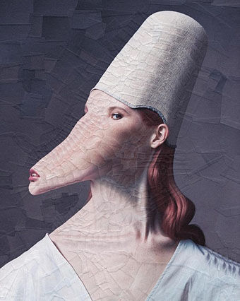
Untitled (2014) by Lola Dupré. Via.

Announcement of the week (if not the month/year) is the news that the BFI will be releasing all of the BBC dramas directed by Alan Clarke on DVD/Blu-ray in May. In addition to the long-awaited appearance on disc of Penda’s Fen (1974) we can expect a previously unseen director’s cut of Clarke’s last TV film, The Firm (1989), the DVD premier of Baal (1982) with David Bowie, plus many other works including some from the 1960s that were believed lost. (And it should be noted that this isn’t everything of Clarke’s; he also worked occasionally for ITV and later directed feature films for Channel 4.)

The BFI attention is a tribute to an exceptional director that’s overdue. Clarke has long been a cult figure among the British actors who worked with him, and among directors such as Harmony Korine and Gaspar Noé, but the tendency of TV to give one-off dramas a single screening has meant that much of his best work has been unavailable for years outside old VHS tapes. Clarke is important for having persistently chosen difficult subjects which he directed with a flair and intensity usually only found in cinema. When he died in 1990 the BBC repeated a handful of his films but the only ones given repeated DVD release have been the violent dramas with the big names attached: Scum (1979, with Ray Winstone), Made in Britain (1982, with Tim Roth), and The Firm (with Gary Oldman). Clarke’s oeuvre is much more than a parade of nihilistic villains, as will become evident later this year.

• A psychedelic video directed by Peter Strickland for Liquid Gate (ft. Bradford Cox) by Cavern of Anti-Matter. The debut album from Cavern of Anti-Matter, Void Beats/Invocation Trex, will be out later this month.

Celebrating Dusseldorf, the city that birthed Krautrock. (Article loses points for not mentioning producer Conny Plank.)

All Rivette’s features might be regarded as different kinds of horror films; Céline et Julie vont en bateau is his first horror comedy. The anxiety and despair of Paris Nous Appartient and La Religieuse, L’Amour Fou and Spectre seem relatively absent, yet they perpetually hover just beyond the edges of the frames. We still have no privileged base of ‘reality’ to set against the fictions, each of which is as outrageous as the other; and along with Borges, we can’t really say whether it’s a man dreaming he’s a butterfly or a butterfly dreaming he’s a man—although we may feel, in either case, that he and we are just on the verge of waking.

Jonathan Rosenbaum on work and play in the house of fiction: Jacques Rivette’s Out 1 and Céline and Julie Go Boating

• Mixes of the week: Finders Keepers Radio Show Krautrock Special, and The Ivy-Strangled Path Vol. XV by David Colohan.

• At Dangerous Minds: Super strange sculptures (by Shary Boyle) only the dark and demented could love.

• Beautiful Brutalites: S. Elizabeth questions Arabella Proffer about her paintings.

KTL is a musical collaboration between Peter Rehberg and Stephen O’Malley.

• Why study art when you can make it? The strange world of…This Heat.

Sarah Galo on the explicitly sexual female artists that feminism forgot.

Irmin Schmidt‘s favourite music (this week).

• LSD: My life-saving drug by Eric Perry.

The Occult Activity Book

Twenty Tiny Cities

Der LSD-Marsch (1970) by Guru Guru | Krautrock (1973) by Faust | Düsseldorf (1976) by La Düsseldorf

The kosmische design of Peter Geitner

geitner07.jpg

Cyborg (1973) by Klaus Schulze.

More German music design. Once you start delving into the music produced in Germany between 1969 and 1975 you eventually notice that a) the good albums generally have decent cover designs, and b) there are many justly forgotten albums with astonishingly tasteless artwork. Most of the well-known names were smart enough to craft a visual identity: Kraftwerk’s efforts have been explored here recently but there was also the Gothic Surrealism of Falk-U Rogner’s photo montages for Amon Düül II (worthy of a post in themselves); Neu! followed the lead of Kraftwerk with strikingly minimal presentation; Faust’s debut album was released on transparent vinyl in a clear sleeve while their second album was an all-black sleeve with a series of strange pictures inside, one for each song. Can are a notable exception in having no clear identity.

geitner23.jpg

Peter Geitner is unique in this scene in being the only graphic designer you can find who was creating any kind of consistent identity for a label and a group of artists. Almost all the work here is for Rolf-Ulrich Kaiser’s short-lived Kosmische Musik which replaced the earlier Die Kosmischen Kuriere. Both labels were offshoots of Ohr Records (Tangerine Dream’s original home), and catered mostly to the musicians based in Berlin, with a later detour to Switzerland. All the releases feature Geitner’s recurrent motifs of radiating stars and sunburst graphics. I think one of the reasons I like Geitner’s design is because I have a tendency to use similar spiky sunbursts in my own work. Whatever Geitner did after the collapse of Kosmische Musik I’ve yet to discover.

geitner22.jpg

The standard design for the vinyl labels. Many of the albums were released as quadrophonic mixes so the star logo also signifies multi-directional sound. Klaus Schulze’s album is nothing if not cosmic, four sides of treated strings and swirling synth noise.

geitner03.jpg

Seven Up (1973) by Timothy Leary & Ash Ra Tempel.

This is a reissue design that replaces the more common sleeve with its Walter Wegmüller doodles and poor layout. I didn’t used to like the music very much either, two sides of bluesy jams with Tim Leary and cohorts bellowing over the top. But it’s a historical oddity, a rare connection between the US psychedelic scene and the German music which took psychedelia in new directions.

geitner04.jpg

Continue reading “The kosmische design of Peter Geitner”

Main aesthetics

main01.jpg

Hydra-Calm (1992).

It’s always good to find a group of musicians who not only make the kind of sounds you like but also package their work effectively. Having read the Quietus interview with Robert Hampson last week I was going back through the catalogue of Hampson’s 90s group Main and thinking again how well the design of their digipak singles and albums complemented their music. Main evolved out of an earlier rock outfit, Loop, and the earliest Main productions still bear some trace of the trancey Loop approach to rock structures. The first Main album, Hydra-Calm, was released on Situation Two, and comes packaged like the first album from Faust, with an X-ray of a skull on a transparent sheet replacing the X-ray fist of the German group.

main02.jpg

Dry Stone Feed (1993).

With a move to the Beggars Banquet label a year later, a different design approach was adopted which set the template for nearly all the Main releases during the 1990s. An outfit (or person) named Avida is credited with Main’s design, with the name being adjusted on various releases to Avida Design, Avida Formations, Avida Hydroforms and Avida Iceforms. The decision to dwell on varieties of texture matches the evolution of the group’s music from arrangements of guitar, bass and drums to abstract and increasingly minimal fields of sound; in this respect, Deliquescence was a perfect title. Hampson and co. created their sound fields by subjecting guitar noise to unspecified sampling and effects processes. When Simon Reynolds invented the term “Post-rock” to describe some of the musical developments happening in the 1990s, Main always seemed to be exemplars of the term, they really did go from being a bona fide rock band to a group pushing sound far beyond anything to do with rock music at all.

main03.jpg

Firmament (1993).

The photos used by Avida Design start out as shots of TV screens or computer monitors then range through the natural world with close-ups of rock formations, lichen, wood grain and underwater ice. The typography is nearly always Copperplate Gothic (or a sans serif variation) printed in metallic silver ink. The most satisfying release for me was the Hz set of six CD-singles released from mid-1995 to 1996, the last of which came with a box to place the singles in and a booklet containing symbols which relate to each disc. Hz is the peak of their output, and although it was later released as a double-disc set I prefer the box.

Anyone looking for these releases today can find copies for sale at Discogs.com. Robert Hampson is still active, his site is here. A few more Main covers follow.

Continue reading “Main aesthetics”