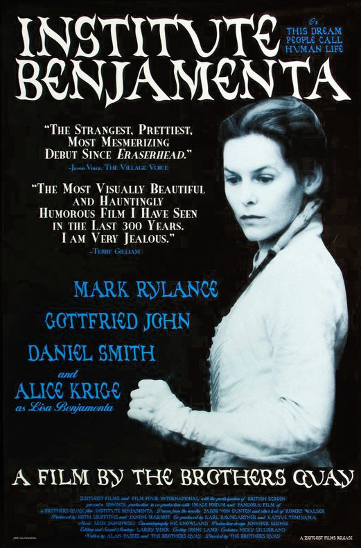
US one sheet (1996).
Heinrich Holzmüller (also spelt Holtzmüller) was a German printmaker and calligrapher active during the 16th century. He may have been dead for centuries but this inconvenience didn’t prevent him from appearing as an interviewer in the catalogue for the MoMA exhibition of artworks by the Brothers Quay that ran throughout the end of 2012.

Film tie-in edition of Jakob von Gunten (1995).
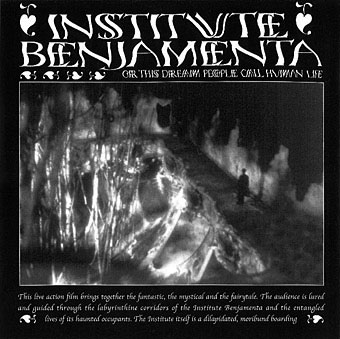
One of the more informative pieces of information to come from that interview concerned the Quays’ resurrection of typefaces designed by Holzmüller in his Liber Perutilis, a book about lettering and calligraphy published in 1553. The Quay versions were most visible around the time of the production of their first feature, Institute Benjamenta (1995): you can see them on the posters, on the cover of the Serpent’s Tail tie-in edition of Jakob von Gunten and also inside the rare soundtrack CD which the Quays designed for Lech Jankowski.
Institute Benjamenta soundtrack booklet (1998).
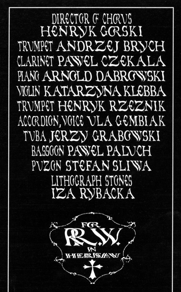
Institute Benjamenta soundtrack booklet (1998).
I’ve had the MoMA catalogue since it was published, and more than once had searched half-heartedly for Holzmüller’s book without success. A more recent search turned up the goods, however (sometimes it helps to keep following leads from one page to another): a copy of Liber Perutilis may be found online at the Universitätsbibliothek Basel.
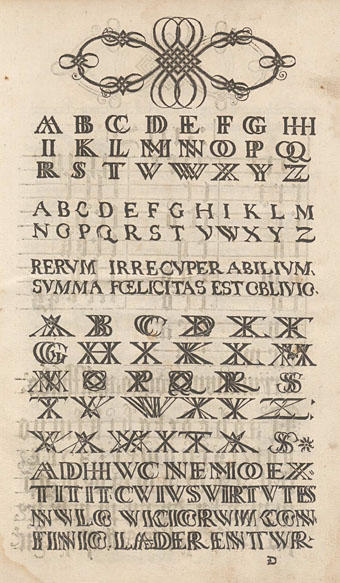
Liber Perutilis is only a short book compared to some in the field, but it’s also much more varied and original than others I’ve seen. Among the alphabets which the Quays digitised there are sets showing the letters doubled and tripled in the manner of monograms. The Quays have often signed themselves using a double Q so this may explain the attraction. The undoubled alphabet is especially striking for Holzmüller’s distortions of the letterforms which make them seem like characters viewed under rippled glass. At a time when most books about lettering and calligraphy were showing alphabets produced by careful and elegant hands this is a feature which to our eyes seems surprisingly advanced. The Quays have copied the alphabets fairly closely, making minor changes such as rounding off an E and adding the J and U which are always missing in Latin alphabets of the period. Elsewhere in the book there are many examples of calligraphic flourishes and some unusual pieces of decorative knotwork. As for Holzmüller’s posthumous interview, copies of the MoMA catalogue are still available, while the interview itself will be reprinted in the booklet for the BFI’s forthcoming Blu-ray collection, Inner Sanctums—Quay Brothers: The Collected Animated Films 1979–2013.
Elsewhere on { feuilleton }
• The Quay Brothers archive