Dubliners

clarke.jpg

Woman walking past a stationery shop on O’Connell (Sackville) Street. Photo by JJ Clarke.

This year is the centenary of James Joyce’s short-story collection, Dubliners, so the book provides a predominant theme for this year’s Bloomsday. Not a great departure when both Dubliners and Ulysses concern the inhabitants of the same city. Dubliners would have been published before 1914 but the book was refused by several publishers and printers who objected to Joyce’s brand of realism.

The picture above is from a selection of photos of Dublin’s citizens by JJ Clarke, all of which were taken during the time depicted in Dubliners and Ulysses. Elsewhere:

• In honour of the Dubliners centenary 15 writers were asked to create new stories as a response to Joyce’s originals. Eimear McBride is one of the contributors. The Guardian posted her response to Ivy Day in the Committee Room, and she writes about Dubliners here.

• An introduction to Dubliners by Anthony Burgess, written in 1986 then never published, with illustrations by Louis le Brocquy.

James Longenbach reviews The Most Dangerous Book: The Battle for James Joyce’s ‘Ulysses’ by Kevin Birmingham.

Richard Hamilton‘s series of drawings and prints based on Ulysses are on display at the British Museum.

• Stefany Anne Golberg on the old people, young people, and priests of Dubliners.

• Illustrations by Robert Berry for Dubliners‘ final story, The Dead.

Previously on { feuilleton }
Covering Joyce
James Joyce in Reverbstorm
Joyce in Time
Happy Bloomsday
Passages from James Joyce’s Finnegans Wake
Books for Bloomsday

Weekend links 211

shau.jpg

Secret Bloom (2014) by Natalie Shau.

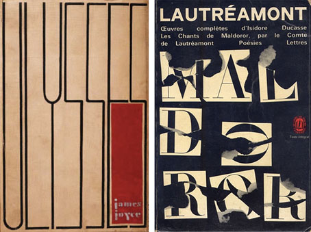
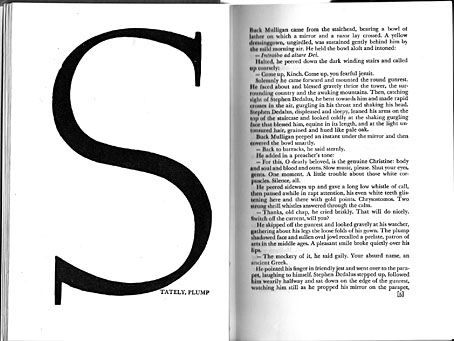
Bloomsday approachs. “Reading Ulysses changed everything I thought about language, and everything I understood about what a book could do,” says Eimear McBride whose debut novel, A Girl Is a Half-formed Thing, recently won the first Bailey’s women’s prize for fiction. McBride was interviewed by Susanna Rustin last month, shortly before the award was announced, and her novel has now become one of those minor causes célèbres for being rejected so often it was eventually published by a new imprint set up by a bookseller. “If the publishing industry doesn’t take a risk then who will?” asks Henry Layte, the bookseller in question.

Speaking of risk, David Hebblethwaite coincidentally wrote a post earlier this week asking where the formal challenge has gone in science-fiction writing. (He mentions McBride in passing.) Nina Allen followed up with a post of her own. I suspect the books are still being written but they’re no longer being accepted by editors and publishers who want even more adventure stories, “sympathetic” characters, and easy reads. Novels that only aspire to be written equivalents of action films or computer games are doomed to be less exciting than their more kinetic competitors. The struggle between the values of art and the values of entertainment is an old one but it shouldn’t be an either/or proposition. “Difficulty is subjective,” says Eimear McBride, “the demands a writer makes on a reader can be perceived as a compliment.”

Related: the following from Geoffrey Hill on “difficulty”:

We are difficult. Human beings are difficult. We’re difficult to ourselves, we’re difficult to each other. And we are mysteries to ourselves, we are mysteries to each other. One encounters in any ordinary day far more real difficulty than one confronts in the most “intellectual” piece of work.

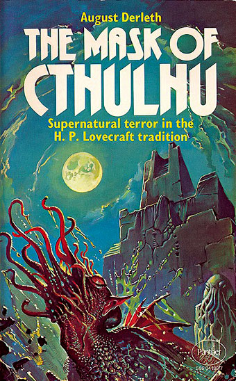
• The Quietus pulled out all the stops this week, interviewing Annette Peacock, Iain Sinclair (again), Alan Moore (again), and asking Peter Strickland, the director of Berberian Sound Studio, for a list of his favourite albums. Given the above, it’s worth noting that all those people have produced challenging work of their own in different media.

• “The Satyrs Motorcycle Club was founded in 1954 with seven members, but little did anyone know it would become the oldest running LGBT organization (and oldest gay motorcycle club) in the world.”

Trunk TV posted another great selection of television title sequences. The previous selection has been taken down for the usual tiresome copyright reasons so watch this one while you can.

• “Detroit techno and black metal have so much in common,” say Wolves In The Throne Room whose new album, Celestite, is predominantly a product of synthesizer technology.

• “Houghton Library’s copy of Arsène Houssaye’s Des destinées de l’ame (FC8.H8177.879dc) is without a doubt bound in human skin.”

• The secret of Nabokov’s sexual style: David Lodge reviews Nabokov’s Eros and the Poetics of Desire by Maurice Couturier.

• How long can you hold your breath? 2 models, 7 divers in an underwater shipwreck by photographer Von Wong.

• At Dangerous Minds: Paul Gallagher on The fantastic world of Sharmanka Kinetic Theatre.

• Wizards of the Coast: Benjamin Breen on John Dee and the occult in California.

• More photography: Peter Guenzel captures strange lights in forests.

• Mix of the week: Bleep podcast 121 presented by Margot Didsbury.

I’m The One (1972) by Annette Peacock | Eros Arriving (1982) by Bill Nelson | The Dire And Ever Circling Wolves (2005) by Earth

Les Chants de Maldoror by Shuji Terayama

terayama.jpg

27 minutes of experimental video from 1977 in which director Shuji Terayama retrieves some predictably unorthodox images from the bottomless pit of Lautréamont’s text. The preoccupations here seem to belong as much to the director’s mind as to that of Isidore Ducasse, what with the emphasis on various forms of bondage and unusual erotics. (Not that Maldoror lacks sexual material but what there is adopts a different guise.) With a score that sounds like outtakes from a Clock DVA studio session it’s very much a product of its time, but not without interest. Terayama was (among other things) the director of Emperor Tomato Ketchup (1971), a film whose title was later swiped by Stereolab. Les Chants de Maldoror may be viewed at Ubuweb.

terayama2.jpg

Previously on { feuilleton }
Polypodes
Ulysses versus Maldoror
Maldoror
Books of blood
Magritte’s Maldoror
Frans De Geetere’s illustrated Maldoror
Maldoror illustrated

Polypodes

jianfu.jpg

Sepia (no date) by Gao Jianfu.

Quelquefois, dans une nuit d’orage, pendant que des légions de poulpes ailés, ressemblant de loin à des corbeaux, planent au-dessus des nuages, en se dirigeant d’une rame raide vers les cités des humains, avec la mission de les avertir de changer de conduite, le caillou, à l’œil sombre, voit deux êtres passer à la lueur de l’éclair, l’un derrière l’autre; et, essuyant une furtive larme de compassion, qui coule de sa paupière glacée, il s’écrie: «Certes, il le mérite; et ce n’est que justice.» Après avoir dit cela, il se replace dans son attitude farouche, et continue de regarder, avec un tremblement nerveux, la chasse à l’homme, et les grandes lèvres du vagin d’ombre, d’où découlent, sans cesse, comme un fleuve, d’immenses spermatozoïdes ténébreux qui prennent leur essor dans l’éther lugubre, en cachant, avec le vaste déploiement de leurs ailes de chauve-souris, la nature entière, et les légions solitaires de poulpes, devenues mornes à l’aspect de ces fulgurations sourdes et inexprimables.

Les Chants de Maldoror (1869) by the Comte de Lautréamont

maldoror.jpg

Sometimes on a stormy night while legions of winged squids (at a distance resembling crows) float above the clouds and scud stiffly towards the cities of the humans, their mission to warn men to change their ways—the gloomy-eyed pebble perceives amid flashes of lightning two beings pass by, one behind the other, and, wiping away a furtive tear of compassion that trickles from its frozen eye, cries: “Certainly he deserves it; it’s only justice.” Having spoken thus it reverts to its timid pose and trembling nervously, continues to watch the manhunt and the vast lips of the vagina of darkness whence flow incessantly, like a river, immense shadowy spermatozoa that take flight into the dismal aether, the vast spread of their bat’s wings obscuring the whole of nature and the lonely legions of squids—grown downcast viewing these ineffable and muffled fulgurations.

Translation by Alexis Lykiard, 1970

pennington-cthulhu.jpg

The Mask of Cthulhu, 1976 paperback reprint. Cover art by Bruce Pennington.

Above these apparent hieroglyphics was a figure of evidently pictorial intent, though its impressionistic execution forbade a very clear idea of its nature. It seemed to be a sort of monster, or symbol representing a monster, of a form which only a diseased fancy could conceive. If I say that my somewhat extravagant imagination yielded simultaneous pictures of an octopus, a dragon, and a human caricature, I shall not be unfaithful to the spirit of the thing. A pulpy, tentacled head surmounted a grotesque and scaly body with rudimentary wings; but it was the general outline of the whole which made it most shockingly frightful. Behind the figure was a vague suggestion of a Cyclopean architectural background.

The Call of Cthulhu (1928) by HP Lovecraft

Previously on { feuilleton }
Ulysses versus Maldoror
Maldoror
Vampyroteuthis Infernalis by Vilém Flusser
Books of blood
Magritte’s Maldoror
Frans De Geetere’s illustrated Maldoror
Maldoror illustrated

Ulysses versus Maldoror

covers.jpg

Ulysses (1934), designed by Ernst Reichl; Complete Works of Isidore Ducasse (1967), designed by Pierre Faucheux.

On the design front, that is, not the writing one. Ernst Reichl’s design for the 1934 Random House edition of James Joyce’s Ulysses (the first US edition) has a cover which isn’t so different to the many Art Deco-style bindings from around this time. Inside, however, there’s a significant innovation with his title spread, and the dramatic imposition of a huge capital letter. Random House was presenting Ulysses as a major artistic statement, a quality which Reichl’s design reinforces when the page-filling capitals recur at the openings of each of the novel’s three sections.

ulysses1.jpg

I encountered the huge S on the opening page in a book about Joyce shortly after I’d started reading the novel for the first time, and for years was under the impression that this had been a specific instruction of the author’s, a typographic flourish to add to the rest of the formal manipulations. I’d suggest—insist, even—that all editions of Ulysses should adopt Reichl’s design. Martha Scotford at Design Observer looks at the book in more detail.

ulysses2.jpg

maldoror1.jpg

Les chants de Maldoror-Poésies-Lettres (1950) by Lautréamont. Le club français du livre.

Pierre Faucheux went one further with his grandiose opening for Les chants de Maldoror-Poésies-Lettres by filling the opening of the book with Didot capitals which spell out M-A-L-D-O-R-O-R on each page before the title is reached. This is the design equivalent of shouting in the reader’s face when the book is opened; given the nature of the text I can imagine the author approving. I’ve no idea whether the idea was borrowed from Reichl but Faucheux was a very inventive designer who was quite capable of arriving at such a layout on his own. His cover for a 1967 reprint of the book (above) spells out the title by tearing up the earlier Didot capitals. Rick Poynor at Design Observer (again) looked at more of Faucheux’s covers for the Livre de Poche imprint, while at Eye magazine there’s an essay by Richard Hollis about Faucheux’s innovations.

Continue reading “Ulysses versus Maldoror”