Early British Trackways

watkins01.jpg

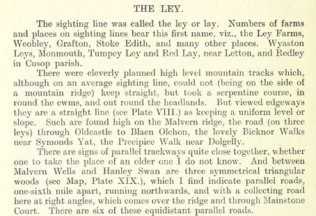
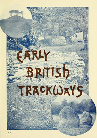
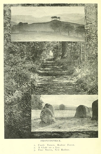
Continuing the Earth mysteries/megaliths theme, Early British Trackways: Moats, Mounds, Camps, and Sites (1922) by Alfred Watkins (1855–1935) was the first book in which the ley lines theory was proposed. Watkins was an amateur archaeologist (more a kind of early psychogeographer), photographer and writer who theorised that ancient Britons had marked the land with pathways connected by a variety of natural and man-made features: hills, mounds, trees, ponds, hillside notches and (of course) standing stones. Watkins coined the term “ley” after noticing that many of the lines connecting these features ran through villages or areas of land whose names ended in “-ley”, “-lay” or similar. The thesis was developed more fully in The Old Straight Track (1925), a book which became the ur-text for subsequent ley hunters. I’ve never seen any of Watkins’ books so it was interesting finding this short volume at the Internet Archive, not least because several of the photos appear in Mysterious Britain (1972) by Janet & Colin Bord, a classic guide to Britain’s sacred sites and folk rituals.
watkins02.jpg

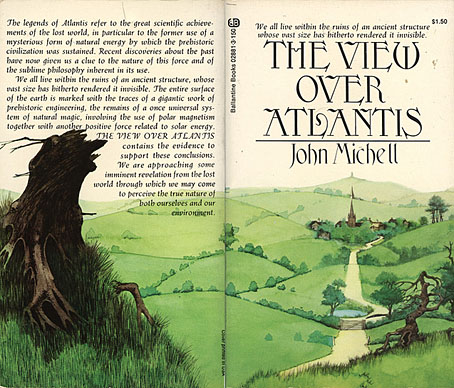
Watkins never regarded ley lines as having any mystic significance, he thought they were probably old trade routes. Archaeologists have never agreed with his suppositions, however, and Watkins himself might have disapproved of the conjectures added to his theories by John Michell in The View Over Atlantis (1969) which wedded ley line theory to feng shui to create the whole “lines of energy” idea. Whatever one thinks of Michell’s theories, that book and subsequent volumes put ley lines firmly into popular culture, and without them we wouldn’t have the references in Children of the Stones, Steve Hillage’s Green (1978) (pretty much a Michell-inspired concept album), Nigel Kneale’s Quatermass (1979) and so on. But this slim book is where it all begins.
tvoa.jpg

Illustration by Roger Dean (1972).
watkins03.jpg

Continue reading “Early British Trackways”

Jeffrey Catherine Jones, 1944–2011

jones1.jpg

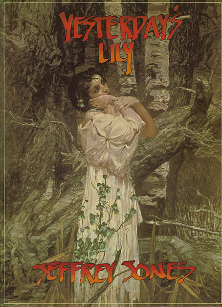
Yesterday’s Lily (1980), a collection of painting and illustration work published by Dragon’s Dream.

Artist Jeffrey Jones, whose death was announced this week, transitioned to Jeffrey Catherine Jones in the late 1990s so we’ll honour that here and won’t insist on referring to her as “he” as I’ve been seeing on some other websites. Jones’ work was significant for me mainly as a result of her participation in The Studio collective from 1975 to 1979, an affiliation of four artists—Jones, Barry Windsor-Smith, Mike Kaluta and Berni Wrightson—who shared a loft studio in New York City. The fruits of that relationship were recorded in one of my favourite art books, The Studio, in 1979. Of the four it was Barry Smith’s Pre-Raphaelite-inspired work which made the greatest impression at the time (especially Pandora), followed by Berni Wrightson’s Frankenstein illustrations. But Jones was the best painter in the group, with a style that blended influences from (among others) JM Whistler, Gustav Klimt and Frank Frazetta. There are galleries of paintings and drawings at the official website. Still to come is Better Things: Life & Choices of Jeffrey Jones, a documentary film by Maria Cabardo. Clips and trailers can be seen here.

A selection of paintings at Golden Age Comic Book Stories
The Studio Pt.1: Jeff Jones

Elsewhere on { feuilleton }
The illustrators archive

Previously on { feuilleton }
Roger Dean: artist and designer
Berni Wrightson’s Frankenstein

Weekend links 24

early.jpg

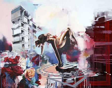
Delta-Wing (2009) by Chloe Early.

• “Feted British authors are limited, arrogant and self-satisfied, says leading academic”. Stating the bleeding obvious but it still needs to be said, apparently, especially when the announcement of the Booker list this year caused the usual confusion when Amis Jr. and McEwan weren’t included, as though the mere existence of their novels makes them prize-worthy. And as someone pointed out, the word “male” is missing from that headline.

Hero of Comic-Book World Gets Real: Alan Moore again, in the NYT this time. Related: a review of Unearthing live.

• Announcing The Hanky Code by Brian Borland & Stephen S Mills, a 40-poem book to be published next year by Lethe Press. For an explanation of the Hanky Code there’s this, and there’s also an iPhone app.

Folk—the ‘music of the people’—is now hip again, says (who else?) Rob Young who can also be heard on the archived podcast here. Related: the folk roots of Bagpuss. Related to the latter: The Mouse Mill.

zvorykin.jpg

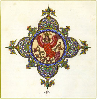
An endpiece from The Firebird and other Russian Fairy Tales by Boris Zvorykin.

‘Yes’ to Catastrophe: Roger Dean, Prog and SF. A lengthy and thoughtful analysis of Roger Dean’s early work.

Into the Media Web, the enormous Michael Moorcock book which I designed, is officially published this week.

Cassette playa: in praise of tapes. I’ve complained about tapes in the past but people continue to find them useful. Some technologies die harder than others.

Boy BANG Boy: “Quiet moments made suddenly very loud with the attitude and opinion of what it means to be a young male in an impossibly diverse world.” An exhibition opening at Eastgallery, London, on August 5th.

Empty your heart of its mortal dream: Alfred Kubin’s extraordinary novel, The Other Side.

Ghostly and Boym Partners devise a new way to deliver digital music.

Besti-mix #27: a great selection by producer Adrian Sherwood.

Agnostics are troublemakers. Amen to that.

• RIP Harry Beckett.

Acousmata.

Let Us Go In To The House Of The Lord by Pharoah Sanders (live, 1971): Part 1 | Part 2

Dodgem Logic #4

dodgem1.jpg

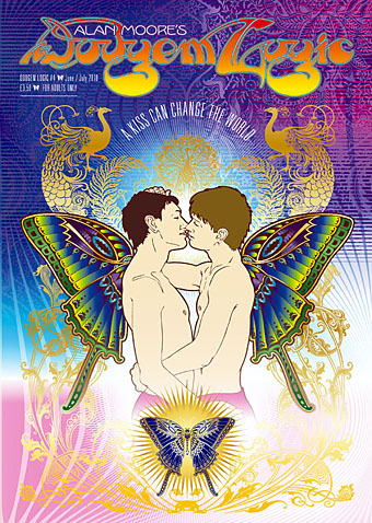
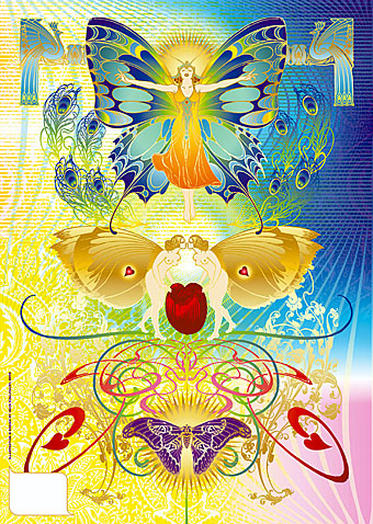
The magazine isn’t out for another couple of weeks but my cover art has been posted to various websites so I can finally show this here. Alan Moore was in touch at the beginning of February asking for a wraparound cover design, the only brief being that he liked my Alice in Wonderland calendar and asked for something equally florid or—for want of a better term—psychedelic. Alan’s magazine owes something to the underground mags of the 1960s and a common feature of those, especially Oz magazine, was a degree of provocation in the choice of cover art. A picture of two boys kissing is nothing more than a show of affection yet to many people the sight still inspires enormous outrage. This was demonstrated a week or so after I’d finished the cover when the Washington Post was deluged by angry letters and emails after they showed a photo of two newly-weds outside the Washington DC Superior Court. People used to have a similar reaction to the sight of a black man kissing a white woman; the only way attitudes change is when something becomes so commonplace it’s no longer worthy of note.

dodgem2.jpg

Aside from the politics, this was also an excuse to run riot with more Art Nouveau motifs, especially peacocks and butterflies. The butterfly-winged boys are a nod to the paintings of Yannis Tsarouchis, and this in turn gave me an excuse to borrow from another magazine cover, Frank X Leyendecker’s 1922 painting of The Flapper for Life. Frank X was the brother of the more renowned illustrator JC Leyendecker. Joseph C was known to have been discreetly homosexual; so too was brother Frank according to this article in which case his butterfly woman has an additional resonance.

dodgem3.jpg

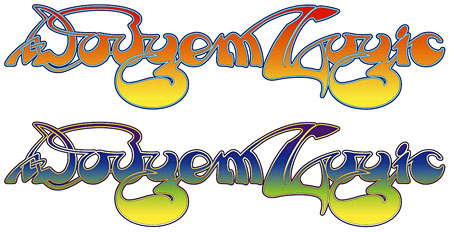
Having written a lengthy polemic about Roger Dean’s work in January I had the idea of doing the magazine title in his lettering style. I spent the best part of two days working on these as I wanted the result to be as accurate as possible. All the gold parts of the cover shown here are gradients but I made a slightly different version for print which will render those areas in gold ink. I’m looking forward to seeing this printed.

Previously on { feuilleton }
Roger Dean: artist and designer
The art of Yannis Tsarouchis, 1910–1989
Dodgem Logic
Psychedelic Wonderland: the 2010 calendar
Butterfly women

Storm Thorgerson: Right But Wrong

storm.jpg

Storm Thorgerson, he of the great design partnership Hipgnosis, has some of his album covers and other work in exhibition this month at the Idea Generation Gallery, London. The exhibition runs to May 2nd. This Sunday (April 11th) he’ll be signing copies of his books at the gallery from 2pm.

Alongside some of the most iconic images from his seminal career, the exhibition will include previously unseen sculptures, sketches and writings from the artist. Right But Wrong will provide an in-depth account of the artist and the processes behind some of the artist’s most acclaimed works. Especially for Idea Generation Gallery, Storm will also present a number of brand new site-specific installations, including ambitious reinterpretations of a few his most renowned pieces. (More.)

xtc.jpg

Go 2 by XTC (1978).

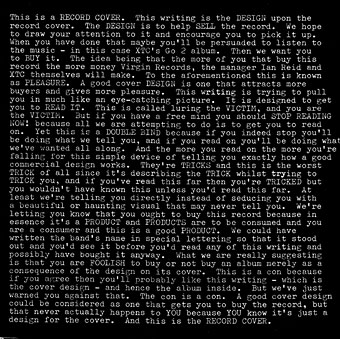
News of the exhibition inspired the BBC news site to create a slideshow featuring Hipgnosis covers and examples of Thorgerson’s post-Hipgnosis work. Everyone invariably throws up a Pink Floyd cover when discussing Hipgnosis. Rather than do that, allow me to point you to XTC’s Go 2 album from 1978, the last word (so to speak) in self-referential album design.

Elsewhere on { feuilleton }
The album covers archive