The art of Bob Pepper

pepper1.jpg

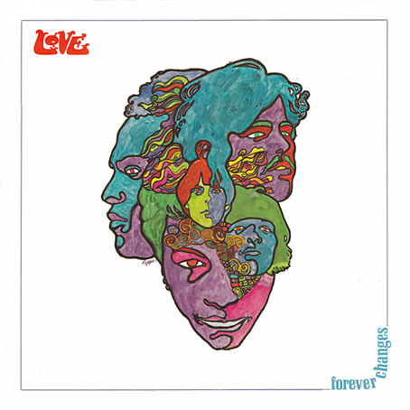
Forever Changes (1967) by Love.
Art by Bob Pepper, design by William S. Harvey.

Following yesterday’s post about Philip K Dick covers (and Erik Davis’s appraisal of the DAW cover), I decided to check out Bob Pepper’s work a bit more and it quickly became obvious I should have joined the dots with this particular artist years ago. Pepper’s work not only decorates one of the recognisable record sleeves of the late Sixties (above), he was working shortly afterwards as an illustrator on the celebrated series of fantasy reprints edited by Lin Carter for Ballantine books. Pepper’s connections with Elektra Records also saw him provide sleeve art for some of the eclectic releases on their Nonesuch label. What’s surprising to me now is the realisation that I’d been seeing his work for years in a variety of places and never noticed it was the same artist. Better late than never, I suppose.
pepper2.jpg

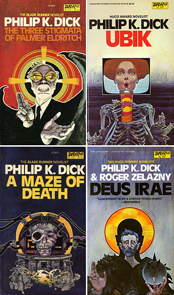
Four more Dick covers for a series of six published in 1982 to coincide with the release of Blade Runner. As with the cover for A Scanner Darkly (in the earlier post) these paintings are all portraits.
pepper3.jpg

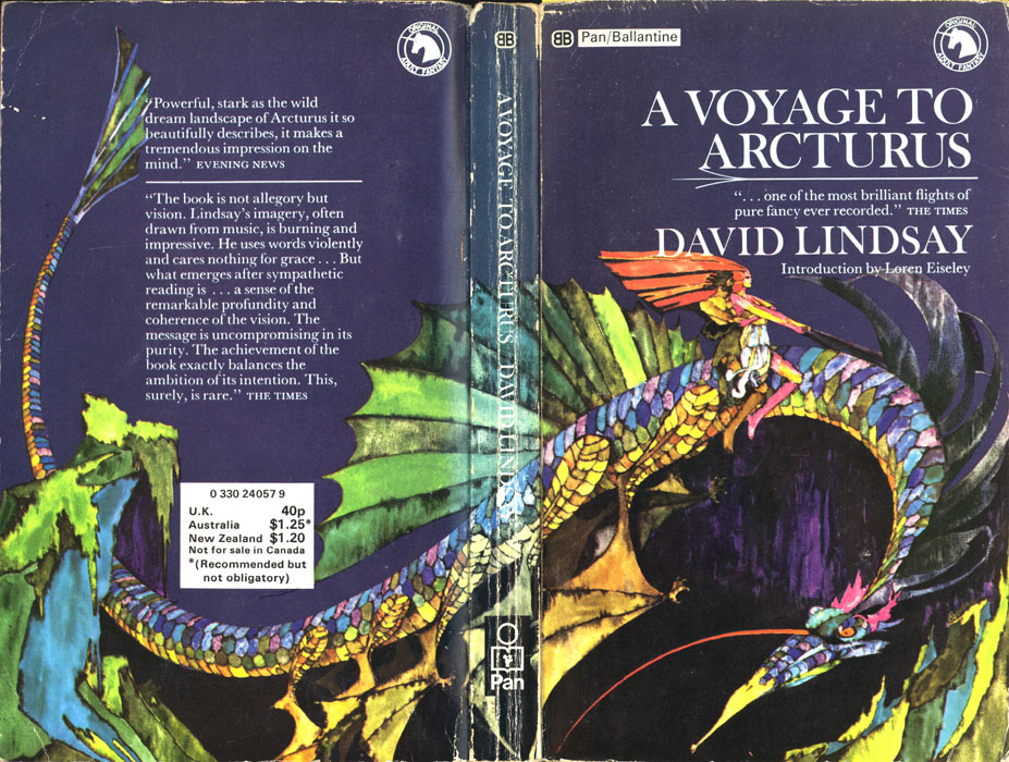
A Voyage to Arcturus (1968) by David Lindsay.

It was the success of the publication of The Lord of the Rings in America which inspired Betty Ballantine to publish a line of fantasy classics in the late Sixties. The series began its run in 1969 and continued until 1974. Lin Carter was commissioned as editor and given free reign to choose any title he thought might be suitable with the result that many of the books in the series—obscurities such as Lud-in-the-mist by Hope Mirrlees—received their first paperback publication. Carter also reprinted personal favourites which frequently shifted from fantasy to outright horror, such as the titles from HP Lovecraft and William Hope Hodgson. The range and scope of this line is what makes the series so notable today and the books have become highly-collectable as a result. Many artists were involved in producing the distinctive cover designs and Pepper’s illustrations were featured on the covers for Mervyn Peake, Lord Dunsany and James Branch Cabell, among others. Unfortunately the various pages devoted to these books aren’t very good at showing the paintings to their best advantage. For a long time Pepper’s cover for A Voyage to Arcturus was one of the few editions available that managed to show a scene from the book, rather than a generic sword-wielding barbarian.
pepper5.jpg

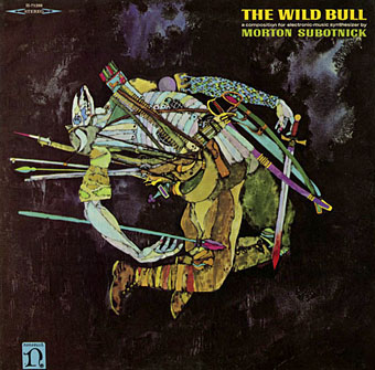
The Wild Bull (1968) by Morton Subotnick.

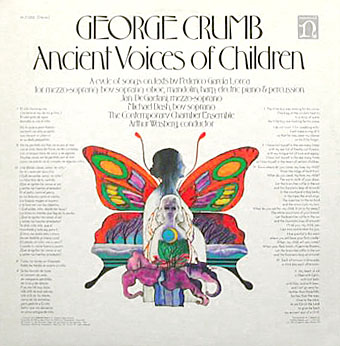
Nonesuch Records was Elektra’s subsidiary classical music label which not only produced classical recordings but also recordings from around the world in their Explorer series, and a range of original works of contemporary electronic music. I’m not positive that the sleeve above is a Pepper painting but it certainly looks like it. This is another surprise since I’ve had Morton Subnotnick‘s album on a reissue CD for years (with different artwork). The George Crumb recording below is Pepper’s work and I’ve had the original vinyl of that one for several years. The similarity between that sleeve and the one for Love is striking.
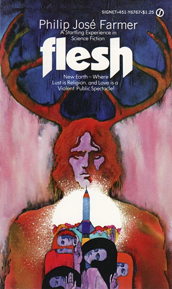
farmer.jpg

Flesh (1969) by Philip José Farmer.

pepper6.jpg

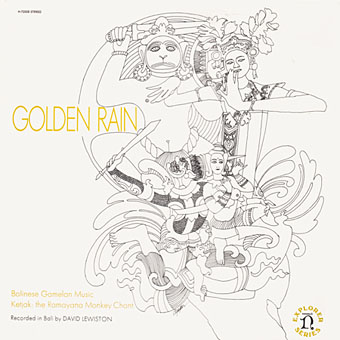
Golden Rain – Balinese Gamelan Music – Ketjak: The Ramayana Monkey Dance (1969) by Various Artists.
Art by Bob Pepper, design by William S. Harvey.
pepper4.jpg

Ancient Voices of Children (1971) by George Crumb.
Art by Bob Pepper, design by Robert W. Zingmark.
delany.jpg

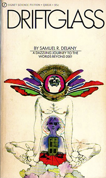
Driftglass (1971) by Samuel R. Delany.

pepper7.jpg

Debussy’s Greatest Hits (1972).

pepper8.jpg

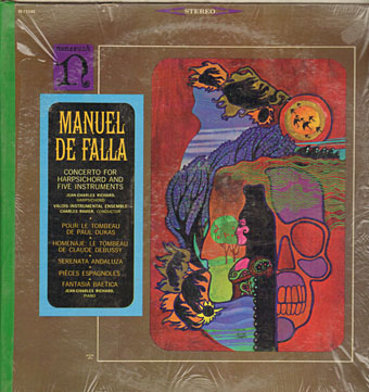
Concerto For Harpsichord And Five Instruments by Manuel De Falla (no date).
ellison.jpg

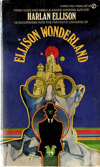
Ellison Wonderland (1974) by Harlan Ellison.
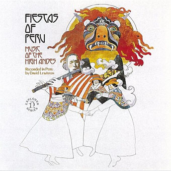
pepper9.jpg

Fiestas of Peru: Music of the High Andes (1975) by Various Artists.
Art by Bob Pepper, design by Jo Ann Gruber.
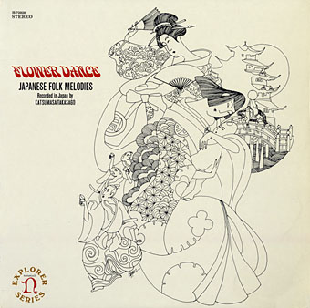
japan.jpg

Flower Dance: Japanese Folk Melodies (no date) by Kofu Kikusui, The Noday Family, Nakagawa & Oishi.
Art by Bob Pepper, direction by William S. Harvey, design by Elaine Gongora.

Pepper is retired now but produced artwork for Dark Tower, a fantasy boardgame, in 1981. The game still has its enthusiasts, and this site features a short interview with the artist.

Update: more about the Ballantine covers.

Update 2: a large scan of the George Crumb cover art.

Update 3: More album and book covers added.

Elsewhere on { feuilleton }
The album covers archive
The book covers archive
The illustrators archive

Previously on { feuilleton}
Philip K Dick book covers
Masonic fonts and the designer’s dark materials
Philip K Dick book covers

scanner_covers.jpg

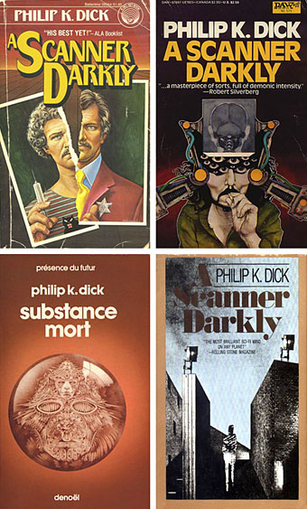
650 Philip K Dick covers here although no thumbnails for ease of browsing. Interesting seeing how many publishers have tried to bracket Dick as a typical science fiction writer when many of his books are marginal sf at best. Then there’s the curiosity of the translated title, Substance Mort for A Scanner Darkly being one example.

Update: Odd coincidence dept. (well, it’s PKD, right?), having posted the above last night I find today that Dick enthusiast Erik Davis is discussing the DAW cover (above, right) over at Total Dick Head. Thanks to this we discover that the artist is Bob Pepper who produced the classic cover art for Love’s Forever Changes album.

Update 2: Henri alerts us to his own PKD site which also includes even more cover scans (and thumbnails this time), including those from French editions.

Elsewhere on { feuilleton }
The book covers archive

Wasted Talent: A Scanner Darkly

scanner.jpgWasted talent

John Patterson
Friday July 14, 2006
The Guardian

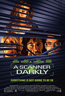
If you’re making a serious movie about drugs, it doesn’t hurt to assemble a cast that knows whereof it collectively speaks. And for his adaptation of A Scanner Darkly, Philip K Dick’s unsettling 1977 masterpiece about drugs, fractured identity, paranoia and betrayal, Richard Linklater has found a quartet that runs the full gamut of the drug experience. You’ve got Keanu Reeves – who for all we know has never even smoked a single joint, but whose name is a byword for stoner inarticulacy – playing Dick’s addict- cum-narcotics-detective Bob Arctor. As Arctor’s dealer-addict paramour Donna, we have Winona Ryder, all grown up since her apparently pill-induced moment of shoplifting madness. Hemp activist Woody Harrelson plays one of Arctor’s drug-addled housemates, while the other is played by no less august an imbiber of chemicals and sacred roots than Robert Downey Jr, who has what one might call an embarrassment of riches in this field.

(More.)

Watchmen

watchmen.jpg

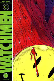
This year sees the 20th anniversary of the publication of Watchmen by Alan Moore and Dave Gibbons. The landmark comic book, one of the few to deserve the designation “graphic novel”, remains a particular favourite of mine, and one that still excites for its consummate command of the comics medium. The following is a very long round table discussion with Watchmen‘s creators from issue 100 of Fantasy Advertiser, first published in March 1988. It’s surprising that this doesn’t seem to have been posted anywhere else on the web as it’s an excellent discussion about this great book.

Spoiler warning: this piece discusses in depth just about every revelation in the story so you’d be advised to skip it if you haven’t read the book.

MARTIN SKIDMORE: Alright, let’s have a starting point… just what is it about Watchmen that distinguishes it from other…
STEVE WHITAKER: Cream cheeses?
MS: …superhero comics on the market?
DAVE GIBBONS: Is this in the form of direct questions to us, or…
FIONA JEROME: No, we’re all gonna talk.
DG: Well, I’ll have a schnoozle then…
SW: The thing that I think distinguishes Watchmen from other comics is that the series holds together more like a novel. Your climax isn’t in the last 3 panels in Watchmen 12. There are long quiet tracts with exciting bits or…moderately exciting bits (LAUGHTER) In terms of Jack Kirby Wham! Smash! Pow! it’s all very quiet. There’s a lot of suffering but…
MS: …it’s all emotional rather than physical suffering.
ALAN MOORE: It’s a difficult question for me and Dave to answer, probably one that you could answer better, but if I had to say anything then it’s the degree of structure that me and Dave have applied to it—I can’t think of many examples of that degree of structure, that degree of layering.
FJ: I was going to say: especially visually you don’t get such a use of motif certainly not in American comics.
MS: Doug Moench has used it occasionally.
FJ: But not with the same complexity and not filling-in with written structure as well.
PETER HOGAN: The thing is: you’re given a world. The characters, alright, they’re based on the Charlton Characters but they’re new as of page 1. Even so, they’re characters with a history that comes out over the course of the thing… Their world has a history… it has a cohesion to it.
SW: Something that quite interests me now we’re talking about structure and stuff, is the symmetry—there is a real symmetry to Watchmen and the way the characters are set up.
DG: Two arms… two legs. (LAUGHTER)
MS: Perhaps the Comedian and Rorschach…
SW: I was thinking more of Osterman and Ozymandias.
MS: That’s right—the intellectual and physical, chaos and law…
AM: It’s difficult pinning down what’s symmetrical to what—I mean to me, at least to some extent, there’s an equally good case for contrasting Nite Owl and Rorschach.

Continue reading “Watchmen”