Engelbrecht lives to fight another day

engelbrecht1.jpg

The beat Engelbrecht had drawn for the early morning rise was a stretch of jet black water between the Jubilee Gasometer and the Municipal Slaughter House. A dank mist lay over the canal. The vampire bats were out in swarms. The bot-fly waltzed in virid clouds. You could hardly have had a better surrealist fishing day.

Thus Maurice Richardson in The Exploits of Engelbrecht, newly-printed copies of which I picked up this week from the Savoy Books’ office. This is the reprint of the Savoy edition which was published in 2000 and would have been out two years ago had various problems not intervened. As a result it’s inadvertently become an anniversary edition which is fitting since Engelbrecht was the first title in the line of books from Savoy’s publishing relaunch ten years ago. I’ve mentioned before that I was dissatisfied with my original design so it was a pleasure being able to rework the book slightly in a manner which better suits Richardson’s marvellous stories. The main change is a completely re-designed dust jacket done in three colours printed on textured paper; this has made the book a nice thing to handle as well as look at. A few new illustrations were added courtesy of Savoy artist Kris Guido. Kris is a far better cartoonist than I and his drawing of Engelbrecht facing one of his broomstick-riding foes adorns the front board.

engelbrecht2.jpg

Another cartoonist, Martin Rowson (currently at the Guardian), reviewed the earlier edition for The Independent on Sunday:

Far more obscure, but for my money the best book of the year, is The Exploits of Engelbrecht by Maurice Richardson. Richardson, who died in 1978, was one of the old school of hacks; he later became a stalwart infester of the Colony Rooms and the sordid pubs round Soho that teemed with pissed-up talent in the 1940s and 1950s. The Exploits of Engelbrecht, the dwarf surrealist boxer, and his adventures shooting witches, boxing grandfather clocks, playing football on Mars and games of surrealist golf which last for infinity, originally appeared in Lilliput when it was at its post-war zenith. The stories were illustrated by, among others, Searle and Hoffnung. Ah, God, those were the days.

This edition is lavishly illustrated and comes with endorsements from artist James Cawthorn (who provided some illustrations and an introduction), Michael Moorcock (who provided the afterword), and JG Ballard (who provided a blurb). Since its original publication in 1950 Engelbrecht had been one of Ballard’s favourite books; I wish he could have lived long enough to see this latest edition.

Engelbrecht isn’t on sale yet as I don’t think a price has been decided on but since this is a limited run it’ll be around £25 + p&p. Any queries should be directed to Savoy Books who have a PDF of the first chapter (plus illustrations) available to read. Next up is the enormous Moorcock tome; more about that soon.

Previously on { feuilleton }
Ronald Searle book covers
Engelbrecht again
Mervyn Peake in Lilliput

Roger Dean: artist and designer

Kieran at Sci-Fi-O-Rama was in touch recently asking me to contribute a paragraph about a favourite Roger Dean picture for this feature about the artist. The following splurge of polemic was the result, something I’d been intending to write for a while. Since so many words would have overwhelmed the other contributions it’s being presented here while Kieran’s post has a variety of shorter appreciations and further examples of Dean’s art and design.

dean1.jpg

Pathways (1973). A slightly reworked version of the original painting.

“Science fiction is unfortunate in having a most unsatisfactory framework of existence—it’s considered literary kitsch. I believe it should be the mainstream of literature because all the books that have become important down the generations of civilisation have been books about ideas. Superficially, science fiction would seem to offer the most scope for idea content, but the promise is unfulfilled. Good ideas and good writing rarely coincide. All too often the medium is used for entertainment alone and its potential beyond this should be obvious to everyone. I don’t just mean in the sense of fantasy technology. The potential for anticipating human evolution is there and perhaps the means to bring it about and definitely the means to bring about a social evolution.”

Roger Dean, interviewed in Visions of the Future (1976).

If popularity is often a curse as well as a blessing, it’s been Roger Dean‘s curse to see his work dismissed along with many other products of a decade—the 1970s—with more than its share of cultural heroes and villains. Music journalists in Britain have for years given the impression that the arrival of the Sex Pistols in 1976 swept away all that preceded them, in particular bands such as Yes whose album covers had helped raise the visibility of Dean’s art to an international level. This is not only a lazy assumption, it’s also wrong. When Yes released Going For the One in 1977 it was their first studio album in three years, yet despite the punk explosion it went to no. 1 in the UK album charts, while a rare single release from the band made the UK top ten. Yes were playing sell-out tours in Europe and the US in 1977 and 78, as were Pink Floyd whose The Wall was massively popular worldwide in 1979. Punk didn’t sweep prog away, what happened with its advent was that progressive rock and everything associated with it—Roger Dean’s art included—became critically disreputable almost overnight, such that no music journalist would dare say anything good about it. That disrepute has persisted for thirty years despite a lasting and indelible influence. This is an old argument but some facts often need restating anew. *
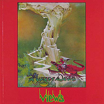
dean6.jpg

Views (1975).

I was 13 in September 1975 when Roger Dean’s first collection of his illustration and design work, Views, was published. At that time, I hadn’t heard any of the music to which his paintings and drawings were attached, and I didn’t even see a copy of the book until February 1976 when I happened to be in London on a school trip and found a big pile of what I guess was the second edition in Foyle’s book shop. This appeared at exactly the right moment. I wasn’t listening to the music but I was reading a lot of science fiction, and was starting to notice and imitate the work of various paperback artists. I recognised many of the pictures in Views from the covers displayed in the window of our local record shop, Cobweb, whose shopping-bag logo was a cowled magician figure à la Dean or Rodney Matthews. It’s difficult to say what struck me about Dean’s work at the time since you rarely articulate your preferences at that age. I think I liked the consistency of vision and the invention which blended the organic and mechanical, the architecture which looked at once ancient and futuristic, and the flat landscapes which put lone pine trees into rocky terrain familiar from Japanese and Chinese prints. For a teenager his style was also relatively easy to imitate if you forgot about basic things such as imagination and finesse, and I spent a year producing a lot of badly-drawn reptiles posed against lurid watercolour skies.

Continue reading “Roger Dean: artist and designer”

A profusion of Peake

gormenghast_box.jpg

Bellgrove, young Titus and Barquentine by Mervyn Peake. Case designed by Robert Hollingsworth.

I’d thought about posting the covers of my boxed set of Gormenghast paperbacks a couple of years back when there was a flurry of blogospheric attention being given to Penguin cover designs…thought about it then never got round to it. The reason for doing so now is twofold: firstly I’ve been re-reading the books, and secondly some Gormenghast-related news emerged this week which gives this post an additional relevance.

gormenghast1.jpg

Fuchsia by Mervyn Peake.

The set of Peake paperbacks which Penguin published in 1968 (and their subsequent reprints) were the first editions of Peake’s trilogy which I encountered so I can’t help but regard them as the ones, the only copies I could countenance reading. That may change, however (see below). I’ve no idea how scarce the boxed edition is but the books are reprintings from 1970 so I presume Penguin put out a boxed gift set to make the most of Peake’s posthumous success. I always liked the presentation which is the standard Penguin Modern Classics format of the period, it leaves to you how much you want to regard the books as works of fantasy or simply novels of a rather grotesque and highly imaginative reality. Titus Groan‘s sketch of a glowering and thoroughly unglamorous Fuchsia was a daring choice for a cover intended to lure a newer, younger audience to Peake’s work. The drawing says a great deal about the author’s unsentimental attitude towards his creations; compared to the florid and often delicate covers of the fantasy books being published by Ballantine in the late Sixties (a series which included the Gormenghast trilogy), it seems shockingly unpleasant.

Continue reading “A profusion of Peake”

Eduardo Paolozzi’s Jet Age Compendium

paolozzi.jpg

Detail from the cover of Ambit # 40, 1969.

A teenage enthusiasm for Pop Art meant I was familiar with the paintings and collages of Eduardo Paolozzi (1924–2005) long before I became aware of his association with sf magazine New Worlds, and his friendship with JG Ballard. Paolozzi was famously credited on the masthead of New Worlds as “Aeronautics Advisor”, a listing which impressed the relevant authorities when Brian Aldiss petitioned for an Arts Council grant and saved the magazine from collapse. Paolozzi’s work was featured in New Worlds now and then, and he provided a cover for issue 174, but it was to Ambit magazine one had to turn to see regular work by the artist.

paolozzi2.jpg

New Worlds #174, Aug 1967.

My favouritism towards New Worlds has always led me to see Ambit as NW-lite; frequent NW contributor JG Ballard was Ambit‘s fiction editor, and both stood to the side of the British literary scene, although Ambit editor Martin Bax didn’t share Michael Moorcock’s preference for pursuing generic or experimental means to Romantic or visionary ends. Quibbles aside, it’s good to see Paolozzi’s work for the magazine is now the subject of an exhibition, The Jet Age Compendium, at Raven Row, London, and also a book, The Jet Age Compendium: Paolozzi at Ambit from Four Corners Books. If you can’t see the former, the latter is priced £12.95 which strikes me as very reasonable.

The Jet Age Compendium runs until 1 November 2009. For an insight into the artist’s interests and attitudes, there’s a great Studio International interview here from 1971 with Paolozzi and Ballard talking to art critic Frank Whitford.

Previously on { feuilleton }
Sculptural collage: Eduardo Paolozzi
Revenant volumes: Bob Haberfield, New Worlds and others

More book design

hotel.jpg

Yes, it’s been a busy year. These are books three and four respectively of the titles I’ve been designing for Tachyon Publications, and there are more on the way.

Kage Baker’s The Hotel Under the Sand is a charming fantasy for children concerning the hotel of the title and its curious inhabitants, which include a ghost bellboy and a pirate captain. The illustrations were by Stephanie Pui-Mun Law and I tried to complement these with the lettering design and graphic elements. I always enjoy working on illustrated books.

fandsf.jpg

The Very Best of Fantasy & Science Fiction is a very different beast, a big (480 pages) selection by Gordon Van Gelder of some of the many first-class stories from the sixty-year history of the fiction magazine. F&SF has published so many classic stories over the years the book could easily have been twice as big. As it is there are pieces by Alfred Bester, Ray Bradbury, Shirley Jackson, Philip K Dick, Harlan Ellison, Stephen King and Neil Gaiman, among others. The design in this case came from studying a copy of the magazine from 1967; I was already thinking of using Bodoni for the story titles and that choice was confirmed when I saw it used for the same purpose in the magazine. The calligraphic titles were also scanned from there, their design going back to the very first issue.

Both these books are on sale now, and Keith Brooke gave a glowing appraisal to the latter in The Guardian at the weekend.

Previously on { feuilleton }
Medicine Road by Charles De Lint
The Best of Michael Moorcock