Harry Clarke in colour

years01.jpg

Older illustrated books often suffer at the hands of owners or a certain breed of iniquitous antique dealer who razor out their colour plates in order to frame them as prints. The Internet Archive has two copies of The Year’s at the Spring; An Anthology of Recent Poetry (1920) edited by Lettice D’Oyly Walters, and illustrated by Harry Clarke: one copy features all of the colour plates, the other has many of them missing. Looking at these again I thought it worth drawing attention to their peculiar mixture of the delicate and the grotesque, a result of illustrating a variety of content combined with Clarke’s habit of pushing book illustration into areas where few of his contemporaries would tread. His painting for The Donkey by GK Chesterton is at once an accurate illustration of the poem but also quite repellent, especially in the company of those phallic extrusions which become increasingly common in his later work. Elsewhere, when illustrating James Elroy Flecker’s The Dying Patriot, it’s a description of submerged corpses that he chooses to depict.

The rest of the book—which contains many beautiful ink drawings—may be browsed here or downloaded here. The Internet Archive is raising funds throughout December to support its running costs. I’ve been using their books as a source of reference a great deal over the past two years so was happy to contribute something.

years02.jpg

years03.jpg

years04.jpg

Continue reading “Harry Clarke in colour”

More from the Decadent Dutch

netherlands3.jpg

Illustration by Otto Verhagen from Yolanda – Het Boek van Bloei (1931) by Nan Copijn.

Would-be Decadents is perhaps a better label, the Decadent ship having set sail across an absinthe-tinted sea by the time these artists were putting pen to paper. Their drawings are another set of scarce images forwarded by Sander Bink who maintains the Rond1900 site. (See this earlier post for further examples.) Sandor also sent artwork details which I’ve quoted below. In addition to yet more overt Beardsley influence (the Verhagen above and René Gockinga’s woman with a candle) there’s also a striking Harry Clarke influence in the second Gockinga drawing which is closer to Clarke’s idiosyncratic style than (for example) these later drawings by Cardwell Higgins. Seeing one artist borrow the mannerisms of another is a common thing; far less common is finding an artist who adopts different styles the way Gockinga does. Incidentally, the Couperin novel mentioned below was published with a typically elegant cover design by Symbolist artist Jan Toorop.

(Thanks again Sander!)

netherlands2.jpg

Otto Verhagen. Illustration (not used as such) for Couperus’ Psyche (1898). Engraving, ca 1913. Collection Sander Bink. This is a personage from the story but to me it looks somewhat like an Oscar Wilde portrait!
Illustration for the very popular fairy tale for adults Psyche by Louis Couperus (1863–1923). You might have heard of Couperus: Oscar Wilde appreciated his decadent, somewhat homosexual, novel Noodlot (1890), translated as Footsteps of fate. Some letters were exchanged. Couperus’ wife Elisabeth translated Dorian Gray in 1893. (First Dutch translation.)

netherlands1.jpg

Sortie (1904) by Carel de Nerée tot Babberich. Museum of Modern Art, Arnhem (from De Neree catalogue, 1986). Verhagen’s Dorian Gray seems to be influenced by this.

netherlands4.jpg

Woman with candle by René Gockinga, ca 1916. Current location unknown.

netherlands5.jpg

Indonesian lady dancing [as I call it—SB] by René Gockinga. From the Indonesian satirical-political periodical De Zweep [The Whip] 1922.

Previously on { feuilleton }
Further echoes of Aubrey
A Wilde Night
Echoes of Aubrey
After Beardsley by Chris James
Illustrating Poe #1: Aubrey Beardsley
The art of Karel de Nerée tot Babberich, 1880–1909
Beardsley’s Rape of the Lock
The Savoy magazine
Beardsley at the V&A
Merely fanciful or grotesque
Aubrey Beardsley’s musical afterlife
Aubrey by John Selwyn Gilbert
“Weirdsley Daubery”: Beardsley and Punch
Alla Nazimova’s Salomé

Recovering Viriconium

viriconium01.jpg

Detail from Assassination in the Night (c. 1600?) by Monsù Desiderio.

Yesterday’s post looked at some of the past cover designs for M. John Harrison’s Viriconium books. This post makes a few suggestions for how they might be presented in the future. Since these are mostly covers that I’d like to see they’re not necessarily ideal for the audience a publisher might be aiming at, cover design is usually a three-way process involving designer, author and publisher. In the end I’ve resisted the temptation to draft a range of original cover proposals—writing these posts has taken long enough—so almost everything here uses pre-existing art. If I was designing covers for all four Viriconium books, however, and the brief was to orient them towards a fantasy readership, the first thing I’d try would be a series of four imaginary Tarot designs. A peculiar pack of Tarot cards is a recurrent feature of the books so I’d create four emblematic cards that featured significant elements and characters from each. The characters wouldn’t be too well defined, they’d be stylised, maybe even silhouettes. Each card would feature a dominant presence: offhand these would be one of the geteit chemosit for The Pastel City, a locust for A Storm of Wings, the Barley Brothers for In Viriconium and a Mari Lwyd horse skull for Viriconium Nights. These presences together with the human characters would loom over a silhouette city at the foot of each card whose outlines would change appearance from book to book, evolving gradually from a fantastic outline of domes and towers to something that resembles a contemporary city. The colours and treatments would show a similar evolution from the bright and bold styles of the Pamela Colman Smith Tarot deck to something more photographic, collaged from elements closer to our world. Maybe.

That’s an idea for the four individual books. All the examples here use the convenience of the omnibus edition so a single image (or pair of images) has to somehow represent the entire series. To save time and effort I’ve taken the liberty of hijacking a couple of Penguin Books layouts. I hope Penguin doesn’t mind, and I should also apologise to Harrison’s UK publishers, Gollancz, for making one of their authors jump ship. The Viriconium omnibus is certainly good enough to be considered a modern classic. Penguin’s recent template for its Modern Classics series happens to be very easy to apply to a wide range of artwork.

viriconium04.jpg

The Anti-Pope (1942) by Max Ernst.

Penguin has a long tradition of using pre-existing art on its covers, especially on those in its Penguin Classics series. You can almost make this into a parlour game: match your favourite novel with the best choice of painting. The tradition was extended to its science fiction titles in the early 1960s when the art of Max Ernst was featured several times along with the work of other Surrealists. Max Ernst is a favourite artist of mine so this is one I can’t resist. Many of Ernst’s decalcomania paintings of the 1940s would suit Viriconium but The Anti-Pope with its horse heads seems especially suitable.

Also on the Penguin sf covers was a picture by the mysterious “Monsù Desiderio” one of whose works can be seen at the top of this post. Desiderio was a 17th-century painter with a vague enough presence—works have been attributed to both François de Nomé and Didier Barra—and a line in gloomy architectural fantasias to make him an ideal Viriconium artist.

Continue reading “Recovering Viriconium”

The Tinderbox

tinderbox4.jpg

HJ Ford (1894).

“Do you see that great tree!” quoth the witch; and she pointed to a tree which stood beside them. “It’s quite hollow inside. You must climb to the top, and then you’ll see a hole, through which you can let yourself down and get deep into the tree. I’ll tie a rope round your body, so that I can pull you up again when you call me.”

“What am I to do down in the tree?” asked the soldier.

“Get money,” replied the witch. “Listen to me. When you come down to the earth under the tree, you will find yourself in a great hall: it is quite light, for many hundred lamps are burning there. Then you will see three doors; these you can open, for the keys are in the locks. If you go into the first chamber, you’ll see a great chest in the middle of the floor; on this chest sits a dog, and he’s got a pair of eyes as big as two tea-cups. But you need not care for that. I’ll give you my blue-checked apron, and you can spread it out upon the floor; then go up quickly and take the dog, and set him on my apron; then open the chest, and take as many farthings as you like. They are of copper: if you prefer silver, you must go into the second chamber. But there sits a dog with a pair of eyes as big as mill-wheels. But do not you care for that. Set him upon my apron, and take some of the money. And if you want gold, you can have that too—in fact, as much as you can carry—if you go into the third chamber. But the dog that sits on the money-chest there has two eyes as big as the round tower of Copenhagen. He is a fierce dog, you may be sure; but you needn’t be afraid, for all that. Only set him on my apron, and he won’t hurt you; and take out of the chest as much gold as you like.”

The Tinderbox (1835) by Hans Christian Andersen

tinderbox1.jpg

Helen Stratton (1910?)

Will at 50 Watts is to blame for this one, the illustrations he posted last week were excessive enough to give even a master of exaggeration like Tex Avery second thoughts. Hans Christian Andersen’s fairy tales have proved so popular over the years that a core group of stories tend to drive out the less familiar works from fresh editions. The Tinderbox is one of these minor stories, the tale of a soldier with a magic tinderbox capable of summoning a trio of supernatural dogs with enormous eyes. My first contact with the story was via a German television adaptation, Das Feuerzeug, filmed in 1958 and later screened in the UK as filler for the children’s TV schedule along with that memorably creepy series (also from Germany), The Singing Ringing Tree. I remembered little about the story but was never able to forget those weird dogs even though their eyes in the TV version are nothing like the way they’re presented in illustrations. They may not be as freaky but the way they’re presented as huge and black makes me think now of the ghostly barghests or black dogs of British folklore.

Searching around for illustrations turned up the handful here. Many illustrators concentrate on other scenes but I’ve only been looking for the dogs. I’m sure there’s more to be found so this may well be a subject to revisit later. The Stratton and Tarrant pictures show the climax of the story when the soldier, about to be hanged for having used the dogs to kidnap a princess, summons his creatures to kill the king, queen and all the people who condemned him. Yes, it’s good wholesome fare for kids.

tinderbox2.jpg

Margaret Tarrant (1910).

Continue reading “The Tinderbox”

Vathek illustrated

vathek1.jpg

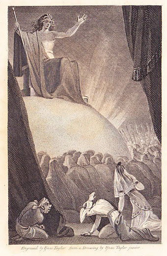
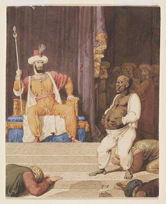
Frontispiece, 1815. Engraved by Isaac Taylor after a drawing by Isaac Taylor Jr.

After some time Vathek and Nouronihar perceived a gleam brightening through the drapery, and entered a vast tabernacle carpeted with the skins of leopards; an infinity of elders with streaming beards, and Afrits in complete armour, had prostrated themselves before the ascent of a lofty eminence, on the top of which, upon a globe of fire, sat the formidable Eblis. His person was that of a young man, whose noble and regular features seemed to have been tarnished by malignant vapours; in his large eyes appeared both pride and despair; his flowing hair retained some resemblance to that of an angel of light; in his hand, which thunder had blasted, he swayed the iron sceptre that causes the monster Ouranabad, the Afrits, and all the powers of the abyss to tremble; at his presence the heart of the Caliph sank within him, and for the first time he fell prostrate on his face.

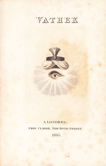
Vathek by William Beckford

The inevitable follow-up to yesterday’s post. Vathek was, we’re told, written in three days and two nights in the winter of 1782 when William Beckford was only 21. The novel is an Orientalist fantasy that’s grotesque and arabesque in the original sense of those terms, very much influenced by The Arabian Nights and similar tales. Here’s HP Lovecraft with a description:

Vathek is a tale of the grandson of the Caliph Haroun, who, tormented by that ambition for super-terrestrial power, pleasure, and learning which animates the average Gothic villain or Byronic hero (essentially cognate types), is lured by an evil genius to seek the subterranean throne of the mighty and fabulous pre-Adamite sultans in the fiery halls of Eblis, the Mahometan Devil. The descriptions of Vathek’s palaces and diversions, of his scheming sorceress-mother Carathis and her witch-tower with the fifty one-eyed negresses, of his pilgrimage to the haunted ruins of Istakhar (Persepolis) and of the impish bride Nouronihar whom he treacherously acquired on the way, of Istakhar’s primordial towers and terraces in the burning moonlight of the waste, and of the terrible Cyclopean halls of Eblis, where, lured by glittering promises, each victim is compelled to wander in anguish forever, his right hand upon his blazingly ignited and eternally burning heart, are triumphs of weird colouring which raise the book to a permanent place in English letters. No less notable are the three Episodes of Vathek, intended for insertion in the tale as narratives of Vathek’s fellow-victims in Eblis’ infernal halls, which remained unpublished throughout the author’s lifetime and were discovered as recently as 1909 by the scholar Lewis Melville whilst collecting material for his Life and Letters of William Beckford. Beckford, however, lacks the essential mysticism which marks the acutest form of the weird; so that his tales have a certain knowing latin hardness and clearness preclusive of sheer panic fright.

Jorge Luis Borges noted some of the influences in his 1943 essay On William Beckford’s Vathek:

…I believe that Vathek foretells, in however rudimentary a way, the satanic splendors of Thomas De Quincey and Poe, of Charles Baudelaire and Huysmans. There is an untranslatable English epithet, “uncanny,” to denote supernatural horror; that epithet (unheimlich in German) is applicable to certain pages of Vathek, but not, as far as I recall, to any other book before it.

[Guy] Chapman notes some of the books that influenced Beckford: the Bibliothéque orientale of Barthélemy d’Herbelot; Hamilton’s Quatre Facardins; Voltaire’s La Princesse de Babylone; the always reviled and admirable Mille et une nuits of Galland. To that list I would add Piranesi’s Carceri d’invenzione: etchings, praised by Beckford, that depict mighty palaces which are also impenetrable labyrinths. Beckford, in the first chapter of Vathek, enumerates five palaces dedicated to the five senses; Marino, in the Adone, had already described five similar gardens.

Byron admired the novel enough to take the name “Giaour” for one of his poems, and it’s no surprise to read that Clark Ashton Smith penned additions to The Third Episode of Vathek. Beckford’s fantasy is very much a precursor of Smith’s equally lurid and sinister stories.

vathek2.jpg

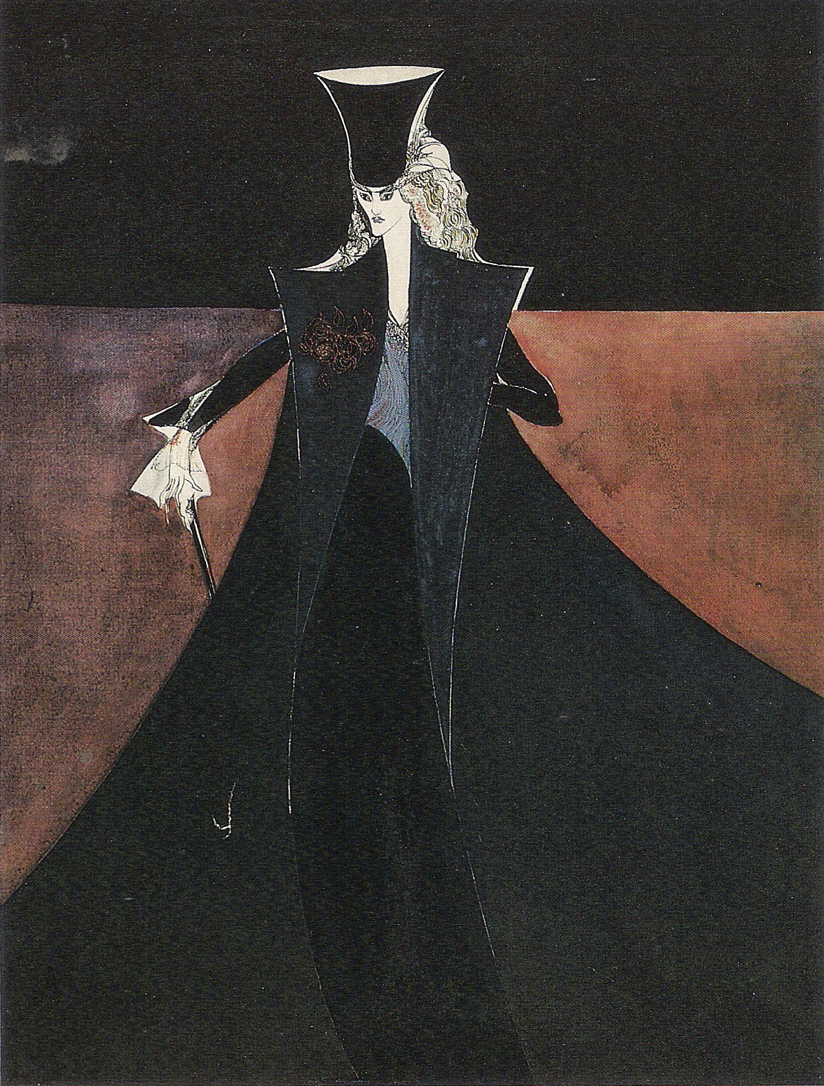
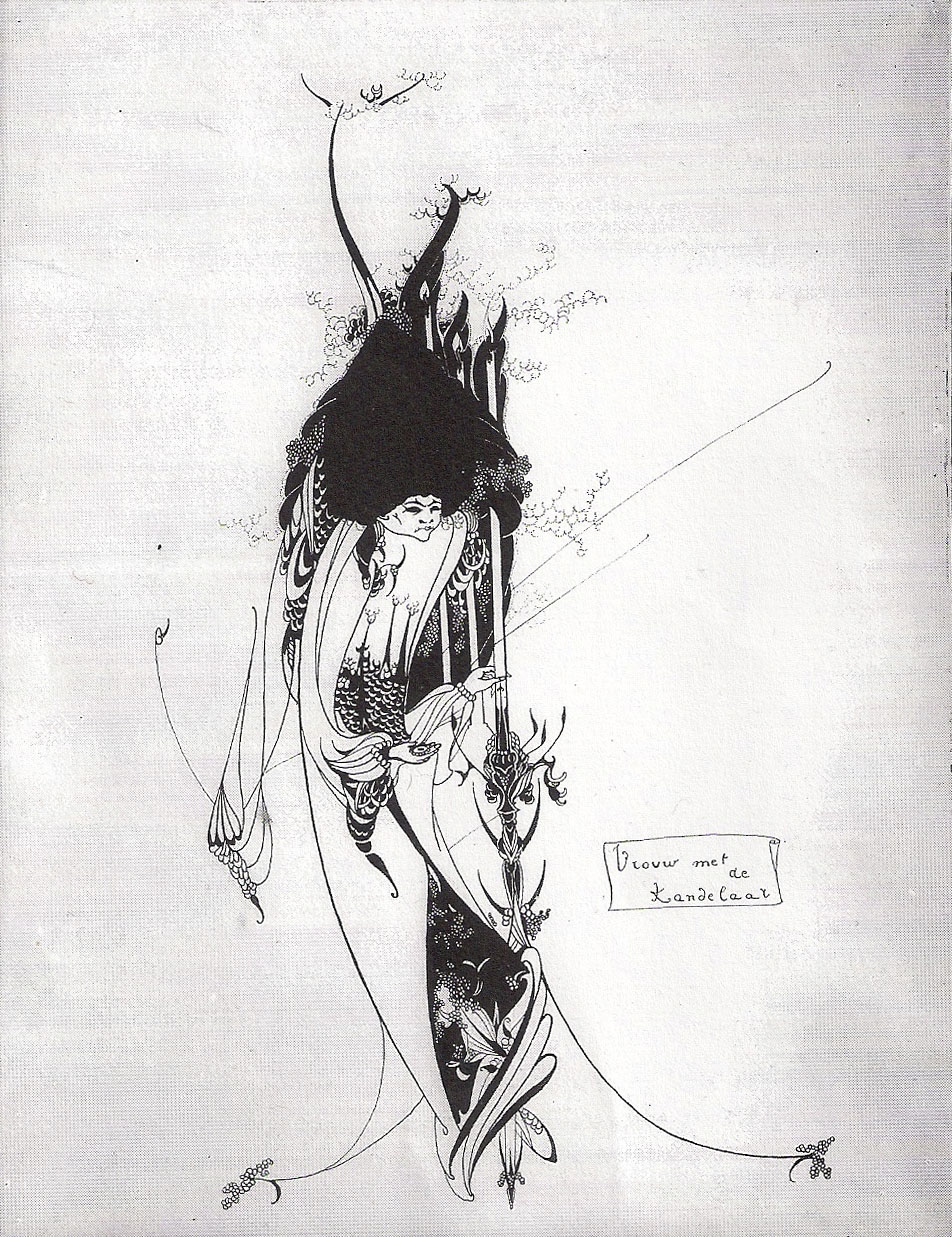
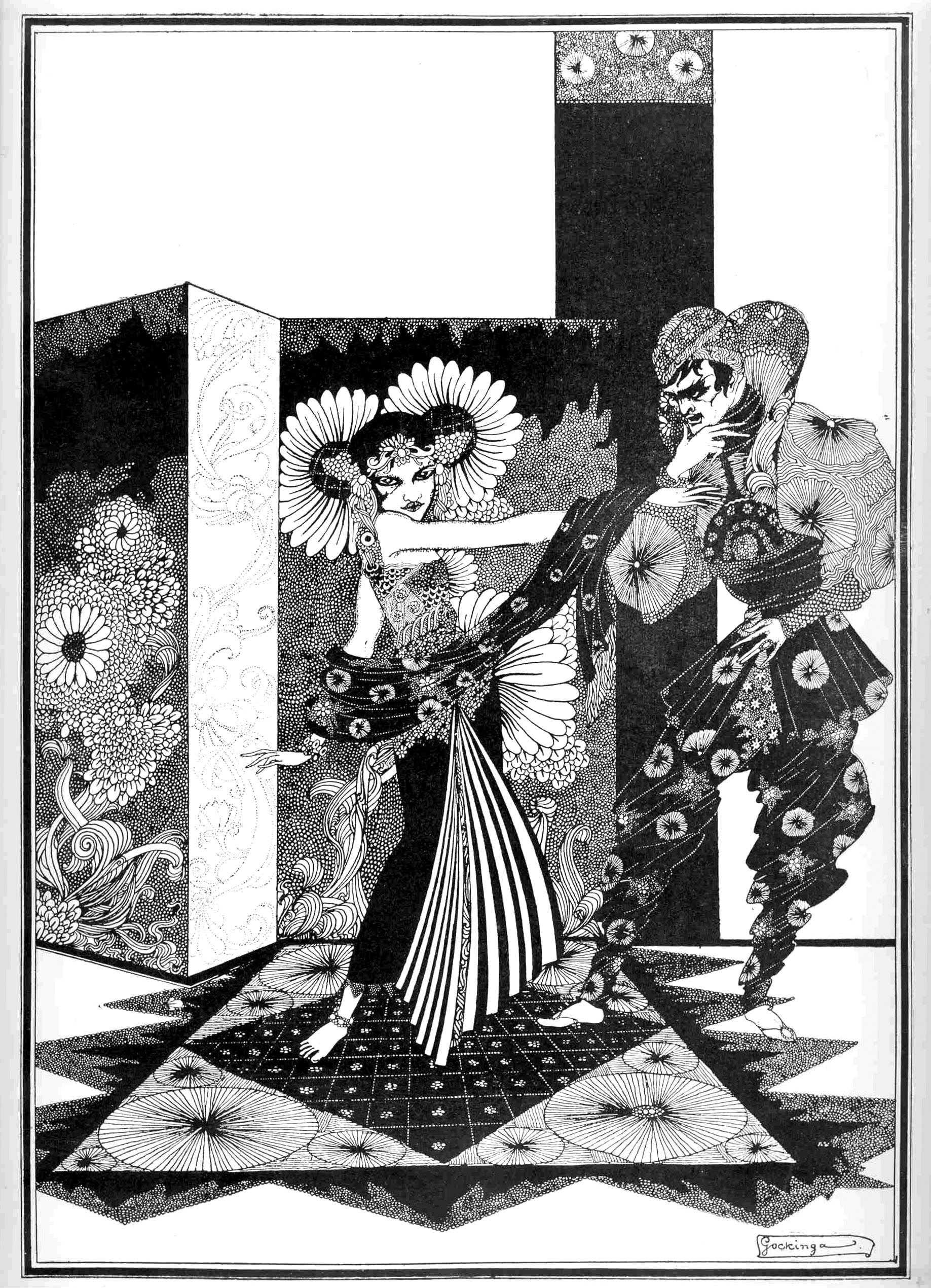
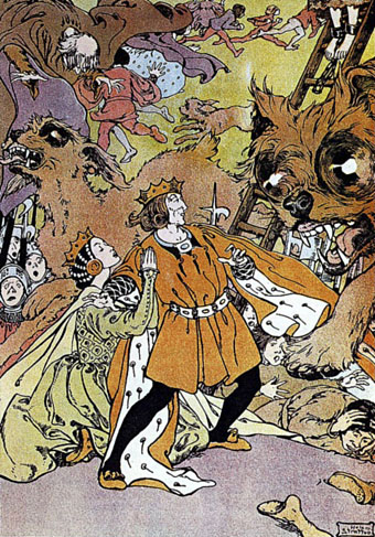
Given all this, it’s a surprise that more illustrators haven’t been attracted to the book. This may in part be a hangover of Victorian prudery: some of the novels of the Gothic period remained shocking to later sensibilities while Beckford’s scandalous reputation (Byron called him “the great Apostle of Paederasty”; to Hilaire Belloc he was “one of the vilest men of his time”) wouldn’t have made his name popular among the collectors of costly illustrated editions. Of the pictures here, the 1815 volume has a frontispiece showing Eblis perched on a hemispherical throne like the one John Martin later gave to Milton’s Satan. More of the uncredited edition from 1923 can be found at the Internet Archive while VTS has plates from the Marion Dorn edition. Mahlon Blaine not only put more effort into his illustrations but the content is also far more suited to his temperament; a shame there aren’t more of the drawings online. And it’s a shame too that Harry Clarke never tackled Beckford’s novel. Many of his contemporaries produced illustrated fairy tale books, as Clarke himself did with Charles Perrault’s stories. But none would have been able to match Clarke if he’d adapted Vathek with the same vigour he brought to Faust.

vathek6.jpg

The Caliph and the Giaour (c. 1800) by Richard Westall.

Continue reading “Vathek illustrated”