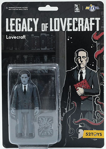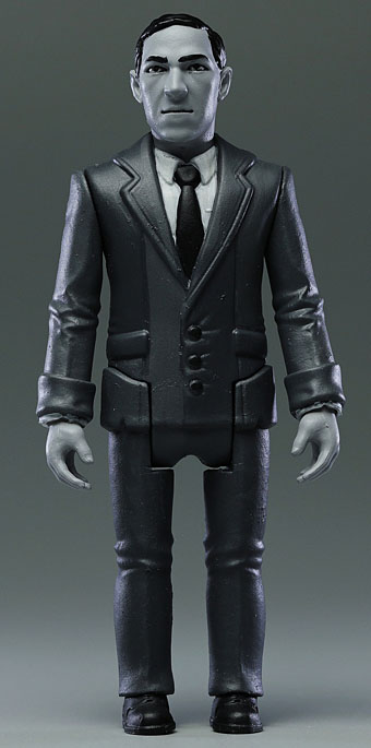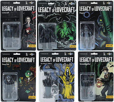
I wouldn’t usually bother writing about new additions to the growing mountain of plastic ephemera generated by 21st-century culture but these items warrant wider attention. Legacy of Lovecraft is a set of six Lovecraft-related action figures made by 52Toys in Japan which include a figure of Lovecraft himself. There was a time when this alone would have been surprising but 20 years have now elapsed since the idea of a Sigmund Freud action figure went from being an unlikely joke to something you could actually buy. Today we’re more likely to be surprised if something with a substantial cultural footprint hasn’t generated any merchandising spin-offs.
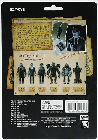
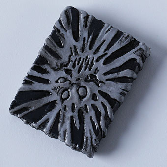
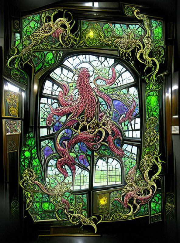
I saw the Lovecraft figure last month in a post at Tentaclii but didn’t notice at the time that it was part of a range which includes Cthulhu, a Deep One, Dagon, and The King in Yellow. The latter isn’t a Lovecraft creation, of course, but Robert Chambers’ stories are Mythos-adjacent. And despite the box art the figure isn’t clad in yellow either, but this provides an opportunity for enterprising owners to create some suitably tattered garments. All the figures come with small complementary items: Lovecraft has a forbidden tome, Cthulhu a tiny ship to torment, and so on. (The nameless “Investigator” comes with two extra items, a lamp and a Cthulhu statue.) The King in Yellow intrigues me the most for being a curious combination of Lovecraftian tentacles with an abundance of gnashing teeth that look like something out of Junji Ito’s comics. If I was going to buy any of these this is the one I’d get first. At around £25 each they’re not cheap but then I’ve spent similar amounts on Japanese CDs in the past.