Several disparate pieces of news worth mentioning recently, so here they are gathered together.
• Some of my Lovecraft art is to be featured in a lavish limited edition volume from Centipede Press.
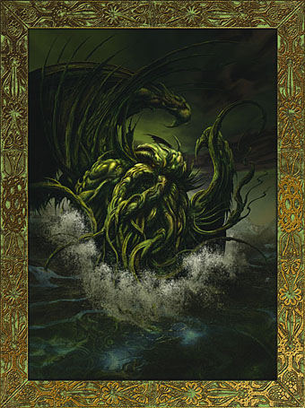
Artists Inspired by HP Lovecraft
Centipede Press is now accepting pre-orders.
A unique art book available in a cloth slipcase edition and leather deluxe edition.
• Cloth edition in slipcase—2,000 copies—400 pages, four color, sewn with cloth covers, enclosed in a cloth covered slipcase. Front cover image, black embossing, two ribbon markers, fold-outs, detail views.
• The first 300 orders will receive a numbered copy with a special slipcase and a hardcover folder with an extensive suite of unbound illustrations. $395 postpaid.
• Leather edition in traycase—50 copies—400 pages, four color, sewn with full leather binding, enclosed in a giant size traycase. Front cover image debossed on front, two ribbon markers, fold-outs, detail views, signed by most living contributors. $2,000 postpaid.
This huge tome features over forty artists including JK Potter, HR Giger, Raymond Bayless, Ian Miller, Virgil Finlay, Lee Brown Coye, Rowena Morrill, Bob Eggleton, Allen Koszowski, Mike Mignola, Howard V Brown, Michael Whelan, Tim White, John Coulthart, John Holmes, Harry O Morris, Murray Tinkelman, Gabriel, Don Punchatz, Helmut Wenske, John Stewart, and dozens of others.
The field has never seen an art book like this—indeed, it is an art anthology unlike anything ever published before. Many of these works have never before seen publication. Many are printed as special multi-page fold-outs, and several have detail views. The book is filled with four color artwork throughout, all of it printed full page on rich black backgrounds. A special thumbnail gallery allows you to overview the entire contents of this 400-page book at a glance, with notations on artist, work title, publication information, size, and location, when known.
HP Lovecraft fans will simply have to have this book. Because of its sheer size and scope, this book will never be reprinted and will sell out very quickly. Twenty years down the road people will be paying huge prices for this book because of its scope and the quality of reproductions. This is the HP Lovecraft fan’s dream come true. Don’t miss it!
Yes, it is indeed expensive but this is a book for serious collectors.
• Bryan Talbot‘s new book, Alice in Sunderland, is finally out. Read a review of it here.
• Arthur Magazine is being summoned back from Avalon, which is excellent news. To celebrate, Jay Babcock has posted Alan Moore‘s history of pornography in its entirety here.
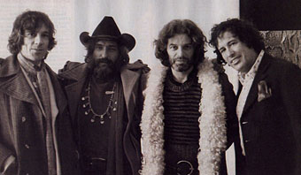
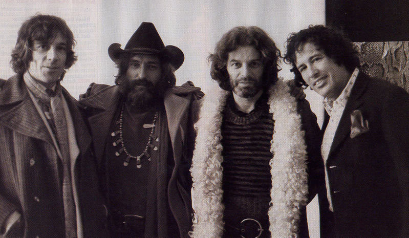
left to right: Donald Cammell, Dennis Hopper, Alejandro Jodorowsky & Kenneth Anger.
One of my favourite photographs of all time shows four directors at the Cannes Film Festival in 1971, all dolled up in their wildest afghan-and-ascot, hairy-hippy finery, and all of them on the cusp of what should have been majestic, transformative, transgressive careers in cinema that by and large never came to fruition. It was not to be—if only it had been.
• John Patterson tell you why we need Jodorowsky as much as we ever did.
Update: And while we’re at it, Eddie Campbell also has a new book out, The Black Diamond Detective Agency. Great playbill cover design.