Plates: Volume 2

plates.jpg

My third CD design for the Tectonic label is another piece of relative minimalism which once again features photos by Liz Eve. All the backgrounds on this occasion are microscope close-ups of vinyl records, very fitting for a double-CD collection of recent 12″ releases.

The Tectonic logo (which predates my involvement with the label) is based on the Technics logo and for this release I tidied the label logo slightly, a process which led to the discovery that the Technics design used a variant of the Clarendon typeface for its letter shapes (it’s not an exact match). This in turn led me to use Clarendon in various weights across the packaging, something which made a change from the usual sans serif or monospace font. The great Saul Bass frequently used Clarendon for his title sequences; if it’s good enough for Saul, it’s certainly good enough for me.

Tectonic main man Rob Ellis talked to Fact magazine about the new release earlier this week.

Previously on { feuilleton }
Aerial by 2562
New things for November

The Great God Pan

pan_daphnis.jpg

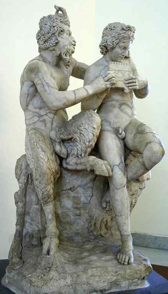
Pan teaching Daphnis to play the panpipes; Roman copy of a Greek original from the 3rd-2nd centuries BCE by Heliodoros.

“The worship of Pan never has died out,” said Mortimer. “Other newer gods have drawn aside his votaries from time to time, but he is the Nature-God to whom all must come back at last. He has been called the Father of all the Gods, but most of his children have been stillborn.”

So says a character in The Music on the Hill, one of the slightly more serious stories from Saki’s The Chronicles of Clovis (1911). Saki’s Pan is a youthful spirit closer to a faun than the goatish creature of legend. But being a gay writer whose tales regularly feature naked young men (surprisingly so, given the time they were written) I’m sure Saki would have appreciated the Roman statue above. There’s nothing chaste about this Pan with his “token erect of thorny thigh” as Aleister Crowley put it in his lascivious 1929 Hymn to Pan, a poem which caused a scandal when read aloud at his funeral some years later. The Roman statue was for a long while an exhibit in the restricted collection of the Naples National Archaeological Museum where all the more scurrilous and priapic artefacts unearthed at Pompeii were kept safely away from women, children and the great unwashed. These are now on public display and include the notorious statue of a goat being penetrated by a satyr.

Continue reading “The Great God Pan”

Peake’s Pan

pan1.jpg

Another charity shop book-raid this week netted me a copy of Ian Fleming’s On Her Majesty’s Secret Service in its 1965 Pan Books edition, one of the Bond series with great covers designed by Raymond Hawkey. The sight of the tiny Pan silhouette above reminded me that this logo was based on drawings commissioned from Mervyn Peake when the company was launched at the end of the Second World War. The design persisted for many years, usually printed on a yellow background.

pan2.jpg

I wasn’t sure I had a copy of Peake’s original version to hand but G Peter Winnington‘s Peake biography, Vast Alchemies (2000), includes a reproduction, one of two drawings Peake produced for the publisher. The other can be seen on this Pan Books site which also reveals that Peake’s Pans were printed at quite large size on the initial run of books. The design model may have been the early Penguin style which nearly always had the famous bird prominently placed in the lower third of the cover. In book terms at least, the Penguin has proved to be the more powerful god, having survived virtually unchanged since 1935. Peake’s Pan is long gone, dropped in favour of two red squiggles.

Elsewhere on { feuilleton }
The illustrators archive

Previously on { feuilleton }
Buccaneers #1
Recovering Bond
Mervyn Peake in Lilliput
James Bond postage stamps
Wanna see something really scary?
T&H: At the Sign of the Dolphin