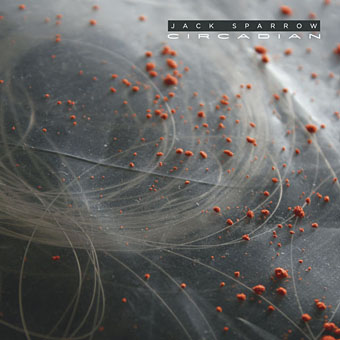
I’m still (still!) playing catch-up posting all the things I’ve been working on this year. Here’s one of the more high-profile releases in the music sphere, Jack Sparrow‘s debut album, Circadian, which is unleashed this week on the Tectonic label. This is another dubstep production and I don’t have to try and describe the music this time when you can hear a stream of it at FACT.
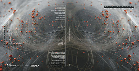
Vinyl sleeve.
Design-wise, this is another release in CD and vinyl editions, and like all the work I’ve done for Tectonic it comes wrapped in Liz Eve’s wonderful photos. The pictures this time are some kind of industrial detritus which she’s turned into abstract landscapes. The vinyl was a three-disc set and the way the labels have turned out is probably my favourite part of this particular job.
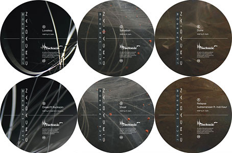
Vinyl labels.
Elsewhere on { feuilleton }
• The album covers archive
Previously on { feuilleton }
• New work: Two forms of darkness
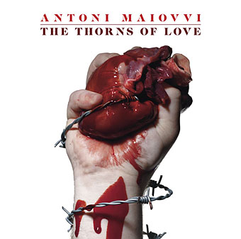
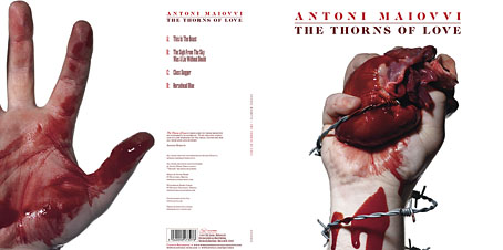
• The Thorns of Love by Antoni Maiovvi
• New music and design
• Plates: Volume 2
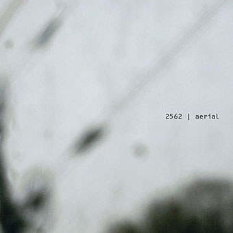
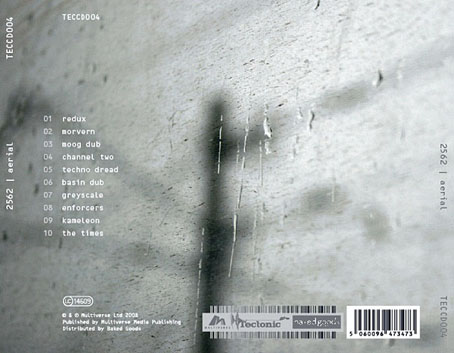
• Aerial by 2562