The art of Denton Welch, 1915–1948

welch04.jpg

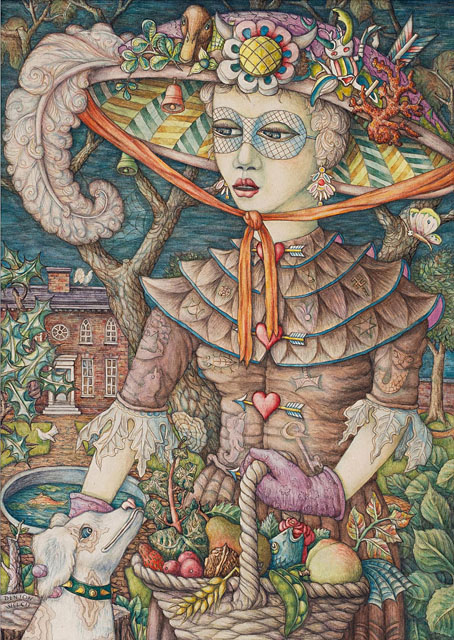
Symbolist Figure (1946).

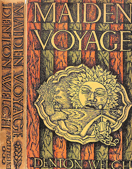
The visual art, that is, not the novels and short stories. Last month I finally got round to reading Denton Welch’s first two novels, Maiden Voyage (1943) and In Youth is Pleasure (1945). Finally, because I’ve known Welch’s name for a long time, mostly via William Burroughs—who dedicated The Place of Dead Roads to him—and John Waters—who often lists In Youth is Pleasure as one of his favourite novels. This was also the book that Burroughs favoured, and he wrote an introduction for a US reprint in 1983. At first glance, Welch would seem a surprising choice for the pair: the protagonist in each book is a thinly fictionalised avatar of the author—he’s even named Denton Welch in the first—an effete upper-middle-class English teenager who hates his school and most of the people he meets, and who spends as much time as possible wandering alone, looking for affordable antiques and any old buildings that may be of interest. The homosexual undercurrents in each book generate persistent tensions which are an obvious attraction for many readers, even though nothing is ever stated overtly and there’s no hand-wringing over unrequited passions. Welch’s boys are most passionate about the things they collect, and their determination to be left alone to pursue their interests when all the adults around them are trying to push them in different directions. Having been a similar school-hating, art-obsessed, introverted teenager, if I’d read In Youth is Pleasure when I was the same age as the beleaguered Orvil Pym it would have made a huge impression.

welch07.jpg

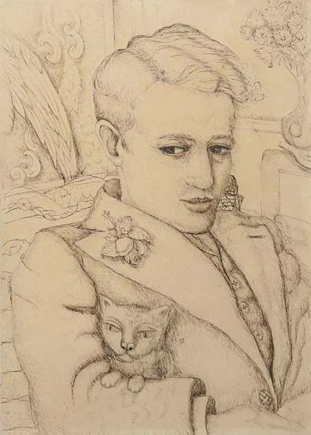
Self-portrait With Cat.

Art was the interest that Welch most wanted to pursue but it’s the writing for which he’s remembered. Few people have good things to say about his drawings and paintings but there’s a strange quality to many of them that I like, an atmosphere of menace that lurks beneath the often naive renderings. I was surprised how gloomy and claustrophobic many of them are. The refined sensibilities in the novels lead you to expect something lighter, frivolous even, like the paintings and illustrations of his contemporary, Rex Whistler, or other artists of the Neo-Romantic school of the 1930s. In fact looking at Whistler’s work again, it’s the Whistler style I most expected even though it’s unfair to compare the two. Welch and Whistler shared a taste for pictorial decoration, and a blithe indifference to the avant-garde trends of the day, but Whistler was a formidable talent, the kind of successful illustrator that Welch could only dream of being. (That said, both artists were commissioned by Shell for the company’s poster series showing views of Britain.) Yet lack of ability sometimes takes an artist into places that a professional wouldn’t reach. Whistler would have given us a perfect cat, not the strange creatures with almost human faces that Welch liked to draw. I’m curious to know which, if any, contemporary artists Welch preferred. His diaries are now earmarked for a future reading.

A Voice Through A Cloud: Discovering Denton Welch

welch05.jpg

Hadlow Castle, Kent (1937).

welch06.jpg

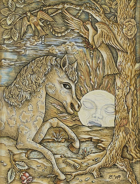
Horse and Moon (1943).

welch03.jpg

Continue reading “The art of Denton Welch, 1915–1948”

Weekend links 714

agar.jpg

An Exceptional Occurrence (1950) by Eileen Agar.

• New music: The Endless Echo by Pye Corner Audio, coming soon from Ghost Box. PCA continue to fly the flag for the original Ghost Box mission of bringing various forms of weirdness to electronic music. The new album “draws inspiration from scientific and science-fictional notions about the nature of time and the idea that it may be entirely unreal”. Over at Bandcamp there’s Here by Stefano Guzzetti and Ian Hawgood.

• “Powell and Pressburger emerge from this film, more than ever, as sui generis: inventors of their own kind of film, gentleman amateurs of cinema in some ways…” Peter Bradshaw reviewing Martin Scorsese’s Made in England: The Films of Powell and Pressburger.

Velocity and Creation, a pair of short films by Vadim Sherbakov made with magnets, glitter and inks. The scores are too bombastic but I like the visuals.

Art is for increasing life. That, I believe, after all the other purposes receive their due, is really what it’s for—why we revere it, why we give our hearts to it. What do I mean by increasing life? How can we live more, given that we can’t live longer? Through attention and intensity. Being fully present to the world, and feeling without reservation: the two things that making art requires and that experiencing it involves.

William Deresiewicz on thirteen ways of looking at art

Modern Illustration is a project by illustrator Zara Picken, featuring print artefacts from her extensive personal collection.

• Mix of the week: Aquarium Drunkard presents Pulp Jazz: Twenty-First Century Groove Music. Great stuff.

• At Public Domain Review: Tales of the Catfish God: Earthquakes in Japanese Woodblock Prints.

• At The Quietus: Jonathan Meades interviews Saint Leonard. And vice versa.

• At Dennis Cooper’s: Michelangelo Antonioni Day.

• The Strange World of…Bill Laswell.

Creation (1971) by Arthur Brown’s Kingdom Come | Création Du Monde (1971) by Vangelis | Creation (1977) by Tangerine Dream

On Babaluma

babaluma.jpg

It’s never the same without the foil sleeve.

Since the death of Damo Suzuki I’ve been reading the Rob Young and Irmin Schmidt book about Can, All Gates Open. Can’s history isn’t exactly unfamiliar so it’s taken me a while to get round to it. I’ve been listening to their music for over 40 years, and bought the Can Box when it came out, a release which includes the Can Book, a substantial volume by Hildegard Schmidt and Wolf Kampmann containing career-spanning interviews with the core members of the group. Mysteries persist, however, so it’s been satisfying to have some of them resolved in the newer book, like the question of what exactly the title of the group’s sixth album, Soon Over Babaluma (1974) refers to. I’ve always liked this album, it was the second or third one I bought in 1981 when I found a secondhand copy of the original release in its shiny foil sleeve. Irmin Schmidt sings the words “Soon over Babaluma” on the second track, Come Sta, La Luna, a title which Young reveals as originating with Leonardo da Vinci. Then he has this to say:

Playfully extemporising from this text, Irmin cast his eyes across the studio to where Jaki’s girlfriend of the time, a woman called Christine, was perched on a sofa with accustomed stillness. “She had this really mysterious aura around her… She could sit there for hours like a cat not moving, or just drawing, or maybe doing nothing,” Irmin recalls. “So ‘Come sta, la luna’ was about Christine in a way. I’m talking about this girl who is going through walls. I don’t remember the words any more and I have never written it down. But there is something very spacey in the words—’Dancer on the rope, in the space’ or something. But when I wrote that, she was sitting in the studio and I was looking at her… I found her very mysterious and very beautiful.”

Almost by accident, the phrase “soon over Babaluma” emerged out of this stream of consciousness. “The word ‘Babaluma’ came out of a conversation with Jaki about the words. He maybe thought I had another word before, and he said, ‘What did you say? Babaluma?’ And because it rhymed with ‘luna’, it was a kind of playing with words—it didn’t mean anything. And it’s true surrealism. But the whole text is about something happening in space, out there. Seeing the moon and, from there, soon being over Babaluma—which must be another star or something. So it has another story behind it.”

So it was automatic writing after all. For a group whose compositions evolved out of endless improvisation this almost seems inevitable. Young makes a good argument for Soon Over Babaluma being Can’s cosmic album, made at a time when the kosmische idiom was peaking in Germany; even Kraftwerk were a little cosmic in 1973/74, with their Kohoutek-Kometenmelodie single being reworked for side 2 of Autobahn. There’s a lot of enlightening detail in All Gates Open, I recommend it. (Although I’m sure that’s a Stylophone solo on Moonshake, not a melodica as he seems to think.)

Meanwhile, Damo returns to the world this month with an official release for the Paris, 1973 concert. This one has circulated for years as a bootleg, and it’s a better showing by the band than some of the other recordings in the recent live series. More, please.

Previously on { feuilleton }
Holger’s Radio Pictures
Jaki Liebezeit times ten
Can esoterics
Can soundtracks
Can’s Lost Tapes

Helix magazine, 1967–1968

helix01.jpg

Another underground magazine, this one originating in Seattle during the first wave of the counter-cultural publications that flourished from the mid-60s on. Wikipedia says that Helix managed 125 bi-weekly issues from 1967 to 1970; the Internet Archive has the first 42 issues which run to October 1968 (the uploader’s dates are out by a year each way). When so few of these magazines are available online this makes a welcome change. As usual, the passage of time means that the ads are just as interesting as the editorial material, while the quality of the art and design improves as the magazine evolves. I’ve been too busy this week to go through all the issues but I’ve picked out some of the more notable covers.

helix02.jpg

helix03.jpg

helix04.jpg

helix05.jpg

Continue reading “Helix magazine, 1967–1968”

Moon and Serpent Rising

masbbom1.jpg

Top Shelf announced this one on Friday so I can break my silence about the book I’ve been working on since May 2021. The Moon and Serpent Bumper Book of Magic by Alan Moore and Steve Moore was first announced in February 2007. I’d created the cover design which was used for promotional purposes after which the project went into hibernation for several years. In 2014 Alan and Steve were back at work again, and were co-writing the final essay when Steve died suddenly in March of that year, whereupon the book retreated to limbo once more. Since 2007 my cover has been floating around the internet like the lid for an empty toybox, but the book really is finished at last, and will be published by Knockabout (UK) and Top Shelf (US) in October.

masbbom2.jpg

In addition to the cover design I was also slated to be working on two of the book’s internal features: The Soul, a six-part illustrated serial set in the 1920s which evolved out of the occult-detective strip that Alan and I were planning circa 1999; also a series of twenty full-page illustrations for a feature titled Magical Landscapes. When Tony at Knockabout informed me at the beginning of 2021 that the book was being revived I made the audacious suggestion to him and to Alan that I could, if need be, design the whole thing as well as illustrate my own sections. Alan readily agreed, saying he trusted me implicitly, which was good to hear; his sole brief was that the book should be “beautiful and psychedelic”. One reason for his trust is that we’d already made excursions into the Moon & Serpent zone together. I designed three of the Moon & Serpent CDs in the 2000s, and made the video that accompanied the William Blake-themed reading/performance by Alan and co. at the Purcell Room, London, in 2001. Consequently, I’ve often felt like a floating member of the Moon & Serpent cabal.

masbbom3.jpg

A couple of things are worth noting now that the book is about to enter the world. The first is that the contents are a little different to the press release from 2007 which announced a book of 320 pages, with 78 of those pages being brand new Tarot card designs. The authors subsequently realised that creating an entirely new Tarot deck is a huge task in itself, especially if, as was the intention, you wanted it to be as wide-ranging and authoritative as the Crowley/Harris Thoth deck. There is a chapter about the Tarot in the finished book but readers will now have to choose decks of their own. I can imagine disappointment being expressed about this, and about some of the other changes but the book as it now stands is actually bigger than the original proposal, with an additional 32 extra pages. The expansion is partly a result of my page design which put fancy borders on all of the text pages. I ended up doing a lot more work for the book than I expected, adding new pages here and there, creating a lot of extra graphics and illustrations, and breaking up the long final essay into sections which are illustrated throughout with small pictures.

Continue reading “Moon and Serpent Rising”