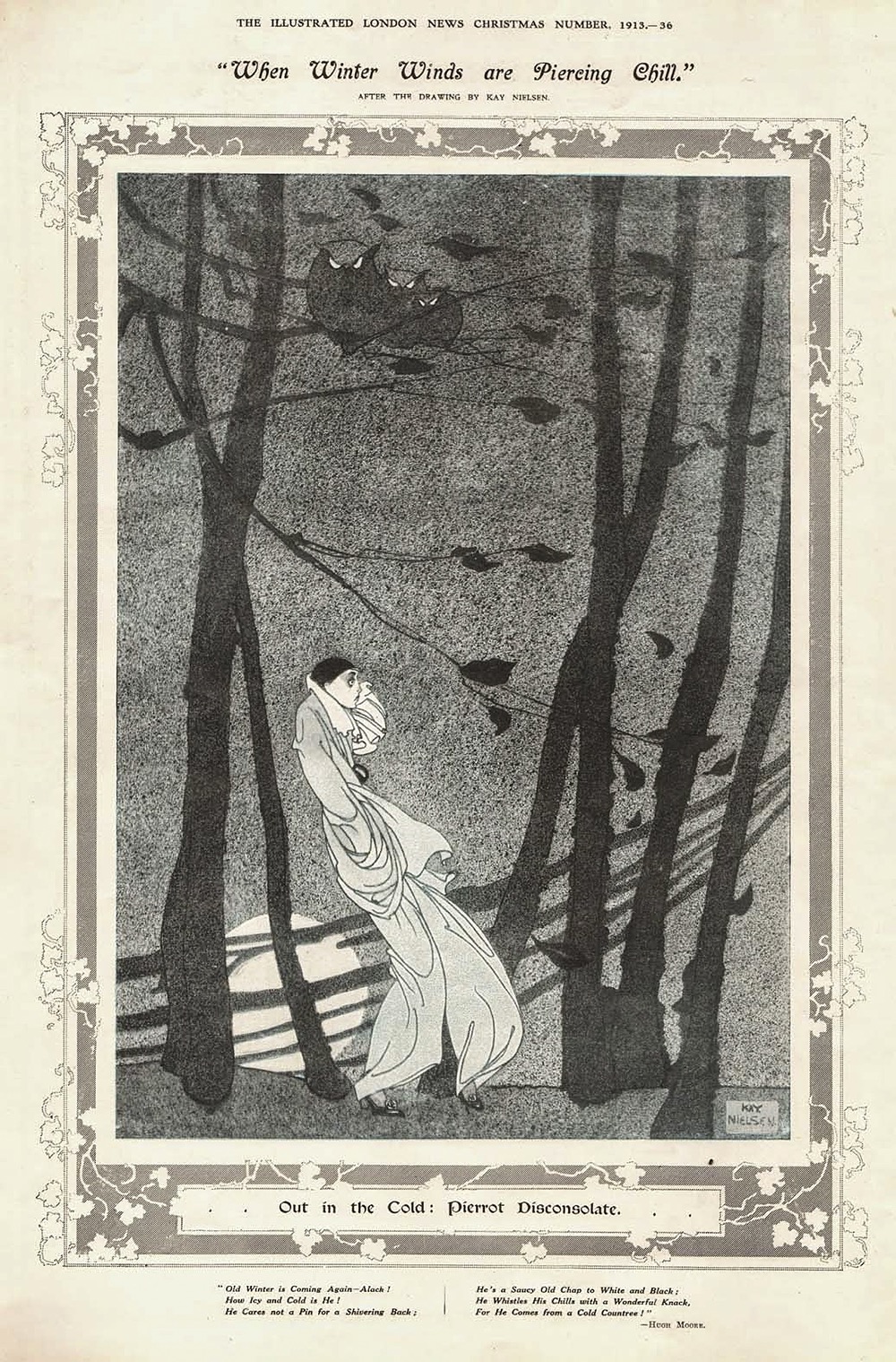
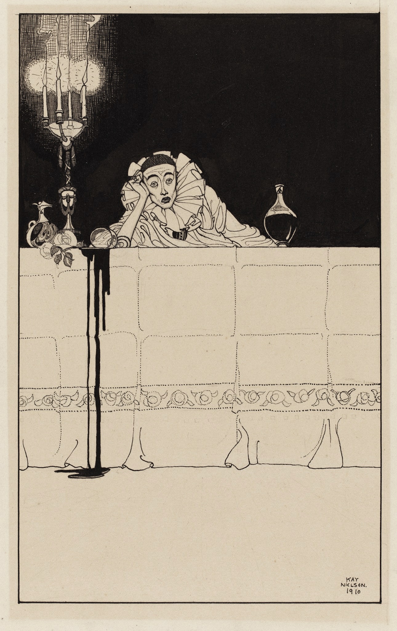
Disconsolate.
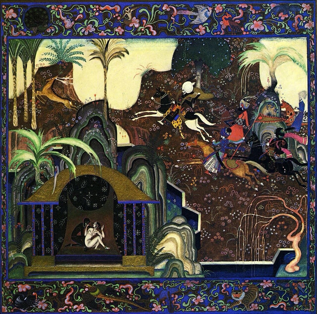
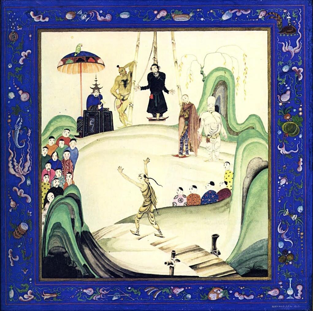
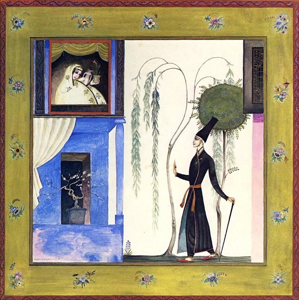
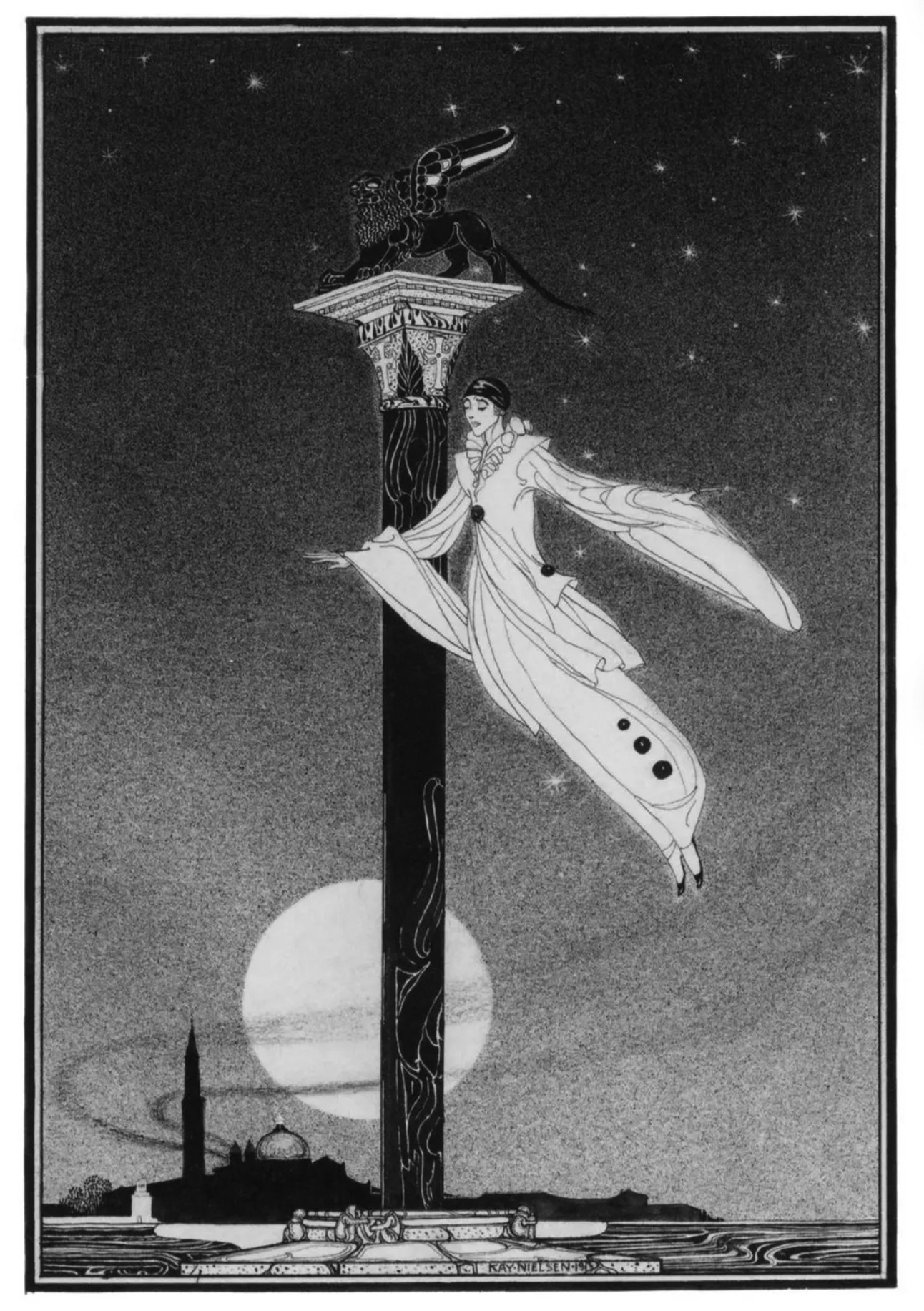
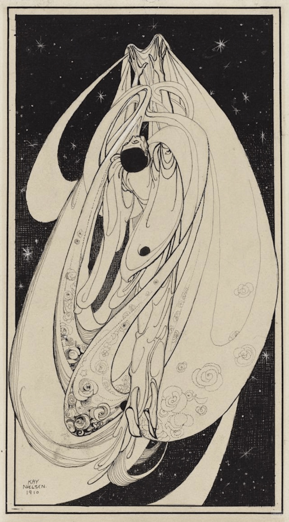
More unknown Kay Nielsen, although “little-known” would be more accurate since the sombre nature of these drawings has made them popular among the image-hoarders in the Tumblr labyrinth. Nielsen created the series known as The Book of Death around 1910 when he was an art student studying in Paris, the “Book” being a cycle of ten (or more?) drawings that chart the progress of one of those Pierrots who we find mourning a lost love. The series was exhibited in London but wasn’t published in full during Nielsen’s lifetime, although a couple of the drawings did see print a few years after their completion. The Illustrated London News published one of them in 1913 when Nielsen’s work was showcased in the magazine’s Christmas special; two more appeared a year later in The Studio where Nielsen’s work was analysed by Marion Hepworth Dixon.
Consolation.
Information about the series is so scant my cursory searches haven’t been able to locate a reliable list of the pictures, or any idea of the order they might follow. The Studio, for example, mentions a picture labelled “Omen” but doesn’t say what the picture looks like. What you see here is a guess at the labelling and an attempt at an order. The problem is complicated by the fact that Nielsen was drawing other Pierrot figures at this time so I can’t be certain that all the pictures are part of the series. They are all Nielsen’s work, however.
Desolation (or Solitude).
Of greater certainty is the way the series differs from Nielsen’s later illustrations, showing the artist proceeding in an opposite direction to that of his contemporary, Harry Clarke. Where Clarke’s illustration work evolved from delicate fairy-tale scenes to the horrors in Poe, Goethe and Swinburne, Nielsen abandoned fin-de-siècle morbidity for his meticulous blending of the art styles of the East and West. Marion Hepworth Dixon makes a great deal of the influence of Beardsley on Nielsen’s early drawings, something that’s most evident in his black-and-white art here and elsewhere. In 1910 he was still developing his own style so there may be other influences at work—Sidney Sime, perhaps—but without further research it’s difficult to say.
Yearning.
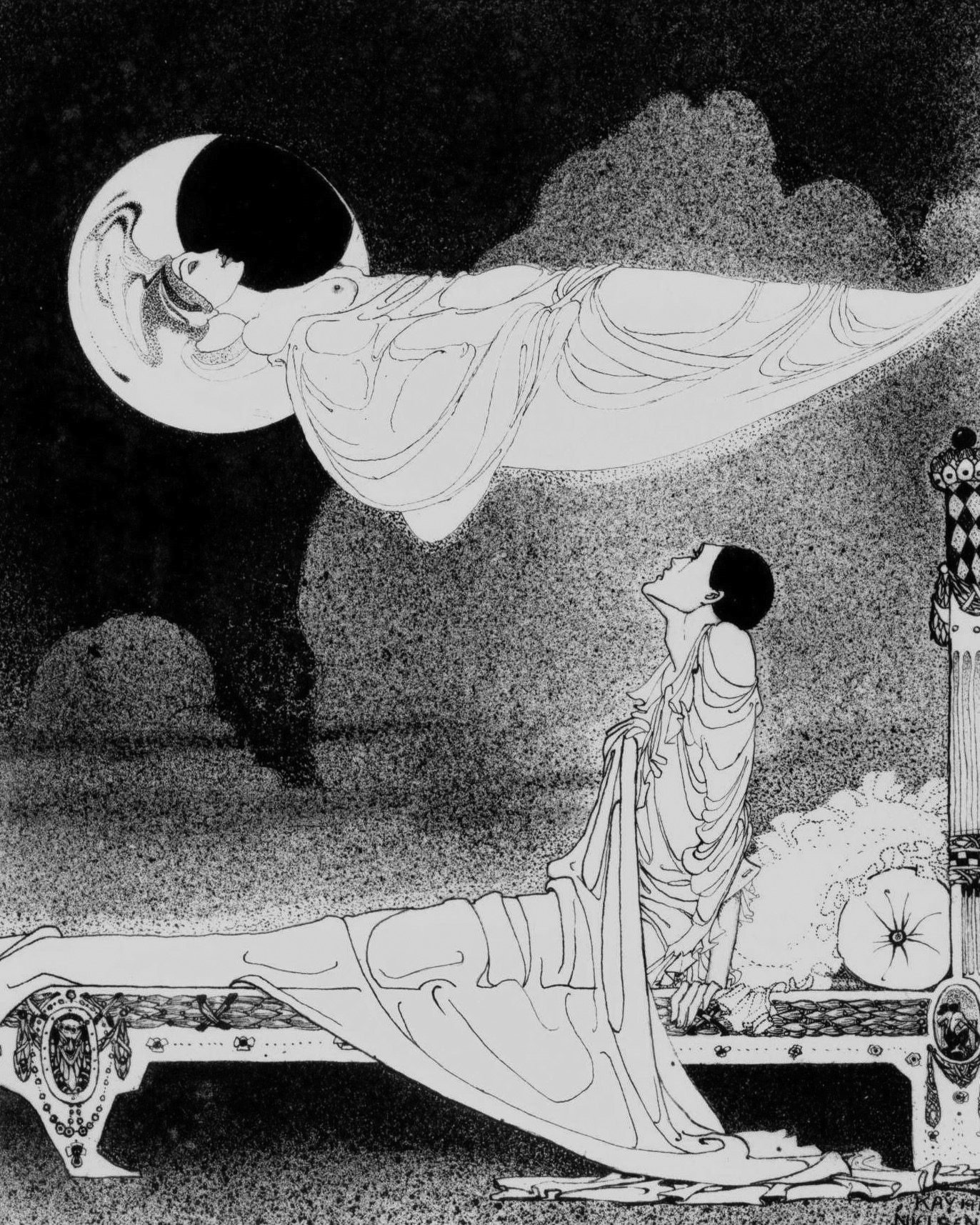
The Vision.