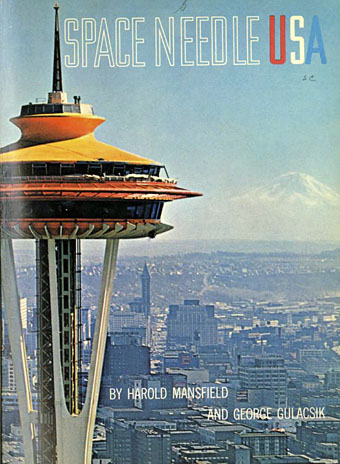
That observation tower again. Previous posts here have exhausted the Paris Exposition Universelle as a subject so it’s time to look elsewhere, and the Century 21 Exposition which was held in Seattle in 1962 seems as good a place to start as any. If you’re interested in old expositions then it’s always good to find a decent site devoted to them, and the site for the Seattle event is particularly useful. Space Needle USA is one of the many pieces of documentary ephemera available to browse and download, a 76-page commemorative booklet by Howard Mansfield devoted to the design and building of the tower:
The Space Needle, a modernistic totem of the Seattle World’s Fair, was conceived by Eddie Carlson as a doodle in 1959 and given form by architects John Graham Jr., Victor Steinbrueck, and John Ridley. When King County declined to fund the project, five private investors, Bagley Wright, Ned Skinner, Norton Clapp, John Graham Jr., and Howard S. Wright, took over and built the 605-foot tower in less than a year.
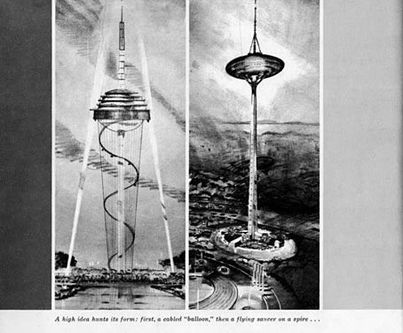
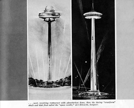
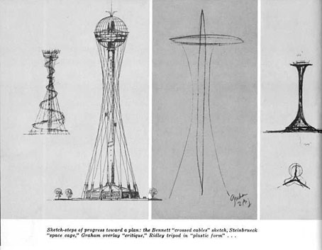
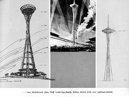
Good to see some of the alternative designs, one of which isn’t so different to one of the designs proposed in the 19th century for a London tower that would rival the Eiffel Tower in Paris.