Cosmic art

cosmic7.jpg

Cosmic Synchromy (1914) by Morgan Russell.

The cosmic in art, and a partial selection at that. Venture too far and you find yourself in a syrupy New Age firmament of pastel galaxies, unicorns and space dolphins. Beware.

cosmic6.jpg

Cosmic Composition (1919) by Paul Klee.

cosmic1.jpg

Cosmic Map (1930) by Bruno Munari.

cosmic9.jpg

Lament Over the Cosmic Egg (1947) by Ernst Fuchs.

Continue reading “Cosmic art”

The Kosmische Tarot

geitner-tarot-box.jpg

Revelation of the weekend has been the discovery that there are two sets of (for want of a better term) Krautrock Tarot cards. The first, Walter Wegmüller’s Zigeuner Tarot, is familiar for being included in the Tarot concept album released on the Kosmischen Kuriere label in 1973. The album was credited to Wegmüller but he only advised on the symbolism and acts as MC/narrator. Wegmüller’s cards are detailed and somewhat original, but their drawing is from the enthusiasm-over-technique school which goes against the grain of the rest of the album design and the accomplishment of the musicians.

mythos.jpg

Dreamlab (1975) by Mythos. Design by Peter Geitner.

As noted a few days ago, the designer of the Tarot album was Peter Geitner working under the direction of a pair of very hands-on label bosses, Rolf-Ulrich Kaiser and Gille Lettmann. The story of Kaiser’s rise and fall has been recounted in some detail over the years (see here and here). Given the colourful saga, and the cast of notable musicians, writers and artists, I’m surprised to have seen no mention of the second Tarot set that Peter Geitner designed and illustrated in 1975 while the Kosmische Musik empire was imploding. One illustration (The Lovers) was even used as cover art for the Dreamlab album by Mythos.

geitner-tarot-back.jpg

Card back for the Sternenmädchen’s Wahrsagespiel.

Sternenmädchen’s Wahrsagespiel (Star Girl’s Fortune Telling Game) is a specialised set of the Major Arcana presented as a spin-off from Gille Lettmann’s Sternenmädchen persona as featured on the Gilles Zeitschiff album; the back of the 22 cards features the photo of Gille from the album cover. I’ve said that Geitner illustrated the cards but some of the drawings may have originated as sketches by Gille Lettmann; information is scant but I’ve seen mention of her having been a textile or fashion designer. What’s most striking to me about these designs is how psychedelic they all are, more so than any of the Kosmische Musik album covers even though they maintain the cosmic themes of the record label. Many of those involved with the Kosmische empire were taking LSD at the time so this isn’t very surprising but psychedelia of this intensity was an outmoded thing by the mid-70s. Also of interest is the renaming of the cards which push the attributions away from medieval tradition and into the cosmos. I’ve not been able to find examples of all 22 designs but a list of the cards follows, together with examples of variable quality. The set was printed by AGM Müller but has never been reissued so it now commands high prices. (Many thanks to Jeff for drawing my attention to these!)

Continue reading “The Kosmische Tarot”

Weekend links 247

buratti.jpg

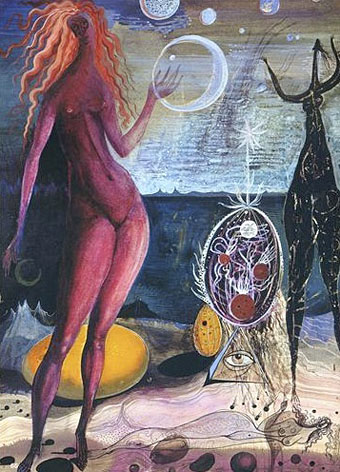
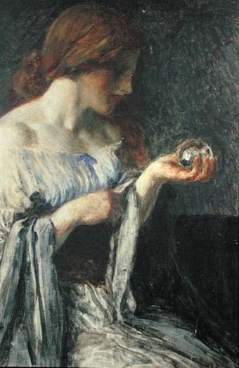
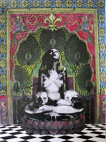
Encounter with the Priestess by Robert Buratti.

• “We were gothy, we loved the New York thing and people like Suicide, Dave loved Throbbing Gristle, we both loved the Sheffield bands…we loved the darkness to that kind of electro.” Marc Almond talking to Simon Price. Also at The Quietus, Cat’s Eyes choose their favourite soundtracks.

• “When he reveals that all he wants is to deliver a breakfast sandwich, the enigma of his desire is not so much dispelled as redoubled—why on earth would anyone want to do that?” Adam Kotsko on the unheimlich nature of old Burger King ads.

• “…commercial design is full of politics, to be a commercial designer is a political decision.” Jonathan Barnbrook talking to Katrina Schollenberger.

You need to know who Billy Wilder was. You need to know the names of people who are no longer alive. Because it’s very important—it’s what our history is made of. You need to see the movies the way they were—with the racism, the violence, and the censorship. All the things that let you see what the movie past had been so you understand where we are! But really nobody’s interested in that right now. Their interests are so bifurcated.

Joe Dante discussing film production past and present with Michael Sragow.

• From 1983: The Encyclopedia of Ecstasy, Vol. 1, a publication which creator Alistair Livingston describes as a “psychedelic goth punk fanzine”.

• Mixes of the week: No One’s There, a collection of post-punk electronica by Abigail Ward, and Secret Thirteen Mix 146 by Te/DIS.

• Frans Masereel’s My Book of Hours is “a crucial example of the power of stories without words,” says Stefany Anne Golberg.

Miles Davis and band in concert, 18th August, 1970. Pro-shot, 45 minutes.

• Lots of good reading and cultural connections at Celluloid Wicker Man.

A world map of micro-nations

Tokyo in dense fog

Tainted Love/Where Did Our Love Go? (1981) by Soft Cell | Tainted Love (1985) by Coil | Titan Arch (1991) by Coil with Marc Almond

Crystal balls

crystal04.jpg

The Crystal Ball (c. 1900) by Robert Anning Bell.

Crystal balls in art, film and the pulp magazines.

crystal05.jpg

The Crystal Ball (1902) by John William Waterhouse.

crystal02.jpg

Alexander, Crystal Seer (1910).

Continue reading “Crystal balls”

The kosmische design of Peter Geitner

geitner07.jpg

Cyborg (1973) by Klaus Schulze.

More German music design. Once you start delving into the music produced in Germany between 1969 and 1975 you eventually notice that a) the good albums generally have decent cover designs, and b) there are many justly forgotten albums with astonishingly tasteless artwork. Most of the well-known names were smart enough to craft a visual identity: Kraftwerk’s efforts have been explored here recently but there was also the Gothic Surrealism of Falk-U Rogner’s photo montages for Amon Düül II (worthy of a post in themselves); Neu! followed the lead of Kraftwerk with strikingly minimal presentation; Faust’s debut album was released on transparent vinyl in a clear sleeve while their second album was an all-black sleeve with a series of strange pictures inside, one for each song. Can are a notable exception in having no clear identity.

geitner23.jpg

Peter Geitner is unique in this scene in being the only graphic designer you can find who was creating any kind of consistent identity for a label and a group of artists. Almost all the work here is for Rolf-Ulrich Kaiser’s short-lived Kosmische Musik which replaced the earlier Die Kosmischen Kuriere. Both labels were offshoots of Ohr Records (Tangerine Dream’s original home), and catered mostly to the musicians based in Berlin, with a later detour to Switzerland. All the releases feature Geitner’s recurrent motifs of radiating stars and sunburst graphics. I think one of the reasons I like Geitner’s design is because I have a tendency to use similar spiky sunbursts in my own work. Whatever Geitner did after the collapse of Kosmische Musik I’ve yet to discover.

geitner22.jpg

The standard design for the vinyl labels. Many of the albums were released as quadrophonic mixes so the star logo also signifies multi-directional sound. Klaus Schulze’s album is nothing if not cosmic, four sides of treated strings and swirling synth noise.

geitner03.jpg

Seven Up (1973) by Timothy Leary & Ash Ra Tempel.

This is a reissue design that replaces the more common sleeve with its Walter Wegmüller doodles and poor layout. I didn’t used to like the music very much either, two sides of bluesy jams with Tim Leary and cohorts bellowing over the top. But it’s a historical oddity, a rare connection between the US psychedelic scene and the German music which took psychedelia in new directions.

geitner04.jpg

Continue reading “The kosmische design of Peter Geitner”