Psychetecture

stamp3.jpg

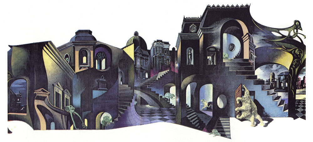
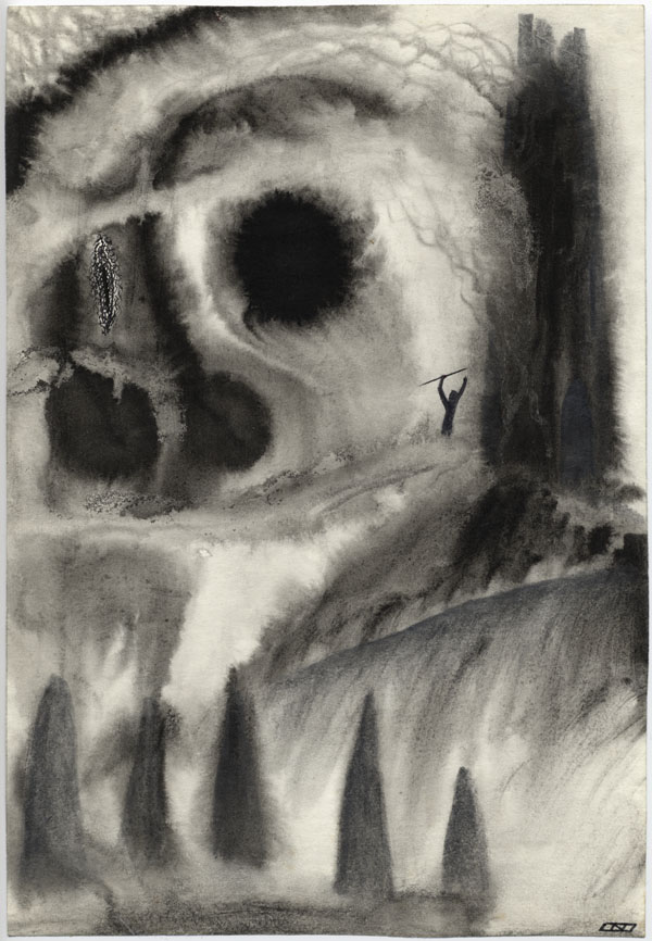
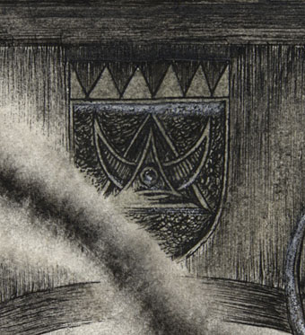
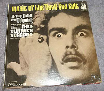
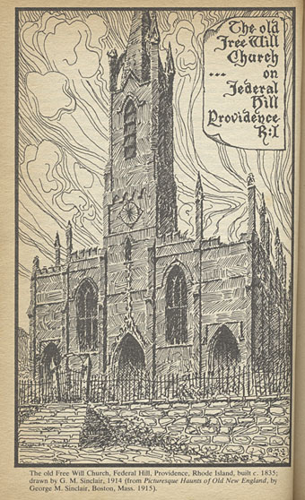
And speaking of architecture… I wouldn’t usually punish the spine of a scarce paperback by subjecting it to trial by flatbed scanner but not all of these drawings have found their way to the web. The artist is Gavin Stamp, here masquerading as “GM Sinclair” for illustrations used in the appendices of the aforementioned Necronomicon (1978), edited by George Hay. The book was published in hardback by occult specialists Neville Spearman, with a paperback following two years later from Corgi Books.

stamp1.jpg

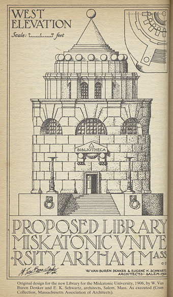
For a purportedly real Necronomicon this one always struck me as more plausible than the US equivalent by Simon; Hay and his collaborators, Robert Turner and David Langford, go to some lengths to describe the sourcing of rare manuscripts from the British Museum, and the process of cryptographic decoding that follows. But the part of the book that made the greatest impression was the essay contributions by Christopher Frayling and Angela Carter, and Gavin Stamp’s accompanying illustrations. In 1980 unless you knew an older book collector (which I didn’t) serious writing about Lovecraft’s work was hard to find. Hay’s book and Stamp’s illustrations were one of several discoveries that pushed me towards illustrating Lovecraft myself.

stamp2.jpg

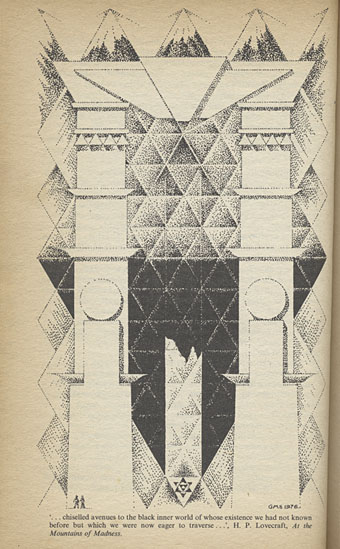
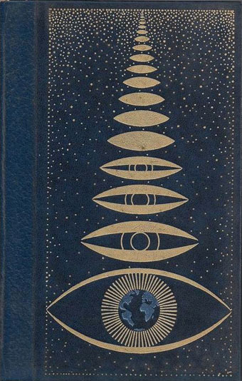
The pictures above are taken from the paperback while the ones below are lifted from David Langford’s site. I borrowed the pentagonal labyrinth from the title page for the cover of the NecronomiCon convention booklet: two Necronomicons joined, and a nod to a group of writers who helped me along the way.

Continue reading “Psychetecture”

The art of Karel Thole, 1914–2000

thole4.jpg

The Disciples of Cthulhu (1976).

A disagreement I have with the burgeoning world of Lovecraft art is the relentless focus on monsters—and I say this in a week when I’ve been working on a new commission of exactly this: six pictures of Lovecraftian creatures. Lovecraft famously emphasised atmosphere as the paramount ingredient in a weird story, and atmosphere in his fiction is often generated by his descriptions of landscape and architecture; Angela Carter’s insightful essay in the George Hay Necronomicon (1978) was entitled Lovecraft and Landscape. Architecture often receives considerable attention in the stories: The Call of Cthulhu, The Dreams in the Witch House, The Haunter of the Dark, and At the Mountains of Madness all concern invented (or reimagined) architectural settings. Given this, you’d expect architecture to be more represented in Lovecraft art but this is seldom the case. When it comes to Cthulhu, a creature whose myriad representations must be reaching some kind of critical mass, artists will lavish great attention on tentacles, claws and flourished wings but the Cyclopean stones of R’lyeh are invariably reduced to a tentative backdrop.

thole1.jpg

I mostri all’angolo della strada (The Monsters on the Street Corner, 1966).

Hence the attraction of the wraparound cover by Karel Thole for I mostri all’angolo della strada, a Lovecraft story collection with one of the few cover designs I’ve seen that attempts to communicate anything of the writer’s preoccupations with angled space. Thole was a very prolific Dutch artist, producing many covers for Italian publisher Mondadori, and painting covers for Mondadori’s SF magazine, Urania, for over 20 years. The first paintings of Cthulhu I saw were those by Thole (above) and Bruce Pennington in Franz Rottensteiner’s The Fantasy Book (1978); Thole’s monster doesn’t have the required scale (and Pennington’s cover is a favourite) but for me it still carries a Proustian charge. The art for I mostri all’angolo della strada was featured in The Cosmical Horror of HP Lovecraft (1991), one of the first attempts to anthologise Lovecraft-related illustration past and present. The book contains many excellent reprints together with dubious material from European comics. Thole’s street scene—a curious combination of Escher, De Chirico and Art Nouveau—stood out among page after page of slavering abominations. I’d like to see more art that follows this direction; less of the monsters, more of the monstrous architecture.

thole2.jpg

Colui che sussurrava nel buio (The Whisperer in Darkness, 1963).

Continue reading “The art of Karel Thole, 1914–2000”

The Gable Window

gable.jpg

The Gable Window (1984) by John Coulthart.

Presenting some of my first Lovecraftian illustrations, neither of which have been made public before. This drawing, and the one below, are as much Derlethian as they are Lovecraftian, depicting scenes from a short story and a short novel written by August Derleth from fragments and notes found in Lovecraft’s papers. The Gable Window was collected in The Survivor and Others (1957) which happens to be the only Lovecraft-related title I own in its original Arkham House printing. Derleth’s posthumous collaborations are often more Derleth than Lovecraft but I liked the central idea of The Gable Window which, like The Music of Erich Zann, concerns a window that also serves as a portal to other dimensions.

lurker.jpg

The Lurker at the Threshold (1982) by John Coulthart.

Before I began adapting The Haunter of the Dark in 1986 I hadn’t made much of an attempt to illustrate Lovecraft seriously. These drawings and a handful of other pieces were more like experimental sketches, although The Gable Window is obviously a very polished piece of work. Rather than depict anything overtly monstrous, each piece began as an arrangement of ink splotches and washes applied to cartridge paper soaked with water. The Lurker at the Threshold is one of several small pictures made with this technique in 1982, none of which are very successful. This one doesn’t look too bad but the best one, depicting the climax of The Dunwich Horror, I sent to the late Roger Dobson for possible use in an issue of Aklo, and haven’t seen it since. The Gable Window refined the technique by using fewer splotches and a more detailed drawing applied afterwards. I’ve never been happy with the figure, and the books on the left are lazily done, but it’s one of the better things I was doing in 1984. The biggest surprise looking at the drawing again was noticing the crest over the window which features a triangle/crescent motif that’s very similar to the one I designed a year later for Hawkwind’s Chronicle of the Black Sword album. This wasnt intentional.

gable-detail.jpg

Today The Gable Window seems like an indicator of where my head was at during this time. I was tired of doing Hawkwind-related things, and eager to immerse myself in something different; a series of Ballard illustrations was one potential way forward, Lovecraft was another. A year later I’d made a decision and, as it were, stepped through the window.

Elsewhere on { feuilleton }
The Lovecraft archive

Occult gestures

dunwich1.jpg

Dean Stockwell freaks out: The Dunwich Horror (1970).

I’m off to the NecronomiCon later this month so HP Lovecraft and all his works will be a predominant theme for the next couple of weeks. I’m also extremely busy right now so posts may tend to be brief.

One of the films showing in Providence for the convention is Daniel Haller’s 1970 production of The Dunwich Horror. I have a low tolerance for bad horror films, and this is a bad one despite being closer to its source than other AIP quickies. Dean Stockwell plays Wilbur Whateley whose goatish qualities are here reduced to a gesture which even the filmmakers may not have known as “the Horns of Pan”, a borrowing from the famous photo of Aleister Crowley in his magician’s robes. I noted an earlier borrowing of this gesture some time ago after stumbling upon an obscure silent film serial, The Mysteries of Myra. The use in The Dunwich Horror provides another odd link between Lovecraft and Crowley, and makes me wonder whether any other films have nodded to Crowley in this way.

crowley.jpg

Aleister Crowley in 1912.

Another stray connection worth noting: Dean Stockwell was good friends with Dennis Hopper, and the pair are described in a number of sources as living for a while in a house run by Marjorie Cameron, an artist with a direct connection to Crowley via her husband, Jack Parsons. This may be rumour but Hopper and Cameron did appear together in Curtis Harrington’s beguiling Night Tide in 1961.

dunwich2.jpg

Finally, the gesture appears again on the cover of the soundtrack album which AIP smartly titled Music of the Devil God Cult: Strange Sounds from Dunwich. The title was too much for easy-listening maestro Les Baxter to live up to but he does have the distinction of being the first composer to record a piece of music entitled Necronomicon.

Previously on { feuilleton }
NecronomiCon Providence 2015
The horror
Die Farbe and The Colour Out of Space
The Mysteries of Myra

Weekend links 270

ufo.jpg

Cover design for UFOs and Extra-Terrestrials in History (four vols, 1978) by Yves Naud.

Come To The Sabbath, “a festival of dark arts delving into the influence of Black Magick, Witchcraft, Demonology and Satanism in pop culture”, takes place at Apiary Studios, 458 Hackney Road, London, from Tues 18th–Sun 23rd August.

• “Visitors, if there had ever been any, would have said that the little town of Mansfield was haunted.” Showdown is a previously unpublished short story by Shirley Jackson.

• “A sandbox stealthy immersive sim in a surreal, horror-y world inspired by writers like Burroughs and Ballard…” Alice O’Connor previews the forthcoming computer game, Tangiers.

Sometime in the late 1960s, the artist Robert Smithson took a trip to southwestern Ohio. He saw the Great Serpent Mound there and decided that he would make a great spiral too. […] Because the Great Salt Lake’s levels vary several feet from year to year, and also from season to season, Spiral Jetty is not always visible even if you make the trip to Utah. You could go out to Spiral Jetty and find that the entire earthwork is invisible underwater. When Robert Smithson created this earthwork in 1970, he did not care if it could be easily seen or who owned it. And so, even today, no one knows to whom Spiral Jetty really belongs. To view it requires a pilgrimage.

Stefany Anne Goldberg on earthworks, new and ancient, and the art of disappearance

• “Commercial book cover design is a minor portion of Gorey’s award-winning legacy, but not a lesser art.” Steven Heller on Edward Gorey: cover designer.

• “You are accepted,” he says, “by the genre that can accept you.” Samuel R. Delany talked to Peter Bebergal about being an outsider in the world of science fiction.

A battle of Witts: A brief look at ‘Taboos’ and the work of The Passage. Mark Griffiths on a great, if seldom-remembered, Manchester band.

• “Hispanic photomonteur Josep Renau aimed Technicolor jets of scorn at the mirage of US consumerist culture,” says Rick Poynor.

• Because the internet is really big… Kelli Anderson reworks the Eames’ The Powers of Ten using imagery found via Google searches.

Against Nature is a forthcoming musical adaptation of Huysmans’ À Rebours by Marc Almond, Jeremy Reed and Othon.

“What makes a film noir?” Adam Frost & Melanie Patrick have an infographic for you.

• Mixes of the week: Gizehcast #20 by LCC, and Jenny Hval‘s WEIRD Quietus mix.

• Mysterium Tremendum: Russell Cuzner on The Strange World of Lustmord.

• The charming march of the Penguin Books logo.

Cosey Fanni Tutti: Agent Provocateur

Dark Times (Peel Session) (1980) by The Passage | XOYO (1982) by The Passage | Revelation (1982) by The Passage