Illustrating Sherlock Holmes

beeton.jpg

Beeton’s Christmas Annual, 1887.

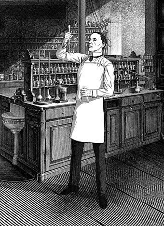
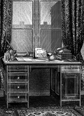
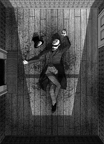
The latest in the series of illustrated editions I’ve been working on for Spanish publisher Editorial Alma is a single-volume collection of two short Sherlock Holmes novels, A Study in Scarlet and The Sign of Four. Work on this book began immediately after I’d finished Dracula so maintaining the Victorian theme was easy enough, although the commission as a whole was an awkward one. The main problem was having barely enough time to create 20 new illustrations while I was finishing work on the huge Jim Cawthorn book. But even with enough time this would have been a difficult brief. I regard Sidney Paget‘s original Holmes illustrations as the definitive ones so trying to offer people a fresh take on the world’s greatest detective is difficult. (And, as with Dracula, there’s further competition from the innumerable screen adaptations.) Then there are the stories themselves which are often more cerebral than visual, offering little for an illustrator beyond successive views of rooms, streets, houses and so on. Even Paget has trouble with this aspect of the stories, with many of his illustrations showing the various characters standing or sitting in rooms. If I’d had more time I might have tried a lateral take on the content—two of the illustrations in Dracula avoided the people-in-rooms problem by showing collections of objects on tables—but I didn’t have the time…

paget.jpg

Watson and Holmes by Sidney Paget. From The Adventure of Silver Blaze, The Strand Magazine, December 1892.

As things turned out, the least satisfying of the novels from a story perspective, A Study in Scarlet, was easier to illustrate because much of the second half takes place in the United States. This was the first Holmes novel, and it doesn’t work as well as the others for precisely this reason, the narrative attention is removed from Holmes, Watson and London, but the change of scene is a benefit for an artist. The second novel, The Sign of Four, is a better story but was compromised in this edition because the publisher only wanted every other chapter illustrated. For this reason Holmes and Watson are elusive presences in their own books although given the problems outlined above this may be for the best.

There’s still one more volume to emerge from my recent round of work for Alma, a collection of four Lovecraft stories, three of which I hadn’t illustrated before. More about this in a month or so. In the meantime, the full run of Holmes pictures follows below, while all may be seen at a larger size here.

A Study in Scarlet

holmes01.jpg

holmes02.jpg

holmes03.jpg

Continue reading “Illustrating Sherlock Holmes”

Weekend links 423

howe.jpg

The Miracle (Genet’s Dream) (2001) by Delmas Howe.

• “Zachary Lipton, an assistant professor at the machine learning department at Carnegie Mellon University, watched with frustration as this story transformed from ‘interesting-ish research’ to ‘sensationalized crap’.” Oscar Schwartz on how the media gets AI alarmingly wrong.

• The Aesthetics of Science Fiction: what does SF look like after cyberpunk? Very Brutalist if you ask Rick Liebling, although the first example shown in his piece—the Brunel University Lecture Centre—appears briefly as future architecture in A Clockwork Orange.

• At Expanding Mind: Erik Davis talks with philosopher and religious studies professor Dustin Atlas about ancient skepticism, Madhyamaka Buddhism, the taste of honey, Montaigne, Robert Anton Wilson, and the path of doubt.

• At Muddy Colors: Part 1 of their choices for best fantasy book covers of the year so far, a list which includes my cover for Moonshine by Jasmine Gower. Thanks!

• Soundtracking with Edith Bowman, episode 84: director Todd Haynes on the music of Wonderstruck, I’m Not There, Carol and Far From Heaven.

• Mixes of the week: FACT mix 663 by Space Afrika, Secret Thirteen Mix 262 by Mieko Suzuki, and Black Minimalism, a playlist by David Toop.

• Two minutes, eight barrels: drone and GoPro footage of surfer Koa Smith riding the waves of the Namibia shoreline.

• David Lynch’s Sacred Clay: Shehryar Fazli reviews Room to Dream by David Lynch and Kristine McKenna.

Charlotte Higgins on myths, monsters and the maze: how writers fell in love with the labyrinth.

• Monstrous Geometries in the Fiction of HP Lovecraft by Moritz Ingwersen.

Listen to the mournful wails of planets and moons.

• A Peel Session by Laika

Surf Ride (1956) by Art Pepper | Surf (1976) by Tim Blake | Surfside Sex (1982) by Patrick Cowley

The art of Antoon van Welie, 1866–1956

vanwelie1.jpg

The Artists’ Studio (1906).

This week’s post is another by Sander Bink about a neglected artist of the Dutch fin de siècle. There’s no need for me to add a great deal to Sander’s appraisal below other than to point out the evident debt that Antoon Van Welie seems to owe to the Pre-Raphaelites for whom Ophelia was a popular subject. British artists of the 19th century have often been criticised for adding little to the evolution of Continental art but the influence of the Pre-Raphaelites and the Arts and Crafts movement pervades European Symbolism. My thanks again to Sander for the post.

* * *

Antoon van Welie (Dutch Wikipedia only) was a Dutch painter known mainly for his portraits of the rich and famous. Around 1900 his work was praised by writers and critics such as Camille Mauclair, Jean Lorrain and Anatole France. He had studios in The Hague, London, Paris and The Vatican. There’s not much information about him in English, and for a long time there wasn’t a great deal in Dutch either, since during his lifetime he was already more or less forgotten. His being openly gay could have been one of the reasons. Male beauty is one of his subjects, as illustrated by The Artists’ Studio. His preference for depicting Catholic priests and flamboyant society ladies might also have been a little too extravagant for Dutch artistic standards of the period. The influence of Symbolism and mysticism on his work sets him a little apart from the crowd as well. All this does make him somewhat of a “decadent” or fin de siècle artist. What surely did not help his posthumous fame was a portrait of Mussolini he painted in 1921, and apparently he later also made one of Hitler. But in 2003 he was rescued from art-historical oblivion by the good people of the Louis Couperus Museum in The Hague. An exhibition there was followed in 2007 by a larger one at Museum Het Valkhoff in Nijmegen: The Last Decadent Painter. The book published for the occasion gives an extensive overview of Van Welie’s life and oeuvre but is unfortunately only available in Dutch.

The portraits which made him famous in his day are, in my opinion, technically not that great and sometimes tend toward kitsch. More subtle and beautiful are his early Symbolist works which, like those by Simon Moulijn, are strongly influenced by Maeterlinck’s neo-mystical writings.

vanwelie2.jpg

Aglavaine en Sélysette (1899).

Some quite refined examples are the lithograph Aglavaine en Sélysette and the pastel Les Princesses de Légende, both directly inspired by Maeterlinck’s plays.

vanwelie3.jpg

Les Princesses de Légende (1899).

vanwelie4.jpg

Ophelia.

Literature was an important influence, as it was for many other Symbolist painters, and Van Welie duly produced the pastel Ophelia in 1898–’99. The same goes for musical themes, an example of which is the serene pastel Holy Cecilia with Lyre.

vanwelie5.jpg

Holy Cecilia with Lyre (1899).

vanwelie6.jpg

He also designed book covers like the one for Jean Lorrain’s novel Ellen from 1906.

vanwelie7.jpg

La Douleur (1895).

But his most attractive work and as far as I am concerned one of the finest works of 1890s Dutch art is the chalk drawing La Douleur. Although the title emphasizes the young lady’s suffering, she also seems to be in a (sexual) ecstasy. A paradoxical beauty like Baudelaire’s femmes damnées: “de terribles plaisirs et d’affreuses douceurs”.

Sander Bink

Elsewhere on { feuilleton }
The gay artists archive

Previously on { feuilleton }
The art of Simon Moulijn, 1866–1948
René Gockinga revisited
Gockinga’s Bacchanal and an unknown portrait of Fritz Klein
More from the Decadent Dutch

Weekend links 422

kolosimo.jpg

Wu Ming, a communist writing collective known for its historical fiction, sees Kolosimo as using pseudohistory as a tool to shake people from their belief that capitalist society is natural and transhistorical, opening minds to other possibilities for how humans can live. They regret that popular proponents of his theories today, like Graham Hancock and Erich von Däniken, are unable to recognize the political motivations behind his project: “Nothing of his radicality survives in today’s copycats… Every corner has been blunted, the heresy has become telegenic, but we know that the revolution will not be televised.”

The secret history of Marxist alien hunters by AM Gittlitz

I received the Sphere edition of Peter Kolosimo’s book as a Christmas present in 1974, and being 12 years old at the time took its theories fairly seriously. As a work of pseudohistory it’s as poor as the books of Erich von Däniken but I always liked the title, and it happens to be the place I first encountered the mysterious words “Popol Vuh”, a name that would acquire a very different significance a few years later. Kolosimo also joins Kenneth Grant in taking HP Lovecraft’s work as a thin fictionalisation of supposed fact. For a serious dismantling of Not of This World see this review (the first of three parts) by “skeptical xenoarchaelogist” Jason Colavito.

• The Archons are back: Erik Davis talks with Gnostic scholar Matthew Dillon about religious mourning, the Nag Hammadi library, sex-magick Jesus, the Gnostic Eden, David Icke’s lizards, and the power of the Archons as an allegory of contemporary technological and political power.

Crystal Voyager (1973) is a surfing film by David Elfick that ends with a 23-minute sequence of slow-motion waves set to Echoes by Pink Floyd. Some of the same footage later appeared in the final scenes of Peter Weir’s The Last Wave (1977).

• Sweet artifice: “Dandies in the age of decadence favoured synthetics over nature, nowhere more so than in perfumery’s fabulous counterfeits,” says Catherine Maxwell.

• Now for a lampshade solo: Pascal Wyse on how the Radiophonic Workshop built the future of sound.

• Wilde about Paris: Alex Dean on the sex, drink and liberation of Oscar Wilde’s “lost” years.

Bee in the City: the vanguard of an invading army from Planet Bee.

• Five books that most inspired Alexander McQueen.

Colin Newman‘s favourite albums.

Echoes (1969) by Leon Thomas | Echo Waves (1974) by Ash Ra Tempel | Not Of This World (1988) by Danzig

Bibliothek des Hauses Usher

rottensteiner.jpg

As promised a couple of weeks ago, this book-cover post is one of several that originates with Franz Rottensteiner’s horizon-expanding The Fantasy Book: The Ghostly, the Gothic, the Magical, the Unreal (1978). Rottensteiner’s study was important for me not only for its introduction to many hitherto unknown writers but also for its wide-ranging collection of illustrations and cover designs. Most of the artwork has since become very familiar but a few examples were by artists or designers I hadn’t encountered elsewhere. Hans Ulrich Osterwalder was one of these, his art for a series of German horror titles appearing inside the book and, in the case of the US edition of The Fantasy Book, on the cover. Searching for Osterwalder’s work a few weeks ago I was delighted to discover that the German covers were part of a series of horror/dark fantasy reprints for the Bibliothek des Hauses Usher imprint from Insel Verlag, for which Osterwalder created many more striking and unusual covers.

Bibliothek des Hauses Usher published 26 novels or story collections from 1969 to 1975. I thought at first that this was a paperback series but all the books were hardbacks with uniform black covers and white spines. The imprint logo is a rather ordinary looking House of Usher cracking down the middle (a nod to Arkham House, perhaps) with a slogan on the back cover borrowed from Ambrose Bierce: “Can such things be?” Each volume was printed on light green paper, at least until the paper stock ran out. The last three volumes were printed on white paper then on green again when further stocks were found.

page.jpg

Osterwalder’s work on this series stands out for being innovative, surreal and free of the cliches that persist on horror titles. Most of the artwork is illustrative of the contents but it manages this without being too overt or obvious which isn’t an easy thing to do. The list of authors is an interesting mix as well (if you overlook the typically lamentable absence of women writers): many of the names are those you’d expect in a series such as this but there are also some such as Jean Ray and Stefan Grabiński who you wouldn’t find in an Anglophone series. Grabiński was a Polish writer of weird fiction who receives a mention in Rottensteiner’s book (and is a favourite of China Miéville) but whose work is still largely unknown to Anglophone readers. Just as obscure to English readers is Thomas Owen who was a Belgian writer (real name Gérald Bertot) and a friend of Jean Ray’s. Tartarus Press published a collection of Owen’s stories in 2012 but I’ve not read it so can’t vouch for their quality.

All 26 covers are shown below in their order of publication. Hans Ulrich Osterwalder still works as an artist and designer, and has a website here. Franz Rottensteiner was interviewed at 50 Watts a few years ago.

usher01.jpg

usher02.jpg

usher03.jpg

Continue reading “Bibliothek des Hauses Usher”