Antique badges not included.
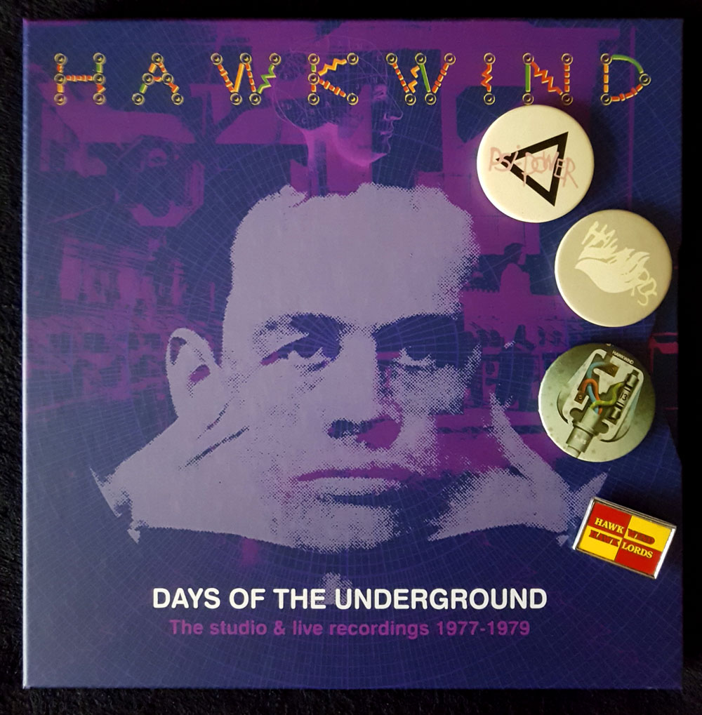
My weekend has been spent immersed in Days Of The Underground, the latest box of Hawkwind albums from Cherry Red Records. I’d avoided many of the earlier sets but this one was irresistible for being a 10-disc collection (8 CDs and 2 blu-rays), the core of which is three of the four albums recorded by the group for the Charisma label–Quark, Strangeness And Charm (1977), 25 Years On (credited to Hawklords, 1978), and PXR 5 (1979)–with all three albums being given the Steven Wilson remix treatment. The studio material is complemented by further Wilson mixes of live recordings and alternate takes, plus demo tracks (previously available but I didn’t have them). You also get three bonus video clips: Hawkwind (minus Dave Brock) playing the Quark single on Marc Bolan’s TV show in 1977, together with two promo films from the 1978 Hawklords concert at Brunel University. Absent from the set is the group’s first album for Charisma, Astounding Sounds, Amazing Music (1976), also the two singles that were released that year. I’ve not seen any explanation for these omissions but reasons may include the uneven quality of the music (recorded shortly before the group imploded), and Dave Brock’s lasting dislike of the album.

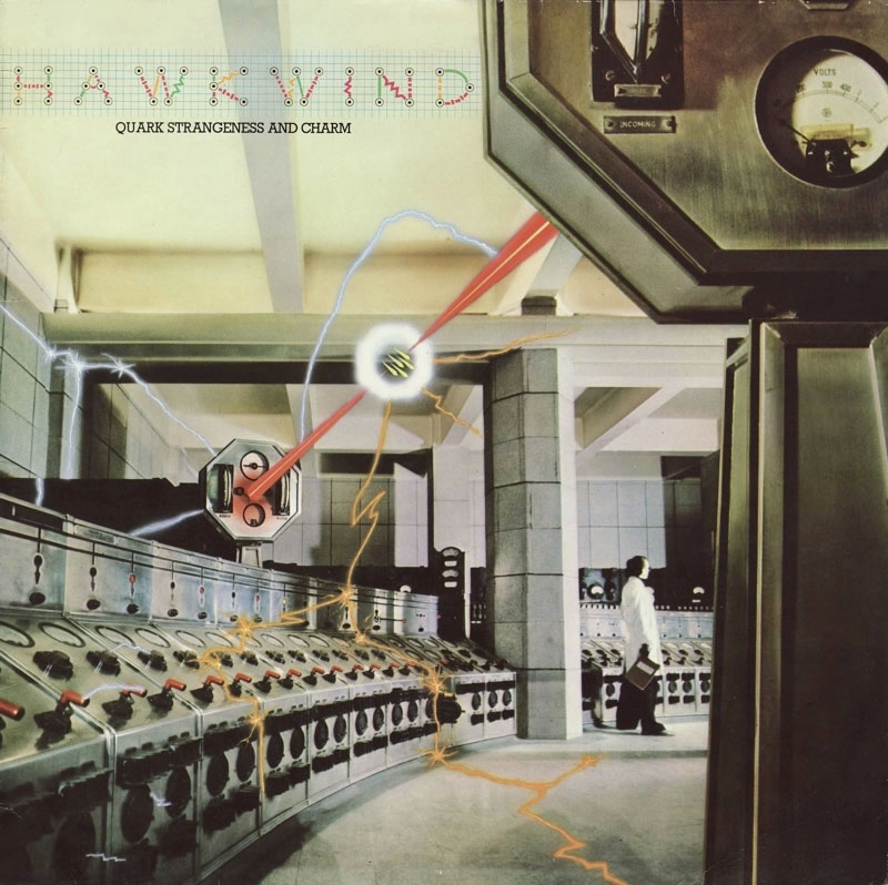
Cover design by Hipgnosis; photography by Peter Christopherson with graphics by Geoff Halpin. Aubrey Powell says that Robert Calvert commissioned this one after the pair met each other at a party. The photography made use of the interior of Battersea Power Station in the same year that Hipgnosis used the building for a rather more famous album cover.
Steven Wilson did a great job of remixing the Warrior On The Edge Of Time album so I had high hopes for this set, hopes that have been substantially fulfilled. Many of the adjustments are individually minor–boosted bass, more prominent keyboards, some extended intros–but taken together they offer a refreshed experience of three very familiar albums. The packaging has been well-designed by the estimable Phil Smee with a booklet that presents a snapshot of the graphics produced for the group during this period, not only album artwork but also posters, ads and pages from the tour programmes. As a bonus there’s a small reproduction of the 1977 tour poster, a welcome inclusion since I used to own an original one of these which I’ve either misplaced or lost altogether. The attention to detail extends to the animated graphics of the blu-ray interface; when the Quark album is playing you can watch sparks dancing around the control room. The Marc Bolan TV appearance was something I’d seen many times before (including its original broadcast) but the live Hawklords films are revelatory when there’s so little footage of the band from the 1970s with synched sound. The performances of PSI Power and 25 Years offer a frustratingly brief taste of Robert Calvert’s magnetic stage presence, and make me hope that a video of the entire concert may be released eventually.

Cover art by Philip Tonkyn.
Robert Calvert is the key figure here, to a degree that Hawkwind’s Charisma years are also known as the Calvert years, this being the period when the group’s part-time lyricist, occasional singer and conceptual contributor graduated to lead vocalist and songwriter. Calvert’s new role as front man changed Hawkwind from an ensemble of underground freaks into a more typical rock group, albeit one with a very theatrical singer prone to changing outfits to suit the songs, and with props that included a loudhailer, a machine-gun (fake) and a sabre (real). The songs became shorter and, in places, poppier, although none of the singles managed to repeat the chart success of the Calvert-penned Silver Machine. Nevertheless, Brock and Calvert were a great song-writing team, and the lyrics that Calvert wrote from 1976 to 1978 are better than anything else in the discography: witty, alliterative, and filled with clever rhymes that range widely in their subject matter, from the usual science-fiction fare to Calvert’s own obsessions, especially aircraft and flying. Calvert’s approach to science fiction was more sophisticated than the freaks-in-space approach of the group’s UA years. You get a sense of this from his contributions to the Space Ritual album (only Calvert would have known what an orgone accumulator was), but his Charisma songs go much further, condensing whole novels—Roger Zelazny’s Damnation Alley and Jack of Shadows, Ray Bradbury’s Fahrenheit 451—while maintaining the spirit of the New Wave of SF, where the emphasis was as much on inner as outer space.
Continue reading “New Wave Strangeness: Hawkwind’s Calvert years”