Books Borges never wrote

borges2.jpg

Design by Hector Haralambous.

The composition of vast books is a laborious and impoverishing extravagance. To go on for five hundred pages developing an idea whose perfect oral exposition is possible in a few minutes! A better course of procedure is to pretend that these books already exist, and then to offer a resume, a commentary… More reasonable, more inept, more indolent, I have preferred to write notes upon imaginary books.

Jorge Luis Borges

Borges was true to his intention in scattering invented volumes throughout his work, a number of the ficciones either have invented books as their subjects or use them to propel the narrative. Tlön, Uqbar, Orbis Tertius is perhaps the most elaborate example, the story in which Borges invents an encyclopedia which is itself being invented to prove a philosophical point. My favourite Borges site at The Modern Word has a page detailing some of the imaginary volumes. Invented books naturally suggest invented book covers. Several years ago another Borges site took up the challenge for the latter which is where the examples above and below originate. The site is now defunct but its pages can be seen mostly intact thanks to the Internet Archive. The book covers are here and here. The designs for the most part could have been better, although they don’t look any worse than some of the poorly-designed covers for genuine books now flooding the web thanks to print-on-demand and electronic publishing.

borges3.jpg

Design by George Kranitis.

ttl7.jpg

The Spanish language edition of the Thackery T Lambshead Pocket Guide to Invented and Discredited Diseases (1977).

All of which reminded me of my own fake Borges covers from 2003, supposedly Borges’ own compilations of The Thackery T Lambshead Pocket Guide to Invented and Discredited Diseases, the fake disease guide edited by Jeff VanderMeer and Mark Roberts. These were created in colour but printed in black-and-white. Since they’ve appeared here before I’ve included links this time to larger copies. In a detail that Borges might have appreciated the idea for the disease guide came about after Modern Word editor Allen B. Ruch, who often manifests as The Great Quail, remarked to Jeff VanderMeer that “I think I have contracted Mad Quail Disease”. You have to be cautious with casual quips to writers, you never know where they might lead.

ttl8.jpg

An English paperback reprint of the Borges edition (1979).

Update: While we’re on the subject… Remember the Fake Books from The Royal Tenenbaums? Here They Are!

Elsewhere on { feuilleton }
The book covers archive

Previously on { feuilleton }
Borges and I
Recovering Viriconium
Forbidden volumes
Pasticheur’s Addiction

Weekend links 121

lambshead.jpg

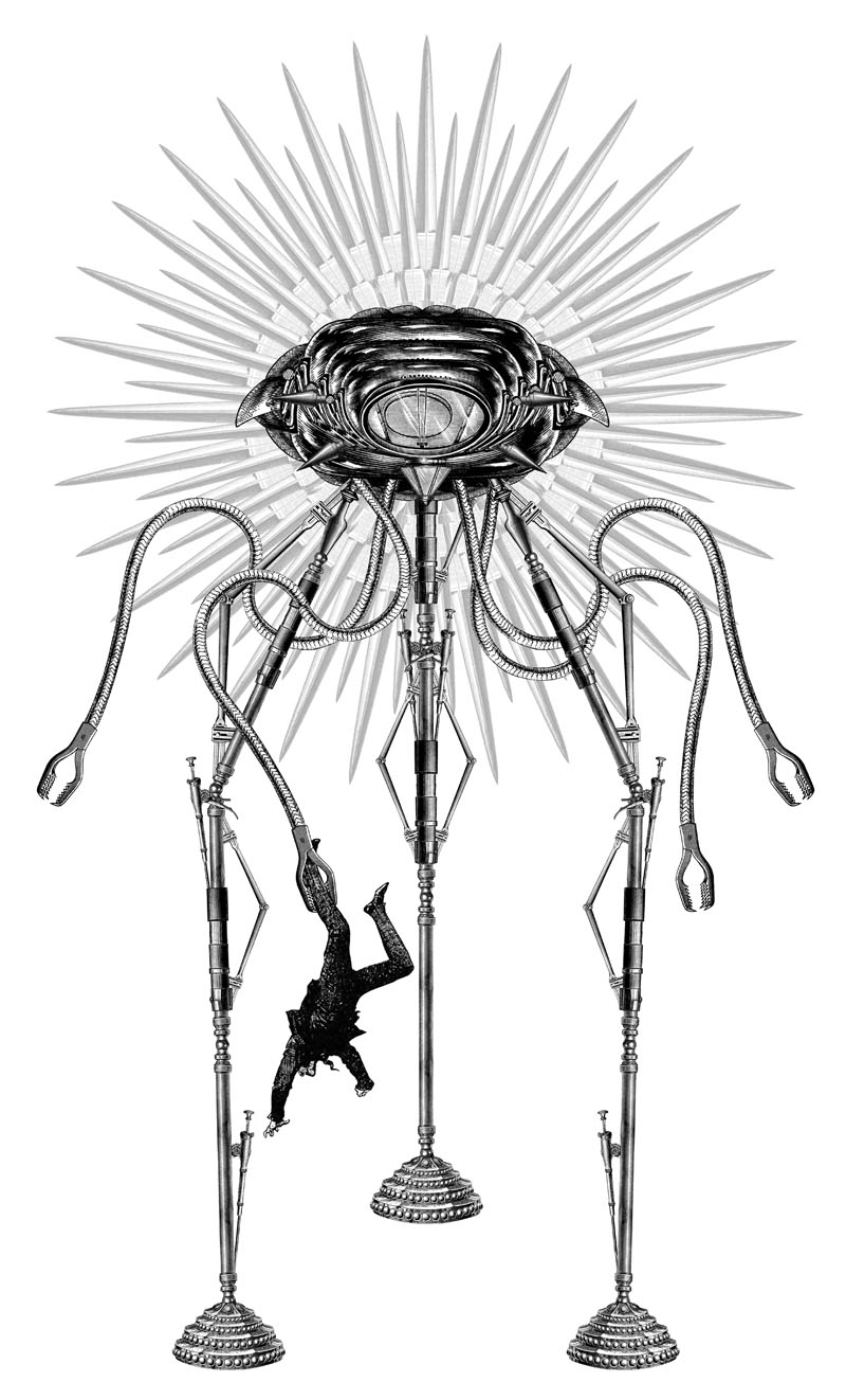
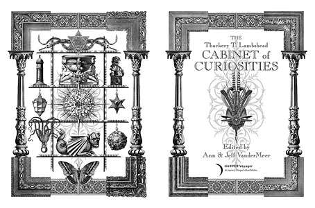
Title spread for The Thackery T. Lambshead Cabinet of Curiosities (2011) edited by Ann & Jeff VanderMeer.

I was surprised this week to find myself nominated as Best Artist in the World Fantasy Awards. The results will be announced at the World Fantasy Convention in November. Among the books nominated for Best Anthology is the Thackery T. Lambshead Cabinet of Curiosities for which I provided title page designs and some illustrations. Editors Ann & Jeff are well-represented (and ought to win for their landmark The Weird anthology), and I’m pleased to see Mark Valentine receive a nod for his excellent Wormwood magazine. Mark and Roger Dobson published my first Lovecraft adaptation, The Haunter of the Dark, in a large-format edition under their Caermaen imprint in 1988.

I remember having a conversation with my father about it. I told him what I’d really have liked to find, in my exhaustive search of the canon, was a gay superhero. You know: fucking dudes, saving the world. Never mind the fact that superheroes, with their notoriously contour-hugging apparel, are usually assumed gay by default. I wanted something that had existed, something from history. My father considered my criteria.

“I think what you want is Gore Vidal.”

Henry Giardina on Gore Vidal’s Bully Republic at the Paris Review.

• Appreciations and memorials for the late Gore Vidal continue to surface: “He was punk rock with a traditional, smooth exterior. But there was nothing traditional about him, not really. He defied singular category,” says Aaron Tilford at Lambda Literary. “Jokes course through Vidal’s entropy-heavy commentaries like a warm, reviving current. They, more than the barbs to which they form a counterpoint, are what make his essays a continuing pleasure to read,” says “J.C.” at the TLS.

• “Winterson’s opposition to strict realism is less an artistic critique than a cultural one. She uses the term ‘realism’ to describe an entrenched way of viewing the world, which it is the writer’s duty to challenge.” Hannah Tennant-Moore on Jeanette Winterson at n+1.

The Ghosts of Bush by Robin The Fog: “A final hauntological perambulation around the hidden corners of Bush House, Aldwych, London, June 2012”.

• “For everything that is not shown, the filmmaker counts on the power of imagination of his viewers.” Lebbeus Woods on Chris Marker and La Jetée.

Joseph Burnett on “Rainbow Ambiguity: Defying conservatism in mainstream LGBT culture”.

• Leigh Brackett book and magazine covers at Golden Age Comic Book Stories.

BLDGBLOG visited the Whitechapel Bell Foundry in London.

Stilled Life: A collection of photography by Thom Ayres.

• Underground subversion: Stickers on the Central Line.

Andrei Codrescu on five favourite Fantastical Tales.

Vangelis performs an analogue synth freakout for Spanish TV in 1982 | Oro Opus Alter, a track from the forthcoming album by Ufomammut | New World, a track from the forthcoming album by The Irrepressibles. Can’t wait.

Reverbstorm update

board.jpg

The photo shows a detail of the design embossed on the front board proof of the forthcoming Reverbstorm book, publication of which has been put forward while the printers address some production problems. Without getting overly technical there’s been trouble with the ink causing a number of pages to print far too dark for reasons that still aren’t clear. As a result of this I’ve still no idea when the book will be ready for sale. Be assured that any frustration would-be readers are feeling goes double for the writer and artist. More news will appear here in due course.

Previously on { feuilleton }
James Joyce in Reverbstorm
A Reverbstorm jukebox
Reverbstorm: Bauhaus Horror
Reverbstorm: an introduction and preview

James Joyce in Reverbstorm

jj1.jpg

A post for Bloomsday with a handful of the many and varied appearances of James Joyce in the forthcoming Reverbstorm book. Ulysses was published ninety years ago this year. Among the usual commemorations BBC Radio 4 will be dramatising the entire novel throughout the day.

jj2.jpg

But as before the lightning the serried stormclouds, heavy with preponderant excess of moisture, in swollen masses turgidly distended, compass earth and sky in one vast slumber, impending above parched field and drowsy oxen and blighted growth of shrub and verdure till in an instant a flash rives their centres and with the reverberation of the thunder the cloudburst pours its torrent, so and not otherwise was the transformation, violent and instantaneous, upon the utterance of the word.

James Joyce, Ulysses (1922)

jj3.jpg

Prison and place and reverberation
Of thunder of spring over distant mountains
He who was living is now dead
We who were living are now dying
With a little patience

TS Eliot, The Waste Land (1922)

jj4.jpg

Continue reading “James Joyce in Reverbstorm”

Recovering Viriconium

viriconium01.jpg

Detail from Assassination in the Night (c. 1600?) by Monsù Desiderio.

Yesterday’s post looked at some of the past cover designs for M. John Harrison’s Viriconium books. This post makes a few suggestions for how they might be presented in the future. Since these are mostly covers that I’d like to see they’re not necessarily ideal for the audience a publisher might be aiming at, cover design is usually a three-way process involving designer, author and publisher. In the end I’ve resisted the temptation to draft a range of original cover proposals—writing these posts has taken long enough—so almost everything here uses pre-existing art. If I was designing covers for all four Viriconium books, however, and the brief was to orient them towards a fantasy readership, the first thing I’d try would be a series of four imaginary Tarot designs. A peculiar pack of Tarot cards is a recurrent feature of the books so I’d create four emblematic cards that featured significant elements and characters from each. The characters wouldn’t be too well defined, they’d be stylised, maybe even silhouettes. Each card would feature a dominant presence: offhand these would be one of the geteit chemosit for The Pastel City, a locust for A Storm of Wings, the Barley Brothers for In Viriconium and a Mari Lwyd horse skull for Viriconium Nights. These presences together with the human characters would loom over a silhouette city at the foot of each card whose outlines would change appearance from book to book, evolving gradually from a fantastic outline of domes and towers to something that resembles a contemporary city. The colours and treatments would show a similar evolution from the bright and bold styles of the Pamela Colman Smith Tarot deck to something more photographic, collaged from elements closer to our world. Maybe.

That’s an idea for the four individual books. All the examples here use the convenience of the omnibus edition so a single image (or pair of images) has to somehow represent the entire series. To save time and effort I’ve taken the liberty of hijacking a couple of Penguin Books layouts. I hope Penguin doesn’t mind, and I should also apologise to Harrison’s UK publishers, Gollancz, for making one of their authors jump ship. The Viriconium omnibus is certainly good enough to be considered a modern classic. Penguin’s recent template for its Modern Classics series happens to be very easy to apply to a wide range of artwork.

viriconium04.jpg

The Anti-Pope (1942) by Max Ernst.

Penguin has a long tradition of using pre-existing art on its covers, especially on those in its Penguin Classics series. You can almost make this into a parlour game: match your favourite novel with the best choice of painting. The tradition was extended to its science fiction titles in the early 1960s when the art of Max Ernst was featured several times along with the work of other Surrealists. Max Ernst is a favourite artist of mine so this is one I can’t resist. Many of Ernst’s decalcomania paintings of the 1940s would suit Viriconium but The Anti-Pope with its horse heads seems especially suitable.

Also on the Penguin sf covers was a picture by the mysterious “Monsù Desiderio” one of whose works can be seen at the top of this post. Desiderio was a 17th-century painter with a vague enough presence—works have been attributed to both François de Nomé and Didier Barra—and a line in gloomy architectural fantasias to make him an ideal Viriconium artist.

Continue reading “Recovering Viriconium”