Comps

comps.jpg

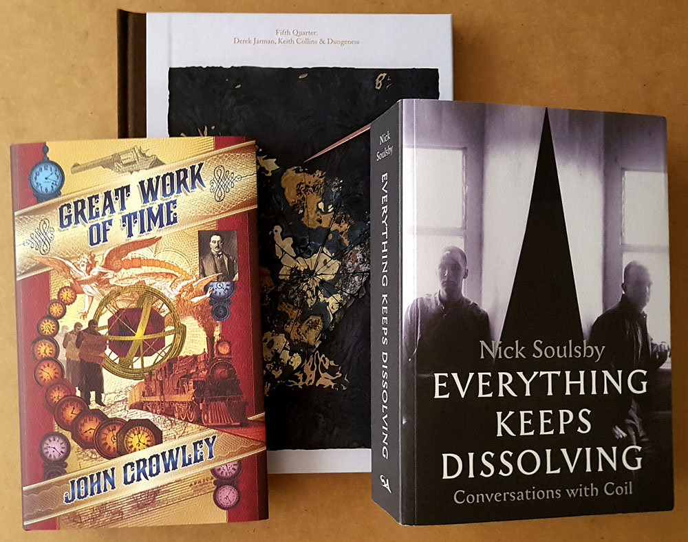
The month in complimentary copies. In publishing you often get sent at least one copy of something you’ve worked on although there are plenty of occasions when this doesn’t happen. This trio turned up while I’ve been waiting for two other books to arrive, both of which I’d contributed to (one of them even has my name on the cover) but still had to request from editors. It’s always a quandary when this happens. You feel reluctant to add to somebody’s working day by making a petty request for a copy of that thing you provided some artwork for a year ago; on the other hand, one of the books I’ve been waiting for is published by an international company with a 70-year history who nevertheless didn’t have a budget to pay for all the artwork they were using. The comp was supposed to be my payment for their use of a single picture. It looks like I’ll be buying this one myself.

crowley1.jpg

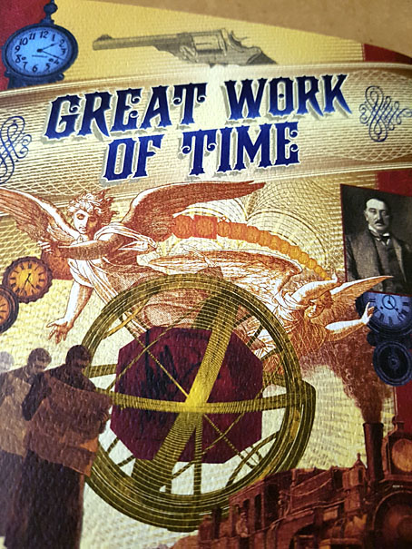
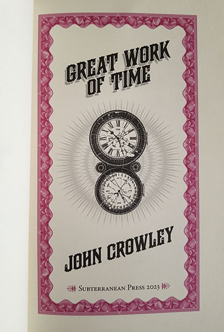
Great Work of Time is a book I’ve already mentioned here, being a hardcover reprint of an award-winning novella by John Crowley. I designed the interior and the cover which has been beautifully printed by Subterranean Press on textured paper. The interiors feature two-colour printing, with various details picked out in magenta ink. A handsome edition that’s also one of the best time-travel stories I’ve read.

crowley2.jpg


soulsby1.jpg

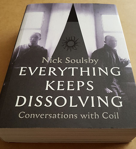
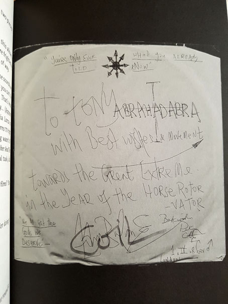
Everything Keeps Dissolving: Conversations with Coil has also been mentioned here before. This is Nick Soulsby’s collection of interviews with Coil, a book that rescues from obscurity and potential loss a wealth of interview material—magazine features, fanzine profiles, video and tape transcripts—which chart the group’s career. I assisted in a very small way with this one, letting Nick see some of my written correspondence with John Balance. I’m also mentioned in one of the interviews which was a surprise to discover after all this time. This is a very large book which will be essential reading for all Coil cultists.

soulsby2.jpg


jarman1.jpg

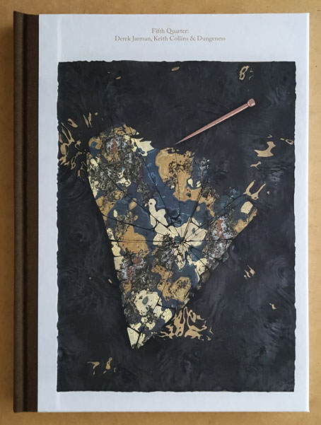
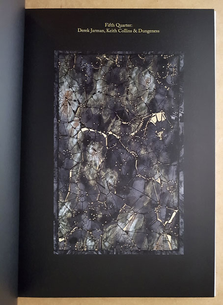
Fifth Quarter: Derek Jarman, Keith Collins and Dungeness is a collection of personal responses to the films and art of Derek Jarman. The book has some slight relation to the Coil volume via the pictures that resemble the Jarman piece used on the cover of How To Destroy Angels. Fifth Quarter has been published by the Subtext record label to accompany Fifth Continent, an album by Alexander Tucker and the late Keith Collins, Jarman’s former partner and custodian of Prospect Cottage. I didn’t contribute to the book but I’ve done a lot of design work for Subtext who have been releasing avant-garde music now for almost 20 years. Book publishing is a new venture for them. The list of contributors to Fifth Quarter is an impressive one: Barry Adamson, Jennifer Lucy Allan, Sarah Bade, Derek Brown, Keith Collins, Garry Clayton, Peter Fillingham, William Fowler, Dan Fox, Elise Lammer, Matthew R. Lewis, James Mackay, Frances Morgan, Garrett Nelson, Stephen O’Malley, Paul Purgas, Damien Roach, Howard Sooley, Mark Titchner, Alexander Tucker, Peter Tucker, Luke Turner, Simon Fisher Turner, and Cosey Fanni Tutti.

jarman2.jpg

Previously on { feuilleton }
Great Work of Time
Man is the Animal, issue three
Derek Jarman album covers

Eco Del Universo

edu1.jpg

Eco Del Universo, the ninth album by Mexican band Los Mundos, was released last month on Acid Test Recordings. I designed and illustrated the outer and inner sleeves for an album whose music is described on the group’s Bandcamp page as psychedelic rock. I’ve not seen a physical copy yet but the vinyl disc is available in two pressings that complement the colours of the cover.

edu2.jpg

The brief for this one was for something based on the concrete fantasia known as Las Pozas, an overgrown park with accompanying hotel that Edward James spent many years and a great deal of money building in the Mexican jungle. James was a British aristocrat who fell for Surrealism in a big way in the 1930s, using his inherited wealth to support artists such as Salvador Dalí, René Magritte and Leonora Carrington, while creating Surrealist-styled homes for himself, first at Monkton House in West Sussex then at Xilitla in Mexico. James and his jungle resort have been recurrent subjects here so I didn’t need much encouragement to create something based on his constructions. In the past I’ve described Las Pozas as unfinished but this suggests a scheme with a final goal in mind. I don’t think this was ever James’s intention. His creations are more like very large concrete sculptures rather than architecture, even though some of them have a recognisable architectural form. Finished or not, the structures are a unique hybrid of the purposeless architectural folly—a popular indulgence for British landowners of the 18th and 19th centuries—and caprices like the Palais Idéal of Ferdinand Cheval.

edu3.jpg

My cover art is a fantasy on the fantasy which makes James’s improvisations look a little more planned than they are by mirroring their disposition. I also crowded together several of the constructions which at Las Pozas are in separate areas of the complex. Looking at the artwork again I’m reminded of some of Roger Dean’s views which wasn’t my intention originally. I think it’s the combination of unusual architecture, layered foliage and the treatment of light and shade. If the structures weren’t outlined and the sky was a Dean-like gradient there’d be even more of a similarity. The beautiful stellar photo is from the European Southern Observatory (ESO) whose images of the cosmos are free to use so long as you give them credit. This one was by Stéphane Guisard.

Previously on { feuilleton }
The Secret Life of Edward James
Palais Idéal panoramas
Las Pozas panoramas
Return to Las Pozas
Las Pozas and Edward James

Bugged by Jaffee

jaffee-bug1.jpg

This one is for my own benefit as much as anyone else’s. Last week, after reading about the late Al Jaffee, I went looking for the panel you see above, a minor item in a much longer Jaffee feature for an issue of Mad magazine from the 1960s. The flatbugs have been one of my favourite Jaffee jokes for many years, but never having kept a note of which issue they appeared in I’ve always had a problem finding them when I’ve wanted to tell someone about them or see them again. On this occasion searches for various combinations of “mad”, “magazine”, “jaffee”, “bugs”, “flatbugs”, “flat bugs” yielded nothing other than a brief mention on a Reddit thread, along with too many articles about insect infestation. Google Books is sometimes useful for search leads but not this time. Twitter still has its uses, however; someone there had mentioned the flatbugs a couple of years ago, as well as the issue they appeared in, Mad no. 107 for December 1966, so here they are at last.

jaffee2-bug2.jpg

The thing that made the flatbugs so memorable (if not locatable) was that this is a rare Mad joke that’s allowed to extend throughout the rest of the issue. Jaffee’s bug panels occupied two corners of a three-page collection of puzzles and visual gags which is why they’ve always been difficult to track down, you won’t see any mention of them in an index or table of contents. Despite this, issue 107 really ought to be called the flatbug issue. Once you’ve read about the breeding habits of the creatures you start seeing more of them on the pages that follow, even those by artists other than Jaffee; the last of the bugs appears on Jaffee’s fold-in page. This has some precedent in the tiny Sergio Aragones cartoons that appeared in the page margins but I’ve not seen any other one-off gags used like this. Jaffee is lauded for his fold-ins but this shows him playing with the form of the magazine in a different way, suggesting that these were real creatures, albeit motionless and almost two-dimensional.

jaffee-bug4.jpg

I only got to see issue 107 a few years ago when scanned copies of the magazine began to turn up online. Prior to this I knew the flatbugs from one of the reprint books which were all you got to see of older copies of Mad magazine outside the US. I might never have seen these either if it wasn’t for a friend at school who collected humour paperbacks. He had a huge stock of the things, not only the Mad books but many of their spin-offs by Al Jaffee, Don Martin and co. The book with the flatbugs, Rip Off Mad, dates from 1973 but most of the material inside is from the previous decade. I’ve not seen a copy of this since the 1970s but I know that the bugs spread throughout the book just as they did in the magazine, even though the contents were different to issue 107.

lambshead.jpg

In 2003 the flatbugs came to mind when I was writing my entry for the Thackery T. Lambshead Pocket Guide to Eccentric and Discredited Diseases. My disease, “Printer’s Evil”, is a fungal growth that infects paper, and thereby passes to anyone who touches an affected page. The entry itself was, of course, contaminated in this way. Ideally one of the pages for this section would have had a frayed edge but there wasn’t the budget for such indulgence. If you do have the budget then the possibilities expand for humorous invention. The first Monty Python book, Monty Python’s Big Red Book, features a die-cut page (below), while Eric Idle’s Rutland Dirty Weekend Book has a parody of Rolling Stone magazine (Rutland Stone) printed on smaller-sized newsprint pages bound into the centre of the book. The Python books were developing a convention established by Mad (and continued in National Lampoon) of parodying print media in exacting detail, matching fonts, layouts, graphics and so on. (See this article.)

python.jpg

From the Python books. Left: Monty Python’s Big Red Book (1971); right: The Brand New Monty Python Bok (1973).

The pinnacle in this sphere is The Brand New Monty Python Bok, with its smudged fingerprints printed on a white dust-jacket (which prompted complaints from booksellers), beneath which you find a cover for a very different book, Tits ’n Bums: A Weekly Look at Church Architecture, a cover that must cause problems for resale if the dust-jacket is missing. Inside the book there’s a tipped-in library card showing the names and signatures of previous owners, while two differently-sized supplemental sections are bound into the pages. In the early 1960s Terry Gilliam had worked for Harvey Kurtzman’s Help! magazine so there’s a direct line from Python back to Mad, especially when other artists on the Help! staff included Mad regulars Al Jaffee, Jack Davis and Will Elder; Kurtzman and Gilliam subsequently collaborated on a puzzle book where the graphics and the humour sit mid-way between Mad and Monty Python. The Mad-like quality of The Brand New Monty Python Bok is reinforced by a pair of Gilliam comic strips. Jaffee’s flatbugs would be (immovably) at home there.

Previously on { feuilleton }
Blivets
The Thackery T. Lambshead Cabinet of Curiosities
Gilliam’s shaver and Bovril by electrocution
Portuguese Diseases
Pasticheur’s Addiction

jaffee-bug3.jpg

Kris Guidio, 1953–2023

kris.jpg

A self-portrait, 2011.

Farewell to the artist I used to refer to as my partner in art-crime. We weren’t really criminals but in the 1990s we’d both seen our published works for Savoy Books condemned as obscene in British courts of law, a farcical set of circumstances looking back, although it all seemed serious enough while it was happening. Kris and I began working for Savoy in the late 1980s, during which time our creative confederacy might be characterised as familiarity at a distance. He lived in Liverpool, and generally remained there, while the rest of us were in Manchester, so I saw his drawings much more than I saw him in person. I don’t think I ever met him more than 10 times in 30 years, yet his art was as familiar as my own, especially when I was being called upon to add backgrounds to some of his figures. I even ended up making a font based on the lettering he used in his comic strips in order to standardise the captions in the later books.

cramps1.jpg

Kris and I shared a symbiotic relationship with writer David Britton, who pushed the pair of us to take our art into places we might otherwise have avoided, while we opened up artistic possibilities for Dave’s characters and the settings they occupied. We were an ideal team in this respect, each of us having strengths in different areas that suited the titles on which we worked. I brought a greater sense of realism to the Lord Horror comics, while Kris developed a hitherto unexplored flair for satire and caricature in the Meng & Ecker series. Kris was a natural cartoonist, as well as a natural humorist to a degree you wouldn’t have predicted looking at his early strips and illustrations featuring The Cramps.

cramps2.jpg

The Meng & Ecker comics provoked the ire of the authorities, thanks in part to Dave’s frequent digs at the Greater Manchester Police, but there was a lot more to Kris’s art than outrage, a quality which is always easy to generate if you push the right buttons. His Cramps strips are gems of that minor form, the rock’n’roll comic, while his later illustrations for the La Squab character had a lightness of touch that suited Dave’s conception of a world where fairy tales and childhood fantasies collide with adult themes and sensibilities. Kris’s art was analogue to the last (I don’t think he ever owned a computer), drawn with whatever pens he had to hand; watercolour-hued, and fuelled by endless cigarettes. Kris in person was generous, witty, and erudite in the autodidactic manner common to all at Savoy. Remote or not, we’ll miss him here.

Further reading:
Sinister Legends (1988)
The Adventures of Meng & Ecker (1997)
Fuck Off and Die (2005)
La Squab: The Black Rose of Auschwitz (2012)

cramps3.jpg

cramps4.jpg

Continue reading “Kris Guidio, 1953–2023”

Now it’s here

rucker1.jpg

Arriving in the post this week, the Lynda E. Rucker story collection with my art on the dustjacket and the printed boards. This is a typically high-quality production from Swan River Press which comes with the usual complement of postcards and bookmark. I’ve already written something about the art but now the book is in print you can see the texture of the stock that covers the boards. I like the way this works with the texture of the drawing.

The book is available now. All copies are signed by the author, by Rob Shearman (who wrote the introduction), and by myself.

rucker2.jpg

rucker3.jpg