Peter Haars book covers

haars20.jpg

Peter Haars (1940–2005) was born in Germany but moved to Norway in the 1960s where he worked as a graphic designer, art director and illustrator. He also wrote fiction and created Prokon (1971), a one-off publication that looks like a designer’s take on underground comics. Most of the covers that turn up when you search for his work are science fiction, and all painted in that bold airbrush style that was common in the 1970s. Documentation is scarce, unfortunately, ISFDB only lists two titles, so I’ve no idea about the dates, but the Lanterne SF imprint was active throughout the decade.

haars01.jpg

haars21.jpg

haars15.jpg

haars08.jpg

Continue reading “Peter Haars book covers”

The art of Mike Hinge, 1931–2003

hinge06.jpg

Amazing Science Fiction, May 1972.

Back in March I ended my post on the psychedelia-derived art style that I think of as “the groovy look” with the words “there’s a lot more to be found.” There is indeed, and I’d neglected to include anything in the post by Mike Hinge, a New Zealand-born illustrator whose covers for American SF magazines in the 1970s brought a splash of vivid colour to the groove-deprived world of science fiction. This was a rather belated development for staid titles like Amazing and Analog whose covers in the previous decade wouldn’t have looked out of place in the Gernsback era. Opening the door to someone like Mike Hinge, a graphic designer as well as a general illustrator, was probably a result of both magazines having undergone recent changes of editorship. Hinge approached SF art in the same way that Jim Steranko approached comic-book art in the late 1960s, importing trends that had been flourishing outside the medium. (And Steranko liked Hinge’s art enough to publish a portfolio of black-and-white drawings, The Mike Hinge Experience, in 1973.) This kind of graphic style was increasingly outmoded by the mid-70s but some of Hinge’s compositions are audacious in context: the Algol cover with one of his robots seen in a water reflection (and those ripples that defy perspective), the Analog cover that works both vertically and horizontally.

For this post I’ve favoured Hinge’s groovy look over other covers, especially those from the late 70s when his cover art shifted to a painted style which is less distinctive, and less interesting as a result. It’s the distinctive style that people still prefer today. There’s more to be seen at Tenth Letter of the Alphabet and Onyx Cube.

hinge21.jpg

Undated drawing (probably mid-60s).

Something else you can always find more of is Aubrey Beardsley borrowings. Via Tenth Letter of the Alphabet which has a couple more pieces in this style.

hinge19.jpg

Wraparound cover for Witzend #6, Spring 1969.

Witzend was a magazine of comics, fantasy stories and related art published by Wallace Wood, a complete run of which may be found here.

hinge01.jpg

Amazing Science Fiction, November 1970.

hinge02.jpg

The Leaves of Time (1971).

Continue reading “The art of Mike Hinge, 1931–2003”

Ian Miller at Interzone

im05.jpg

Issue 4, 1983.

Ian Miller was the art editor for the early issues of Interzone magazine, during which time several of his own drawings and paintings appeared as illustrations. Many of these haven’t been reprinted since, including three that are credited to an “Edwin Dorff”, a name I think we can take as a pseudonym. The run of Interzone at the Internet Archive is an incomplete one, unfortunately, some of the missing issues feature more Miller. Issue 34 contains Miller drawings throughout.

im01.jpg

Issue 3, 1982.

im02.jpg

Issue 3, 1982.

im03.jpg

Issue 3, 1982.

im04.jpg

Issue 3, 1982.

im06.jpg

Issue 4, 1983.

Continue reading “Ian Miller at Interzone”

Weekend links 569

lehr.jpg

City with Eyes in Blue (1989) by Paul Lehr.

• “Lehr chose science fiction illustration because he saw it as a path to making a living and an opportunity to ‘depict the epic’. ‘War, destruction, celebration, congestion, marching armies, waving flags and banners—the strange and mysterious atmosphere of it all, rather than the literal illustration.'” Jane Frank on the art of Paul Lehr (1930–1998).

• “Time isn’t the only thing Harrison treats as firmly malleable. The same is true of his willingness to play with genre conventions…” Tobias Carroll on M. John Harrison, and an article where you have to ignore the clickbait clichés in the headline.

• The narrators for the forthcoming audiobook of Voice of the Fire by Alan Moore have been revealed.

• At Public Domain Review: A remembrance of aerial forms: Odilon Redon’s À Edgar Poe.

• The weight of the ritual: Frank Rynne on The Master Musicians of Joujouka.

• “Cerne Giant in Dorset dates from Anglo-Saxon times, analysis suggests.

Aaron Moth, the artist creating exquisite collages from vintage [gay] porn.

Clive Hicks-Jenkins on revision in illustration.

• At Wikimedia Commons: Lesbian pulp fiction.

• Mix of the week: A Wire mix by BLK JKS.

• At Dennis Cooper’s: Psychedelics.

Colleen‘s favourite albums.

Ritual Fire Dance (1969) by Tuesday’s Children | Ritual (1973) by Vangelis | Rituals (1981) by Bush Tetras

Trip texts revisited

trip1.jpg

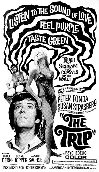
An update to a post from several years ago about the handful of significant books that appear in Roger Corman’s The Trip (1967). The earlier post was prompted by a DVD viewing; this update has been prompted by a re-viewing via blu-ray which yielded screen-grabs showing more detail. As I’ve no doubt said before, one of the pleasures of home viewing is being able to scrutinise film frames in this manner, something that was previously only possible if you were a writer with access to a cinema print.

trip2.jpg

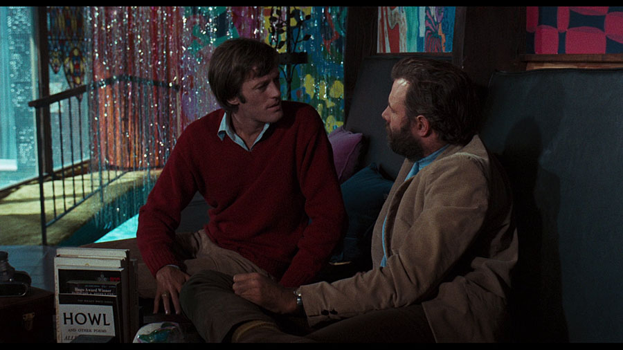
Corman’s film is probably the only feature from American International Pictures that contains any kind of extraneous intellectual reference. The AIP ethic was always “shoot it fast and cheap”, a production rule that had no time for winking to the hip contingent of the audience with books, of all things. Leave that stuff to the French. The Trip was still shot fast and cheap but Corman had been stretching himself increasingly while making his cycle of Poe films, especially with The Masque of the Red Death which had a longer production schedule, a British cast and crew, and a symbolic finale that sets it apart from its rivals at Hammer and other studios. The Trip is as far-out as Corman gets, the cut-up shots of Peter Fonda stumbling in delirium around Sunset Boulevard wouldn’t be out of place in any underground film of the period.

trip3.jpg

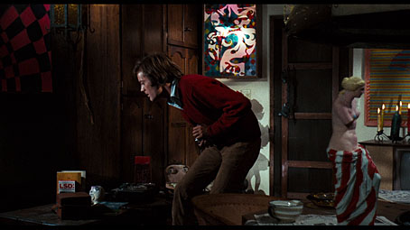
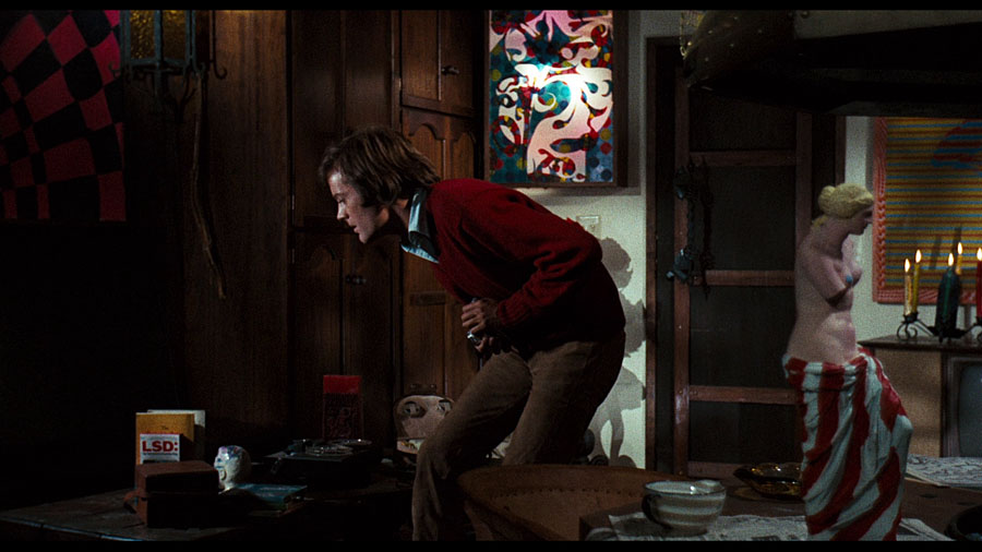
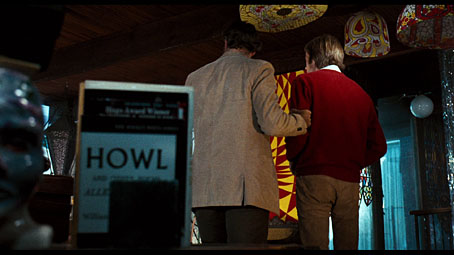
The surprising thing about the books that appear in the scene where Fonda’s character, Paul, drops his acid is that they’re perfectly appropriate items of set decoration but only two of them—the unmissable copy of Allen Ginsberg’s Howl, and David Solomon’s LSD: The Consciousness-Expanding Drug—would have been discernible to an audience. The latter inclusion is probably more to do with the three magic letters being so prominent on its cover than anything else, although it is the kind of book you’d find in a house owned by lysergic voyagers. The blu-ray detail now reveals more of the book hiding behind it although this one has eluded my attempts to search for a match: “The [something]….”? I thought it might be The Prophet by Kahlil Gibran but none of the editions prior to 1967 resemble the cover.

trip4.jpg

trip5.jpg

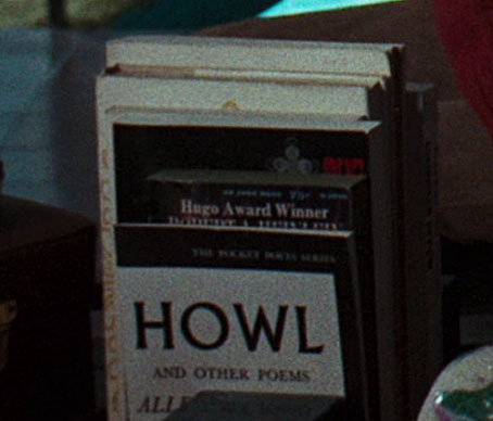
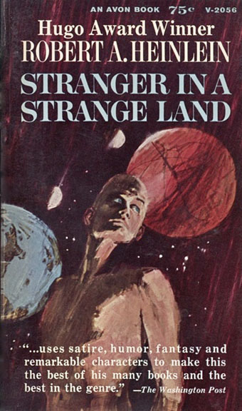
The main discovery this time round was finding a match for the book hidden by Howl, a title that I now confidently declare to be the 1962 Avon edition of Stranger in a Strange Land by Robert A. Heinlein. (The reds and blues of the cover art are more discernible in a full-frame shot.) When watching the DVD I thought those words might be “Hugo Award Winner” but couldn’t make out an author’s name, and “Award Winner” was a guess. The book might also have been written by someone named Hugo… Heinlein’s novel was a hippy favourite in the 1960s, one of several books together with The Prophet, Richard Brautigan’s novels and poetry, Herman Hesse’s Steppenwolf, etc, that were popular with turned-on readers. The irony of the author of Starship Troopers being mooned over by the love ‘n’ peace crowd wasn’t lost on the younger generation of SF authors but their criticisms didn’t travel outside genre circles. Heinlein could evade opprobrium for being one of the signatories of an ad in Galaxy for June, 1968, supporting the war in Vietnam because hippies en masse weren’t reading SF magazines.

heinlein.jpg

As noted in the earlier post, the book behind the Heinlein is a 1960 edition of The Tibetan Book of the Dead, which I was only able to identify because I own a copy of the same edition. Behind this there lurks another title whose identity is now going to nag at me. The cover decoration means it will be easy to find if it ever turns up somewhere. But will I remember it when it does? We’ll see.

Previously on { feuilleton }
Alice’s Adventures in the Horse Hospital
LSD-25 by The Gamblers
More trip texts
Trip texts
Acid albums
Acid covers
Lyrical Substance Deliberated
The Art of Tripping, a documentary by Storm Thorgerson
Enter the Void
In the Land of Retinal Delights
Haschisch Hallucinations by HE Gowers
The art of LSD
Hep cats