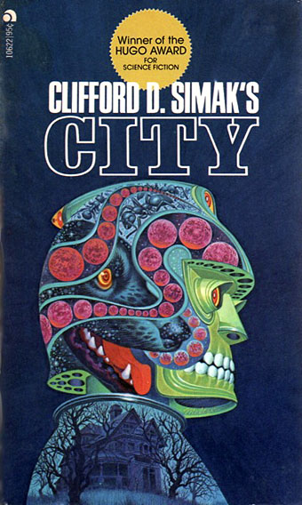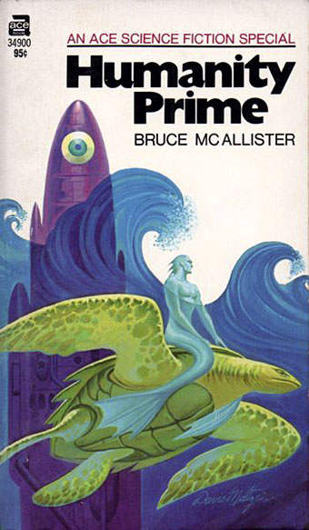
The art of Davis Meltzer, 1929–2017

meltzer01.jpg

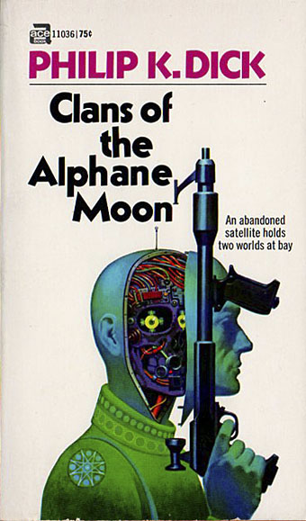
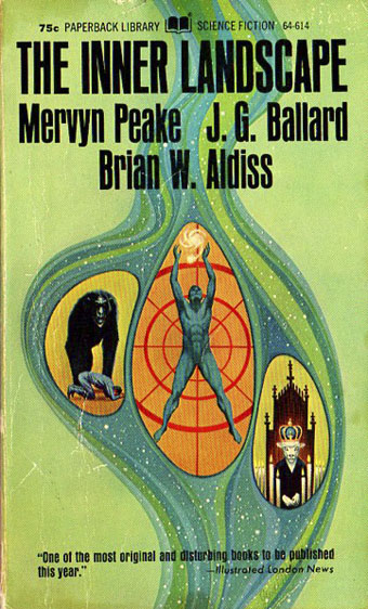
Illustrators were often easy to miss in the pre-internet days, when paperbacks published overseas could be hard to find or even see. Such is the case with Davis Meltzer whose work I hadn’t really noticed before until this cover turned up at 70s Sci-Fi Art. Meltzer had a long career as a scientific illustrator for National Geographic but his work as a cover artist for SF novels only lasted a decade, from 1970 to 1981. Not everything is as dramatically eye-catching as his Simak cover but there’s a unique sensibility at work, with only occasional similarities to other artists of his generation like Kelly Freas.

meltzer22.jpg

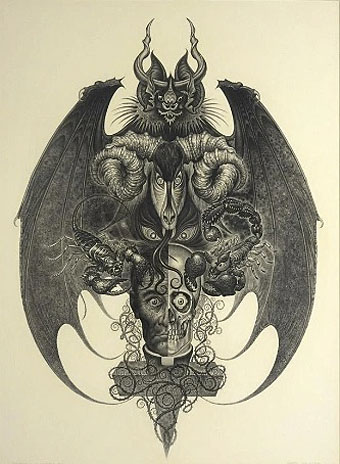
The Temptation of St. Gerome.

The piece above is from an auction site which doesn’t reveal any information apart from the title. If this was a religious illustration it’s one of the strangest I’ve ever seen. Auction listings state that Meltzer’s paintings were mostly done in gouache, a common medium for illustrators and graphic designers owing to its flat bright colours. The following selection favours the more visually arresting examples over generic spaceship art.

meltzer06.jpg

meltzer05.jpg

meltzer08.jpg

Continue reading “The art of Davis Meltzer, 1929–2017”

Weekend links 676

binnie.jpg

Sleeve Study, from Kakitsubata (1998) by Paul Binnie.

• “London was not a project for me. It was the curse that never stops giving.” Iain Sinclair talking to Matthew Stocker about his new book for Swan River Press, Agents of Oblivion.

The Ultimate DMT Breakthrough Replication Compilation, a video guide to the DMT experience by Josie Sims. Related: Kristen French on what hallucinogens will make you see.

• At Spoon & Tamago: A return to Tokyo Genso’s depictions of an urban Japan transformed by vegetation and neglect.

• New music: The Shell That Speaks The Sea by David Toop & Lawrence English.

• At Bajo el Signo de Libra: San Sebastián de Mártir a Icono Homosexual.

• Cosmic views from the Milky Way Photographer of the Year, 2023.

Nakamura Mitsue makes a Noh mask from a single block of wood.

• Mix of the week: A mix for The Wire by Eleni Poulou.

• At Dennis Cooper’s: Delphine Seyrig Day.

Of Ancient Memory (The Oblivion Seekers) (1994) by Jarboe | Oblivion (2001) by Lustmord | Oblivion (2004) by Redshift

Phantastische Edelmann

edelmann1.jpg

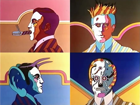
There’s more to Heinz Edelmann than the designs he created for Yellow Submarine, as Edelmann himself often used to remind people. And there’s more to his work for animated film than the Beatles’ exploits. Der Phantastische Film is a short introductory sequence for a long-running German TV series which has been doing the rounds for a number of years. Brief it may be but a couple of the monstrous details resemble those that Edelmann put into his covers for Tolkien’s books.

edelmann2.jpg

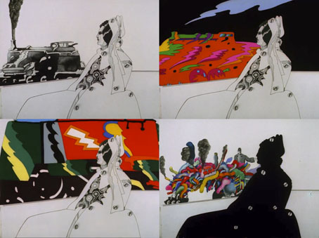
Edelmann had plans to capitalise on the success of Yellow Submarine with more films like this when he set up his own animation company, Trickfilm, but the only other example is The Transformer, a short about steam trains which he designed. (The direction was by Charlie Jenkins, with animation by Alison De Vere and Denis Rich.) Given the persistent popularity of Yellow Submarine I keep hoping someone might revive its style for something new. The first animated feature directed by Marcell Jankovics, Johnny Corncob, comes close but lacks the trippy Surrealism of the Beatles film. The Japanese can certainly do trippy Surrealism (see Mind Game or Paprika) but I’ve yet to see anything that approaches the Edelmann style. Johnny Corncob, incidentally, is now available on Region B blu-ray from Eureka. It’s worth seeing but the main film in the set, Son of the White Mare, is Jankovics’s masterpiece.

edelmann3.jpg

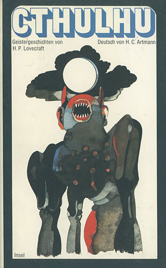
On a slightly related note, until today I hadn’t looked at ISFDB.org for Heinz Edelmann’s genre credits so I hadn’t seen this Lovecraft cover before. Hard to tell if this creature is supposed to be Cthulhu or Wilbur Whateley’s brother when The Dunwich Horror is one of the stories in the collection. Either way, it belongs in the Sea of Monsters. Insel Verlag published this one in 1968, a year before launching their special imprint devoted to fantastic literature, Bibliothek des Hauses Usher.

Previously on { feuilleton }
Return to Pepperland
The groovy look
The Sea of Monsters
Yellow Submarine comic books
Heinz Edelmann

X-ray visions

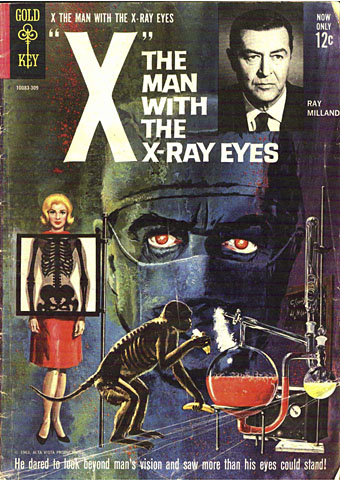
x1.jpg

Cover art by George Wilson.

Cosmic weirdness isn’t something you expect to find in the tie-in comics published by Gold Key in the 1960s, but this adaptation of Roger Corman’s film contains a few such traces, as does the film itself. Having watched X: The Man with the X-ray Eyes again recently I was curious to know how artist Frank Thorne would manage with the scenes where Dr Xavier’s vision is showing him more of the world than he wants to see. Despite the general sketchiness of the drawing, in some of the panels these visions are more fully realised than they are in the film, it being easier to draw an unusual effect than capture it on celluloid. Roger Corman had a great idea, a talented co-writer in Ray Russell, and an authentically tormented performance from Ray Milland, but the film is hampered by the limitations of AIP’s budgets. When Xavier complains about the oppressive sight of people above him on the floors of his tenement building only the comic shows us what he sees.
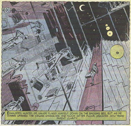
x3.jpg

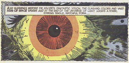
So too with the later scenes, by which time all of Corman’s point-of-view shots are the same combination of a diffracted lens (Spectarama!) and Les Baxter’s wailing theremin. Xavier’s description of a great watching eye “at the centre of the Universe” isn’t conjured so well by Corman’s visuals. The comic gives us an all-too-human eyeball floating in space, but before this there’s a panel of ragged shapes flapping through the interstellar void, as well as something never seen in the film when Xavier looks down into the Earth’s core.
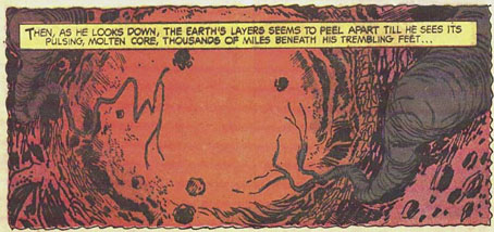
x4.jpg

The comic was written by Paul Newman (not that one), and was evidently adapted from a script rather than a print of the film. None of the characters or scenes resemble their cinematic equivalents, while Xavier’s eyes in the comic hardly change appearance. But the additions to the finale make me wonder whether there was a little more in the script than ended up in the film.

x2.jpg

Corman made The Man with the X-ray Eyes in 1963, immediately after The Haunted Palace—the first film to adapt HP Lovecraft—and a few years before The Trip—the first feature film devoted solely to the psychedelic experience. Xavier’s journey into nightmare is a curious hybrid of Lovecraft and psychedelia: the titles are set against a swirling violet spiral, while the doctor’s Spectarama visions are precursors of the delirium experienced by Peter Fonda’s Paul in The Trip. (Corman’s initial idea for The Man with the X-ray Eyes had a jazz musician taking too many drugs.) At one stage in his LSD trip Paul looks in a mirror and announces that he can see inside his own brain, but in the earlier film we get to see inside Xavier’s brain for ourselves when he takes his eye drops for the first time, after which the camera passes through the back of the doctor’s head until we’re looking out of his eyes. This is so close to a moment in Gaspar Noé’s Enter the Void that I’ve been wondering whether Corman’s film is another of Noé’s cult titles like those you see named at the beginning of Climax.
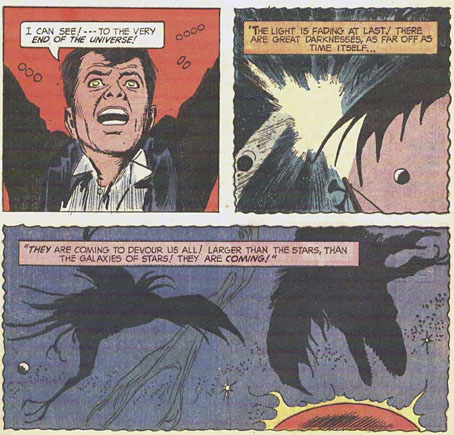
x5.jpg

As for the Lovecraftian quality, The Man with the X-ray Eyes misses an opportunity to do more with the scope of its central concept. Stephen King famously reported a rumour that the film had a suppressed line of dialogue from the very end, when Xavier tears out his eyes then screams “I can still see!” Corman denied that this was the case but admitted it was a good idea. King mentions this in Danse Macabre, in a description of the film which also interprets the story as being far more Lovecraftian—he uses that word—than it actually is. His suggestion (or mis-remembering) is that all the Spectarama effects are Xavier’s growing perception of the Eye at the centre of the Universe, even though Xavier only mentions this presence in the last few minutes.
x6.jpg

The implications of this remain unexplored but Xavier’s final vision of cosmic horror is still truer to Lovecraft’s Mythos philosophy—a warning that the human race peers into the void at its peril—than almost anything else in cinema, and the revelation is made all the more disturbing by the appearance of Xavier’s eyes which by this point are solid black orbs. As King suggests, there’s another film altogether lurking under the surface of this one, a horror film with a cosmic reach. Hollywood still struggles to do anything substantial with Lovecraft’s fiction, but you know the way things are today we’ll be lucky to get anything weirder than more CGI monsters and lumbering kaiju. I wouldn’t want to suggest that Gaspar Noé remake The Man with the X-ray Eyes but if he ever wanted to create a psychedelic horror story then the cosmic route is the way to go.

Previously on { feuilleton }
Undead visions
Trip texts revisited
More trip texts
Enter the Void

Dennis Leigh book covers

leigh03.jpg

Secker & Warburg, 1989.

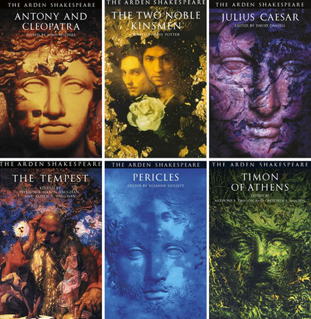
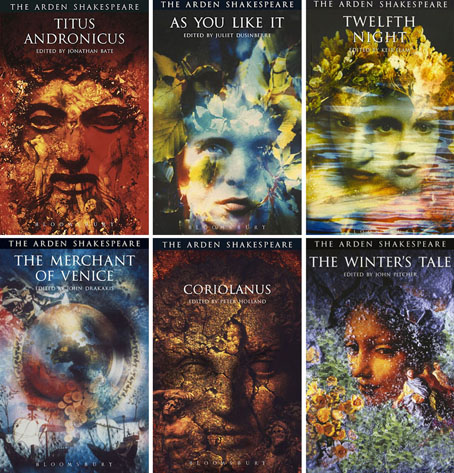
Most people will know Dennis Leigh—if they know him at all—as John Foxx, the name that Leigh adopted in the 1970s when he was the lead singer and songwriter in Ultravox! (That exclamation mark was a fixture for the group’s first two albums.) Foxx and Leigh maintained parallel careers for a while, or alternating careers in the 1990s when he was working more as an illustrator than as a musical artist.

leigh25.jpg

Routledge/Thomson Learning.

I’ve been asked a few times to consider writing about artists or designers who create covers for literary titles. This is something I often consider myself but the research is never easy. If you’re looking for genre titles you can go to isfdb.org and immediately find entries for hundreds of artists with lists of their credits; Dennis Leigh has an entry there himself. There’s no equivalent source for literary fiction, and nothing for crime novels or non-fiction either. This post is based on a list compiled by a correspondent (thanks, Marc!) to which I added a couple of discoveries of my own. It’s not complete but it ranges through Leigh’s career as a cover artist from the 1970s to the 2000s.

leigh26.jpg

Bloomsbury.

One of the useful things about Dennis Leigh having a more popular alter ego is the amount of interviews in which John Foxx discusses his work outside the music business. While researching this post I found a Smash Hits interview where Foxx mentions having attended Blackpool art college for a short time. This was the same art college that my mother attended in the 1950s, and a place I happily avoided myself. The college is so undistinguished I think Foxx/Leigh may be the only person of any note to have passed through its doors. A more recent interview for Shakespeare Magazine features some discussion of the techniques behind the book covers.

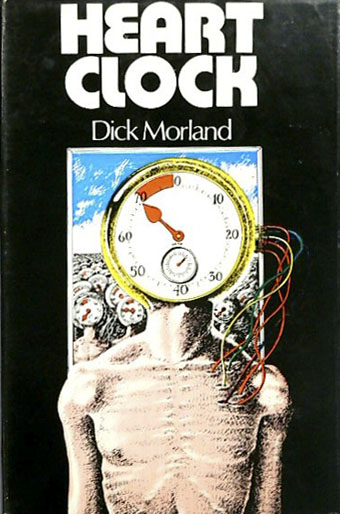
leigh01.jpg

Faber, 1973. Reginald Hill wrote two science-fiction novels as “Dick Morland”, this one and Albion! Albion! (1974). The latter is also listed as having a Leigh cover but the evidence for this is unclear so I’ve not included it.

Missing from this list are covers for novels by Neil Bartlett, Michael Cunningham, Evan Eisenberg, Eva Figes, and Marina Warner, all of which are only available as very low-grade images or not available at all. Another hazard when researching these posts is that artists and designers aren’t always credited, especially on paperbacks, so there may be a few more to be found. Be aware that some covers that might look like Dennis Leigh creations may be the work of somebody else. In the late 80s/early 90s there was a trend for Photoshop montage and what I call “artschool assemblage” (collage riffs on Joseph Cornell and others). If any of the examples here are erroneous attributions let me know.

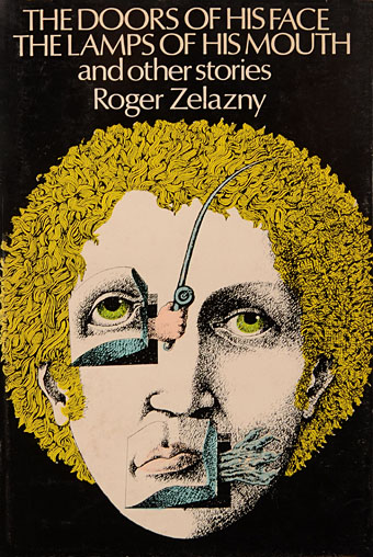
leigh02.jpg

Faber, 1973.

leigh04.jpg

Vintage, 1990.

Continue reading “Dennis Leigh book covers”