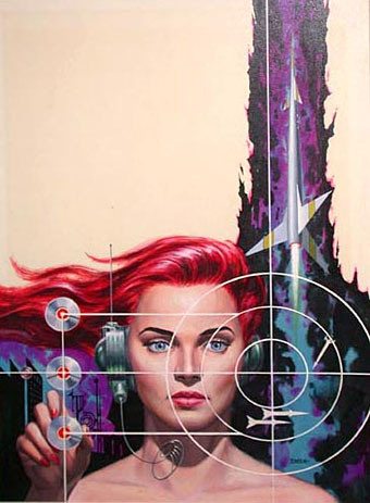
The art of Ed Emshwiller, 1925–1990

vance.jpg

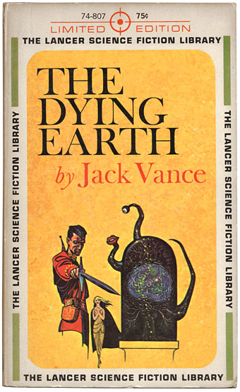
Another item brought to light during the Great Shelf Re-ordering and Spring Clean is this 1962 Lancer paperback of The Dying Earth by Jack Vance, a slim collection of six short connected stories, and another favourite book. Despite the SF label this is far more a work of fantasy (science fantasy, if you must), being tales of the bizarre and occasionally grotesque inhabitants of the last days of the earth. Magic is the order of the day, not advanced technology, although Vance hints that the book’s elaborate spells may be a higher ordering of mathematics capable of manipulating reality. I like the simple cover layout of this edition; Ed Emshwiller’s illustration manages to be sparing yet fully representative of a key scene.

emsh.jpg

French sf portal Noosfere has recently revamped its artwork showcase and has a substantial collection of Emshwiller’s cover paintings. I’d prefer to see more of his earlier style but the collection includes some striking designs.

sunstone.jpg

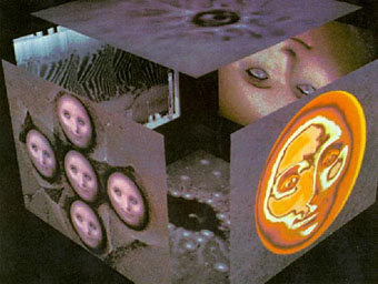
Sunstone (1979).

Emshwiller was a very prolific illustrator but from the 1960s on also developed his own style of experimental filmmaking, some examples of which can be found at YouTube. I’d actually seen Sunstone—a very early piece of computer animation—years ago without registering the credit. In addition there’s also Thanatopsis, a strange b&w short which is remarkably similar in tone to some of the films which William Burroughs and Antony Balch were making at around the same time.

The genre artist | Jack Vance profiled in the NYT

Elsewhere on { feuilleton }
The book covers archive
The illustrators archive

Previously on { feuilleton }
The King in Yellow
Ballantine Adult Fantasy covers
Clark Ashton Smith book covers
Revenant volumes: Bob Haberfield, New Worlds and others
The World in 2030
The art of Virgil Finlay, 1914–1971
Towers Open Fire

The King in Yellow

king_ace.jpg

Along the shore the cloud waves break,
The twin suns sink beneath the lake,
The shadows lengthen
In Carcosa.

Strange is the night where black stars rise,
And strange moons circle through the skies
But stranger still is
Lost Carcosa.

The King in Yellow, Act i, Scene 2.

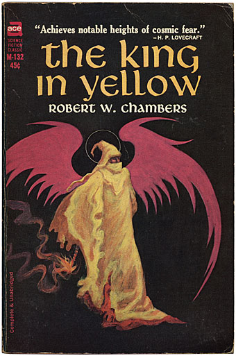
Rearranging the bookshelves this week had me looking again at this old Ace paperback of Robert Chambers’ weird classic, one of that select handful of books which can bear a blurb from HP Lovecraft. Any Lovecraft aficionados yet to read the first four stories in Chambers’ collection (the others pieces are of lesser interest) are missing out. These are as good as anything that Weird Tales published and together they achieve that unique blend of science fiction, fantasy and horror which Lovecraft and others also managed in the days when writers, and readers for that matter, were far less concerned with the definition and boundaries of genre.

king2.jpg

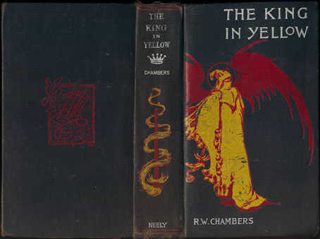
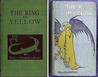
My Ace edition was the first paperback printing from 1965 and the cover painting is by Jack Gaughan, credited inside as being based on Chambers’ own first edition design. I’d often wondered what the original cover looked like and now, of course, it’s easy to find. Whether Chambers himself drew this is unclear but whoever the artist was, the design is rather more finessed than Gaughan’s sketchy painting.

king.jpg

Searching around reveals two further variations, one of which—the green cover—is described on a bookselling site as the actual first edition of the book from 1895. Yours for a mere $1,750. The other cover is probably a later reprint which gives a clearer view of the mysterious King. What’s notable here is the curious sigil on both the Neely editions. I was hoping this might be the dreaded Yellow Sign which is the subject of Chambers’ fourth (and Lovecraft’s favourite) story; it’s certainly more suitable than the squiggle which seems so unaccountably popular among certain quarters of Lovecraft fandom. It isn’t the Yellow Sign, however, it turns out to be the monogram for publisher F. Tennyson Neely. Perhaps this is just as well. “The solution to the mystery is always inferior to the mystery itself,” as Borges said, and some things, like the malevolent play which gives its name to this collection, are best kept out of reach.

The King in Yellow at the Internet Archive

Elsewhere on { feuilleton }
The book covers archive
The Lovecraft archive

Previously on { feuilleton }
Arthur Machen book covers
Clark Ashton Smith book covers

The Best of Michael Moorcock

mm1.jpg

The first of the books I’ve been designing for Tachyon Publications appears this month. Two more are due to follow and I’m working on another at the moment; more about those titles later.

The Best of Michael Moorcock was a pleasure to be involved with not only because I’ve been reading Moorcock’s fiction for a very long time but I’ve also been fortunate during that time to get to know the writer and Linda Moorcock, his wife. Mike likes the work I’ve done in the past for Savoy Books and we did have an anthology of his favourite pieces by other writers planned for Constable & Robinson back in 2005. That book didn’t work out so this makes up for its cancellation. This is an excellent anthology, put together initially as a private enterprise by editor John Davey who managed the difficult task of compiling a collection which ranges over forty years of writing. Ann and Jeff VanderMeer came aboard as co-editors for the Tachyon edition.

I’ve been working mainly on the interior design of the Tachyon volumes (although I’ve also done the cover for Jeff VanderMeer’s forthcoming Booklife) and for this title I took a cue from Ann Morn’s cover design which features a pair of gates emblazoned with large letter Ms. The title spread above takes the letter M from the typeface used for the author’s name and multiplies that to create an equivalent set of gates for the reader to pass through. I try to play down the pyrotechnics for fiction—the words are the important thing, not the graphic design—but since this was a story collection I thought I’d try illustrating each piece using the title typography alone. Most of these are done by using a suitable typeface but for a few pieces I managed to create an arrangement that reflected the story. Behold the Man (below) is the Nebula Award-winning story of a journey back in time to find the historical Jesus. The cross shape not only relates to the Biblical theme but also implies the crossed time streams and Moorcock’s layered, cross-cut narrative.

mm2.jpg

The Best of Michael Moorcock is available now from the usual sources and received a glowing review in the Guardian. Later this month, and other work permitting, I’m hoping to make a start on what will effectively be a companion volume, Savoy’s long-delayed Into the Media Web, another collection by John Davey which this time collects the best of Moorcock’s copious essays, reviews and other non-fiction.

Previously on { feuilleton }
Designing Booklife
The Sonic Assassins
Revenant volumes: Bob Haberfield, New Worlds and others
An announcement redux

Penguin science fiction

drought.jpg

The Drought, 1968; design by Richard Hollis, photography by Dr. J Comroe.

James Pardey contacted me earlier this week announcing his site devoted to Penguin Books’ science fiction covers. I posted some of my own dishevelled copies a while back and this news gives me an excuse to throw up another Ballard cover. Pardey’s site is just the kind of thing I enjoy seeing, with a comprehensive collection and detailed notes for each design. The front page is especially good since you can see immediately how the look of the titles evolved, from spare layouts and pictorial covers through to bold graphic design which culminates in David Pelham’s great run as designer during the 1970s. Creative Review posted a talk Pelham gave a couple of years ago which explores his work at Penguin and touches on the covers he did for Ballard. A shame they didn’t do a complete set of Ballard’s titles at the time, I’d have loved to see how he treated the other books.

Elsewhere on { feuilleton }
The book covers archive

Previously on { feuilleton }
Penguin Labyrinths and the Thief’s Journal
Penguin Surrealism
Penguin book covers