The art of John Alcorn, 1935–1992

alcorn16.jpg

Ad art for Seventeen magazine, August 1970.

Another member of the Groovy Set, John Alcorn was a very prolific illustrator and designer whose career included a period at Milton Glaser and Seymour Chwast’s Push Pin Studios. Alcorn’s art predates the groovy look, and also extends beyond it, but since I have a taste for this quasi-psychedelic style all the examples here are from the late 1960s/early 1970s. An overview of Alcorn’s career may be found in John Alcorn: Evolution by Design, a book edited by Stephen Alcorn and Marta Sironi which was featured at 50 Watts. And since I keep referring back to it, I’ve added some updates to the original groovy post.

alcorn12.jpg

The Astrology Album, 1967.

From an astrological album to astrological covers for Sydney Omarr’s books, 12 of which were published by Signet in 1969.

alcorn04.jpg

alcorn05.jpg

alcorn06.jpg

Continue reading “The art of John Alcorn, 1935–1992”

Weekend links 572

poumeyrol.jpg

L’Insolite (1980) by Jean-Marie Poumeyrol.

• “As we move down the ladder of prestige into the world of unvetted tweets, we observe an increasing difficulty, among people with very strong opinions, in exercising that basic critical competence of distinguishing between the authorial creation of a character, and the author’s affirmation of that character’s every moral trait and political view.” Justin EH Smith on the HR managers of the human soul.

• “When is a Didone not a Didone? How far must an exemplar Didone, like a Didot or a Bodoni, be altered before it loses its ‘Didoneness’?” John Boardley on the vexed question of font classification, and the need for an alternative to the present system.

• “Birds with Human Faces and Birds with Human Souls share shelf space with The Book of Owls and Expert Obedience Training for Dogs…” Joanna Moorhead visits the Casa Estudio Leonora Carrington in Mexico City.

“Indolent” is a funny way to characterize her natural state, which seems more like “incisive” to me, but I also have the unshakable sense—for myself—that writing can’t or shouldn’t look like staring into space or feel like not wanting to move from the couch. “A fraud is being perpetrated: writing is not work, it’s doing nothing,” she states in that first essay, from 1992. But she immediately counters with, “It’s not a fraud: doing nothing is what I have to do to live.” Listing a few more pertinent existential options, Diski ends with, “Or: writing is what I have to do to be my melancholy self.” The protoplasmic, chattering, melancholic “I” of these essays is, of course, the collection’s constant, its true subject. I can commiserate with her on every page even if emulation is out of reach.

Johanna Fateman on the incisive long-form criticism of Jenny Diski

• At Spine: Vyki Hendy identifies sunburst as a new trend in book cover design. I often think I overuse these things in my own cover designs which means I may be inadvertently (and fleetingly) trendy.

• At the Magnum Gallery, London: Metamorphoses, photographic studies by Herbert List of male bodies and Greek statuary.

• At Spoon & Tamago: A butterfly sipping moisture from puddles, sculpted entirely in wood by Toru Fukuda.

• At Dangerous Minds: Joseph Lanza on the easy listening side of psychedelic pop.

• At CounterPunch: Louis Proyect on thinking like an octopus.

• Mix of the week: Fact Mix 510 by Britton Powell.

Bye Bye Butterfly (1965) by Pauline Oliveros | Butterfly Mornings (2001) by Hope Sandoval & The Warm Inventions | Butterfly Caught (2003) by Massive Attack

The art of Mike Hinge, 1931–2003

hinge06.jpg

Amazing Science Fiction, May 1972.

Back in March I ended my post on the psychedelia-derived art style that I think of as “the groovy look” with the words “there’s a lot more to be found.” There is indeed, and I’d neglected to include anything in the post by Mike Hinge, a New Zealand-born illustrator whose covers for American SF magazines in the 1970s brought a splash of vivid colour to the groove-deprived world of science fiction. This was a rather belated development for staid titles like Amazing and Analog whose covers in the previous decade wouldn’t have looked out of place in the Gernsback era. Opening the door to someone like Mike Hinge, a graphic designer as well as a general illustrator, was probably a result of both magazines having undergone recent changes of editorship. Hinge approached SF art in the same way that Jim Steranko approached comic-book art in the late 1960s, importing trends that had been flourishing outside the medium. (And Steranko liked Hinge’s art enough to publish a portfolio of black-and-white drawings, The Mike Hinge Experience, in 1973.) This kind of graphic style was increasingly outmoded by the mid-70s but some of Hinge’s compositions are audacious in context: the Algol cover with one of his robots seen in a water reflection (and those ripples that defy perspective), the Analog cover that works both vertically and horizontally.

For this post I’ve favoured Hinge’s groovy look over other covers, especially those from the late 70s when his cover art shifted to a painted style which is less distinctive, and less interesting as a result. It’s the distinctive style that people still prefer today. There’s more to be seen at Tenth Letter of the Alphabet and Onyx Cube.

hinge21.jpg

Undated drawing (probably mid-60s).

Something else you can always find more of is Aubrey Beardsley borrowings. Via Tenth Letter of the Alphabet which has a couple more pieces in this style.

hinge19.jpg

Wraparound cover for Witzend #6, Spring 1969.

Witzend was a magazine of comics, fantasy stories and related art published by Wallace Wood, a complete run of which may be found here.

hinge01.jpg

Amazing Science Fiction, November 1970.

hinge02.jpg

The Leaves of Time (1971).

Continue reading “The art of Mike Hinge, 1931–2003”

Weekend links 570

griffin.jpg

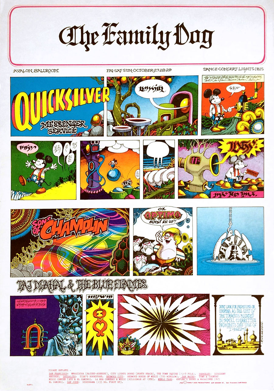
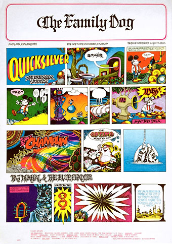
Rick Griffin’s comic-style poster for The Quicksilver Messenger Service at the Avalon Ballroom, October 1967.

• “Like ‘perversion,’ the word ‘script’ has a special meaning for Escoffier, who devotes most of the book’s attention to films featuring sex between men, and treats pornography as a vast screen on which all of our fantasies are projected.” Steve Susoyev reviews Sex, Society, and the Making of Pornography by Jeffrey Escoffier.

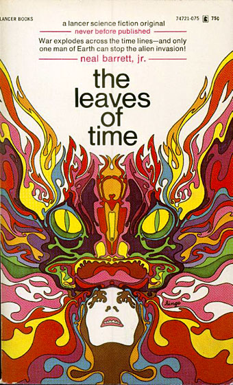
• “The themes reflect Griffin’s core obsessions: sex, death, Christ, flesh, liquids, goofy japes, and lysergic gnosis. Man from Utopia is an opus, one that Griffin felt strongly enough about to eschew the usual pulp, printing the cover on good full-color card stock.” Erik Davis on Rick Griffin and a comic book like no other.

Strange Things Among Us, a summer exhibition at The College of Psychic Studies, London, will include among its exhibits a room of art by Austin Osman Spare.

She delighted in the fact that after The Sadeian Woman, she ended up on the mailing lists of both pro- and antiporn groups, though no one (alas) ever sent her any actual porn. She aligns more naturally in retrospect with Madonna—potent, fiercely individualistic, disruptive, and self-invented. Carter’s evolved philosophical position on gender was a variation on Stoicism. Gender roles were “behavioural modes,” a construct (“Baby is hermaphrodite!”), and there was weakness in allowing oneself to be beholden to (let alone enslaved by) a construct. Above all, women should have total sexual agency and also their own money. “I became a feminist,” she wrote in a postcard to Susannah Clapp, “when I realised I could have been having all this instead of being married.”

Minna Zallman Proctor on the life and work of raucous fabulist Angela Carter

• New music: Chapter 4 by the Moritz Von Oswald Trio with Heinrich Köbberling & Laurel Halo, and Synth Vehicles For Guitar by Michael C. Sharp.

• DJ Food searched the back issues of International Times to find a handful of adverts for London’s legendary UFO Club.

• At Wormwoodiana: Mark Valentine explores Hy Brasil, a novel by Margaret Elphinstone.

• Remembering Tom of Finland through stories of those who knew him.

• What I’m Aiming For: Peggy Seeger’s favourite music.

• At Dennis Cooper’s: The Light Show (1965–1971).

• Mix of the week: Haze by The Ephemeral Man.

• A Strange Light From The East (1967) by Tuesday’s Children | Strange Things Are Happening (1968) by Rings & Things | Strange Walking Man (1969) by Mandrake Paddle Steamer

Weekend links 569

lehr.jpg

City with Eyes in Blue (1989) by Paul Lehr.

• “Lehr chose science fiction illustration because he saw it as a path to making a living and an opportunity to ‘depict the epic’. ‘War, destruction, celebration, congestion, marching armies, waving flags and banners—the strange and mysterious atmosphere of it all, rather than the literal illustration.'” Jane Frank on the art of Paul Lehr (1930–1998).

• “Time isn’t the only thing Harrison treats as firmly malleable. The same is true of his willingness to play with genre conventions…” Tobias Carroll on M. John Harrison, and an article where you have to ignore the clickbait clichés in the headline.

• The narrators for the forthcoming audiobook of Voice of the Fire by Alan Moore have been revealed.

• At Public Domain Review: A remembrance of aerial forms: Odilon Redon’s À Edgar Poe.

• The weight of the ritual: Frank Rynne on The Master Musicians of Joujouka.

• “Cerne Giant in Dorset dates from Anglo-Saxon times, analysis suggests.

Aaron Moth, the artist creating exquisite collages from vintage [gay] porn.

Clive Hicks-Jenkins on revision in illustration.

• At Wikimedia Commons: Lesbian pulp fiction.

• Mix of the week: A Wire mix by BLK JKS.

• At Dennis Cooper’s: Psychedelics.

Colleen‘s favourite albums.

Ritual Fire Dance (1969) by Tuesday’s Children | Ritual (1973) by Vangelis | Rituals (1981) by Bush Tetras