Gristleism

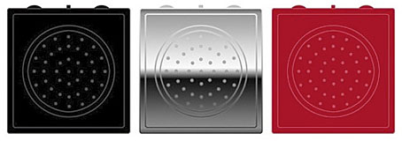
gristleism.jpg

In which the Buddha Machine returns as a bespoke instrument/greatest hits package from Industrial music outfit Throbbing Gristle. Having been a TG aficionado for many years, and being the proud owner of a Buddha Machine, this item looks like an essential purchase.

Thirteen original TG loops: a mix of experimental noise, industrial drone, and classic melodies and rhythms.
Built-in 50mm speaker, volume control, pitch-shift control and loop selector switch.
Features more loops and almost twice the frequency range of the original Buddha Machines.
Powered by two AA batteries.
Palm-Sized: W 67mm x H 69mm x D 35mm
Available in three colours: Black, Chrome and Red
UK Retail Price: 19.99 GPB
Designed by: Throbbing Gristle & Christiaan Virant
Concept by: Christiaan Virant
Manufactured by: Industrial Records Ltd
Music by: Throbbing Gristle

While we’re on the subject of music/noise and musical noise, there’s a couple of other recent discoveries worthy of mention. Inudge is another music-making web toy using loops and a grid system. Very easy to use and fun to play with. Less frivolously, the British Library opened its Archival Sound Recordings to the public earlier this month. I grew up by the sea, and still miss being near it, so the lapping wave soundscapes are a pleasant balm.

Previously on { feuilleton }
A=P=P=A=R=I=T=I=O=N
Uncopyable
Buddha Machine Wall
God in the machines
Layering Buddha by Robert Henke
Generative culture

Design as virus 11: Burne Hogarth

mighty_baby.jpg

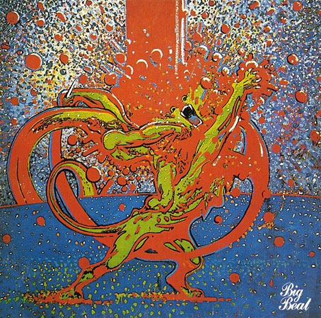
Mighty Baby (1969). Illustration by Martin Sharp.

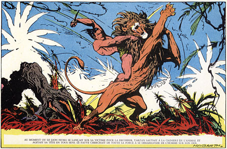
Yet another album cover prompts this post, part of an occasional series. Mighty Baby were a British rock band who formed out of psychedelic group The Action in the late Sixties, and their music is fairly typical of the period, being “heavy” without any of the psych trappings which—for me—often make everything from that time a lot more interesting. This was a journey undertaken by many groups at the end of that lurid decade, a junking of the playful and evocative side of what was now called rock music in favour of a denim-clad earnestness. This album isn’t one I like very much—I’d rather listen to their earlier incarnation—but the cover painting by psych artist Martin Sharp is certainly a startling piece, being a violent mutation of one of the most famous Tarzan drawings by comic artist Burne Hogarth.

hogarth.jpg

Tarzan by Burne Hogarth (194?).

Hogarth was drawing Tarzan for much of the 1940s and this particular panel showing the Ape-Man attacking Numa the lion dates from the latter part of his run on the series. I wish I could pin this to an actual year but I don’t have a complete set of the comics and that detail eluded me. If anyone knows the date, please leave a comment.

Continue reading “Design as virus 11: Burne Hogarth”

La fièvre d’Urbicande by Schuiten & Peeters

urbicande1.jpg

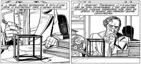
La fièvre d’Urbicande (1985) by François Schuiten and Benoît Peeters is the second volume in the Cités Obscures series. This was the one which captured my attention the most when I first saw it. The book opens with a foreword by the central character, Robick, chief architect of the city of Urbicande, in which he discusses his plans to unify the city’s separate halves by extending the design of the city’s southern half into the chaotic northern section.

urbicande2.jpg

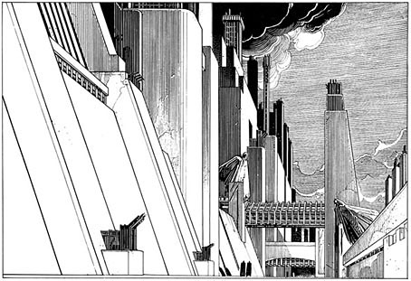
Urbicande is built on the steeply-sloped banks of a wide river. The rational, rectilinear southern bank is exposed to the sun while the northern bank is a place of shadow and mists; traffic between the two halves is strictly controlled by the administrators of the south who fear the chaos the north represents. The style of the southern region is a superb imagining of an Art Deco metropolis, the physical and psychological opposite of the north bank which is revealed as an older place of winding lanes and dishevelled buildings. In Robick’s foreword he refers to former “masters” who happen to be people from our world: architect Étienne-Louis Boullée and architectural renderer and theorist Hugh Ferriss. Mention of Ferriss was a surprise since he isn’t so well-known outside the architectural sphere. I’ve previously discussed his Metropolis of Tomorrow which is an evident influence in the style of some of Schuiten’s skyscrapers.

Continue reading “La fièvre d’Urbicande by Schuiten & Peeters”

Design as virus 10: Victor Moscoso

india.jpg

Continuing an occasional series.

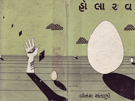
A recent post at A Journey Round My Skull is a stylish series of Indian book jackets from 1964 to 1984. These impress partly for the way they rework western design approaches, and they consequently look very different from the florid visuals one might (lazily) expect of Indian cover design. Western culture borrowed more than enough from India in the 1960s, from clothes to music, so it only seems right that the sub-continent should be free to take something back.
luna.jpg

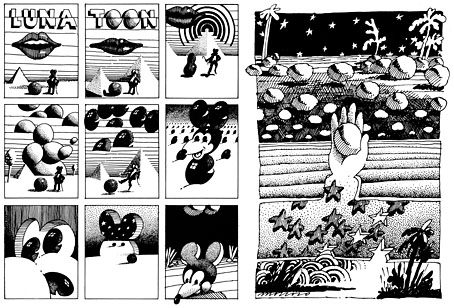
Luna Toon by Victor Moscoso (1968).

Will at A Journey Round My Skull mentions the above cover design as reminding him of this Krautrock bible, The Crack in the Cosmic Egg, a book which happens to be a favourite repository of musical obsession. The cover reminded me more of the weirdly abstract comic strips created by artist and graphic designer Victor Moscoso for the early run of Zap Comix in the late Sixties. Moscoso was one of the most graphically revolutionary of the West Coast poster artists, and his approach to comics looks surprisingly fresh today next to the work of fellow artists like Robert Crumb. Those limitless vistas go back to Giorgio de Chirico but it was Salvador Dalí who made deserts raked by evening shadows reflect interior landscapes of his own, and it was Dalí’s immense popularity that in turn popularised that endless plane as a stage for surreal events. Moscoso borrows from the Surrealists and comic artists like George Herriman as much as he borrows from Disney; in his posters he was one of many artists taking motifs or whole designs from Art Nouveau. Our Indian egg may well be an original work but the first example in Will’s post is a very Saul Bass-like hand, so I’m guessing that the designers of these books were looking around for inspiration. And that eye-in-a-hand? Moscoso had done that as well.
neon.jpg

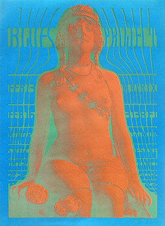
Blues Project Poster by Victor Moscoso (1967).

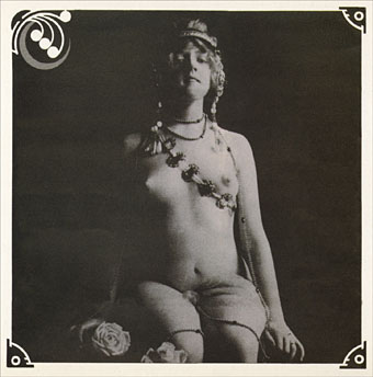
While we’re discussing Victor Moscoso, it’s convenient to draw attention to a slight mystery connecting his poster art and the great album cover designer, Barney Bubbles. The poster above was one of a number that Moscoso made incorporating Victorian or Edwardian photographs, and two at least of these use antique erotica as their central image.
ritual.jpg

Space Ritual interior, design by Barney Bubbles (1973).

This particular photo always stands out for me. The woman is familiar to anyone who’s seen the interior of the fold-out sleeve Barney Bubbles created for Hawkwind’s Space Ritual album in 1973. Barney spent some time in San Francisco in the late Sixties and was undoubtedly familiar with Moscoso’s work, as he was with all the great designs coming from the West Coast at that time. What surprises me is that he should have somehow found the same image to use as Moscoso did. Was there a popular book of Edwardian erotica which everyone was familiar with? Did he ask Moscoso where he’d found the photo? Did he find it by chance? Barney Bubbles experts don’t know the answer (I’ve asked) and the question is in any case a rather trivial one. But I’m still curious… As early porn photos go it’s a particularly fine one and I’d like to know whether there are more like it and where it came from. Needless to say, if anyone knows more about this, please leave a comment.

Previously on { feuilleton }
Design as virus 9: Mondrian fashions
Design as virus 8: Keep Calm and Carry On
Design as virus 7: eyes and triangles
Design as virus 6: Cassandre
Design as virus 5: Gideon Glaser
Design as virus 4: Metamorphoses
Design as virus 3: the sincerest form of flattery
Design as virus 2: album covers
Design as virus 1: Victorian borders