
Category: {music}
Music
Tony Wilson, 1950–2007
Paul Morley remembers Tony Wilson in The Observer.
Occultism for kids
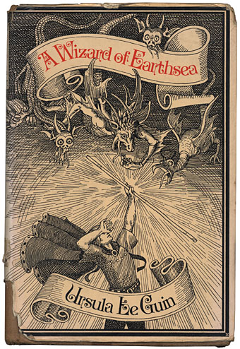
My battered 1973 Gollancz hardback. Cover illustration by David Smee.
It may be all Harry Potter starter homes crowding the imaginative landscape these days but the lush fields of the early Seventies bred a peculiar brand of wizardry and wild romance, something I was reminded of recently by reviews of a new compilation of psychedelic singles (yes, another one), Real Life—Permanent Dreams on the Castle Communication label. Mention of a curio from the heady days of 1970, Tarot by Andrew Bown, summoned vague memories of a childrens’ television series, Ace of Wands, for which Tarot was the theme song. You can see the title sequence here and this clip compilation features the whole song plus trippy lyrics (“Velvet roofs, tattooed skies, patterns made from words…”). The wonderfully facetious TV Cream describes the series thus:
ACE OF WANDS (1970–72), THAMES TELEVISION. Jim-Morrison-alike boy magician Tarot (MICHAEL MACKENZIE) has adventures through history, for which read cheap studio set representing pyramid, cheap studio set representing Stonehenge and so on. DR WHO-style menace on a budget. Fought enemies such as Madame Midnight, Mr Stabs and Mama Doc, aided by an owl called Ozymandias (played by FRED THE OWL). Tarot cards and tarot phenomena abounded, much worthy roustabouts ensued. Prog-heavy title theme babbling – “Jet white dove/Snow black snake/Time has turned his face/From the edge of mystery” – singularly failed to assault the charts.
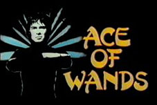 I’ve mentioned before how magic and occultism were more popular at this time than they’ve probably ever been, and this flush of popularity, much of it coming from underground culture, managed to work its way into children’s television in a diluted form. Ace of Wands is easily the most baroque example of this, mixing the bell-bottom trendiness of Jason King with pulp plots given a psychedelic twist (hallucinogenic gases anyone?). Also from 1970 and far more down-to-earth (and, it should be said, more fun for kids) was Catweazle, written by Richard Carpenter and starring Geoffrey Bayldon. TV Cream has the details again:
CATWEAZLE (1970–71), LWT. Hairy tinker who can’t speak but who’s really an 11th Century magician (and who’s really GEOFFREY BAYLDON) tries to escape from some pissed off Norman soliders, jumps in a pond to hide and finds himself transported to Children’s Film Foundation-era Britain. Luckily there’s a posh (as always) boy on hand to explain all our modern day shit to him.
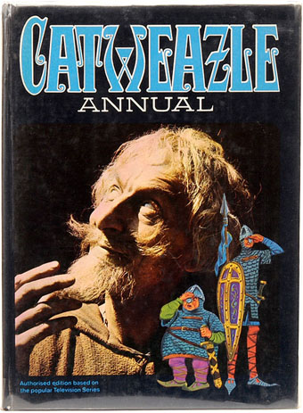 Catweazle quickly became the most popular kids’ progamme of its day and part of its attraction was the way in which Bayldon’s Norman time-traveller mistranslated modern technology as magic. So the telephone became a device called the “telling bone”, electricity was “electrickery” and so on. I had the first Catweazle annual which was an odd mixture of comic strips, text stories and articles about stage magicians with a smattering of genuine occult history.
Best of all for this Seventies kid was my favourite reading on the frequently dull Jackanory (“Ramshackle reading-is-fun relic wherein a Famous Person would sit on a chair with a pretend book and ponderously recount the contents of your local mobile library” says TV Cream) which one week had Ursula K Le Guin‘s A Wizard of Earthsea as its featured book. Try as I might, I’ve been unable to find the name of the actor who read this (black clothes, medieval chair) but I was knocked out by it. Years later the Earthsea cycle is still the only work of Le Guin’s I’ve been able to read, her science fiction seemed boring by comparison.
The inflated success of Harry Potter has had people casting about for JK Rowling’s influences over the past few years. A Wizard of Earthsea was first published in 1968 and also concerns a school of wizards, as do several other pre-HP novels. Rowling has acknowledged this although that acknowledgement hasn’t been loud or regular enough to appease a grouchy Le Guin. The Earthsea books are a lot shorter than the Potter door-stops and the first book at least is rather more sophisticated, reading equally well as a fantasy adventure for children and as a Jungian fable for adults with hints of Buddhist or Taoist philosophy. The characters are also notable for not being the Caucasians that most fantasy characters usually are, one of many details a recent TV adaptation (which Le Guin condemned) managed to ignore. It’s worth noting that JK Rowling is part of my generation (I’m 45, she’s 42) so she would have watched all this Seventies stuff herself. One of the reasons fantasy readers and writers (as opposed to snooty broadsheet critics) are often disappointed by the Potter juggernaut is that it could have been so much more considering the wealth of precedent that it draws upon. But then books rarely achieve this scale of popularity without being conservative and undemanding, Rowling’s work is merely the most recent example of this.
Le Guin spoiled the impact of her excellent first Earthsea book with several sequels of diminishing interest. A new animated film from Japan, Gedo Senki or Tales from Earthsea, based on the later works is released in the UK this month. The great British director Michael Powell had plans for an Earthsea adaptation scripted by Le Guin when he was director in residence at Francis Coppola’s Zoetrope Studios in 1980. Powell was great with fantasy (watch his Thief of Bagdad) so it’s a shame that nothing came of this. Ace of Wands is on DVD now and so is Catweazle. I can’t vouch for the former having much value beyond pure nostalgia but there’s plenty of clips from the latter at YouTube. Proceed with caution.
Previously on { feuilleton }
• The art of Bob Pepper
• Of Moons and Serpents
• Austin Osman Spare
Impressions de la Haute Mongolie revisited
Impressions de la Haute Mongolie – Hommage á Raymond Roussel (1974-75).
When I wrote a short reminiscence about Impressions de la Haute Mongolie last March I really didn’t expect I’d be watching it again just over a year later having waited thirty years for the opportunity. But now we can all see José Montes-Baquer’s collaboration with Salvador Dalí, thanks to the indispensable Ubuweb. The copy there doesn’t have English subtitles, unfortunately, but the visuals are still beguiling and not too difficult to follow if you can understand some French and Spanish. It was a curious experience seeing this again, some parts I remembered very well, others I’d completely forgotten about. Most surprising was the soundtrack of electronic music, much of it taken from recordings by Wendy Carlos, including a part of her ambient Sonic Seasonings suite and portions of her complete score for A Clockwork Orange. There’s more about this deeply strange film in Tate Etc.
And speaking of surreal landscapes, it’s worth mentioning that I’ve spent the past few weeks working on a new piece of Lovecraft-themed artwork for an exhibition at Maison d’Ailleurs, the Museum of science fiction, utopia and extraordinary journeys in Yverdon-les-Bains, Switzerland. The exhibition of newly-commissioned work based on themes from HP Lovecraft’s Commonplace Book will be launched in October 2007. More details about the event, and my contribution, closer to that date. In the meantime, the European edition of TIME magazine has a short feature about the gallery and its ethos.
Previously on { feuilleton }
• Dalí and Film
• Ballard on Dalí
• Fantastic art from Pan Books
• Penguin Surrealism
• The Surrealist Revolution
• The persistence of DNA
• Salvador Dalí’s apocalyptic happening
• The music of Igor Wakhévitch
• Dalí Atomicus
• Las Pozas and Edward James
• Impressions de la Haute Mongolie
The Demon Regent Asmodeus
The Demon Regent Asmodeus (2006).
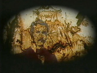
Alan Moore readers have finally discovered my little easter egg on the Mindscape of Alan Moore DVD so I can now talk about the creation of this miniature work. Director Dez Vylenz and I thought it would be nice to have a hidden extra somewhere on the main disc and this was the result.
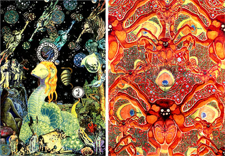
Glykon and Asmodeus by Alan Moore (1994).
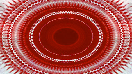
I’d always liked the Asmodeus section that Alan reads on the first Moon & Serpent CD and had the idea for some kind of animation based around the reading using his 1994 portrait of Asmodeus for the visuals. I used Apple’s Motion application for the animation of the DVD menus and it was this application that also animated the three-minute film. Alan’s picture was the sole source for all the visuals even though for most of the running time these are a kaleidoscopic mesh of circles and hexagons. The reading (with sound effects by Tim Perkins) works symmetrically, building to a central point then reversing itself so that the words from the first half are read in reverse order. I followed this scheme with the animation; the film begins in abstraction, evolves into the Asmodeus portrait then devolves back into abstraction. There’s also a symmetrical split to the visuals which are matched along a vertical axis in the centre of the screen. I had James Whitney’s Lapis in mind when creating these circular patterns although Whitney’s forty-year-old film remains abstract throughout. Whitney’s film was also done the hard way, one frame at a time, without the luxury of computer filters.
The Mindscape of Alan Moore is available via mail order from Shadowsnake Films.
Previously on { feuilleton }
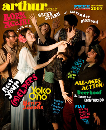
• Alan Moore in Arthur magazine
• Of Moons and Serpents
• Lapis by James Whitney