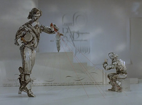
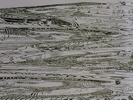
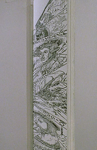
La fièvre d’Urbicande by Schuiten & Peeters

urbicande1.jpg

La fièvre d’Urbicande (1985) by François Schuiten and Benoît Peeters is the second volume in the Cités Obscures series. This was the one which captured my attention the most when I first saw it. The book opens with a foreword by the central character, Robick, chief architect of the city of Urbicande, in which he discusses his plans to unify the city’s separate halves by extending the design of the city’s southern half into the chaotic northern section.

urbicande2.jpg

Urbicande is built on the steeply-sloped banks of a wide river. The rational, rectilinear southern bank is exposed to the sun while the northern bank is a place of shadow and mists; traffic between the two halves is strictly controlled by the administrators of the south who fear the chaos the north represents. The style of the southern region is a superb imagining of an Art Deco metropolis, the physical and psychological opposite of the north bank which is revealed as an older place of winding lanes and dishevelled buildings. In Robick’s foreword he refers to former “masters” who happen to be people from our world: architect Étienne-Louis Boullée and architectural renderer and theorist Hugh Ferriss. Mention of Ferriss was a surprise since he isn’t so well-known outside the architectural sphere. I’ve previously discussed his Metropolis of Tomorrow which is an evident influence in the style of some of Schuiten’s skyscrapers.

Continue reading “La fièvre d’Urbicande by Schuiten & Peeters”

Design as virus 10: Victor Moscoso

india.jpg

Continuing an occasional series.

A recent post at A Journey Round My Skull is a stylish series of Indian book jackets from 1964 to 1984. These impress partly for the way they rework western design approaches, and they consequently look very different from the florid visuals one might (lazily) expect of Indian cover design. Western culture borrowed more than enough from India in the 1960s, from clothes to music, so it only seems right that the sub-continent should be free to take something back.

luna.jpg

Luna Toon by Victor Moscoso (1968).

Will at A Journey Round My Skull mentions the above cover design as reminding him of this Krautrock bible, The Crack in the Cosmic Egg, a book which happens to be a favourite repository of musical obsession. The cover reminded me more of the weirdly abstract comic strips created by artist and graphic designer Victor Moscoso for the early run of Zap Comix in the late Sixties. Moscoso was one of the most graphically revolutionary of the West Coast poster artists, and his approach to comics looks surprisingly fresh today next to the work of fellow artists like Robert Crumb. Those limitless vistas go back to Giorgio de Chirico but it was Salvador Dalí who made deserts raked by evening shadows reflect interior landscapes of his own, and it was Dalí’s immense popularity that in turn popularised that endless plane as a stage for surreal events. Moscoso borrows from the Surrealists and comic artists like George Herriman as much as he borrows from Disney; in his posters he was one of many artists taking motifs or whole designs from Art Nouveau. Our Indian egg may well be an original work but the first example in Will’s post is a very Saul Bass-like hand, so I’m guessing that the designers of these books were looking around for inspiration. And that eye-in-a-hand? Moscoso had done that as well.

neon.jpg

Blues Project Poster by Victor Moscoso (1967).

While we’re discussing Victor Moscoso, it’s convenient to draw attention to a slight mystery connecting his poster art and the great album cover designer, Barney Bubbles. The poster above was one of a number that Moscoso made incorporating Victorian or Edwardian photographs, and two at least of these use antique erotica as their central image.

ritual.jpg

Space Ritual interior, design by Barney Bubbles (1973).

This particular photo always stands out for me. The woman is familiar to anyone who’s seen the interior of the fold-out sleeve Barney Bubbles created for Hawkwind’s Space Ritual album in 1973. Barney spent some time in San Francisco in the late Sixties and was undoubtedly familiar with Moscoso’s work, as he was with all the great designs coming from the West Coast at that time. What surprises me is that he should have somehow found the same image to use as Moscoso did. Was there a popular book of Edwardian erotica which everyone was familiar with? Did he ask Moscoso where he’d found the photo? Did he find it by chance? Barney Bubbles experts don’t know the answer (I’ve asked) and the question is in any case a rather trivial one. But I’m still curious… As early porn photos go it’s a particularly fine one and I’d like to know whether there are more like it and where it came from. Needless to say, if anyone knows more about this, please leave a comment.

Previously on { feuilleton }
Design as virus 9: Mondrian fashions
Design as virus 8: Keep Calm and Carry On
Design as virus 7: eyes and triangles
Design as virus 6: Cassandre
Design as virus 5: Gideon Glaser
Design as virus 4: Metamorphoses
Design as virus 3: the sincerest form of flattery
Design as virus 2: album covers
Design as virus 1: Victorian borders

A=P=P=A=R=I=T=I=O=N

apparition.jpg

A=P=P=A=R=I=T=I=O=N is a collaboration between artist Cerith Wyn Evans and Throbbing Gristle, the once notorious Industrial music act now enjoying a resurgence of activity and attention. Evans and TG have an earlier connection via Derek Jarman, for whom Evans worked as an assistant. Given how much I enjoy seeing mirrors used in art, I’m very taken with these, and knowing that they function as drifting speakers transmitting specially recorded TG audio makes them doubly interesting. The mirrors-plus-audio aspect is reminiscent of Josiah McElheny’s recent Island Universes with Paul Schütze but that’s not to imply any influence, both artists have been following their individual paths for some time.

The title of this work comes from a poem by Stephan Mallarmé (1842–1898), a poet closely associated with the Symbolists. Looking at an English translation, the piece ends with the line “a snow of white bouquets of perfumed stars”; that final, impossible flourish—perfumed stars—is a very Symbolist touch. Claude Debussy, who took the title of his Prélude à l’après-midi d’un faune from Mallarmé, set Apparition to music in 1884.

A=P=P=A=R=I=T=I=O=N can be seen at Tramway, Glasgow until September 27, 2009.

A=P=P=A=R=I=T=I=O=N test run on Chris Carter’s Flickr pages.

Previously on { feuilleton }
In the Shadow of the Sun by Derek Jarman
The art of Josiah McElheny

Battersea Power Station

battersea.jpg

A photograph of the control room of Battersea Power Station, London, by Michael Collins, one of a series which will shortly be on display at the Royal Institute of British Architects.

The images show Battersea Power Station as what Collins describes as a “twentieth century ruined castle” – a building that was built to last, with a high quality structure and interior, including Art Deco walls and ceilings.

Giles Gilbert Scott’s enormous temple of heavy industry continues to sit decaying on the banks of the Thames while property developers come and go. The latest of these, Real Estate Opportunities, has fallen into debt which means proposals to develop the site are once again on hold. A part of me likes the idea of the building sitting there unused and purposeless year after year, like some vast Steampunk Stonehenge; Giles Gilbert Scott’s other Thames-side power station, Bankside, was successfully transformed as Tate Modern, but we know from various proposals that the fate of Battersea, whether as theme park or shopping centre, is likely to be a lot less edifying.

quark1.jpg

It took redevelopment to transform Bankside from temple of industry to temple of culture but Battersea’s unmistakable presence has a powerful cultural history of its own. Everyone knows the Hipgnosis sleeve design for Pink Floyd’s Animals (1977); less familiar is the photos of the control room which Hipgnosis used for Hawkwind’s Quark, Strangeness and Charm the same year. I tend to prefer the back cover of this sleeve to the front; that octagonal readout device is more interesting than the rather unconvincing sparks and exchanges of energy. And speaking of energy, my former employers are still active, unlike the rancorous Floyd.

quark2.jpg

There’s a page here listing other uses of the power station, including its many film appearances which date back to the 1930s. That list mentions the control room’s use as a background for the “Find the Fish” sequence in Monty Python’s The Meaning of Life (1983) but they omit an earlier Monty Python appearance when you briefly see the building in operation during And Now for Something Completely Different (1971). It was closed down a few years later. So here it is, then, belching fumes over west London on a profoundly gloomy winter afternoon.

battersea2.jpg

Elsewhere on { feuilleton }
The album covers archive

Previously on { feuilleton }
The Sonic Assassins
The Bradbury Building: Looking Backward from the Future