New things for November II

newthings_0711.jpg

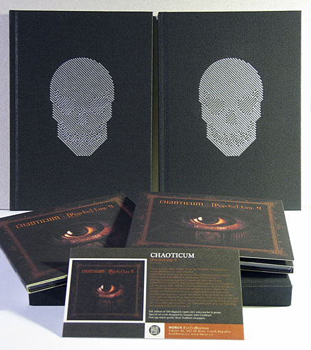
It’s always nice when something you’ve worked on turns up in the post and there’s been a double helping of that this week with the arrival of the Chaoticum CD and the catalogue for the Maison D’Ailleurs exhibition. Since both of these are either partly or wholly connected to HP Lovecraft, their simultaneous arrival is fitting.

The CD is a digipak on textured art paper and another quality production from Horus CyclicDaemon. The exhibition catalogue manifested as a small hardback book which was a pleasant surprise, with the skull maze design blocked in silver on the cover. Each artist is allotted a single page and the book also includes some original fiction based on Lovecraft’s story notes by a number of well-known writers. My picture is rather shrunken the way it’s positioned across the centre of a page (would have been better running vertically) but then it was my decision to make it so wide in the first place.

The Chaoticum CD is limited to 500 copies and can be ordered here. The catalogue is available from Maison D’Ailleurs or the Payot Libraire bookstore for CHF 37.00 + p&p (or 38, depending on which page you look at).

bishop.jpg

Also arriving this week is my illustration of ex-Sun City Girls guitarist Sir Richard Bishop for an Arthur Magazine interview by Erik Davis. Arthur #27 will be hitting the stands in the US and Canada shortly but for now you can download it in PDF form here.

Previously on { feuilleton }
• Lovecraftian horror at Maison d’Ailleurs
• New things for October
New things for November

pinch.jpg

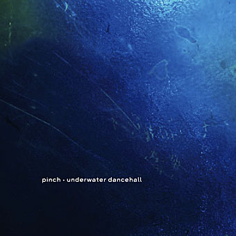
So then, where were we? There’s a few things to catch up with… First up, a recent design of mine for CD and vinyl has been released this month, Underwater Dancehall by Pinch, an acclaimed dubstep album from Bristol. I was very pleased at the way this came out, not least because of the excellent photos by Liz Eve I was given to use.

book_of_biblio.jpg

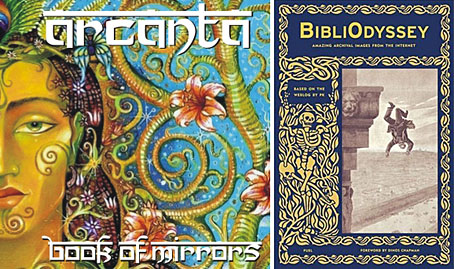
Then a couple of gratuitous plugs: Thom sent me a copy of his Arcanta CD, Book of Mirrors, this week. The luscious cover art is by Philip Shadbolt and you can learn more about Arcanta at their MySpace page. And Mr PK (who you should know now from BibliOdyssey) has a book out this month, a paper approximation of his excellent pictorial smorgasbord. PK denies his book is the perfect present for Christmas and discusses his book and blog at 3quarksdaily.

The poster art of Richard Amsel

amsel.jpg

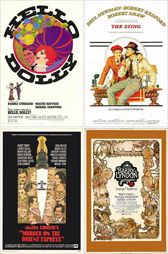
Hello Dolly (1969); The Sting (1973).
Murder on the Orient Express (1974); Barry Lyndon (1975).

Thanks are due for today’s post to Sebastiane who reminded me of the poster art that Richard Amsel produced through the Seventies up to the mid-Eighties. Together with Bob Peak, Amsel was a major exponent of the illustrated poster, a form that’s now completely vanished from cinema promotion in a sea of floating Photoshop heads and persistently lazy design. Amsel’s most famous piece in terms of success and visibility is probably his Raiders of the Lost Ark poster (and its variants) but I tend to prefer his work from the previous decade.

I collected film posters for a while and have one of Amsel’s Chinatown designs packed away somewhere. The Hello Dolly poster above was his first commission and must count as the first and only time a Spirograph was used (for the flowers) to create a design for a major Hollywood production. The Amsel page at American Art Archives notes that the poster for The Sting is a pastiche of the very popular (and gay) JC Leyendecker whose magazine and advertising art was contemporary with the film’s setting. This is exactly the kind of thing that can’t be done with ease today when the art is predominantly a product of digital techniques.

Amsel died in 1985, an early victim of the AIDS pandemic which possibly explains why there isn’t a site dedicated to his work as there is for Bob Peak. This page features a few examples of Amsel’s other work, however, including his instantly recognisable Divine Miss M album cover for Bette Midler. And there’s a small gallery of his posters at IMP.

Update: A retrospective article and marvellous gallery of Amsel’s work by Adam McDaniel

Elsewhere on { feuilleton }
• The illustrators archive

Previously on { feuilleton }
• Bollywood posters
• Lussuria, Invidia, Superbia
• The poster art of Bob Peak
• A premonition of Premonition
• Perfume: the art of scent
• Metropolis posters
• Film noir posters

Bollywood posters

bollywood.jpg

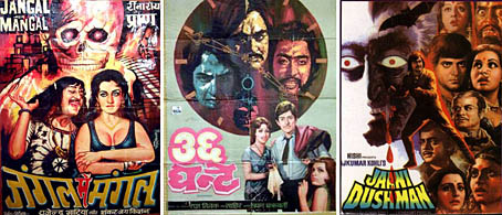
left: Jangal Mein Mangal (1972); centre: Shalimar (1978); right: Jaani Dushman (1979).

Three examples of the art of the lurid from this site which has a huge selection of Indian poster art from the Fifties on. I still haven’t seen Shalimar but I’ve been playing the great soundtrack by India’s Ennio Morricone, Rahul Dev Burman, continually for the past year. There’s also several pages of Lollywood billboards from Pakistan. And a gallery of posters for trashy horror movies from the west; these people are lurid connoisseurs. I actually own the David Cronenberg Shivers/Rabid poster on that pulp page, something I’d completely forgotten about. Had I seen the utterly dreadful art for Zuma 2: Hell Serpent earlier I could have included it in the Men with snakes post.

Previously on { feuilleton }
• Lussuria, Invidia, Superbia
• Zeppelin vs. Pterodactyls
• The poster art of Bob Peak
• A premonition of Premonition
• Perfume: the art of scent
• Metropolis posters
• Film noir posters
• Shalimar by Rahul Dev Burman

From LSD to OSX

itunes_jelly.jpg

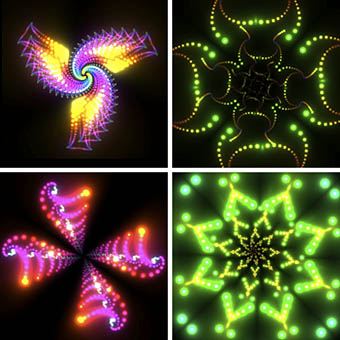
A few servings of iTunes jelly.

I’ve spent the past week or so enjoying the delights of Leopard, the 10.5 iteration of Apple’s OS X operating system, but have only just noticed the new Visualizer patterns in the latest version of iTunes. I don’t use the Visualizer much, especially since the introduction of Front Row, Apple’s home media management system, but it’s always nice to know it’s there. The original Visualizer isn’t so far removed from the graphic tricks I used to laboriously program into my old Spectrum computer in the 1980s, simple repeated shapes with coloured lines, albeit a lot faster and with far more detail and animation than a 48k Spectrum could ever manage. The latest Visualizer has been significantly supercharged, however, and the new “Jelly” setting creates some really beautiful (and it should be noted, trippy) patterns, reminiscent of Steven Spielberg’s Close Encounters UFOs or James Cameron’s Abyss inhabitants.

I can’t help but see a direct line of continuity here from Apple’s origin in the head culture of Sixties and Seventies’ California to the present. Writer John Markoff examined some of the connections between psychedelic culture and the nascent computer scene in What the Dormouse Said: How the Sixties Counterculture Shaped the Personal Computer Industry where we find Apple CEO Steve Jobs saying that “taking LSD was one of the two or three most important things he had done in his life.” Given this, the glowing, pulsating mandalas in the new iTunes can be seen as a vestigial remnant of that era, and it seems fitting that those patterns are integrated into a music player; it was upon the Sixties’ music scene, after all, that LSD originally had its greatest cultural impact.

Update: For anyone wanting to play with iTunes Jelly, there’s a couple of undisclosed features (this is for Macs but I imagine they’d be the same in the PC version). Pressing M tells you the name of the pattern currently being displayed, pressing 1 shrinks part of the pattern, 2 zooms it out and 8, 9 and 0 cause different colours to over-saturate. It’s a full-on psychedelic light-show, in other words.

Update 2: If you press M so it shows the pattern name then press the Up or Down arrow, you can flick through the various pattern settings.

• Watch Jelly in action
• Steve Jobs drops acid in Pirates of Silicon Valley

Previously on { feuilleton }
• iTunes 7