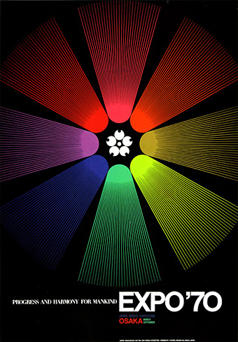
A poster design by Yusaku Kamekura. More here, via A Journey Round My Skull.
First of all this week, there’s a new interview posted which I gave last year to Crows ’n’ Bones magazine. The replies skate around the usual subjects (Cthulhu et al) and you also find out why I don’t think design and illustration for music is going to vanish as soon as some people think.
• A Journey Round My Skull has announced The Raymond Roussel Illustration Contest which is open to all.
• Cover designs: David Pearson on redesigning Cormac McCarthy’s UK covers, a huge improvement on the previous Picador series. Also, The Robert Lesser Pulp Art Collection.
• Last year I discussed Teleny, Or the Reverse of the Medal, the novel of gay erotica attributed to Oscar Wilde, giving a mention in passing to Jon Macy’s comic strip adaptation of the book. That adaptation has now been published and is available via his website.
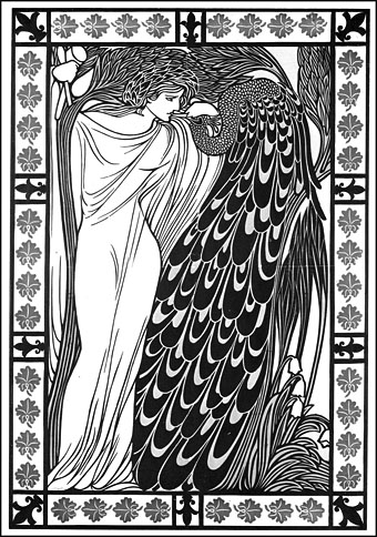
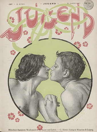
The Kiss (1896) by Will Bradley.
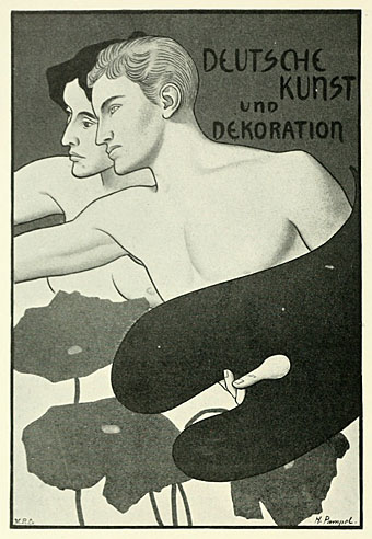
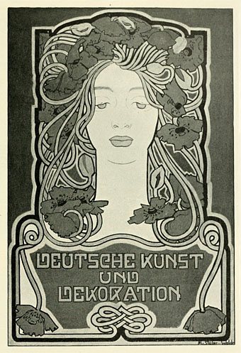
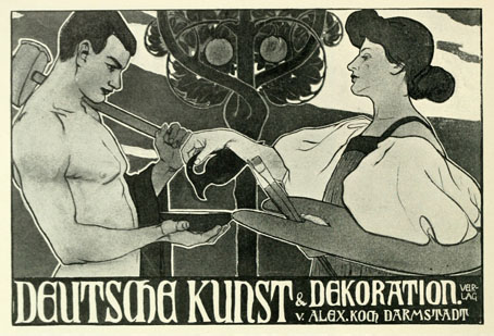
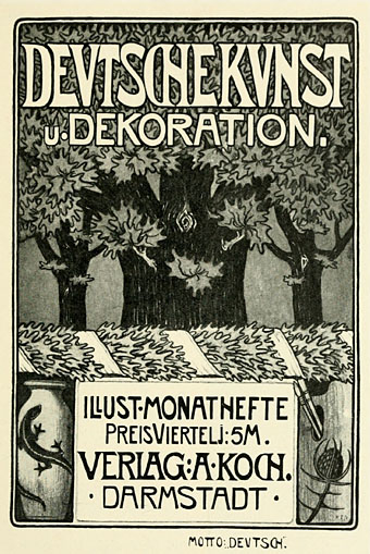
• More Art Nouveau (because too much is never enough): Will Bradley’s work at Golden Age Comic Book Stories. Can’t understand how I missed this one.
• A discussion: The Magic Mystery and Melancholy of Five Leaves Left by Nick Drake.
• Sandi Vincent’s Flickr pages overflow with Graphis Annual goodness.
• A new edition of the Arthur Radio Voyage is available to download. And Trunk Records’ Jonny Trunk has a mix of obscure vinyl for you.
• Song of the week: We Want War by These New Puritans. Slow motion shots in the video are a plus.