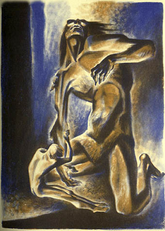
The art of Philippe Mohlitz

mohlitz3.jpg

Planche où je me suis perdu (1972).

mohlitz1.jpg

31 Decembre (1982).

mohlitz2.jpg

Batir (1989).

Recipient of the Grand Prix L.G. Baudry 2000, Philippe Mohlitz is well known to printmakers and collectors for having spectacularly rescued the art of copper engraving from a long period of increasingly stiff and stylized treatment. A true virtuoso of the burin (engraving tool), Mohlitz has restored a freedom of line to the medium not seen for centuries. In his best work he achieves a flow of light, particularly difficult to render in engraving, reminiscent of Dürer’s “St. Jerome in his Study”. The artist’s imagination, moreover, is equal to his technique, with fantastic visions which fascinate in both composition and detail.

Frustratingly small reproductions of what appear to be very detailed engravings here and here. Slightly larger images gathered here.

Update: another gallery of pictures at Velly.org.

Elsewhere on { feuilleton }
The etching and engraving archive

Angels 4: Fallen angels

delville_satan.jpg

The Treasures of Satan by Jean Delville (1894).

Some more favourite paintings today. Jean Delville produced a splendidly strange portrayal of Satan as an undersea monarch lording it over a sprawl of intoxicated, naked figures. When Savoy Books decided to put together the definitive version of David Lindsay’s equally strange fantasy novel, A Voyage to Arcturus, I felt this was the only painting adequate to the task of filling out the cover. That was in 2002; a year later Gollancz used the same painting on the cover of their Fantasy Masterworks paperback edition of the book. Lindsay’s book has been plagued by bad cover art for years so we managed to raise the bar for future editions. Delville was one of the great painters of the Symbolist school, all his work is worth looking at.

There are numerous representations of Lucifer but Franz Stuck’s is especially striking and apparently caused viewers to cross themselves before it when it was first exhibited.

Gustave Doré’s tumbling figure is from his illustrated edition of Paradise Lost, a book full of armour-clad, spiky-winged angels. Some of those wings have even found their way into my work via the miracle of Photoshop.

stuck_lucifer.jpg

Lucifer by Franz Stuck (1890).

dore_lucifer.jpg

Paradise Lost by Gustave Doré (1866).

Elsewhere on { feuilleton }
The etching and engraving archive

Previously on { feuilleton }
The art of Thomas Häfner, 1928–1985

The Door in the Wall

Photographer Alvin Langdon Coburn (1882–1966) illustrates HG Wells’ wonderful short stories in a rare edition of The Door in the Wall and Other Stories, from 1911. More pictures here.

The Door in the Wall was a true three-way collaboration between the author, the photographer and the typographer, Frederic W. Goudy, who specifically produced his Kennerley Old Style typeface for this book. Designed in the elegant Arts-and-Crafts style, it was printed on French hand-made paper at Goudy’s Village Press in an edition of 600 copies. In fact, only 300 copies contain the full compliment of Coburn’s rich photogravures, due to some being damaged in shipment and being replaced by aquatones. The photographer personally prepared the gravure plates, pulled proofs and oversaw the printing of the edition.

coburn1.jpg

The Door in the Wall.

coburn2.jpg

The Lord of the Dynamos.

Previously on { feuilleton }
War of the Worlds book covers

The art of Thomas Häfner, 1928–1985

lucifer.jpg

Lucifer (no date).

…I find nothing fantastic in so-called fantastic art, it is an aspect of reality in search of sanity beyond the normal bounds. I believe that fantastic art is related to the protective dream, that it prolongs the healing dream and finds symbols that change dread into wonder, strangeness and beauty.

As in all figurative art, fantastic art must of course be judged not only by its intentions but by the quality of the execution, and by standards that have been almost totally lost in the turbulence of changing fashions, movements and politics on the art market. This has led to a noticeable helplessness among the critics, who seem to ignore a growing tendency toward the fantastic in the hope that it will fade away and die. I do not believe it will.

Thomas Häfner

Who was Thomas Häfner? Good question, because he’s virtually invisible on the web. The painting above is scanned from David Larkin’s excellent Fantastic Art (Pan/Ballantine, 1973) and was also used as a cover image for an edition of Blaise Cendrars‘ scurrilous masterpiece, Moravagine. The Demon Woman below is a watercolour original for sale on eBay. Häfner was a member of a group of German artists who called themselves the Young Realists, formed in Düsseldorf in the mid-Fifties. Significantly, another group of young imaginative painters was active at the same time in Vienna, the Fantastic Realists, who included the great Ernst Fuchs among their number. “Realism” here can be considered as referring to a style that favoured the hard-edged realistic approach of Surrealism; Häfner’s content certainly wasn’t realistic.

These people remain neglected or unknown because art critics like to pretend there’s only one story being told in the development of art at any given time when there are usually several, often with conflicting agendas. So we’re always being informed that the dominant movement in fin de siècle Paris was Impressionism and hear little of the Symbolists who were equally—if not more—popular, productive and influential during that period.

(This laziness carries over to other areas; Debussy is continually described as “an Impressionist composer” when one of his most famous works, Prélude à l’après-midi d’un faune, was based on a Symbolist poem by Mallarmé. There are no fauns in Impressionist paintings.)

The prevailing trend in the mid-Fifties was the thin gruel of Abstract Expressionism, the complete antithesis of the kind of art being produced by Häfner, Fuchs and company. There’s a reason for the elevation of this type of work over others. Critics such as Clement Greenberg saw abstraction (which, ironically, grew out of Surrealism) as being a politically acceptable direction after the turmoil of the Second World War. The Nazis liked realism in their art, while the Soviets under Stalin and the Chinese under Mao had declared Socialist Realism to be the official art of the Communist Revolution, therefore realism of any variety was reactionary and bad. Further irony comes when the CIA agreed with this argument and secretly promoted Abstract Expressionism outside America. This has led us to the situation we have today where a Willem de Kooning painting, Woman III (1952–53), was recently sold for $137.5 million which means collecting this kind of work is now a game for billionaires. It really would be the final irony if the kind of realistic art that Clement Greenberg despised was elevated to a new popularity by over-priced Abstract Expressionism as collectors with fewer assets were forced to look elsewhere. Critics can protest all they like but these days it’s money that speaks with the loudest voice in the world of art.

demon_woman.jpg

Demon Woman (no date).

Update: added some additional works:

hafner2.jpg

Marionetten (1964).

hafner1.jpg

Szene mit Schädeln (1970).

hafner3.jpg

Phantastische Waldszene (1971).

hafner.jpg

Masken in zerfallener Umgebung (1974).

hafner2.jpg

Die Harpye (no date).

Elsewhere on { feuilleton }
The fantastic art archive