The art of James Marsh

marsh14.jpg

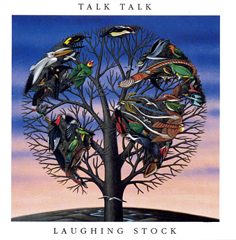
Laughing Stock (1991).

The paintings of James Marsh came to mind this week following news of the death of Talk Talk singer Mark Hollis. Marsh’s art was a feature of all the Talk Talk releases, singles as well as albums, but his work was equally prominent throughout the 1980s on a range of book covers, particularly the series he produced for Angela Carter and JG Ballard. The hard-edged, post-Surrealist style favoured by Marsh was a popular one in the 70s and 80s (among British illustrators, Peter Goodfellow and the late John Holmes worked in a similar manner), and I’ve often had to look twice to see whether a cover is one of his. But while the Magritte-like visual games may be replicated elsewhere, Marsh has a preoccupation with animals—birds and butterflies especially—that sets his paintings apart.

marsh15.jpg

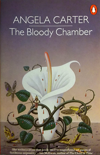
The Bloody Chamber (1981).

I never saw Mark Hollis discuss Marsh’s work but the use of the paintings across all the Talk Talk releases has given the group’s output a coherent look lacking in many of their fashion-chasing contemporaries. The consistency also meant that the cover art was unlikely to overly influence prior perception of their music; there was little warning in 1988 of the musical gulf separating The Colour Of Spring from Spirit Of Eden until stylus met vinyl. Mark Hollis was remembered this week by Rob Young who interviewed him in 1998 when his one and only solo album was released. More from James Marsh’s prolific career may be seen at his website.

marsh12.jpg

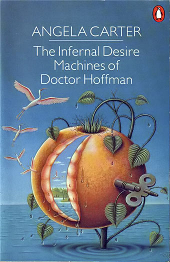
The Infernal Desire Machines of Doctor Hoffman (1982).

marsh01.jpg

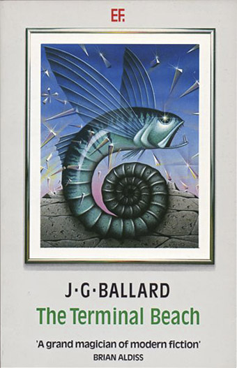
The Terminal Beach (1984).

marsh04.jpg

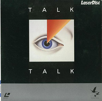
Talk Talk (laserdisc, 1984).

Continue reading “The art of James Marsh”

Constructive Cover Designing

constructive01.jpg

Not a guide from myself but a sample book from 1923 produced by the Hampden Glazed Paper and Card Co. of Holyoke, Massachusetts. Seventy-six designs by different artists are arranged by theme—landscape, architectural and so on—the common thread being the way they all give prominent space to the paper that provides the background of the design. The restrained colour palette and use of space reminds me of some of the posters produced by Noel Rook and others for the London Underground at this time. This isn’t an isolated style, in other words, and the prevalence of the look in the 1920s may have filtered into the cover designs Edward Gorey was creating for Doubleday in the 1950s. Mark Dery’s Gorey biography mentions Japanese prints being an influence on Gorey’s covers but he would have grown up around books and poster graphics that looked like this, designs which themselves (via Aubrey Beardsley, Will Bradley and others) possess a Japanese influence.

constructive02.jpg

constructive03.jpg

constructive04.jpg

Continue reading “Constructive Cover Designing”

Weekend links 452

nordine.jpg

Colors (1967) by Ken Nordine.

• “The Do was the thing”: a lengthy chat with Chuck Gould of the San Francisco Diggers. The second interview from Jay Babcock’s oral history of the Diggers.

Sticking it to the Man: Revolution and Counterculture in Pulp and Popular Fiction, 1950–1980 edited by Andrew Nette and Iain McIntyre.

Adrian Shaughnessy‘s Krautrock Top Ten. (People who know me well won’t be surprised to hear that I own everything on this list.)

See “queer” as a term has become an umbrella that accommodates not only the type of sex you have and with whom, but also how you identify the sex you have, how you identify your personality, your aura, the ineffable je ne sais queer that may or may not be related in any way to your sexuality, or even the way you present yourself to the world, but simply some deeply held, internal feeling. You don’t actually need to share a common oppression or a common romantic or sexual behavior.

[…]

The reason I mind is because queer, in functioning as a catchall, serves to obscure what it is about my life, my community, my partners, that I needed to learn to be proud of in the first place. Because for me and all the other lesbians I know, figuring out your sexuality is hard enough, but the real work is in accepting yourself, demanding acceptance from others, being willing to walk away when that acceptance is denied.

Lesbians are women, and women are taught that we’re supposed to be sexually available objects of public consumption. So we spend a lot of time saying “No.” No, we won’t fuck or partner with men; no, we won’t change our minds about this; no, this body is a no-man’s land. Lesbian, straight or bi, women are punished whenever we try to assert a boundary. Queer as a catchall term makes it really hard for lesbians to assert and maintain this boundary, because it makes it impossible to name this boundary.

Jocelyn Macdonald on how the increasing dilution and commodification of “queer” as a label does little to serve the interests of the people to whom it was applied in the first place

• Two sets of live electronica from last year: Pye Corner Audio at The State51 Factory, and Tangerine Dream at Dekmantel.

• “LSD can get deep down and reset the brain—like shaking up a snow globe,” says Amanda Fielding.

• Ewan Wilson on the impossible architecture of video games.

• Mix of the week: Secret Thirteen Mix 279 by Marcos Cabral.

• RIP Betty Ballantine, Bruno Ganz and Ken Nordine.

• At Dennis Cooper’s: They will never exist.

Cosi Fanni Tutti‘s favourite records.

She Comes In Colors (1967) by Love | Colors (1969) by Pharoah Sanders | Balthus Bemused By Color (Mix II) (1988) by Harold Budd

Weekend links 451

smith.jpg

Manifold (2015), a painting by Samantha Keely Smith which will appear in April on the cover of Life Metal, a new album by Sunn O))).

• At Expanding Mind: Professor and queer historian Heather Lukes talks with Erik Davis about Silver Lake riots, gay bikers, house ball scenes, the nostalgia for repression, and the joys and challenges of working on the online archive The Grit and Glamour of Queer LA Subculture.

A Stroke of Ingenious: Chatting Fear and Fantasy with Darius Hinks.  Also this week, Darius Hinks’ The Ingenious (for which I created the cover art) was featured in a Barnes & Noble list of seven attractive (if hazardous) fantastic cities.

• “From the late ’60s and through the ’70s broadcasters invested in home-grown kids’ television, and much of it was decidedly weird.” Paul Walsh on the vanished, thought-provoking strangeness of British TV.

That late surrealism still needs rescuing by curators and critics is perhaps not a sign of its defeat but of the breadth and pervasiveness of its triumph. Could we have Pablo Picasso or Jackson Pollock without surrealism? What about David Lynch, JG Ballard or Angela Carter? As an influence, it’s easy to give [Dorothy Tanning] a crucial place in the canon of feminist art. Louise Bourgeois was born just a year later than Tanning but only started to sew after Tanning had exhibited her first sculptures.

Lara Fiegel on the weird, wild world of Dorothea Tanning

After its own death / Walking in a spiral towards the house by Nivhek, a new album from Liz Harris (Grouper) “recorded using Mellotron, guitar, field recordings, tapes, and broken FX pedals”.

• At Dangerous Minds: Michael Rother (Neu!/Harmonia) on the forthcoming reissue of his solo albums from the 1970s.

Clesse by Clesse, another pseudonymous musical project by Jon Brooks (The Advisory Council et al).

• After Dark: The art of life at night—and in new lights by Francine Prose.

Elena Lazic on where to begin with Gaspar Noé.

• Mix of the week: Headlands by David Colohan.

Steven Heller‘s confessions of a letterhead.

• RIP Albert Finney.

• Void (2009) by Monolake | Void (2013) by Emptyset | Void (2014) by The Bug feat. Liz Harris

Dolmetsch’s Ornamentenschatz

ornamentenschatz01.jpg

If Racinet’s Polychromatic Ornament (1869–1873) was the French answer to The Grammar of Ornament (1856) by Owen Jones, then Heinrich Dolmetsch’s Der Ornamentenschatz (1887) is the German response to both, an equally lavish collection of colour plates showing ornamental decoration through the ages. Dolmetsch’s book follows the same chronological format as its counterparts, the main difference being an emphasis on objects as much as patterns or small portions of design. And being a German book, there’s rather more attention given to the German Renaissance than you might find elsewhere.

ornamentenschatz02.jpg

ornamentenschatz03.jpg

ornamentenschatz04.jpg

ornamentenschatz05.jpg

Continue reading “Dolmetsch’s Ornamentenschatz”