HP Lovecraft: Tales of Horror

hpl.jpg

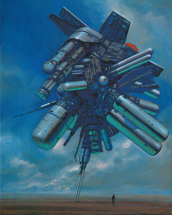
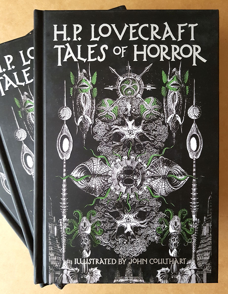
Cover design by Jo Obaroswki.

More Lovecraftiana (for a change). Today’s mail included the surprise delivery of these books, a very late arrival since the book was published over a year ago. Well better late than never, I was very pleased to be involved with this one which has been published by Fall River Press, an imprint of Barnes & Noble. The plan was to reprint a small number of Lovecraft stories on colour pages accompanied by my artwork. So the book is also a reprint of many of my earlier Lovecraftian drawings, from the comic strips to more recent illustrations, with the pictures carefully cropped and, in some places, reworked a little to match the stories.

The contents:
• Introduction by Stefan Dziemianowicz
• The Call of Cthulhu
• The Colour Out of Space
• The Haunter of the Dark
• The Whisperer in Darkness
• The Dunwich Horror
• The Thing on the Doorstep
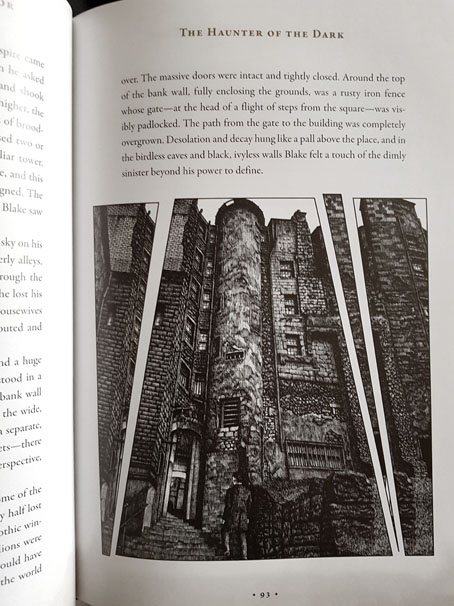
hpl2.jpg

The end result is very impressive. The book is solidly bound in hard covers with the cover art featuring metallic silver ink and gloss highlights. The interior design is by Gavin Motnyk who chopped up and tinted my drawings (with my approval) in a very effective manner. Many of the panels at the end of my adaptation of The Call of Cthulhu were presented with this kind of fragmentation so I was happy to see this extended to other drawings. In addition to presenting the artwork in a new way it also helped compensate for some of the shortcomings in drawings that date back to 1986. Not everything is this old, however. I sent Gavin a copy of my redrawn R’lyeh panorama which has been printed across the endpapers.

For now this is the most substantial collection of my Lovecraft artwork in print. And since it’s being distributed by Barnes & Noble it’s also relatively easy to find (although that title, Tales of Horror, is very similar to other collections). Fall River Press will be publishing another classic horror volume featuring my illustrations towards the end of the year. More about this later.

Elsewhere on { feuilleton }
• The Lovecraft archive
 

Expositiana

expo09.jpg

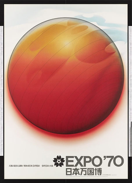
Poster design by Eiko Ishioka.

After writing about Expo 2000 I went looking for films of some of the other world expositions. In previous posts I’d managed to exhaust the Paris Exposition Universelle of 1900 as a subject but never really followed up on my intention to explore the 20th-century events. The 1900 exposition was the first for which a quantity of film footage exists; it was also the one where motion pictures were presented as a new invention among others, like electric light, that would dominate the coming century. The ephemerality of these big events is part of their fascination, and a reason to look for films that document them. Expositions are like temporary theme parks, where the emphasis, since 1939 at least, has tended towards the way things might look in the future. Architects and designers aren’t exactly given free reign at an exposition but they’re also not having to tailor their designs to the requirements of urban planning committees. The events provide a concentrated dose of futurity for a short time in a small geographical space. It ought to be noted that “world exposition” has a specific meaning (see this list), referring to large, general events which run for six months or more. Smaller expositions devoted to single subjects also exist, although “small” here is relative, these can still be sizeable affairs.

Most of the footage that follows is from American expositions. Americans seem to prefer the term “World’s Fair”, although not exclusively—there was a Brussels World’s Fair—and not consistently: the Seattle event in 1962 was the Century 21 Exposition. There’s a lot more footage out there, of course, but I was looking for official films and documentaries rather than home movies.


The New York World’s Fair, 1939

expo01.jpg

• The Middleton Family at the New York World’s Fair

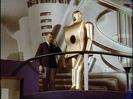
This drama illustrates the contribution of free enterprise, technology, and Westinghouse products to the American way of life. The Middleton Family at the New York World’s Fair pits an anti-capitalist bohemian artist boyfriend against an all-American electrical engineer who believes in improving society by working through corporations. The Middletons experience Westinghouse’s technological marvels at the Fair and win back their daughter from her leftist boyfriend.

Memorable moments: the dishwashing contest between Mrs. Modern and Mrs. Drudge; Electro, the smoking robot; and the Westinghouse time capsule.

Too much drama in this one, and not enough expo, but the 1939 world’s fair is where the preoccupation with the future begins. The Middletons were a promotional device, also seen in newspaper and magazine ads. This is the world’s fair that gave us the word “Futurama”. A shame, then, that Electro, the cigarette-smoking robot, doesn’t tell the All-American Family to bite his shiny metal ass.

expo05.jpg

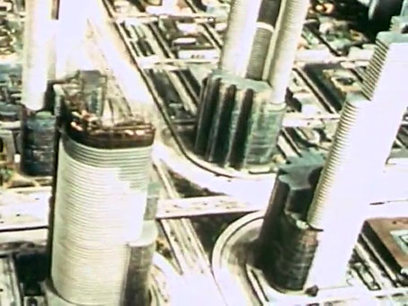
• To New Horizons
The Hugh Ferriss view of the future (sponsored by General Motors), all skyscrapers and superhighways. Pedestrians? What are they?


The Brussels World’s Fair, 1958

expo04.jpg

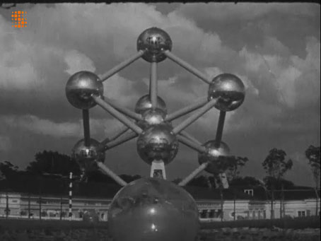
• L’Expo 58, il y a un an
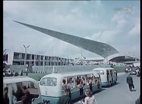
A retrospective view of the Brussels event in murky monochrome. The Czech film below is better value although the second half is mostly concerned with the Czech pavilion.

expo08.jpg

• Ceskoslovensky pavilon – Expo 58


The Century 21 Exposition, 1962

expo03.jpg

• Century 21 Calling
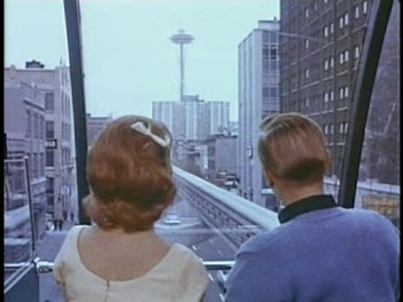
A trip to the Seattle exposition in which our guides are a hyperactive teen couple who look like the squares from Hairspray after they’ve been dosed with bop pills. For a generation of Brits “Century 21” will always mean Gerry Anderson’s Space-Age imagination.

Continue reading “Expositiana”

Weekend links 685

katoh.jpg

Art by Naoyuki Katoh, 1982.

• RIP Paul Reubens. Here’s Steven Heller on Pee-wee Herman and his clinically hyperactive playhouse (not forgetting Gary Panter’s involvement); Bruce Handy on Paul Reubens’ preposterous grace; and David Hudson on Paul Reubens before and after Pee-wee.

• Three Thousand (2017), a short film by Asinnajaq in which “a riveting collage portrays a century of Inuit history, and envisions a vibrant future”.

• New music: Velocity Of Water by Suki Sou; The Blue Beyond by Jana Winderen; and Jäi mieleen by Aki Yli-Salomäki.

• DJ Food posted a handful of psychedelic LP sleeves for non-psychedelic artists. There’s a lot more to be found.

• “We had no rules. Song structure didn’t exist. It was nihilistic.” It’s Bush Tetras again.

• “Infrared light reveals hidden portrait beneath 1943 René Magritte painting.”

• At Dennis Cooper’s: Gakuryu Ishii Day.

• Tequila (1958) by The Champs | Tequila (1958) by Perez Prado | Tequila (1972) by Hot Butter

Biblio-hauntology

hauntology.jpg

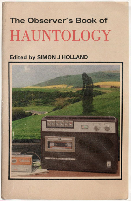
An invented book cover from the latest post at blissblog. Since I like fakes of this nature, especially when they’re carefully done, I had to go in search of the creator. Rachel Laine is the person responsible, and there’s more along these lines at her Flickr pages, together with many similar items from the universe next door. (I know someone who’ll appreciate all those faded magazine covers combining soft-porn photos with headlines for stories about analogue synths.) Another of the book covers is a guide to “Witches and Witch Craft”, a title whose real-life counterparts included books such as the Hamlyn guide to witchcraft and black magic from 1971. As I’m often saying, the 1970s was the witchiest decade of the 20th century.

uncanny.jpg

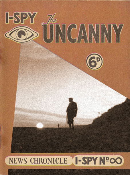
All of which reminded me of a couple of recent inventions of my own. One of the advantages of writing here is that I can retrieve from obscurity some of the things I’d previously cast into the Malebolge formerly known as Twitter. This impromptu creation is something I threw together after Callum J posted the cover of an old I-Spy book dedicated to “The Unusual”. (If you don’t know what the I-Spy books were—and still are—Wikipedia has the history.) The screen-grab from Whistle and I’ll Come to You is a lazy choice but I wanted to surprise Callum by reworking his cover as quickly as possible.

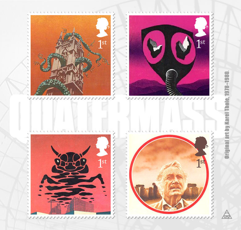
quatermass-stamps.jpg

A little more considered is this proposal for a set of British postage stamps dedicated to Nigel Kneale and his works. This one came about after a comment from Kim Newman that such a thing was overdue from the Royal Mail. Since I agreed I thought I could at least fake them into existence. They’re still a little incomplete—actual stamps would have a mention of Kneale on each one—but they look plausible. The artwork was swiped from a series of Quatermass book covers created by the prolific Karel Thole for Mondadori in the late 1970s. The images for the first Quatermass and Quatermass and the Pit work very well, I think, the fourth one less so. If I was doing these myself I’d try some combination of a radio telescope and a stone circle. Windows into another world; in the universe next door Quatermass is bigger than Star Wars. But we live here, not there.

Previously on { feuilleton }
• Disciples of the Scorpion
• Ghost Box and The Infinity Box
• Llewellyn occult magazine and book catalogue, 1971
• Typefaces of the occult revival
• The Book of the Lost
• Books Borges never wrote
• Forbidden volumes

The exposition moiré

expo2000-1.jpg

Logos designed by QWER, Iris Utikal and Michael Gais.

Hannover’s Expo 2000 wasn’t very successful as expositions go but it had an attractive logo, a combination of bold sans-serif type with a moiré background pattern which ideally had to be seen in its animated form. World expositions tend to be concerned with technical innovations and novelties, and this animated design was certainly novel, if impossible to replicate in print. All the static versions of the logo are essentially screenshots of the moving version, with the moiré image frozen at a various places to generate many shape and colour variations. Not all of these are satisfactory. I think it was Matisse who said that anyone can put two colours together; the real challenge is putting three together in a harmonious manner.

expo_logo.gifThe pattern was a little more animated on the original exposition website, albeit reduced to this tiny gif. The site is mostly intact and browsable at the Internet Archive, a primitive thing by today’s standards but Expo 2000 was the first world exposition with a dedicated website, something which really did set it apart from its predecessors. Many of the exposition’s buildings and exhibits would have seemed bizarre or alarmingly ugly to the people who attended the Paris Exposition Universelle in 1900 but much that was on display in Hannover would at least have been comprehensible to a visitor from the past. Trying to explain what “a website” was to someone in 1900, even a futurologist like HG Wells, would have required considerable effort.
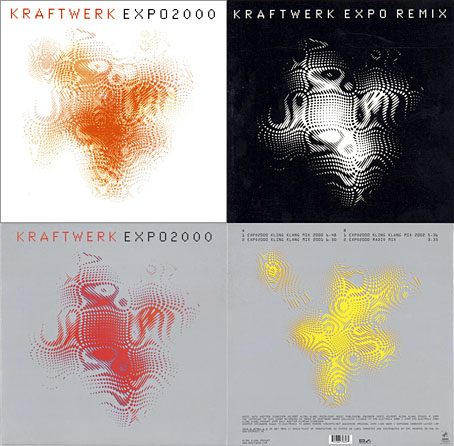
expo2000-2.jpg

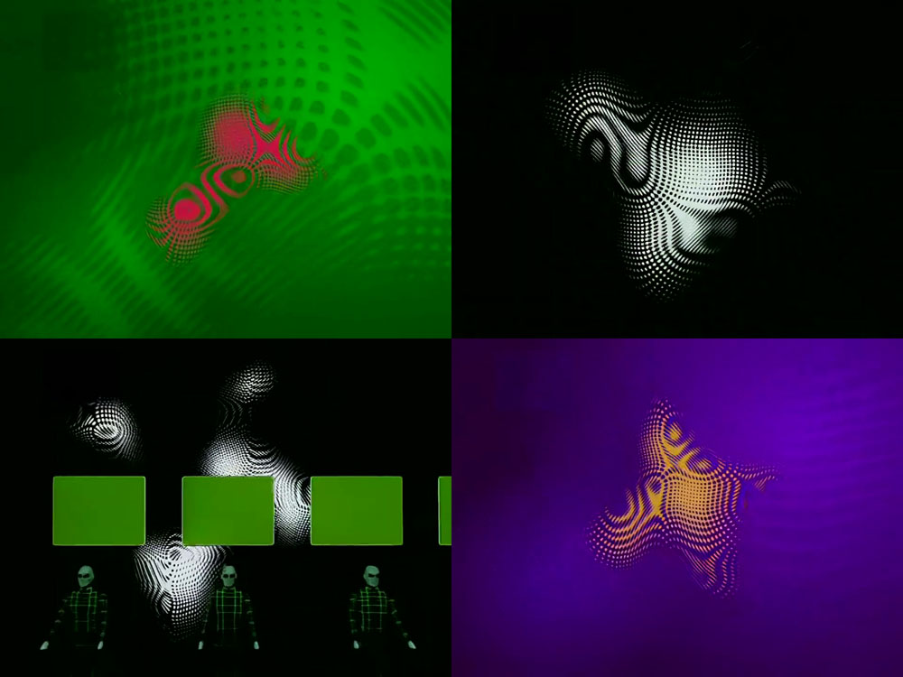
Video for Expo 2000 by Kraftwerk.

Ephemerality is a distinguishing characteristic of world expositions, all those splendid pavilions and eye-catching constructions don’t last very long even though the events themselves involve years of planning. A list of exposition features that have managed to survive would be a disparate collection, taking in well-known landmarks like the Eiffel Tower, Seattle’s Space Needle and the Atomium in Brussels, architectural projects such as the Grand Palais in Paris and the Biosphere in Montreal, and one-off oddities like the Unisphere in Queens and the cement dinosaurs in Crystal Palace Park. If Expo 2000 is remembered for anything today it’s the one-off song that Kraftwerk wrote for the occasion, Expo 2000, which arrived with graphics and visuals based on the expo logo. Kraftwerk had been hired at great cost to create the jingles in different languages that accompany the animated logo. This is turn led to the song, the group’s first new studio composition in 14 years.

expo2000-4.jpg

I thought these abstract images were a good match for Kraftwerk, I prefer them to the other designs for the single which show the four computer-generated figures that later appeared on the cover of Minimum-Maximum. The CD case at the top left was made with lenticular plastic which imitated the moiré effect of the animated logo. I didn’t buy this one when I had the chance, choosing instead the “enhanced” version which came with a minuscule copy of the video in a CD-ROM section. Like most CD-ROM singles, the audio tracks still play but the enhanced section no longer works. Welcome to the future.

Continue reading “The exposition moiré”