Odilon Redon lithographs

redon1.jpg

La mort: mon ironie dépasse toutes les autres! (1889).

Two samples from a collection of Odilon Redon etchings lithographs at Gallica, an archive I’ve only recently begun to look at. A shame that the larger images scale up the content and the empty margin, often leaving a very small picture in the centre not much bigger than thumbnail size. Oh, well… On the plus side there’s a portrait I hadn’t seen before of Des Esseintes from Huysmans’ À Rebours, the book which in 1884 introduced Redon’s work to a wider public. Via BibliOdyssey, without whom, etc.

redon2.jpg

Et là-bas l’IDOLE ASTRALE, l’apothéose (1891).

Previously on { feuilleton }
The eyes of Odilon Redon
Arthur Zaidenberg’s À Rebours

Suchard at the Exposition Universelle

suchard1.jpg

A pair of adverts from the Guide Lemercier for the Paris Exposition Universelle of 1900, available as either a PDF or individual page scans at the University of Heidelberg’s archive. This looks like it would have been a very usable guide, with coloured maps and a good selection of photographs. The Suchard adverts provide splashes of colour throughout and this is the only guide I’ve seen to date which favours a single company this way. The space for notes on each ad page is rather generous as well as being something you can’t imagine anyone trying now.

suchard2.jpg

Previously on { feuilleton }
Esquisses Décoratives by René Binet
Le Palais de l’Optique, 1900
Exposition Universelle films
Exposition jewellery
Exposition Universelle catalogue
Exposition Universelle publications
Exposition cornucopia
Return to the Exposition Universelle
The Palais Lumineux
Louis Bonnier’s exposition dreams
Exposition Universelle, 1900

Weekend links 39

galas.jpg

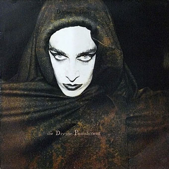
The Divine Punishment (1986) by Diamanda Galás. Design by Paul White/Me Company.

What the Catholic League and certain members of the House presumably wish to remove from their consciousness is thirty years of death sentences handed down to their parishioners and citizenry, who were told not to wear condoms, and the mistreatment of those stigmatized as miscreants and sinners by their viral status and/or homosexuality and/or status as drug addicts.

• Diamanda Galás responds in her usual forthright manner to the censoring of David Wojnarowicz’s film (and her music which accompanied it) by the Catholic League and members of the House of Representatives earlier this week. Related: Demonstrators gather to protest removal of Wojnarowicz art from NPG | Is the censored David Wojnarowicz video really ‘anti-Christian’? | Vengeance is hers: a conversation with Diamanda Galás.

Update: Hide/Seek: Too shocking for America. One of the exhibition curators speaks out against the censorship.

“Their attitude is: ‘Next time you think of writing about sex, don’t,'” said Susie Bright, who was the editor of the Best American Erotica anthology series for 15 years. “I can’t think of any other fundamental human experience that writers would be encouraged to keep to themselves.” Melissa Katsoulis, a literary reviewer for the Times of London, certainly seemed to conform to Bright’s impression when asked to comment on the award by the BBC: “Sex is a subject best avoided altogether,” she said. “If I was writing a novel, I wouldn’t attempt to write it except in the most Victorian and prim way, because it’s awful. It’s a cliché, but the moments of genuine frisson in books are when hardly anything happens.” Speak for yourself, missy.

Laura Miller dissing the Literary Review‘s annual Bad Sex Award. Good to find more voices being raised against this drivel and the admission of failure which it implies.

The latest offbeat experiment from filmmaker David Lynch: pop singles. He gets crazy with the vocoder here. Related: David Lynch talks new music projects.

scenaillustrata.jpg

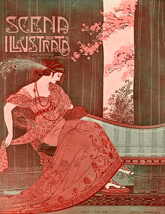
Scena Illustrata (1914). Cover by Ezio Anichini (?). Via this set of magazine covers from 1880–1920.

• Tumblrs of the week: Heart Killer and Pretty Pictures from the Paleo-Future Blog.

The Big Picture’s 2010 Hubble Space Telescope Advent Calendar.

National Geographic‘s Best Underwater Views of 2010.

A seasonal gift from a famous Northampton resident.

Paris versus New York: A Tally of Two Cities.

This is your browser on drugs.

Double-Barrel Prayer (1988) by Diamanda Galás, with a video directed by the late Peter Christopherson.

Gilded volumes

thomson.jpg

The cover of an 1894 edition of Jane Austen’s novel designed by Hugh Thomson (1860–1920). The so-called “Peacock Edition” is illustrated throughout and a copy can be yours for £845 should you be so inclined. Or you can go to the Internet Archive and download the same edition for free. Thomson’s lavish cover design is absolutely right for the 1890s and as such would have suited Oscar Wilde far more than Jane Austen. AbeBooks drew my attention to this with a feature on rare books with gilded covers where, needless to say, all the titles are very expensive. A lot more reasonable but just as lavish is I Wonder by Marian Bantjes, the perfect gift for anyone who enjoys the art of book design.

Elsewhere on { feuilleton }
The book covers archive

Previously on { feuilleton }
I Wonder by Marian Bantjes

Ten titles and a cover

cdlcover.jpg

The Very Best of Charles de Lint. Art by Charles Vess.

Over the weekend I found the time to finally update the book design section of the site, adding new pages for most of the titles I’ve been working on recently. There’s still a couple of things missing but I’ll add those in due course. Many of these design jobs have been for the interiors only so what follows is a comparison of title spreads from books I’ve worked on that have been published this year. Lest it seem that I have an army of clones at my service it should be emphasised that I was working on several of these last year (and Engelbrecht was completed in 2008) but the nature of release schedules means they all carry 2010 publication dates.

sr.jpg

Steampunk II: Steampunk Reloaded, edited by Ann & Jeff VanderMeer.

I invariably make a feature of title pages, usually creating them as a spread in order to heighten their impact. The title page is a kind of gateway to the rest of the book which gives you an opportunity to establish a mood for what follows. It’s also the area where you can be most lavish with your graphic treatment and, where necessary, add illustrative material without worrying too much about intruding on the content. With a number of these designs I was following typographic choices from pre-designed covers so the challenge was to find something that would match the cover and connect to the rest of the interior. The Charles de Lint book was a variation on this process in that the author had chosen a Charles Vess drawing for the cover art. I designed a cover to accommodate the drawing then carried the design inside. The colours were chosen to match Vess’s artwork while the general Art Nouveau style came from an Alphonse Mucha poster he’d placed on the wall. With a different cover picture the entire book would have had a very different design.

pkd.jpg

The Search for Philip K Dick by Anne R Dick.

Continue reading “Ten titles and a cover”