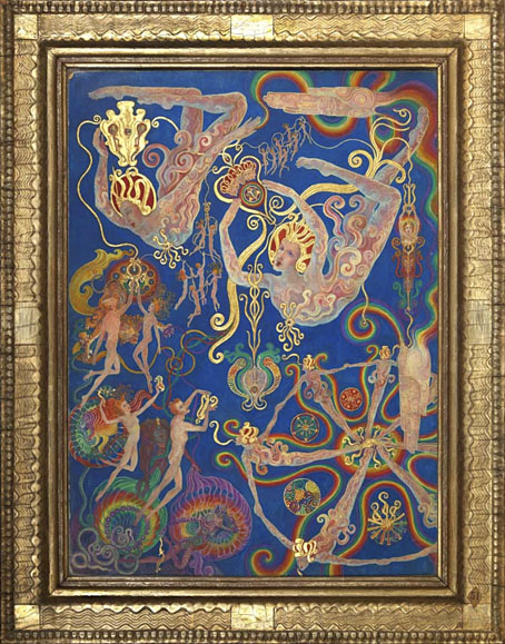
The Creative Power of the Spirit, No. 31 of A Goodly Company series, 1920–1933 by Ethel le Rossignol.
• “One moment it was a little blip. The next, our friends are dying”: the gay porn soundtrack composers lost to the Aids crisis. More gay porn: Pink Narcissus, James Bidgood’s micro-budget homoerotic fantasy, will receive a UK blu-ray release later this year.
• Old music: Thirst by Clock DVA gets a very welcome reissue later this year, having been unavailable in any form since 1992. I’m not so happy about the changes to Neville Brody’s original cover design but the album itself is a major post-punk statement.
• “Graphic design was thought to be a man’s discipline,” she says. “So I think it was quite a surprise for people to find me there.” A profile of Margaret Calvert, designer of (among other things) Britain’s road signs.
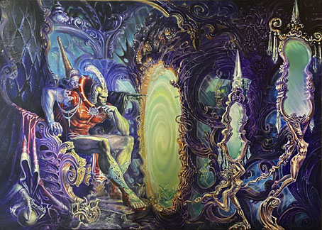
• At Colossal: A major survey in Paris chronicles Leonora Carrington’s esoteric Surrealism.
• At Public Domain Review: Sara Weiss’ Journeys to the Planet Mars (1903).
• At the BFI: The mystery music video for The Beatles’ Penny Lane.
• Winners and entrants for Close-up Photographer of the Year 7.
• “Cats to blame for octopus deity enshrinement delay.”
• Steven Heller’s font of the month is Cattivo.
• At Dennis Cooper’s it’s Jack Arnold’s Day.
• Pink Noir (1996) by David Toop | Pink Dust (2013) by Sqürl | The Pink Room 2 (2024) by Seigen Ono