It was the slightly gamy residue of the super-elegant and exotic pictures of Aubrey Beardsley. I have always considered the 1900 period as the psycho-analytical end-product of the Greco-Roman Decadence. I said to myself: Since these people will not hear of aesthetics and are capable of becoming excited only over “vital agitations”, I shall show them how in the tiniest ornamental detail of an object of 1900 there is more mystery, more poetry, more eroticism, more madness, perversity, torment, pathos, grandeur and biological depth than in their innumerable stock of ugly fetishes, possessing bodies and souls of a stupidity that is simply and uniquely savage!
Salvador Dalí, The Secret Life of Salvador Dalí (1942).
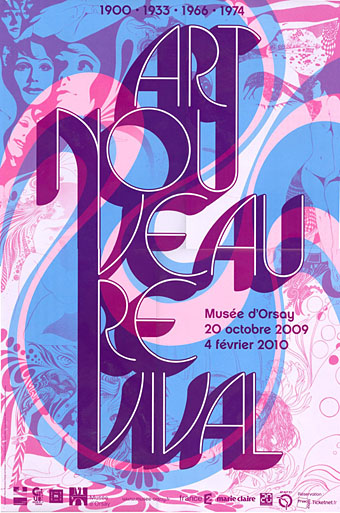
More from Paris, whereupon it becomes necessary to ask: how much more groovy could this poster be? And the answer is none. None more groovy. Art Nouveau Revival 1900 • 1933 • 1966 • 1974 is an exhibition running at the Musée d’Orsay, Paris, which traces the echoes of Art Nouveau through Surrealism into the revival of the 1960s.
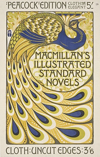
Poster by Albert Angus Turbayne for Macmillan’s illustrated Standard Novels (1903).
Rejected and scorned in the decades following its brief flowering, Art Nouveau was spectacularly rehabilitated in the 1960s. This re-evaluation offers a particularly interesting interlude in the history of style in that many different areas were affected at the same time by this phenomenon: the history of art, the art market, contemporary creative work, particularly design and graphics.
There’s further detail here, along with photos of some of the exhibits. Verner Panton’s Visiona II makes another appearance and in addition to Dalí and company there’s the magic word “psychedelic”. The exhibition runs until February 4, 2010, and there’s a catalogue co-written by the V&A’s fin de siècle expert Stephen Calloway which I’m going to have to buy. Via.
Previously on { feuilleton }
• Beardsley at the V&A
• Michael English, 1941–2009
• Temples for Future Religions by François Garas
• Antonin Mercié’s David
• Art Nouveau illustration
• Dirty Dalí
• Verner Panton’s Visiona II
• Flowers of Love