Underground labyrinths

wallinger.jpg

Labyrinth (Westminster) by Mark Wallinger.

A mandatory post, this one, seeing as how it combines two continual sources of interest: labyrinths and the London Underground transport system. Transport for London commissioned artist Mark Wallinger to create something for the 150th birthday celebrations of the Tube, the result being a series of 270 different labyrinth designs, one for each of the capital’s stations. Needless to say, I like the idea, and it’s been interesting to see that some of Wallinger’s designs hark back to earlier labyrinths. The one for the Westminster station is notable for the way it references the famous Chartres Cathedral labyrinth (below)—a nod to Westminster Abbey, perhaps—and also features an enclosed and inaccessible loop, a possible comment on the irresolvable dealings occurring across the road in the Houses of Parliament.

maze02.jpg

It’s Nice That has more of Wallinger’s designs while Creative Review draws attention to an earlier maze design on the wall at Warren Street station.

Previously on { feuilleton }
Cthulhu Labyrinth
The labyrinth of Versailles
Maze and labyrinth panoramas
Mazes and labyrinths
Labyrinths
Jeppe Hein’s mirror labyrinth

MC Escher album covers

scaffold.jpg

L The P (1969) by Scaffold. Art: Ascending and Descending (1960).

A follow-up to yesterday’s post. MC Escher lived long enough to see his work move from curiosities appealing to a small circle of print collectors, through enthusiasm among scientists and mathematicians, to mass acceptance in the late 1960s thanks, in part, to the general vogue for any art that looked weird or far out. New Worlds magazine used Relativity on a cover in 1967, while Thomas Albright writing for Rolling Stone in 1970 introduced a generation of American heads to Escher’s work. A year earlier, another Rolling Stone, Mick Jagger, had tried to persuade Escher to create something for the cover of Let It Bleed; the artist declined but that didn’t stop others using his prints for cover art.

mott.jpg

Mott The Hoople (1969) by Mott The Hoople. Art: Reptiles (1943).

Escher’s work is so well-suited to a vinyl sleeve that I’m surprised his lithographs and woodcuts haven’t seen more use. Liverpool group Scaffold beat Mott the Hoople to the first usage by a few months in 1969 (unless there’s an earlier example I don’t know about); L The P is a play on the Scaffold’s big hit, Lily The Pink. As is often the case with these music design histories, things start off well with sympathetic treatments of the artwork then degrade when hamfisted amateur designers take over. I can’t imagine Escher being flattered by some of the later examples. If you know of any others, good or bad, then please leave a comment.

beaverkrause.jpg

In A Wild Sanctuary (1970) by Beaver and Krause. Art: Three Worlds (1955).

mandrake.jpg

Puzzle (1970) by The Mandrake Memorial. A gatefold sleeve which opened out to reveal the whole of Escher’s House of Stairs I (1951). Inside the gatefold was Curl-up (1951). Design by Milton Glaser who also designed the group’s second album, Medium.

Continue reading “MC Escher album covers”

Escher and Schrofer

schrofer5.jpg

Design by Jurriaan Schrofer.

That’s Maurits Cornelis Escher (1898–1972), the Dutch artist, and Jurriaan Schrofer (1926–90), the Dutch typographer and graphic designer. Aside from a shared nationality the pair had a similar interest in periodicity and incremental metamorphosis, something that’s strikingly apparent when you compare their works. I don’t know much about Schrofer so I can’t say whether he was consciously following Escher’s example or whether this is coincidence. Some of the gradations and distortions also bear comparison with the Op Art paintings of Bridget Riley, Victor Vasarely and others.

escher8.jpg

MC Escher signed most of his works with three square “MCE” letters which are remarkably similar to Schrofer’s type designs.

There’s an opportunity to find out more about Schrofer’s distinctive approach to graphic design in a forthcoming book from Unit Editions (currently available at a reduced pre-order price). More of his work can be seen at But Does It Float and scattered around Tumblr. MC Escher is well-represented on the web; I’d suggest starting at WikiPaintings.

escher1.jpg

Circle Limit I (1958) by MC Escher.

schrofer1.jpg

Design by Jurriaan Schrofer.

escher2.jpg

Square Limit (colour, 1964) by MC Escher.

Continue reading “Escher and Schrofer”

Weekend links 145

brundage.jpg

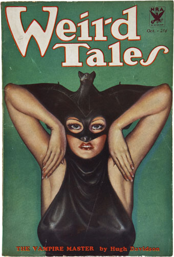
Weird Tales, October 1933. Cover art by Margaret Brundage.

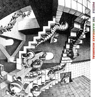
• Michael Moorcock’s novels are being republished this year by Gollancz in a range of print and digital editions. Publishing Perspectives asks Is Now a Perfect Time for a Michael Moorcock Revival? • Related: Dangerous Minds posted The Chronicle of the Black Sword: A Sword & Sorcery Concert from Hawkwind and Michael Moorcock. My sleeve for that album was the last I did for the band. • Obliquely related: Kensington Roof Gardens appear as a location in several Moorcock novels, and also provided a venue for the author’s 50th birthday party. If you have a spare £200m you may be interested in buying them once Richard Branson’s lease expires.

• One of my favourite things in Mojo magazine was a list by Jon Savage of 100 great psychedelic singles (50 from the UK, 50 from the US). This week he presented a list of the 20 best glam-rock songs of all time. For the record, Blockbuster by The Sweet was the first single I bought so I’ve always favoured that song over Ballroom Blitz.

The Alluring Art of Margaret Brundage is a forthcoming book by J. David Spurlock about the Weird Tales cover artist. Steven Heller looks at her life (I’d no idea she knew Djuna Barnes) while io9 has some of her paintings. Related: Illustrations for Weird Tales by Virgil Finlay.

The masterpiece of Mann’s Hollywood period is, of course, Paracelsus (1937), with Charles Laughton. Laughton’s great bulk swims into pools of scalding light out of greater or lesser shoals of darkness like a vast monster of the deep, a great black whale. The movie haunts you like a bad dream. Mann did not try to give you a sense of the past; instead, Paracelsus looks as if it had been made in the Middle Ages – the gargoyle faces, bodies warped with ague, gaunt with famine, a claustrophobic sense of a limited world, of chronic, cramped unfreedom.

The Merchant of Shadows (1989) by Angela Carter. There’s more of her writing in the LRB Archive.

• Television essayist Jonathan Meades was back on our screens this week. The MeadesShrine at YouTube gathers some of his earlier disquisitions on culture, place, buildings and related esoterica.

• Sometimes snark is the only worthwhile response: An A-Z Guide to Music Journalist Bullshit.

• London venue the Horse Hospital celebrates 20 years of unusual events.

The Politics of Dread: An Interview with China Miéville.

How Giallo Can You Go? Antoni Maiovvi Interviewed.

A guide to Terry Riley’s music.

• Three more for the glam list: Coz I Love You (1971) by Slade | Get It On (1971) by T. Rex | Starman (40th Anniversary Mix) (1972) by David Bowie

The Library of Babel by Érik Desmazières

library1.jpg

The print work of French artist Érik Desmazières has featured here on several occasions, and I’ve also had reason to mention more than once his aquatints and etchings which illustrate Jorge Luis Borges’ celebrated short story The Library of Babel (1941). The prints were produced in 1997, with a small book edition being published in 2000. Copies of the volume now sell for upwards of $100, and at a mere 36 pages this somewhat exceeds my acquisitiveness threshold; hence this post which gathers some of the better online reproductions, one or two of which have only come to light in the past couple of years.

library2.jpg

Borges’ description of the architecture of the Universe-size Library is sketchy so Desmazières opens out some of the spaces to give a Piranesian sense of space to what would otherwise be little more than views of the same small rooms and corridors, endlessly repeating. MC Escher could have made something of those infinite perspectives—the hexagonal chambers are the closest to the story descriptions—but the larger rooms convey without words an impression of colossal spaces filled with nothing but people and an infinitude of books. The volumes that Borges describes contain few illustrations but one of them at least would describe this very book. Another would describe this book with a minor variation in one of the plates; another would describe MC Escher’s depictions of the Library, and Piranesi’s, and Salvador Dalí’s, and yours, and mine, and on and on…

library3.jpg

library4.jpg

library5.jpg

library6.jpg

library7.jpg

library8.jpg

library9.jpg

library10.jpg

library11.jpg

library12.jpg

Elsewhere on { feuilleton }
The etching and engraving archive

Previously on { feuilleton }
Les lieux imaginaires d’Érik Desmazières
The art of Érik Desmazières