The weekend artists, 2013

fournier.jpg

“Chloromgonfus detectis, a dragonfly that can detect volatile pollutants.” A speculative insect by artist Vincent Fournier.

The annual review of artists/designers/photographers featured in the weekend posts should have run at the end of December but MR James got in the way. Big thanks, and happy new year to Form is Void and Beautiful Century for pointing the way to many of these people.

strongowski.jpg

Two cover designs from Eliash Strongowski’s 30 Days—30 Covers project.

gebbie.jpg

Pink Boy by Melinda Gebbie.

lipton.jpg

Seam Stress (1987) by Laurie Lipton. The Drawings of Laurie Lipton is out now from Last Gasp.

blackwell.jpg

The Baron in the Trees (2011), a book-cut sculpture by Su Blackwell.

Continue reading “The weekend artists, 2013”

Doctor Moreau book covers

moreau22.jpg

William Heinemann (first edition, 1896).

The inevitable book cover post. The examples here are among the better ones, Wells’ novel having been blighted over the years by monstrosities as hideous as those that fall from Moreau’s vivisection table. That said, some early covers might be bad but they look like masterpieces next to some of the fatuous offerings from the current ebook bonanza. The novel has great illustration potential but few of the covers below seem to have given the matter much consideration. Bantam’s Rousseau painting would suit many other novels but doesn’t belong with this particular book. Even Penguin seem to have been confounded of late; their illustration of feline eyes peering through undergrowth could again be used on many other novels, while their most recent edition sports a maze design which doesn’t communicate anything of the book’s content to a curious reader.

The one I like best of this selection is Cuchi White’s illustration for the 2001 Gallimard edition, a picture that does much to convey the novel’s disturbing blend of speculative fiction and outright horror.

moreau16.jpg

Ace (1958).

moreau06.jpg

Ballantine Books (1963).

moreau12.jpg

Magnum Books (1968); illustration: Douglas Rosa.

Continue reading “Doctor Moreau book covers”

Harry Willock book covers

moreau.jpg

This time last year I happened to be re-reading my way through the collected short stories of HG Wells; this year I’ve been reading The Island of Doctor Moreau, not to continue the seasonal trend, I simply felt the urge. More about Moreau tomorrow.

These covers are from a series of Penguin reprints which first appeared in 1967 and went through several editions. Harry Willock was the cover artist, and may also have been the designer of the Wells and Verne titles, other text-only Penguin covers from around this time being credited to Willock. The Penguin Science Fiction site describes the obtrusive “A Penguin Book” legend as the “panic top”, a heavy-handed attempt by Penguin’s management to reinforce their brand. Later reprints dropped this but it’s stamped across most of these editions.

war.jpg

This edition of The War of the Worlds was my first encounter with the novel so the cover has always been very familiar, a factor which probably prevented me from seeing how effectively all the Willock Wells covers work as a set. The Martian war machines aren’t very menacing—especially when they seem to have done little but arouse a pair of butterflies—but I do like the type layouts and the way the illustrations are concentrated into a circle. Willock’s drawings so closely imitate the style of Victorian engravings it’s easy to take them at first glance for the genuine article.

air.jpg

Continue reading “Harry Willock book covers”

Raphaël Freida’s Torture Garden

freida1.jpg

The guarded, the cautious, the small-scale, the modest, the well-crafted—such books may be rewarded (in our own time, at the national level), but they are rarely preserved. They are not preserved because guardedness, caution, smallness, modesty, and craft can be replaced in any given generation. What is irreplaceable is excess: Of verbal kinesis, religious intensity, intellectual voracity.

Amit Majmudar on Entertainment and Excess: The Great Literary Audiences.

Amit Majmudar is talking about literature and posterity but his argument can be applied to other forms of art. I find the thesis a persuasive one, especially where novels are concerned, for the way it accounts for those works that manage to survive even when they offend the principles of craft and taste by which most novels are judged and criticised. No one would ever claim William Hope Hodgson as a great prose stylist but the excesses of his imagination have ensured that his work remains in print a century after it was first published, while hundreds of “finer” contemporary writers are completely forgotten.

freida2.jpg

Octave Mirbeau’s The Torture Garden (1899) is excessive enough to have ensured that if the author’s other works are reprinted at all it’s because they follow in The Torture Garden‘s wake of notoriety. The moral purpose behind Mirbeau’s scenes of lingering death may have been overwhelmed by its reputation as a classic of erotic sadism, but we’re a long way from 50 Shades of Grey as is evident from these etchings by French artist Raphaël Freida (1877–1942). Given the content it’s surprising to find an illustrated edition at all, Freida’s volume being a limited one published in 1927. The book contained 11 illustrations of which 7 are shown here from two different sources. The impaled figure in the second plate was a surprise since it seems to have been borrowed by Philippe Druillet for one of his pages in his bande dessinée album Yragaël (1974). (See below.) Druillet, like Freida, is an artist whose work is sufficiently excessive to prove attractive to future generations of comic readers and art enthusiasts.

freida3.jpg

Continue reading “Raphaël Freida’s Torture Garden”

Martin Sharp, 1942–2013

sharp1.jpg

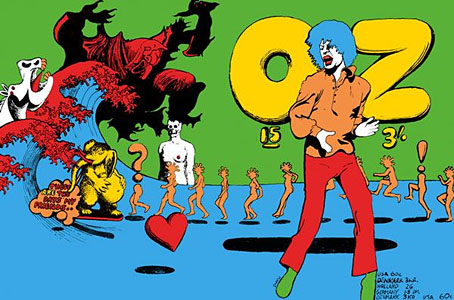
Oz magazine no. 15, October 1968.

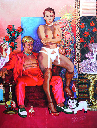
The psychedelic art of Australian artist Martin Sharp has featured here on several occasions. Unlike his British and American contemporaries who maintained a single graphic style, Sharp was a versatile artist whose work could range from loose, often cartoony drawing and painting to very detailed collage designs; he was also as happy as any other artist of the period to plunder art history, as the cover for issue 15 of Oz demonstrates. The Mick Jagger figure from that cover was later reworked as a poster for “Turner’s Purple Orchestra”, one of a number of pieces of Sharp art which can be glimpsed throughout Donald Cammell & Nicolas Roeg’s Performance (1970).

sharp7.jpg

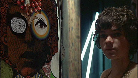
Performance (1970): Michele Breton and a Martin Sharp collage.

Sharp’s involvement with Oz magazine, and the creation of a handful of endlessly reproduced designs—the Bob Dylan Mr Tambourine Man poster, Jimi Hendrix in a Jackson Pollock explosion, the sleeve art for Cream’s Disraeli Gears—makes his art some of the most visible of the period. People may not necessarily know the name but they’ll recognise the work.

In 2009 Sharp’s Oz colleague Germaine Greer wrote a warm appraisal of the artist and his work. A few more examples follow. There’s a great selection of posters and other art and design here.

The GuardianMartin Sharp, Australian artist who came to symbolise the ’60s | Martin Sharp in pictures

sharp2.jpg

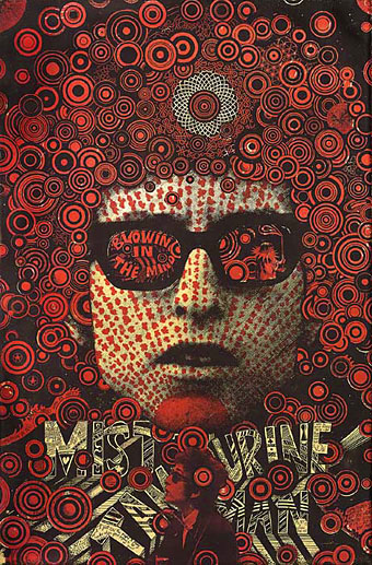
Mister Tambourine Man (1966).

Continue reading “Martin Sharp, 1942–2013”