David Becket’s bookplates

becket.jpg

From David Becket: His Book of Bookplates, a slim volume published in 1906. The wonderfully spare style of these looks advanced for the time but probably owes something to William Nicholson‘s earlier work. Nicholson collaborated with brother-in-law James Pryde (as “The Beggarstaffs”) on poster designs with the same reduced detail, masses of black and hand-drawn type.

For 764 (!) further bookplates, see LUNA Commons.

Charles Ricketts’ Hero and Leander

ricketts1.jpg

Enthusiasts of Charles Ricketts’ illustrations can find book collections of his drawings and paintings but the artist (with partner Charles Shannon) was also a printer, typographer and book designer who would no doubt have preferred his illustrations to be seen in their intended setting. The Internet Archive has a few choice examples of Rickett’s books, of which the most profusely illustrated is Hero and Leander (1894), Christopher Marlowe’s poem (completed by George Chapman).

ricketts2.jpg

Also of interest is Danaë (1903) by Thomas Sturge Moore with its black and red type, A Bibliography of the Books Issued by Hacon & Ricketts (1904), and A Defence of the Revival of Printing (1899). The latter is of interest to book designers and typographers for its presentation of Ricketts’ aesthetic philosophy. Ricketts’ and Shannon’s books made continual use of a small leaf motif as a pilcrow to mark a fresh paragraph. In A Defence of the Revival of Printing Ricketts discusses his replacement for the ampersand (&), which he disliked, preferring instead a new character combining the letters E and T, ampersands being a contraction of the Latin word “et”. There’s also some discussion of his unique type designs which he charmingly refers to as “founts”, preferring, like contemporary William Morris, the antique terminology.

ricketts3.jpg

Colophon from Hero and Leander. A rose forms the monogram of Ricketts’ and Shannon’s Vale Press.

Elsewhere on { feuilleton }
The illustrators archive

Previously on { feuilleton }
Art Nouveau illustration
Dorian Gray revisited

The art of Pamela Colman Smith, 1878–1951

smith_tarot.jpg

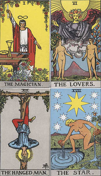
Following yesterday’s post about Frieda Harris’s Tarot designs, it only seems right to acknowledge the other major Tarot artist of the 20th century. Pamela Colman Smith has been overshadowed by her male mentor, Golden Dawn scholar AE Waite, even more than Frieda Harris whose name at least gets mentioned as much as Crowley’s in discussion of her paintings. US Games lists Smith and Waite’s so-called Rider-Waite Tarot of 1909 as “the world’s most popular tarot deck” and uses a silhouette of Smith’s design for The Fool as the company logo, yet it was years before I saw a credit for Smith as artist of this deck, her personal presence being reduced to a tiny monogram in the corner of each picture.

crane.jpg

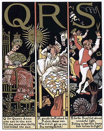
The Absurd ABC by Walter Crane (1874).

I’ve often thought of Smith’s deck as “the Art Nouveau Tarot” which it isn’t really—it’s more late Victorian in style, if anything—but it was created when Art Nouveau was at its height and has some of the character of the poster art of the period. Smith’s designs are incredibly striking in places, with the clarity of drawn archetypes, and her style possibly owes something to the books Walter Crane created for children in the 1870s and 1880s; the clean lines and bright colouring are very similar. In that respect, Smith’s deck might be more fittingly labelled “the Arts and Crafts Tarot.”

hermit.jpg

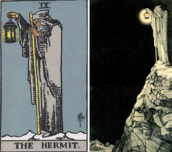
left: Pamela Colman Smith’s Hermit; right: Barrington Colby’s inner sleeve for Led Zeppelin IV.

Pamela Colman Smith also worked as a book illustrator but her other work is overshadowed completely by the popularity of the Rider-Waite cards. Her design for The Hermit was famously borrowed by Crowley obsessive Jimmy Page in 1971 for a gatefold illustration, View in Half or Varying Light by Barrington Colby, on Led Zeppelin IV. This use alone makes it possibly the most famous Tarot card in history (there was even a statue made of it for the now defunct Hard Rock Park Led Zeppelin roller coaster) but I doubt many people familiar with the image could name the original artist.

Happily, Ms Smith’s obscurity is gradually diminishing. US Games recently produced the Pamela Colman Smith Commemorative set for the 100th anniversary of the Rider-Waite deck, a package featuring a book of her artwork (including non-Tarot drawings), prints, postcards and a reprinted set of cards. A long overdue reappraisal but, as is always the case, it’s better late than never.

Mary K Greer’s Tarot blog has some excellent postings devoted to Pamela Colman Smith including this page which gathers links to sites containing further information about the artist’s life and work.

Elsewhere on { feuilleton }
The illustrators archive

Previously on { feuilleton }
Layered Orders: Crowley’s Thoth Deck and the Tarot
William Rimmer’s Evening Swan Song
The art of Cameron, 1922–1995

Der Orchideengarten

orchideengarten.jpg

Will at A Journey Round My Skull turned up some gold this week in the form of several covers from a German periodical, Der Orchideengarten, which ran for 51 issues from 1919 to 1921. This is generally credited as being the world’s first fantasy magazine which makes its unaccountable obscurity all the more surprising. Both Will and I first encountered the magazine in Franz Rottensteiner’s essential history of fantasy, The Fantasy Book, published by Thames & Hudson in 1978, with a US edition produced by Collier Books. As well as being a wide-ranging history, Rottensteiner’s book is profusely illustrated throughout and includes two tantalising and distinctly weird covers from Der Orchideengarten, a magazine which Rottensteiner describes as “one of the most beautiful fantasy magazines ever published.” Over the years I’ve found myself becoming thoroughly acquainted with most of the book’s contents as authors were discovered and various gaps filled. One of the few points of obscurity left was that column which describes Der Orchideengarten and those two covers. So you can perhaps appreciate the excitement at seeing more of these rare specimens brought to light.

strobl.jpg

There’s no need to repeat the history when you can read it for yourself on Will’s page and see the covers. One of the magazine editors was author Karl Hans Strobl whose collection of weird tales, Lemuria, had been published two years earlier. This monochrome copy of the cover design is by Richard Teschner, taken from one of my Art Nouveau design books where it stands out like a rather grotesque sore thumb. I don’t know if Teschner was a contributor to Der Orchideengarten but on the strength of this he should have been.

Update: Will posts some interior illustrations.

Elsewhere on { feuilleton }
The illustrators archive

Previously on { feuilleton }
The Great God Pan
Jugend Magazine
Meggendorfer’s Blatter
Simplicissimus

The art of Oliver Frey

frey1.jpg

It’s inevitable when writing about gay art and artists that Oliver Frey’s name will turn up eventually, so here’s the requisite post. Frey is often better known in gay circles under the nom de plume he used in the 1980s, “Zack”, when he was a very prolific illustrator and comic artist for the few gay mags being published in Britain. As Oliver Frey he was already well-known as an accomplished professional illustrator, who was for a time an artist on Look and Learn’s long-running science-fiction adventure strip The Trigan Empire. His professional work makes him probably the most widely-seen of all gay-porn artists as a result of the comic-strip pages he drew for the beginning of the 1978 Superman film.

frey2.jpg

His career as a comic artist honed his skill at dealing with figures and telling a story which is one of the reasons his gay strips are still highly valued today. Those strips tend to be completely pornographic right from the start so I’ll spare the delicate sensibilities of some of the readers here and link you to some collections of his Zack work instead. In the meantime, I’d love to know where the picture of the boy with the sword (above) comes from originally. It’s a lot more finished than his Zack drawings and is paired on this page with a similar picture of serpent-twined tribal youths which hints at some kind of Burroughs-esque Wild Boys scenario. If anyone knows the answer, please leave a comment. As it is, it makes a good addition to the Men with swords archive, as does the piece of fluff below.

frey3.jpg

Update: As noted in the comments, original art by Oliver Frey/Zack is now available for purchase here.

Oliver Frey links:
Zack Art | official site.
Arrumako’s Gay Blog | A substantial collection of complete strips and sundry illustrations.
Daddy’s Here | More single illustrations and some magazine scans including an interview with the artist.
Gay Erotic Art Links | Another page with further links elsewhere.

Elsewhere on { feuilleton }
The gay artists archive
The men with swords archive