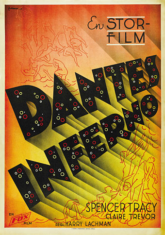
Looking at Willy Pogány’s work last week I was reminded that as well as illustrating books he worked in Hollywood for a while as an art director and set designer. Among those jobs was a credit for “Technical staff” on the only film for which director Harry Lachman is remembered today, a curious 1935 melodrama, Dante’s Inferno. This stars Spencer Tracy as a fairground barker whose talent for drawing an audience helps an old showman boost the attendance at his moralising “Dante’s Inferno” attraction.
Entrance to the fairground attraction.
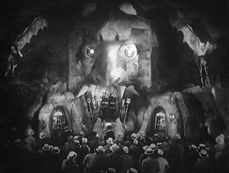
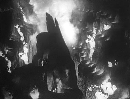
A hubristic rise and fall follows for Tracy, and the film spends much of its running time in routine business and family scenes. What sets it apart is some striking fairground designs (no doubt Pogány’s involvement) and a truly startling self-contained sequence when the old showman describes for Tracy the true nature of the Inferno. This sequence takes Gustave Doré’s celebrated illustrations and brings them to life in a series of atmospheric tableaux which even manage to contain brief glimpses of nudity. Hell, it seems, is the one place you can get away with not wearing any clothes. I’ve read many times that this sequence was borrowed from an earlier silent film, also called Dante’s Inferno, but have yet to come across any definite confirmation. It’s certainly possible since studios at that time treated other films in a very cavalier fashion; when a film was remade the studio would try to buy up and destroy prints of the earlier film. If anyone can point to more information about the origin of the Hell sequence, please leave a comment.
Stone tombs from the Inferno sequence.
If the Inferno sequence wasn’t already stolen in 1935, it works so well that it’s been plundered many times since; Kenneth Anger borrowed shots which he mixed into Inauguration of the Pleasure Dome (1954), Derek Jarman did the same for TG: Psychick Rally in Heaven (1981), and Ken Russell slipped some tinted scenes into Altered States (1980). I tinted the entire sequence red and dumped it into the one-off video accompaniment I made for Alan Moore and Tim Perkins’ stage performance of Angel Passage in 2001; it wouldn’t surprise me if it’s been used elsewhere. As with many of Hollywood’s products, Lachman’s film pretends to condemn prurience—Tracy’s character exploits Hell’s lurid attractions for gain—while revelling in the opportunity to show as much bare flesh as the censors would allow. As with Doré, Lachman’s Inferno seems populated solely by men and women in the peak of physical fitness.
Inevitably, you can see the Inferno sequence on YouTube here and here. The film doesn’t seem to be available on DVD but it’s worth seeking out to watch in full. In addition to the infernal delights, you also get to see 16-year-old Rita Hayworth’s screen debut as a dancer on a cruise ship.
Previously on { feuilleton }
• Willy Pogány’s Lohengrin
• Willy Pogány’s Parsifal
• Maps of the Inferno
• A TV Dante by Tom Phillips and Peter Greenaway
• The art of Lucio Bubacco
• The last circle of the Inferno
• Angels 4: Fallen angels