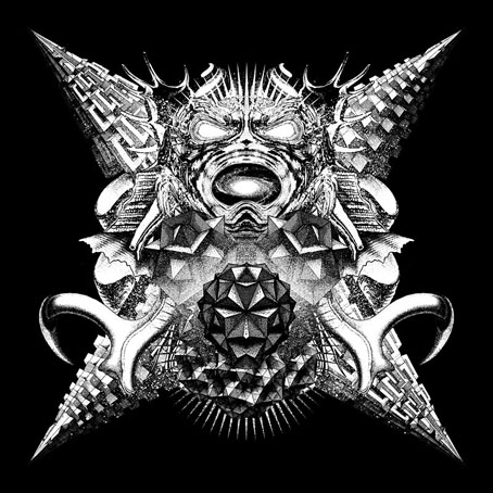
Weekend links 118

owczarek.jpg

The Garden of Urban Delights (2010) by Marcin Owczarek.

His protagonists are misfits: alienated, implicitly gay, longing for love, frequently hard to be around, always fixated on small pleasures that compensate for an essential feeling of not belonging. […] His patroness Edith Sitwell termed him “that rare being, a born writer.” William Burroughs dedicated The Place of Dead Roads to him, declaring Welch “certainly the writer who most directly influenced my work.” John Waters has called In Youth is Pleasure “so precious, so beyond gay, so deliciously subversive, [it] is enough to make illiteracy a worse social crime than hunger.”

Sadie Stein on Denton Welch, a writer I’m embarrassed about still not having read. Edith Sitwell and William Burroughs had a famously disputatious correspondence in the pages of the TLS over The Naked Lunch. An appreciation of Welch’s work was one of the few things they had in common.

• Don’t mention guitars: Robert Hampson on acousmatic music, the curse of Loop and the rebirth of Main.

• No Straight Lines: A Collection Of Queer Comics part one, part two, part three. A history by Justin Hall.

Pieces Of Gold by The Aikiu: shots from gay porn videos repurposed via some smart editing.

• RIP Ilhan Mimaroglu, electroacoustic composer. Ubuweb has a selection of his recordings.

“A good ground rule for writing in any genre is: start with a form, then undermine its confidence in itself,” he says. “Ask what it’s afraid of, what it’s trying to hide – then write that.” For Harrison, the most satisfying writers are “at odds with their cultural context. They’re trying to fit in and failing, or they’re trying to remove themselves and failing. The attempt to resolve the conflict is an angle – a frame or a context – in itself.”

The Guardian’s A Life in Writing profiles M. John Harrison. His new novel, Empty Space, was published on Thursday. There’s also this recent video interview with Arc magazine.

• Stephen Usery interviews editor Russ Kick about The Graphic Canon: Volume One.

At home with Prince Zaleski, the “most decadent and imperial detective in fiction”.

• A Visit with Magritte: photographs by Duane Michals.

Loitering airships could dispense drones on demand.

• Creating a Forever Object: Ian Schon’s Pen Project.

• A Tumblr for the late, lamented Arthur Magazine.

• “Few cities can boast a railway line for the dead.”

The Lost Tapes by Can: An Oral History.

Space Reflex (1963) by Dick Hyman & Mary Mayo | Space Is Deep (1972) by Hawkwind | Space Is The Place (1973) by Sun Ra | Space Moment (1995) by Stereolab | Space Pong (2006) by T++

The Occult Explosion

occult01.jpg

So here’s a strange thing: having spent another working week sifting through scanned books at the Internet Archive what do I find but scans of album booklet art by Wilfried Sätty only a couple of days after writing about his album covers. The album in question may be familiar to some readers but it was a new one to me. The Occult Explosion (1973) was a collection of recorded interviews with people such as Alan Watts and Anton LaVey discussing subjects pertinent to the title, although the general tone is more in the direction of catch-all mysticism than occultism as such. Anton LaVey is there to pronounce about Satanism, of course, and the album also features two songs by British rock band Black Widow, one of which, Come To The Sabbat, has since achieved a kind of novelty notoriety. (There’s a nice video-feedback recording of them playing the song live on Beat Club in 1970.)

Nat Freedland was the author of a book entitled The Occult Explosion for which the album acts as an audio appendix. This is all so typically 1970s: witchcraft, Satanism, rock music, yoga, Alan Watts, UFOs, ESP, and the whole thing packaged in Sätty’s post-psychedelia collages. The entire album is available at the Internet Archive: the recordings are here while the badly-scanned insert pages are here. (There’s a better view of the cover art at Flickr.) Some of the more impressive pieces of Sätty’s art follow, work which has been buried for almost forty years. Just to add to the net of coincidences this week, the last of the pictures below borrows a demon from Gustave Doré’s Divine Comedy, the same source as yesterday’s Rick Griffin poster.

occult08.jpg

occult02.jpg

occult03.jpg

occult04.jpg

Continue reading “The Occult Explosion”

Wilfried Sätty album covers

gandharva.jpg

Gandharva (1971) by Beaver & Krause. Cover art by Sätty, lettering by David Singer.

There aren’t many, unfortunately, and half the ones here have already featured in previous posts, but since I’m often referring people to Sätty’s work it seems worthwhile gathering them together. His album cover art shows he was equally adept at working with colour as with black-and-white, and might have done a lot more in this line had he been given the opportunity. (Sätty’s first book, The Cosmic Bicycle, does include some colour plates.)

The Gandharva album is the oddest in this small collection, one side being a blend of blues, gospel and Beaver & Krause’s Moog doodlings while the other side comprises an improvised Moog-inflected jazz suite recorded live in Grace Cathedral, San Francisco. The setting of the latter is apt since cover artists Sätty and David Singer both came to prominence among San Francisco’s psychedelic poster designers in the late 1960s. Film director Robert Fuest liked Gandharva so much he hired Paul Beaver, Bernie Krause and Gerry Mulligan to play similar music for the soundtrack of The Final Programme.

Of the other albums the Sopwith Camel is obviously closest to Sätty’s familiar style. The covers for George Duke suit the mid-70s trend of jazz/funk albums with “cosmic” sleeve art exemplified by Tadanori Yokoo’s fantastic (in all senses) collage for Agharta by Miles Davis. Documentation of Sätty’s non-book work is still sparse so if anyone knows of any other covers please leave a comment.

Update: Added The Occult Explosion. See this later post.

sopwith.jpg

The Miraculous Hump Returns From The Moon (1973) by Sopwith Camel.

occultsatty.jpg

The Occult Explosion (1973) by Various Artists.

duke2.jpg

Feel (1974) By George Duke.

duke1.jpg

The Aura Will Prevail (1975) by George Duke.

Elsewhere on { feuilleton }
The album covers archive

Previously on { feuilleton }
Nature Boy: Jesper Ryom and Wilfried Sätty
Wilfried Sätty: Artist of the occult
Illustrating Poe #4: Wilfried Sätty

Nature Boy: Jesper Ryom and Wilfried Sätty

ryom1.jpg

Interest in the work of collage artist Wilfried Sätty (1939–1982) increases by slow degrees, and did so again last year although I completely missed the occasion. Better late than never. Nature Boy is a 12-inch single by Jesper Ryom on the Berlin-based Power Plant label which comes adorned with this Sätty collage of a tattooed boy. The picture appears as a vignette in the posthumous Visions of Frisco (2008) but this is the first time I’ve seen the larger work. Power Plant promoted the single by staging an exhibition of Sätty prints, photos of which can still be viewed hereNature Boy can be heard in full at YouTube.

ryom2.jpg

Elsewhere on { feuilleton }
The album covers archive

Previously on { feuilleton }
Wilfried Sätty: Artist of the occult
Illustrating Poe #4: Wilfried Sätty

Recovering Viriconium

viriconium01.jpg

Detail from Assassination in the Night (c. 1600?) by Monsù Desiderio.

Yesterday’s post looked at some of the past cover designs for M. John Harrison’s Viriconium books. This post makes a few suggestions for how they might be presented in the future. Since these are mostly covers that I’d like to see they’re not necessarily ideal for the audience a publisher might be aiming at, cover design is usually a three-way process involving designer, author and publisher. In the end I’ve resisted the temptation to draft a range of original cover proposals—writing these posts has taken long enough—so almost everything here uses pre-existing art. If I was designing covers for all four Viriconium books, however, and the brief was to orient them towards a fantasy readership, the first thing I’d try would be a series of four imaginary Tarot designs. A peculiar pack of Tarot cards is a recurrent feature of the books so I’d create four emblematic cards that featured significant elements and characters from each. The characters wouldn’t be too well defined, they’d be stylised, maybe even silhouettes. Each card would feature a dominant presence: offhand these would be one of the geteit chemosit for The Pastel City, a locust for A Storm of Wings, the Barley Brothers for In Viriconium and a Mari Lwyd horse skull for Viriconium Nights. These presences together with the human characters would loom over a silhouette city at the foot of each card whose outlines would change appearance from book to book, evolving gradually from a fantastic outline of domes and towers to something that resembles a contemporary city. The colours and treatments would show a similar evolution from the bright and bold styles of the Pamela Colman Smith Tarot deck to something more photographic, collaged from elements closer to our world. Maybe.

That’s an idea for the four individual books. All the examples here use the convenience of the omnibus edition so a single image (or pair of images) has to somehow represent the entire series. To save time and effort I’ve taken the liberty of hijacking a couple of Penguin Books layouts. I hope Penguin doesn’t mind, and I should also apologise to Harrison’s UK publishers, Gollancz, for making one of their authors jump ship. The Viriconium omnibus is certainly good enough to be considered a modern classic. Penguin’s recent template for its Modern Classics series happens to be very easy to apply to a wide range of artwork.

viriconium04.jpg

The Anti-Pope (1942) by Max Ernst.

Penguin has a long tradition of using pre-existing art on its covers, especially on those in its Penguin Classics series. You can almost make this into a parlour game: match your favourite novel with the best choice of painting. The tradition was extended to its science fiction titles in the early 1960s when the art of Max Ernst was featured several times along with the work of other Surrealists. Max Ernst is a favourite artist of mine so this is one I can’t resist. Many of Ernst’s decalcomania paintings of the 1940s would suit Viriconium but The Anti-Pope with its horse heads seems especially suitable.

Also on the Penguin sf covers was a picture by the mysterious “Monsù Desiderio” one of whose works can be seen at the top of this post. Desiderio was a 17th-century painter with a vague enough presence—works have been attributed to both François de Nomé and Didier Barra—and a line in gloomy architectural fantasias to make him an ideal Viriconium artist.

Continue reading “Recovering Viriconium”