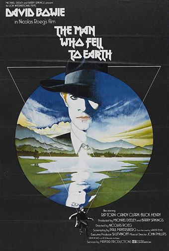
The Man Who Fell to Earth (1976).
This weekend’s viewing was The Man Who Fell to Earth on Blu-ray, highly recommended for anyone who likes the film, Anthony Richmond’s photography looks better than ever. I’ve had this for a while on DVD and what’s notable about the old and new formats is that both UK editions use Vic Fair’s poster design as the cover art. It often seems a hit-or-miss affair whether the original poster gets used for home release. This tends to happen more with older films that have acquired an artistic reputation; the recent UK release of The Conformist by Arrow Films prints four different poster designs on the inlay, with the box enclosure having a clear window that allows one or other of the designs to be facing out. A great idea which makes owning the physical copy a little more worthwhile.
I’d known the poster for Nic Roeg’s film for years but until this weekend I’d never thought to find out who was responsible for the artwork. Vic Fair was a prolific artist for UK film releases during the 1970s and 1980s so this is a small selection of his work. Apparently he was so pleased with the Roeg poster that he signed it. As is often the case with film posters, there’s no record of the designers for these examples so we don’t know who was responsible for the type layouts.
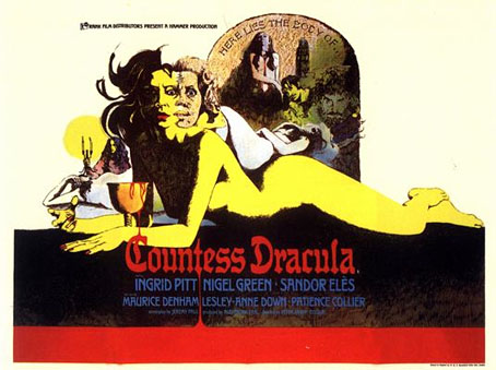
Countess Dracula (1972).
The Countess Dracula art looks surprisingly similar to some of the promotional art that Roger Dean produced around this time for UK studios, Hammer included. A few examples appear in his Views book but it’s a side of his work that’s seldom seen or discussed. I recall being impressed by the Vampire Circus poster in the past (although the big cats look a little silly). One of the better Hammers of the 70s, with a cast including cult cutie John Moulder-Brown.
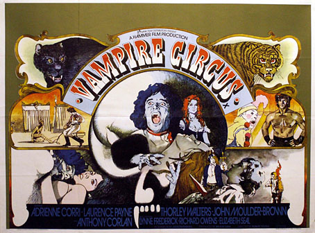
Vampire Circus (1972).
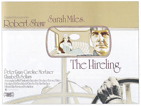
The Hireling (1973).
As with many posters of the 1970s, The Hireling is a great example of an approach that marketing departments would never allow today.
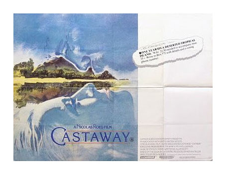
Castaway (1987).
Another Nic Roeg film, and another subtle design, possibly too subtle as I don’t recall seeing it used anywhere. First time I saw this was on the cover of a soundtrack album a few years back when I was putting together Jon Hassell’s website. There’s a piece of his music used in the film so we were trying to trace all the relevant cover art.
There’s more about Vic Fair and his contemporaries in British Film Posters: An Illustrated History by Sim Branaghan & Steve Chibnall, a book I think I ought to buy. If anything it may spare me the temptation to start collecting film posters again.
Previously on { feuilleton }
• Petulia film posters
• Lucifer Rising posters
• Wild Salomés
• Druillet’s vampires
• Bob Peak revisited
• Alice in Acidland
• Salomé posters
• Polish posters: Freedom on the Fence
• Kaleidoscope: the switched-on thriller
• The Robing of The Birds
• Franciszek Starowieyski, 1930–2009
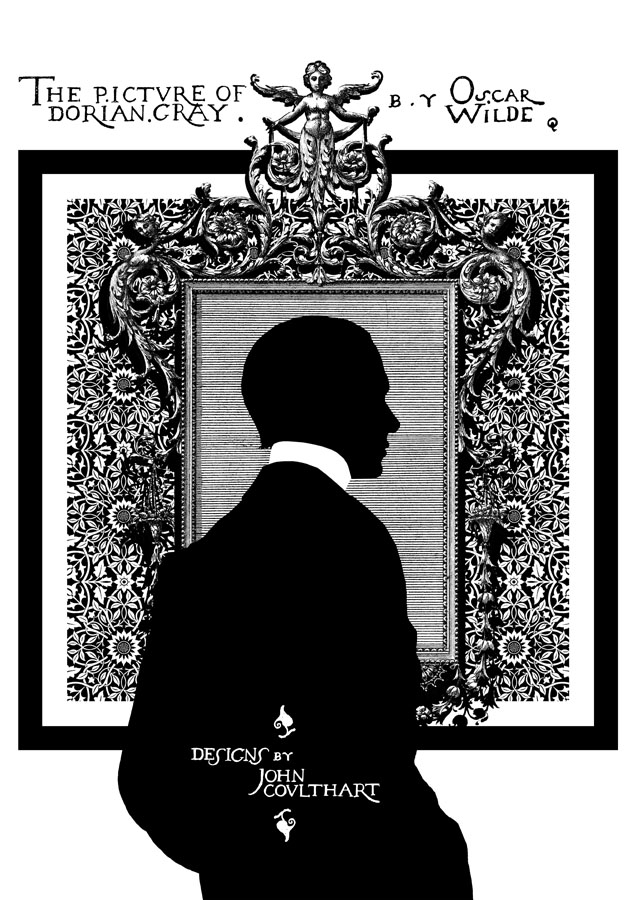
• Dallamano’s Dorian Gray
• Czech film posters
• The poster art of Richard Amsel
• Bollywood posters
• Lussuria, Invidia, Superbia
• The poster art of Bob Peak
• A premonition of Premonition
• Metropolis posters
• Film noir posters
.jpg)