Weekend links 143

empire.jpg

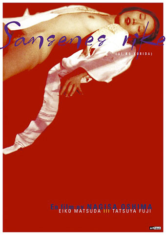
Ai No Corrida poster design by Egil Haraldsen (2001).

• “Back then, publishing an interview with Félix Guattari alongside little chats with rough trade and street walkers was unheard of — it still is for the most part.” BUTT on Kraximo, a gay Greek magazine of the 1980s.

13 books for 2013: A selection of forthcoming titles at Strange Flowers which so closely aligns with my preoccupations that I worry he’s reading my mind.

• “The Macaulay Library is the world’s largest and oldest scientific archive of biodiversity audio and video recordings.”

• A free BitTorrent Robert Anton Wilson audio and video pack. See also the RAW files at the Internet Archive.

beijing.jpg

The Pangu Building, Beijing, January 12th, 2013. Blade Runner arrives six years early.

Wired celebrates 100 years of Edward Johnston’s typeface for the London Underground.

Borges’ translation of Ulysses. Or of the last page of Ulysses as a translation of Ulysses.

0181, a new album by Four Tet, can be heard in full at SoundCloud.

• The Edge question for 2013: “What should we be worried about?

JG Ballard documentaries at Ubuweb.

Unlocking Dockstader.

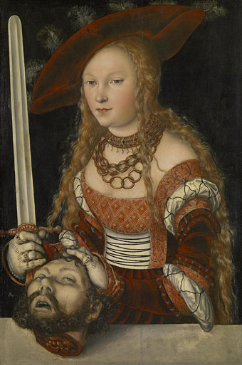
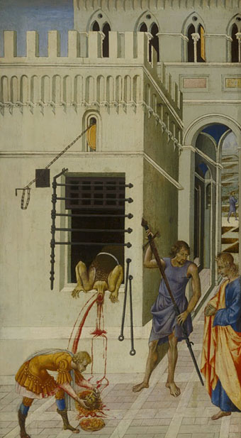
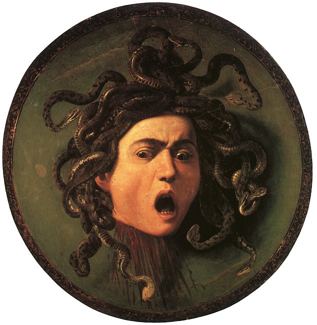
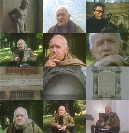
• RIP Nagisa Oshima.

Ai No Corrida (1980) by Quincy Jones | Empire Of The Senses (1982) by Bill Nelson | Forbidden Colours (1983) by David Sylvian & Riuichi Sakamoto

Decapitations

heads03.jpg

Judith with the Head of Holofernes (1520–1540) by Lucas Cranach the Elder.

It doesn’t take much effort to refute the jeremiads of those who complain that popular culture is exclusively violent, all that’s usually required is to direct attention to Titus Andronicus or The Revenger’s Tragedy. Compared to the stage, the art world seems at first to be more circumspect, especially in the 19th century when the battles scenes of history painters sprawled across acres of canvas, all of them devoid of the physical trauma of warfare.

salome6.jpg

The Beheading of Saint John the Baptist (1455–60) by Giovanni di Paolo.

There are exceptions, however, and the nearer you move to Shakespeare’s time the more examples you’ll find. Paintings produced in an age when violent street executions were still a common sight would have seemed less surprising to their intended audience than they do to our eyes. Several of the paintings here provide a useful contrast with the many sanitised depictions of John the Baptist’s severed head in the Salomé archive.

heads01.jpg

Medusa (c. 1590) by Caravaggio.

Of all the paintings of Medusa’s head the one by Caravaggio is the sole example with a gout of spurting blood. It’s also unusual for being painted on a convex panel intended to resemble the reflecting shield of the Gorgon’s killer, Perseus. Given the violent life of the artist the gore isn’t so surprising although the jet of red in his painting of Judith beheading Holofernes still seems shocking if you’ve never seen it before.

heads04.jpg

Judith Beheading Holofernes (1598–99) by Caravaggio.

The Biblical story of Judith and Holofernes may be the poor cousin to the more popular story of Salomé but depictions of the crucial event make an impression by being consistently gruesome. I suspect the reason is less to do with the story itself than with the success of Caravaggio’s paintings among cultured Europeans. The copying or imitation of celebrated works became a thriving industry in the days of the Grand Tour with the result that 17th- and 18th-century art is overburdened with variations on earlier paintings.

Continue reading “Decapitations”

Satyriconte

satyriconte1.jpg

Here in the northern hemisphere it’s the wrong time of year to be cavorting in the open air with your clothes off for any length of time. In warmer months the people behind Satyriconte—who were in touch earlier this week—do just this as an exploration of what they call “the contemporary tale of a satyre”:

Satyriconte is a mix of two french words: satire and tale.
It’s a way to connect with Satyricon, this so old novel written by Petrone.
It’s a road we decided to follow to inquire our world according this point of view.

The Satyriconte project is a photo research around the filthy presence in our occidental civilisation.

So many years of education
……….and still
we can feel the Satire shadow in our daily life.

What about this Satire in our days :
……….Is it washed by our porn torrent ?
……….Is it perfumed and well dressed ?
……….Is it the breath of our parents while they exchange their flesh ?
……….Is it our animal side ? (more)

satyriconte2.jpg

In addition to photos there are drawings and a request for assistance of various kinds, from help staging photo shoots to critical opinion of the project. I’d not-so-helpfully suggest that a contemporary satyr ought to have prosthetic legs (like those used by some paralympic athletes) which give the wearer a suitably goatish appearance.

For more traditional representations of Hermes, Pan, satyrs and fauns this page has plenty of choice examples.

Previously on { feuilleton }
The Piper at the Gates of Dawn
The Great God Pan
Peake’s Pan

The Eighth Court

shevdon.jpg

Mid-January and here’s the first book cover design of the year, and another title for Angry Robot. This is the fourth book in Mike Shevdon‘s Courts of the Feyre series; since I’d already provided the three earlier books with a uniform design it didn’t take long to create this one. I’ve been very pleased with the reception of these covers, the positive response shows that it’s possible to design something for a fantasy series that isn’t the customary generic illustration plus florid typography. I wrote about the problems of designing fantasy covers last year with a lengthy examination of M. John Harrison’s Viriconium books.

angryrobot.jpg

Two recent Angry Robot covers: Joey HiFi‘s cover for Chuck Wendig and Amazing15‘s Pelican-styled design for Chris F. Holm.

Credit should be given to Angry Robot’s Marc Gascoigne for encouraging this direction, the company has been producing a range of very smart covers which don’t pander to the clichés of the marketplace. There’s more of an incentive for smaller publishers to do this when small press imprints and self-publishers often have terrible cover designs (sad but true) while the multinationals play safe for fear of losing readers. If you want to stand out from the crowd then it helps to look good.

Elsewhere on { feuilleton }
The book covers archive

Previously on { feuilleton }
The Courts of the Feyre

Jean Genet, 1981

genet.jpg

Until watching Antoine Bourseiller’s film, the only interview I’d seen with Jean Genet was the one filmed by the BBC in 1985 in which a tetchy and evidently irritated Genet made a fool of interviewer Nigel Williams, and compared the whole experience to a police interrogation. (Williams and his interview are memorialised in Iain Sinclair’s Downriver with the words “Is he the one who made a cunt of himself with Genet?”)

Bourseiller’s 52-minute film is very different, presenting a warm and effusive writer who talks at length about lovers, friends (including Alberto Giacometti), posterity (which he dismisses), and his prison experiences. Between the interview sections there are readings from some of his texts. That this is as good as BBC films used to be shows what a wasted opportunity the actual BBC interview was. At the time it was impossible to tell whether Genet was simply a prickly character or whether Williams and company had severely pissed him off. Judged against Bourseiller’s film I’d bet on the latter.

(Note: The YouTube copy is in French but includes optional subtitles.)

Previously on { feuilleton }
Un Chant d’Amour (nouveau)
Jean Genet… ‘The Courtesy of Objects’
Querelle again
Saint Genet
Emil Cadoo
Exterface
Penguin Labyrinths and the Thief’s Journal
Un Chant D’Amour by Jean Genet