Unearthly tones

belbury.jpg

Design, as always, is by Julian House.

“…we shall only be delivered from our afflictions by sayings and doings that are altogether irrational, paradoxical, and magical: the wild songs of fairyland, sung to unearthly tones, are the only medicine for the heartache and the headache of humanity.”

Arthur Machen, A Note on Asceticism (The Academy, 27th May, 1911)

This quote from the Apostle of Wonder, which will appear on the forthcoming album from Belbury Poly, is one I hadn’t seen before; serves me right for not subscribing to Faunus where the piece was reprinted in 2017. It’s been a while since Machen’s name has appeared in association with Ghost Box even though the label originates from the same area of South Wales that was the writer’s birthplace, a detail that gave the early Ghost Box releases additional resonance. One of the attractions of the Ghost Box recordings was the intersection between quotes and titles from weird literature with electronic music derived from library albums and theme tunes from the 1960s and 70s; Witch Cults Of The Radio Age, as Broadcast & The Focus Group memorably put it. It was a beguiling mix which the label’s more recent releases have increasingly diluted: the rear-view musical themes are still in evidence but the weird quotient has been diminished, giving the listener a box without a ghost. (Pye Corner Audio, whose last album was an exploration of subterranean realms, is a notable exception.) I feel uncomfortable drawing attention to this since it’s tantamount to saying “Please don’t change!”. But it’s also the case that a label devoted solely to Basil Kirchin pastiches might never have attracted my attention in the first place.

The description of new Belbury Poly album, The Gone Away, reaffirms the label’s commitment to its weirder side:

The Gone Away’s 11 tracks are inspired by British fairy folklore, especially its recurrent themes of things that always seem on the point of leaving or vanishing. Also there’s the notion of things that can’t be seen head on but are only glimpsed from the corner of the eye. A scorned and neglected corner of folklore, beguiling and bonkers in equal measure. Of course, this being a Ghost Box record, these themes are received through the prism of old TV soundtracks, and the credulous beliefs and childhood obsessions of a pre-digital age.

Anyone who’s read Arthur Machen’s The Shining Pyramid will know that fairy folklore in his stories conceals a darker and more malevolent manifestation of the supernatural. His comment about “unearthly tones” suggests a different point of view. The Gone Away will be released on 28th August.

Previously on { feuilleton }
The White People by Arthur Machen
Ghost Box

Weekend links 527

equus.jpg

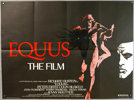
Poster art by Bob Peak.

• Sidney Lumet’s 1977 film of Peter Shaffer’s Equus receives a limited blu-ray release by the BFI in August. Richard Burton’s performance has always received a mixed response (I’ve never been in the anti-Burton camp) but the film is serious and well-made. And, as with The Offence (1973), there’s the thrill of seeing Lumet turn his attention away from his beloved New York City to examine British lives.

• “Astronomer claims to have pinpointed date of Vermeer’s View of Delft.” Yes, but how long did it take Vermeer paint the view? Speaking as someone who used to paint a lot, I’d say two or three days at least. Then there’s that awkward thing known as “artistic licence”…

• “I was taken aback by the antic side of Borges. He was irreverent, funny, insistent on his ways, and brilliantly talkative.” Jay Parini on Jorge Luis Borges, and his experience as the writer’s chauffeur in the Scottish Highlands.

• Strange Islands: Benjamin Welton on a favourite cinematic micro-genre I explored here a few years ago: the mysterious tropical island that’s a home to fearsome beasts and outsized (often deranged) personalities.

Greydogtales on The Sapphire Goddess of Nictzin Dyalhis, the Weird Tales writer with a name like a character from one of his stories.

• “I came for the giant phalluses and stayed for the joy of being a gay person.” Eight artists on the influence of Tom of Finland.

Tamsin Cleary on Nobuhiko Obayashi’s House (1977) which she calls “the world’s most demented haunted house film”. It really is.
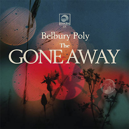
The Gone Away, a short film by Sean Reynard for the forthcoming album from Belbury Poly.

Moorcography: the beginnings of an online Michael Moorcock bibliography.

• “Our sound engineer got a death threat”: Andrew Male on Olivia, a lesbian record label.

Bajo el Signo de Libra explores the art of Aubrey Beardsley.

• At Dennis Cooper’s: Hans-Jürgen Syberberg Day.
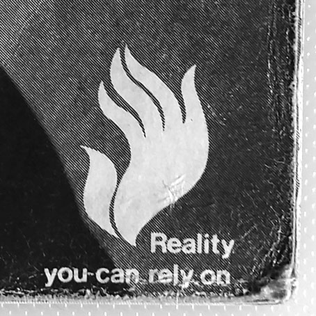
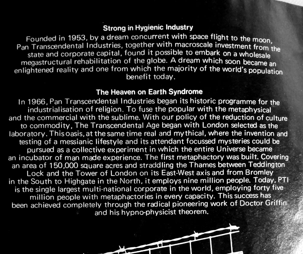
The secret drawings of Great Britain’s UFO Desk.

Wyrd Daze Lvl.4 is here.

The Four Horsemen (1971) by Aphrodite’s Child | All The Pretty Little Horses (2004) by Coil | When The Horses Were Shorn Of Their Hooves (2018) by Dylan Carlson

Hardy art

hardy1.jpg

Hawkwind continue to be the overwhelming topic of the moment while I’m reading Joe Banks’ marvellously detailed account of the group’s first decade. One of the many attractions of Hawkwind for this listener was their intersection with other areas of interest: Moorcock and New Worlds, obviously (two of Robert Calvert’s poems appeared in New Worlds Quarterly), but also SF and fantasy in general. The alien planet on the back cover of the Hall of the Mountain Grill album was immediately recognisable as the work of British space artist David A. Hardy thanks to a feature in Visions of the Future (1976) a collection of artwork reprints from the art and fiction magazine Science Fiction Monthly. Hardy had a long association with astronomer Patrick Moore, illustrating the covers of Moore’s novels and later collaborating on a speculative science book, Challenge of the Stars (1972). A few of the latter paintings were reprinted in Visions of the Future, including one with the title Alien Life Forms that depicted amoeboid creatures on a remote planet. The painting would have become the back cover of the Hawkwind album if Hardy hadn’t insisted on creating a new work in a more suitable ratio.

Hardy’s association with Hawkwind extended to their stage shows, with a series of circular paintings used by “Liquid Len” (Jonathan Smeeton) on a rotating projector that covered the band in moving panoramas of ancient monuments, dinosaurs, alien landscapes and exploding worlds. Two of the paintings appear as the endpapers in Joe’s book; the dinosaurs and the monuments may be seen here.

hardy2.jpg

Cover design by Bryan Cholfin.

My own Hawkwind covers make very poor comparisons to Hardy’s meticulous renderings but we do have a further connection via The Very Best of Fantasy and Science Fiction, a collection of stories from the long-running magazine edited by Gordon Van Gelder. I designed the book’s interiors and Hardy contributed the cover art. Hardy painted many covers for F&SF throughout the 1970s and 80s, this shining rocket being a reworking of a cover he produced for the magazine’s 60th anniversary issue. The archetypal spacecraft of classic science fiction, and almost a definitive example. You might even call it a silver machine…

Previously on { feuilleton }
Silver machines
Notes from the Underground
Hawkwind: Days of the Underground
The artists of Future Life
Science Fiction Monthly
The Chronicle of the Cursed Sleeve
Rock shirts
The Cosmic Grill
Void City
Hawk things
The Sonic Assassins
New things for July
Barney Bubbles: artist and designer

Jean Alessandrini book covers

alessandrini05.jpg

It’s that Golem again, depicted in 1979 by Jean Alessandrini. The publisher was Bibliothèque Marabout, a French fantasy/horror imprint active from the 1960s to the 1990s that was the genre division of Éditions Marabout, itself a division of publishing behemoth Hachette. Bibliothèque Marabout published a wide range of titles, with many familiar names in addition to writers such as Jean Ray, Thomas Owen and Paul Féval whose work receives little attention in the Anglophone sphere. By 1970, many of these covers had a uniform appearance, predominantly painted illustrations on black backgrounds with the titles set in Roberta, one of the Art Nouveau-styled typefaces of the occult revival. All the Alessandrini covers date from the late 70s and early 80s, and show an evolution of the imprint’s style, with the same black livery but a different typeface that I can’t identify (Coliseum is the closest digital equivalent), together with artwork that’s more of a design rather than an illustration of the book’s contents.

alessandrini02.jpg

Jean Alessandrini is a French artist, designer, typographer and author, also the creator of Typomanie, a book of type designs that I’d like to see. He provided cover drawings in the late 1960s for French SF magazine, Fiction, and later worked for the popular comics magazine Pilote, but his Marabout covers look like collage works, with the grainy appearance of photocopied photos that Neville Brody also favoured for his album cover designs. The combination of a simple symbolic graphic in bright colours on a black background is very reminiscent of David Pelham’s designs for Penguin, some of which also used collage elements. French genre titles seldom seem to follow design trends exterior to France so if there was a Penguin influence at work it’s an unusual case.

Jean Alessandrini has a small but well-designed website here.

alessandrini01.jpg

alessandrini03.jpg

Continue reading “Jean Alessandrini book covers”