Weekend links 279

ray.jpg

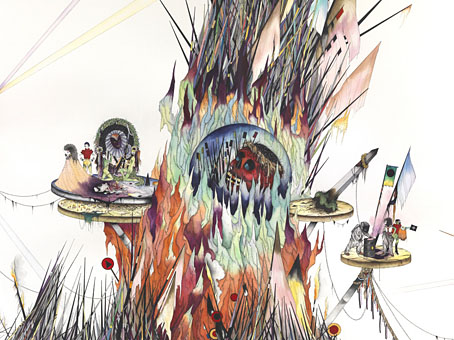
Untitled painting by Jen Ray.

• Lots of architecture links this week so it’s fitting that one of them is director Ben Wheatley talking to David Fear about his forthcoming film of JG Ballard’s High-Rise: “I was just thinking about this the other day, how hard it was to get a hold of stuff before the Internet. You really had to hunt down stuff or have someone who knew what was up to say, ‘You gotta read Naked Lunch, mate. You gotta read Crash.’ […] They were secretive things you had to ferret out, those books. It was the same with music and certain movies. And drugs.” Related: Souvenir d’un Futur, photographs by Laurent Kronental of the high-rise banlieues of Paris.

• “In Ancient Egypt, if a lowly official received the glyph of an owl from the Pharaoh, it was understood that the recipient should take his own life.” Carey McHugh in a brief history of the owl.

• I’d always thought the red buildings seen briefly in Blow-Up (1966) had been painted to Antonioni’s orders. Not so, says Another Nickel In The Machine.

He belongs right up there with Poe and Kafka. The best writer of weird fiction in the past half century. And the reason he belongs there is Ligotti’s both visceral and intellectual, formally experimental and able to tell a traditional horror story with equal ease. He’s also modernized the weird tale, from his early work on. The later workplace stories complete that process. The other thing he brings is a very dark sense of humor and a sense of the absurdity of the world—and a critique of that world that serves as subtext. All of these elements in harmony—symbiosis and contamination—equal genius. I read his work in a continuum that includes Kafka, Poe, Angela Carter, Bruno Schulz, Rikki Ducornet, and the great Caitlin R. Kiernan, but also absurdists and realists and flat-out surrealists. I appreciate that Ligotti stories can be revisited and reveal new dimensions.

Jeff VanderMeer on Thomas Ligotti

David Ferry talks to the people trying to excavate the remains of sets from Cecil B. DeMille’s first film of The Ten Commandments.

• As part of the ongoing vinyl reissue deluge, Crammed Discs are releasing a 10-disc box of albums by the great Tuxedomoon.

• At Strange Flowers: I see for it is night, remembering Marie Cermínová, better known as Surrealist artist Toyen.

Blue Sun Chiming, an animated video by Elisa Ambrogio for the song of that name by Six Organs of Admittance.

• At BLDGBLOG: Occult Infrastructure and the “Funerary Teleportation Grid” of Greater London.

• Enigmatic music makers Watch Repair are now selling their works at Bandcamp.

• Video by Harald Albrigtsen of whales basking under the Northern Lights.

• The urban explorations of Russian photographer Ralph Mirebs.

• Mix of the week: Secret Thirteen Mix 164 by Discipula.

The lost rivers that lie beneath London

Egypt (1985) by Tuxedomoon | Whales Tails (1986) by Cocteau Twins | London’s Lost Rivers (1996) by Coil

Us Down By The Riverside, a film by Jud Yalkut

yalkut2.jpg

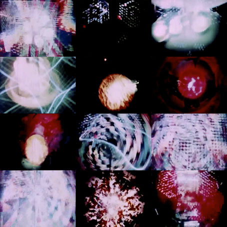
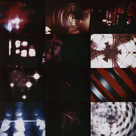
More psychedelic freakery from American filmmaker Jud Yalkut. Us Down By The Riverside (1966) is short and sweet: three minutes of acid visuals accompanied by a muddy recording of The Beatles playing Tomorrow Never Knows. Groovy. For a very different take on John Lennon’s psych-out, see the penultimate episode of cartoon show, The Beatles.

Elsewhere on { feuilleton }
The abstract cinema archive

The Chronicle of the Cursed Sleeve

blacksword7.jpg

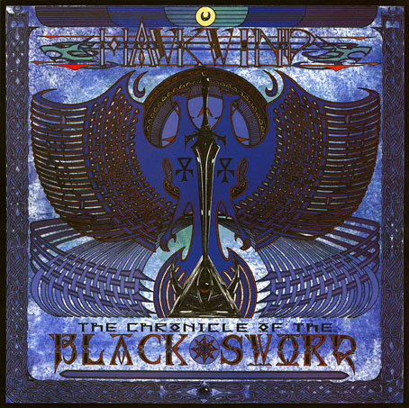
A copy of the cover art that I attempted to colour-correct some years ago to compensate for the poor print reproduction.

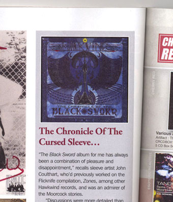
This month I’m in Record Collector magazine talking in a sidebar feature about my work on the Hawkwind album The Chronicle of the Black Sword. The issue is Hawkwind-heavy, with a Nik Turner interview, a history of Flicknife Records (the label that released COTBS), and a retrospective feature on the Black Sword album which was released in December 1985. My words were slightly cut to fit the allotted space but I can run the full text here in which I describe my ambivalent feelings towards this particular cover.

blacksword8.jpg

The Black Sword album for me has always been a combination of pleasure and disappointment. I was very pleased initially to hear that Hawkwind were writing a concept based on the Elric books, a series I’d enjoyed for many years. Cover discussions were a little more detailed than usual since this design was sketched out beforehand then approved by the Dave Brock and co. Prior to this I’d been creating something vague after equally vague requests; communication back then was all done via post and call box as I didn’t own a phone.

This was the first album where I was able to create an integrated front and back cover design. A friend had recently found me a copy of George Bain’s Celtic Art: Its Methods of Construction (1951), a study of the creation of Celtic knotwork, and I was keen to use this somehow. Rather than do a cover that looked like a fantasy paperback the idea was to use the knotwork style to create something that was suitably Hawkish whilst also fitting the Elric theme. The front cover has some nods back to earlier Hawkart in the winged sphere—which goes back to Barney Bubbles and his obsession with Ancient Egypt—and the eye-in-a-triangle, a symbol which first appeared on the cover of the Hawklog booklet in the In Search of Space album, and which I scattered throughout many of my Hawkwind designs.

All the lettering on the album was hand-drawn (not very well in places) using letterforms based on Bain’s examples from the books of Kells and Lindisfarne. I drew the track listing onto the artwork for the back cover, a decision that later proved to be a bad one when the band decided to change the running order of the songs, hence the large purple square that spoils the design. My lack of any direct contact with the record company made problems like this inevitable; I was trying to do graphic design at a distance without having any communication at all with the printers responsible for the sleeve. Before digital design, the creation of an album cover could be a complicated business involving photo-mechanical transfers, knockout areas, overlays, typesetters and more; if you weren’t in direct contact with the printer (or somebody who was) then you simply had to hope for the best.

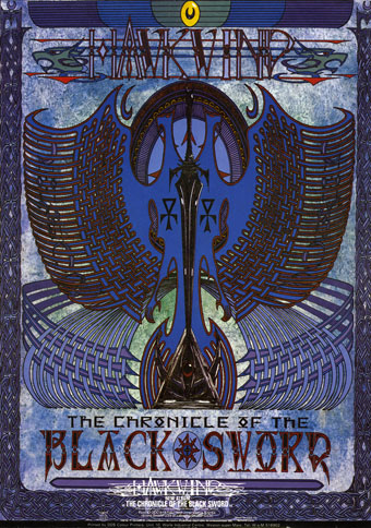
This process of design-at-a-distance led to the disaster with the cover printing, the front of which has an unwarranted blue cast that dulled the impact of the sleeve and, for me, ruined the whole thing. You can see how the cover should have looked by comparing the background colours of front and back; the front was also printed in its true colours on the back page of the 1985 tour programme. It was this, and the messy appearance of the lettering on the back, that pushed me further towards ending my involvement with Hawkwind and doing something of my own over which I’d have complete control.

blacksword1.jpg

The retrospective feature in the magazine includes a picture of the back cover of the tour programme (above) so those familiar with the album can see the difference in reproduction. The difference isn’t so noticeable on the copies posted here after I tried altering the tones of the cover. Over the years I’ve grown used to the blueness but the back cover remains blighted by its purple boxes.

Continue reading “The Chronicle of the Cursed Sleeve”

Turn, Turn, Turn, a film by Jud Yalkut

yalkut.jpg

I’m currently reading my way through Rob Chapman’s lysergic doorstop Psychedelia and Other Colours, a comprehensive study of a cultural phenomenon that’s well-represented on these pages. So expect more posts like this one which concerns another gem of abstract/psychedelic cinema. Turn, Turn, Turn (1966) is a collaboration between Jud Yalkut (visuals) and the Us Company aka USCO (sound). The latter receive several mentions in Chapman’s detailing of the early psych scene in San Francisco in the mid-60s; here they put a Byrds song through the mangler while Yalkut’s mechanical and other effects flicker and gyrate. The visuals are reminiscent in places of the film made by László Moholy-Nagy of his Light-Space Modulator, fittingly so when Chapman credits Moholy-Nagy’s machine with being one of the many forerunners of psychedelia in the art movements of the early 20th century.

The YouTube copy linked here has a bonus at the end with a truncated version of a later Yalkut collaboration with Nam June Paik, Beatles Electronique.

Elsewhere on { feuilleton }
The abstract cinema archive

Relativity

escher1.jpg

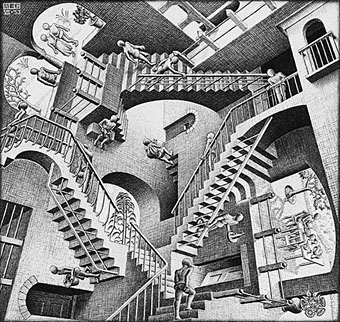
Relativity (1953) by MC Escher.

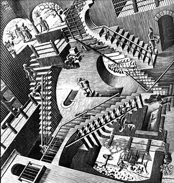
Escher’s famous lithograph has a less familiar companion piece in the woodcut below.

escher2.jpg

escher3.jpg

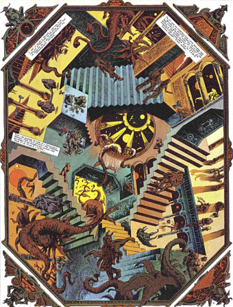
Delirius (1972) by Philippe Druillet.

Lone Sloane’s adventure on the pleasure planet of Delirius was written by Jacques Lob, and features this diversion in the Palais d’Escher. Possibly the first fictional use of one of Escher’s prints.

Continue reading “Relativity”