Weekend links 47

beksinski1.jpg

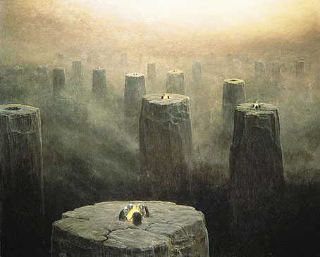
DG-2499 (1975) by the fantastic (in every sense of the word) Zdzislaw Beksinski (1929–2005). See the Dmochowski Gallery for a comprehensive collection of the artist’s work. Thanks to BibliOdyssey for the tip.

• More ICA events: From Animism to Zos: Strange Attractor Salon will be “a series of weekly events, consisting of a talk and a film, exploring some lesser-known intersections of culture, history, mind and nature” running from 10 March–12 May, 2011.

• And on May 10, the London Word Festival presents a Dodgem Logic evening with entertainment provided by contributors to that magazine:

Alan Moore’s reinvigoration of the underground fanzine, Dodgem Logic, comes alive in the non-conformist surroundings of Hackney’s Round Chapel. A night of art, comedy, comment and put-something-back localism. (…) With Robin Ince heading up a colossal stand-up bill, artists Steve Aylett, Savage Pencil, Melinda Gebbie and Kevin O’Neill panel-up to talk about their comic work, while music comes from hyperactive racketeers The Retro Spankees. With an exhibition of artwork from the magazine, and conducted by editor-in-chief Alan Moore.

• Taschen publishes a collection of Dennis Hopper’s photographs this week. The Independent has a small selection here. Also new from Tachen, Alex Steinweiss, The Inventor of the Modern Album Cover.

Bass Notes: The Film Posters of Saul Bass at the Kemistry Gallery, London.

beksinski2.jpg

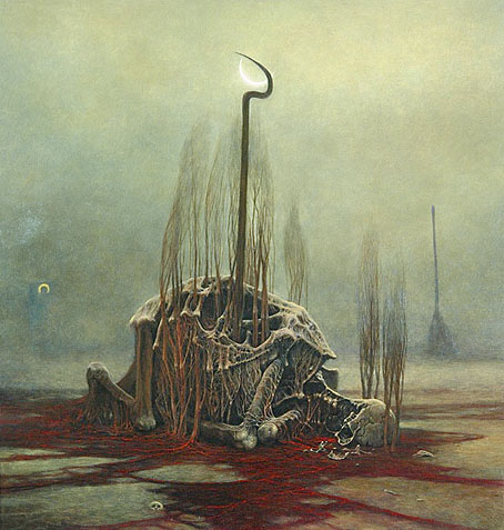
DG-2507 by Zdzislaw Beksinski.

While riding through the bustling streets of London from 1603 to 1621, one was liable to hear the shout “Long live Queen James!” King James I of England and VI of Scotland was so open about his homosexual love affairs that an epigram had been circulated which roused much mirth and nodding of the heads: Rex fuit Elizabeth: nunc est regina Jacobus—”Elizabeth was King: now James is Queen.”

There’s more about the private life of the man who gave his name to the King James Bible here.

Addams and Evil, a Tumblr devoted to the great Charles Addams.

Hannes Bok again at Golden Age Comic Book Stories.

Caravaggio’s crimes exposed in Rome’s police files.

Deserted City, photographs by Kim Høltermand.

• The blue sand dunes of the planet Mars.

• A map of the ghost signs of Chicago.

The movie title stills collection.

The pitfalls of e-book buying.

Life On Mars? (1971) by David Bowie | Uncle Sam’s On Mars (1979) by Hawkwind | Eyes On Mars (1980) by Chrome | Cache Coeur Naif (1997) by Mouse on Mars.

Design as virus 10: Victor Moscoso

india.jpg

Continuing an occasional series.

A recent post at A Journey Round My Skull is a stylish series of Indian book jackets from 1964 to 1984. These impress partly for the way they rework western design approaches, and they consequently look very different from the florid visuals one might (lazily) expect of Indian cover design. Western culture borrowed more than enough from India in the 1960s, from clothes to music, so it only seems right that the sub-continent should be free to take something back.

luna.jpg

Luna Toon by Victor Moscoso (1968).

Will at A Journey Round My Skull mentions the above cover design as reminding him of this Krautrock bible, The Crack in the Cosmic Egg, a book which happens to be a favourite repository of musical obsession. The cover reminded me more of the weirdly abstract comic strips created by artist and graphic designer Victor Moscoso for the early run of Zap Comix in the late Sixties. Moscoso was one of the most graphically revolutionary of the West Coast poster artists, and his approach to comics looks surprisingly fresh today next to the work of fellow artists like Robert Crumb. Those limitless vistas go back to Giorgio de Chirico but it was Salvador Dalí who made deserts raked by evening shadows reflect interior landscapes of his own, and it was Dalí’s immense popularity that in turn popularised that endless plane as a stage for surreal events. Moscoso borrows from the Surrealists and comic artists like George Herriman as much as he borrows from Disney; in his posters he was one of many artists taking motifs or whole designs from Art Nouveau. Our Indian egg may well be an original work but the first example in Will’s post is a very Saul Bass-like hand, so I’m guessing that the designers of these books were looking around for inspiration. And that eye-in-a-hand? Moscoso had done that as well.

neon.jpg

Blues Project Poster by Victor Moscoso (1967).

While we’re discussing Victor Moscoso, it’s convenient to draw attention to a slight mystery connecting his poster art and the great album cover designer, Barney Bubbles. The poster above was one of a number that Moscoso made incorporating Victorian or Edwardian photographs, and two at least of these use antique erotica as their central image.

ritual.jpg

Space Ritual interior, design by Barney Bubbles (1973).

This particular photo always stands out for me. The woman is familiar to anyone who’s seen the interior of the fold-out sleeve Barney Bubbles created for Hawkwind’s Space Ritual album in 1973. Barney spent some time in San Francisco in the late Sixties and was undoubtedly familiar with Moscoso’s work, as he was with all the great designs coming from the West Coast at that time. What surprises me is that he should have somehow found the same image to use as Moscoso did. Was there a popular book of Edwardian erotica which everyone was familiar with? Did he ask Moscoso where he’d found the photo? Did he find it by chance? Barney Bubbles experts don’t know the answer (I’ve asked) and the question is in any case a rather trivial one. But I’m still curious… As early porn photos go it’s a particularly fine one and I’d like to know whether there are more like it and where it came from. Needless to say, if anyone knows more about this, please leave a comment.

Previously on { feuilleton }
Design as virus 9: Mondrian fashions
Design as virus 8: Keep Calm and Carry On
Design as virus 7: eyes and triangles
Design as virus 6: Cassandre
Design as virus 5: Gideon Glaser
Design as virus 4: Metamorphoses
Design as virus 3: the sincerest form of flattery
Design as virus 2: album covers
Design as virus 1: Victorian borders

The Fabulous Fifties

fifties.jpg

Okay, so it’s not all Fifties’ design—the Moog album is from 1974—but these are more choice Flickr postings from a set devoted to album sleeves of the Easy Listening variety. Much of the music would no doubt erode my patience very quickly but there’s some nice (uncredited) design work going on. Viva! Percussion! has a distinct Saul Bass quality while The Sound of Chris Cross looks like something from the Designers Republic 20 years before its time. The Bolero album I picked solely out of shameless nostalgia. My mother used to have this among her collection of light classical albums and I’d completely forgotten about it until today. This recording would have been the first I heard of any of Ravel’s works. My sister and I used to find the cover slightly rude due to the red points on the ends of the model’s steel brassiere.

Lots more great sets at the same Flickr account; go and lose yourself. Thanks to Thom for the tip!

Elsewhere on { feuilleton }
The album covers archive

Previously on { feuilleton }
Exotica!

Plates: Volume 2

plates.jpg

My third CD design for the Tectonic label is another piece of relative minimalism which once again features photos by Liz Eve. All the backgrounds on this occasion are microscope close-ups of vinyl records, very fitting for a double-CD collection of recent 12″ releases.

The Tectonic logo (which predates my involvement with the label) is based on the Technics logo and for this release I tidied the label logo slightly, a process which led to the discovery that the Technics design used a variant of the Clarendon typeface for its letter shapes (it’s not an exact match). This in turn led me to use Clarendon in various weights across the packaging, something which made a change from the usual sans serif or monospace font. The great Saul Bass frequently used Clarendon for his title sequences; if it’s good enough for Saul, it’s certainly good enough for me.

Tectonic main man Rob Ellis talked to Fact magazine about the new release earlier this week.

Previously on { feuilleton }
Aerial by 2562
New things for November

Pablo Ferro on YouTube

ferro1.jpg

Dr. Strangelove titles (1964).

There’s less of his work around than there should be, unfortunately. Saul Bass is justly celebrated for his title sequences and poster designs yet Pablo Ferro—whose titles were equally innovative and memorable—is rarely heard of even though you’ll have seen a lot of his work.

ferro2.jpg

Bullitt titles (1968).

Ferro’s advertising films brought him to the attention of Stanley Kubrick for whom he created titles and trailers for Dr. Strangelove and A Clockwork Orange (1971). The hand-drawn quality of the Strangelove titles was revisited for Stop Making Sense (1984) and Men In Black (1997), while the frenetic pace of the Clockwork trailer still seems advanced over thirty years later. This collection lacks his titles for the original Thomas Crown Affair (1968) but you can see a mix of Ferro’s split-screen work (which includes parts of the titles) here.

By Pablo Ferro:
Dr. Strangelove trailer
Dr. Strangelove titles
Bullitt titles
A Clockwork Orange trailer
Stop Making Sense titles
To Die For titles
LA Confidential titles

This Is Pablo Ferro

About Pablo Ferro:
• Pablo Ferro documentary clips: I | II

Quick Cuts, Coarse Letters, Multiple Screens—an article by Steven Heller
• Free Ferro-derived fonts! Pablo Skinny | Major Kong

Previously on { feuilleton }
Juice from A Clockwork Orange
Clockwork Orange bubblegum cards
Alex in the Chelsea Drug Store