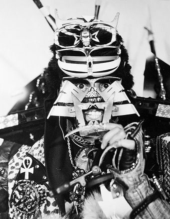
Rammellzee RIP

rammellzee.jpg

Rammellzee.

I consider that immortality is the only goal worth striving for: immortality in space. Man is an artefact created for space travel.
William Burroughs, 1982

We have to leave this tasteless mould of a planet.
Rammellzee, 2004

It’s fitting that a post about the late Rammellzee should follow one about Brion Gysin even if the circumstances aren’t those one would wish. Before he was involved in music Rammellzee was a graffiti artist and the convoluted mythologising which he later wove around the art of the graffiti tag—and his obsession with words and their meaning—bears comparison with Gysin and Burroughs’ similar mythologising, their theories about the viral origins of language. Look at Gysin’s calligraphic paintings (which he based on Arabic script) and you’ll see an exact analogue with the stylisations of graffiti taggers.

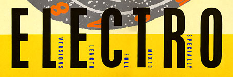
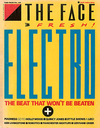
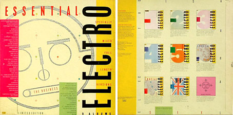
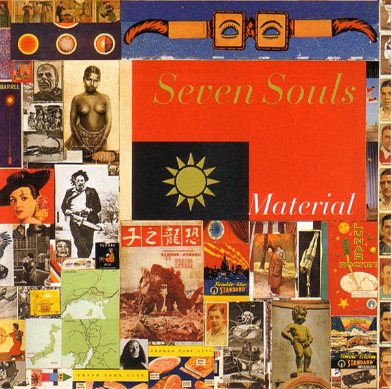
Given all of that, it’s even more fitting that Rammellzee was one of the voices chosen by Bill Laswell to set beside William Burroughs on Material’s finest forty minutes, Seven Souls, in 1989. I knew that voice from the great 1983 single he made with K-Rob, Beat Bop, one of many highlights on the best of the Street Sounds compilations, Electro 2, so it was a pleasant surprise finding it on the album which remains the best musical work that Burroughs was involved with. Rammellzee’s subsequent recordings with Laswell and others evolved an elaborate strain of what’s now known as Afrofuturism which he extended into paintings, collages and sculptural work. When you look at his detailed, science fiction philosophies, or at the underwater mythologies of Drexciya, it’s evident that there’s a rich seam of the African-American imagination which exactly parallels Burroughs’ visionary work. Visionaries right now are in short supply; we can’t afford to lose another.

Rammellzee: The Remanipulator versus Syntactical Virus by Peter Shapiro (1997)
No Guts No Galaxy—Rammellzee & phonosycographDISK (1999)
Rammellzee: The Ikonoklast Samurai by Greg Tate (2004)

Previously on { feuilleton }
Street Sounds Electro
The art of Shinro Ohtake

Street Sounds Electro

electro.jpg

I spent much of the summer of 1983 playing games on a very primitive ZX Spectrum computer while listening to the first couple of Street Sounds Electro compilations. Those mix albums were among the best releases that year and remain highly sought after, seeing as they’ve never been reissued on CD.

face.jpg

The musical reputation of the compilations has overshadowed the sleeve design which was very distinctive for the time and undoubtedly a factor in their success. The vertical ELECTRO type was inspired by Neville Brody’s design for The Face which had turned the magazine’s title through ninety degrees the year before. Also very Brodyish was the use of photocopier-processed graphics and narrow typography although it should be pointed out that Brody hand-drew nearly all his headlines which left his imitators searching through type catalogues for approximations. The sleeve designs are credited to “Red Ranch for Carver’s” about whom I can find no information whatever. Things came full-circle when The Face ran a feature on the electro scene in 1984 giving Brody the opportunity to do a cover with his own variant on the sleeve layouts.

essential.jpg

Essential Electro 9-album box, HBOX 1 (1984).

One of the big attractions of these albums for me was the new directions they were opening up for electronic music. Outside the mainstream pop world electronica in the early Eighties meant either the polite fare of Tangerine Dream or the dreary sludge of minor industrial acts such as Portion Control. Cabaret Voltaire were still vital in the early 1980s: their thundering Crackdown single (with sleeve design by Neville Brody) was remixed for its 12-inch incarnation by dance producer John Luongo while electro producer John Robie (whose production is featured on Electro 1) remixed their Yashar single for Factory Records. But nothing matched the excitement of a bunch of NYC kids lifting Kraftwerk riffs and playing in a very unselfconscious manner with new and relatively cheap equipment, especially the Roland TR-808 drum machine which provides the backbone for many of these recordings.

Continue reading “Street Sounds Electro”

The art of Shinro Ohtake

queer.jpg

Shinro Ohtake is always on the attack. Whether it’s against misguided art education, against the cold treatment and economic constraints Japan puts on anyone who could dare to live differently, against the contemporary art establishment that can’t be bothered to even disguise its own incomprehension—his fight as an artist continues. Ohtake is prodigious, original, and a trouble-maker—in the sense that the work of the artist is always to create difference.

William Burroughs

Two disparate things had me looking for Shinro Ohtake‘s work this week: I’ve been doing a short interview about album cover design (more about that at a later date) in which I mentioned his collage for the cover of Seven Souls by Material (1989), then an editorial in the latest Wire describes his current retrospective exhibition at the Museum of Contemporary Art in Tokyo.

seven_souls.jpg

The Material cover is one I picked as a favourite design. It’s difficult trying to pin-point why I think this works so well without it being at all illustrational. (I’m guessing, but it’s likely that Bill Laswell picked it out of one of Ohtake’s collage books, rather than it being specially commissioned.) It may be the collage aspect that works here. The album features readings by William Burroughs set to music and for me is the best of all the Burroughs recordings (Dead City Radio being a close second). Burroughs’ work, of course, involved literary collage via his own cut-up process, and the musical content can also be seen as a collage in the way it mixes different styles and musicians—Simon Shaheen, Shankar, Rammellzee, Foday Musa Suso, Fahiem Dandan and samples of the famous Brian Jones recordings of the Jajouka pipers. It’s a shame that when the CD was reissued in 1997 (in a superior mastering, it should be noted), the original artwork was largely junked in favour of a lot of muddy Photoshop work from the usually excellent Russell Mills. I’ve a huge respect for Mills but this treatment was a serious mistake.

Elsewhere on { feuilleton }
The album covers archive

Previously on { feuilleton }
William Burroughs book covers