Barney Bubbles: artist and designer

barney1.jpg

Image-heavy post! Please be patient.

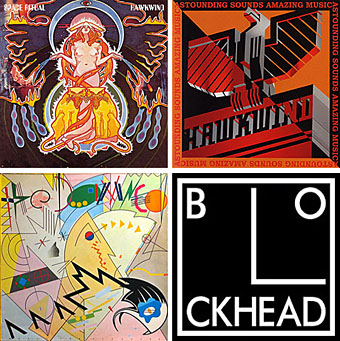
Four designs for three bands, all by the same designer, the versatile and brilliant Barney Bubbles. A recent reference over at Ace Jet 170 to the sleeve for In Search of Space by Hawkwind made me realise that Barney Bubbles receives little posthumous attention outside the histories of his former employers. Since he was a major influence on my career I thought it time to give him at least part of the appraisal he deserves. His work has grown in relevance to my own even though I stopped working for Hawkwind myself in 1985, not least because I’ve made a similar transition away from derivative space art towards pure design. Barney Bubbles was equally adept at design as he was at illustration, unlike contemporaries in the album cover field such as Roger Dean (mainly an illustrator although he did create lettering designs) and Hipgnosis (who were more designers and photographers who drafted in illustrators when required).

Colin Fulcher became Barney Bubbles sometime in the late sixties, probably when he was working either part-time or full-time with the underground magazines such as Oz and later Friends/Frendz. He enjoyed pseudonyms and was still using them in the 1980s; Barney Bubbles must have been one that stuck. The Friends documentary website mentions that he may have worked in San Francisco for a while with Stanley Mouse, something I can easily believe since his early artwork has the same direct, high-impact quality as the best of the American psychedelic posters. Barney brought that sensibility to album cover design. His first work for Hawkwind, In Search of Space, is a classic of inventive packaging.

Update: BB didn’t work with Mouse in SF, I’ve now been told.

in_search_of_space.jpg

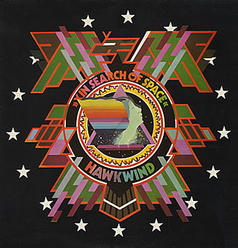
Hawkwind: In Search of Space (1971).

It’s fair to say that Hawkwind were very lucky to find Barney Bubbles, he immediately gave their music—which was often rambling and semi-improvised at the time—a compelling visual dimension that exaggerated their science fiction image while still presenting different aspects of the band’s persona. In Search of Space is an emblematic design that opens out to reveal a poster layout inside. One of the things that distinguishes Barney Bubbles’ designs from other illustrators of this period is a frequent use of hard graphical elements, something that’s here right at the outset of his work for Hawkwind.

This album also included a Bubbles-designed “Hawklog”, a booklet purporting to be the logbook of the crew of the Hawkwind spacecraft. I scanned my copy some time ago and converted it to a PDF; you can download it here.

Continue reading “Barney Bubbles: artist and designer”

City of Spades

city_of_spades.jpg

Today’s book purchase is a secondhand copy of the first novel in Colin MacInnes’ London trilogy (Absolute Beginners and Mr Love and Justice were the others). City of Spades was first published in 1957 but this is the 1985 reissue with a cover by Neville Brody which is the main reason for my picking it up. The books were reprinted in the mid-Eighties to coincide with the release of Julien Temple’s dreadful musical adaptation of Absolute Beginners, a film that must have done a lot to drive people away from MacInnes’ books; it certainly had that effect on me. Brody supplied all the faux-pulp covers for the reissued series.

MacInnes is remembered now by contemporary writers like Iain Sinclair for his pungent documenting of London lowlife. He was also something of a pioneer in writing about the Fifties’ gay scene in a matter-of-fact manner. You can read more about his works here.

Elsewhere on { feuilleton }
The book covers archive

In print

magazines1.jpgBattling through the Xmas post, two new volumes arrived here this week, from Black Velvet and Black Dog Publishing respectively. First up was Serpenti & Scale, the Italian edition of Snakes & Ladders by Alan Moore and Eddie Campbell. This has been available for some time in English, of course. The translated version features some of my artwork for the Moon and Serpent CDs by Alan and Tim Perkins in the lengthy interview section that precedes Eddie’s comic strip. Thanks to Smoky Man for that.

Inevitably overshadowing this was 100 Years of Magazine Covers which author Steve Taylor very graciously had sent to me. A heavyweight book in all senses of the word, with a solid cover, thick paper stock and tremendous design by Neville Brody. Taylor navigates the overcrowded field of 20th-century magazine design with great skill, managing to cover all the principal areas of magazine as news medium, fashion journal, literary forum and vehicle of cultural transgression, whether that be the Sixties’ underground, Seventies’ punk or the disparate worlds of gay life and feminism. Illustrations range from the elegance of early Collier’s and Vogue to the garish incoherence of today’s celebrity rags such as Heat. Given such a broad field of study there are bound to be omissions; I would have liked to have seen something from the New Worlds of the late-Sixties, for example, and maybe one of the Non-Format covers for The Wire. But they got Lilliput in there which is pretty impressive considering that magazine now seems to be largely forgotten. Essential stuff.

Previously on { feuilleton }
It’s a pulp, pulp, pulp world
A few thousand science fiction covers
Vintage magazine art II
Neville Brody and Fetish Records
View: The Modern Magazine
Vintage magazine art
Oz magazine, 1967–73

The Times makeover

times2.jpg

The new masthead designed by Luke Prowse, with a coat of arms
by wood engraver Edwina Ellis.

So, in today’s Neville Brody news (no, I’m not intending on posting about him every day…) it seems the designer has been busy with colleague Luke Prowse making The (London) Times look better. Not before time (so to speak), it was starting to look very out-of-date beside the recent makeovers at The Guardian and Independent. Brody is evidently first choice for these kind of projects at the moment, confirming that he’s still one of our most important print designers.

Among the changes are a new typeface, Times Modern, which has been applied to a new design for the masthead. Considering that this is one of the most famous newspaper mastheads in the world, I hadn’t realised it had changed so much over the years. The Times website has a nice online gallery showing the development from its earliest days as “The Daily Universal Register” through to the present.

times1.jpg

An early edition from 1788.

Brody has said of the new typeface, “Times Modern is a contemporary answer to the needs of compact newspapers. With pinched proportions, it allows more copy in the headline without compromising legibility. It is both authoritative and elegant, while robust at smaller sizes.” Since he’s on record expressing his dislike for Times New Roman, he must have enjoyed being given the opportunity to supplant an ugly and over-familiar font with something more suitable.

Previously on { feuilleton }
100 Years of Magazine Covers

100 Years of Magazine Covers

From Black Dog Publishing. Words by Steve Taylor, design by Neville Brody.

If you pick up a copy of this week’s Heat magazine in 30 years time, think how funny it will seem. Our obsession with D list celebrities’ private lives, weight loss and reality TV shows, will become ridiculous in the light of tomorrow’s trends.

Magazines provide us with snapshots of moments in cultural history. Their disposable nature means that they have to sell quickly, and their covers vie for attention on the shelves with images of beauty, sex, shock, humour and celebrity; presenting our fears, desires and aspirations crudely and honestly. When looked at retrospectively, they become fascinating documents that can tell us more about our past self-image than any academic text.

100 Years of Magazine Covers shows the best of these snapshots from throughout the past century. With images from Vogue, Life, Time, The New Yorker, Mayfair, and more subversive publications such as Oz and Sniffing Glue, this book will appeal to anyone and everyone with an interest in popular culture.

magazines1.jpg

magazines2.jpg

magazines3.jpg

magazines4.jpg

magazines5.jpg

Previously on { feuilleton }
It’s a pulp, pulp, pulp world
A few thousand science fiction covers
Vintage magazine art II
Neville Brody and Fetish Records
View: The Modern Magazine
Vintage magazine art
Oz magazine, 1967–73