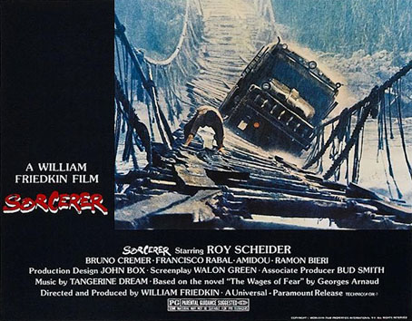
Sorcerer: Druillet and Friedkin

sorcerer1.jpg

Earlier this week I finally got my hands on the recent Blu-ray reissue of William Friedkin’s Sorcerer (1977). Having only ever seen the film on the travesty of a DVD that appeared in 1998 I’m going to enjoy watching this at the weekend. Brits ought to know that (for now) the only edition available seems to be the US version although it is region-free, and if you buy from a UK film dealer on eBay you won’t get hit with import duties.
sorcerer2.jpg

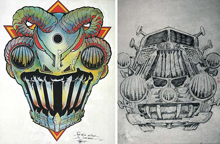
Sorcerer designs by Philippe Druillet.

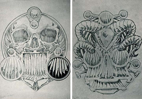
By coincidence, Sorcerer has a minor connection with Philippe Druillet, although his contribution was so minimal that there’s not even a mention of his name on the obsessively detailed Sorcerer film blog. If you’ve seen the film (or Henri-George Clouzot’s equally good earlier version, Wages of Fear), or even read George Arnaud’s novel, you’ll know that the crucial part of the story concerns a potentially suicidal expedition by four men in two trucks, each of which are carrying crates of nitroglycerine through hazardous terrain to the site of an oil-well fire. Friedkin and writer Walon Green expand the story without aping any of Clouzot’s set-pieces (something few directors today would resist), while Friedkin adds some details of his own, notably in the design of the trucks which have distinct “faces” and their own names—”Lazaro” and “Sorcerer”—hence the film’s title which also nods misleadingly to The Exorcist. The truck design was Druillet’s contribution although there’s very little of this apparent on-screen, understandably so when his sketches show fantastic designs that would have no place in the dishevelled jungle town where much of the film takes place. Later sketches by production designer John Box can be found at Wikipedia.
sorcerer3.jpg

Sorcerer designs by Philippe Druillet.

What interests me most about this connection is its being another example of the surreptitious influence of French comics on American cinema during the 70s and 80s. Moebius is the most obvious example of this but it’s also there in the influence of Métal Hurlant/Heavy Metal on the look of Blade Runner, and in Enki Bilal’s design of Molasar in Michael Mann’s The Keep. Since the 1980s we’ve seen a greater industrialisation of conceptual art for the cinema, as a result of which directors are less inclined to look outside Hollywood for their stylists. And now that the treadmill of superhero franchises is grinding away relentlessly, Continental comics and their creators are even less visible than before.

Probably the oddest thing about the Sorcerer/Druillet connection is that the commercial failure of the film in 1977 has often been laid at the door of Star Wars, the advent of George Lucas’s dismal saga being regarded, with some justification, as the opening of the gate to the barbarian hordes. (Friedkin’s film might also have fared better had it not been titled as though it were an Exorcist sequel.) The irony here is that George Lucas happened to be a big Druillet enthusiast, although there’s little evidence of this in his films; in addition to writing an appreciation for Les Univers de Druillet in 2003, he also commissioned Druillet to create a one-off piece of Star Wars art in the late 70s. Knowing this it’s tempting to imagine Lucas creating a very different kind of science-fiction film in 1977, one with some Continental weirdness at its core. But when the world has already been deprived of Jodorowsky’s Dune it’s best not to dwell too much on might-have-beens.

Previously on { feuilleton }
Ô Sidarta: a film about Philippe Druillet
Lovecraft: Démons et Merveilles
Heavy Metal, October 1979: the Lovecraft special
Philippe Druillet album covers
Druillet’s vampires
Salammbô illustrated
Druillet meets Hodgson

Reverbstorm at Supervert

reverbstorm.jpg

Keith Seward’s Horror Panegyric was a concise examination of David Britton’s multimedia Lord Horror project which Savoy Books published in 2007. I designed the book, the cover of which was my Arcimboldo pastiche of Lord Horror’s profile which appeared on the cover of issue 3 of Reverbstorm. The Supervert site which hosts an online copy of Horror Panegyric has this month posted my answers to some questions about Reverbstorm, the series having grown out of the first Lord Horror novel and the earlier comics:

The graphics in Reverbstorm sometimes seem more narrative than the words. How did you and David work out a scenario?

I don’t have objections per se to the usual story structures but in this series we both wanted to create something that wasn’t following familiar adventure narrative lines. The precedents for me were the European comic artists from Métal Hurlant who often favoured art over story; also Burne Hogarth whose work was a great influence on the style I used to draw Lord Horror. Hogarth’s Tarzan strips are adventure narratives but in his later books it’s the art that’s paramount. James Joyce is one of the characters in Reverbstorm, and you can also find a precedent in Ulysses where the story is overwhelmed by the surface detail.

Reverbstorm began with Paul Temple’s lyrics for the Reverbstorm song and a brief Lord Horror film treatment that Dave and Mike had put together for a production company. I don’t recall much about the treatment — I only looked at it once in the office — but it concerned Horror and Jessie Matthews in New York City, opening with a sequence where his Lordship kills some policemen in an alleyway. That vague outline can be seen in the first few pages of Reverbstorm with NYC changed to Torenbürgen. Other elements taken from the film treatment included the name Blue Blaze Laudanum — the actual robotic character came later — and the Souls which likewise became more substantially developed as the comic progressed.

Once we’d introduced all the characters things developed along thematic lines rather than strictly narrative ones. So the second part introduces the Ether Jumpers, the third part has the Apes, the fourth part the Ononoes, the fifth part Picasso and T.S. Eliot, and so on. Musical structure is an obvious parallel, and I consider some of the recurring background material to be visual leifmotifs which can indicate or imply one of the three main characters even if they aren’t present on the page. This musical analogy is an important one for appreciating the series as a whole. The entwined themes and references work in a manner that’s a lot closer to musical works than to the mechanics of an adventure narrative. (more)

Previously on { feuilleton }
Reverbstorm in print
Reverbstorm update
James Joyce in Reverbstorm
A Reverbstorm jukebox
Reverbstorm: Bauhaus Horror
Reverbstorm: an introduction and preview

Chronopolis by Piotr Kamler

chronopolis3.jpg

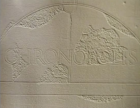
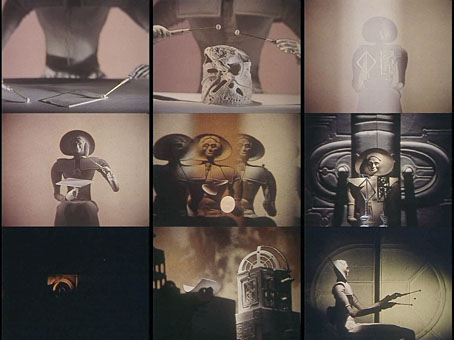
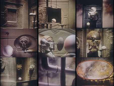
Another gem at Ubuweb, and nothing to do with JG Ballard’s SF story of the same name, Piotr Kamler’s Chronopolis (1983) is a 50-minute animated science fiction film, albeit science fiction of a much more abstract variety than one usually finds in cinema. I’m generally exasperated by the way film and TV SF does little more than play Cowboys & Indians in space so it’s refreshing to see something that’s unashamedly strange and doesn’t feel the need to explain itself. There is apparently a version of this with some English narration for those benighted American audiences everyone feels a need to pander to but the Ubuweb version is wordless, and if you can’t read French then you won’t understand the few lines of text prologue at the opening.

chronopolis1.jpg

Accompanying Kamler’s beautifully crafted and quite inexplicable scenes there’s an electronic score by composer Luc Ferrari, mostly analogue timbres whose origin is as mysterious as the events taking place on-screen. Kamler’s statuesque figures remind me of the gods and aliens that Moebius and co. were drawing in Métal Hurlant during the 1970s. Chronopolis was a French production begun in 1977 so it’s possible that French comics were an influence. Moebius himself worked on another animated SF film during this period, René Laloux’s Time Masters (1982). Chronopolis is closer in tone to the weirdness of Laloux’s earlier Fantastic Planet (1973), and all the better for it.

chronopolis2.jpg

Previously on { feuilleton }
Les Jeux des Anges by Walerian Borowczyk
Les Temps Morts by René Laloux

Heavy Metal, October 1979: the Lovecraft special

hm1.jpg

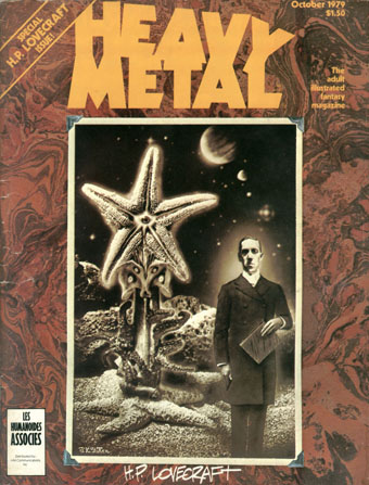
Mr Lovecraft by JK Potter.

HP Lovecraft died seventy-five years ago on 15th March, 1937. Twenty-five years ago I was halfway through drawing my comic strip adaptation of The Call of Cthulhu, conscious at the time that, yes, it was fifty years ago today… I mentioned at the weekend the special Lovecraft edition of Heavy Metal that was published in October 1979; of the many stimuli that led to the drawing of CoC, this magazine was by far the most important. Given the date, now seems as good a time as any to say something about it.

hm2.jpg

Illustration for the contents page by Stephen R. Bissette.

Heavy Metal was the US offshoot of Métal Hurlant, the sf/fantasy comics magazine founded by Jean Giraud (Moebius), Philippe Druillet and Jean-Pierre Dionnet in 1974. Copies of Métal Hurlant could be found in London but none ever made it further north. The advent of Heavy Metal provided an invaluable introduction to a generation of European artists whose work was otherwise difficult to find. Even better: their stories were being translated into English for the first time. The late 70s was a dizzying period for a Lovecraft reader: HR Giger appeared apparently out of nowhere in 1977 when Big O published the first UK collection of his art (which I couldn’t afford at the time), a book with Necronomicon in the title; a year later Thames & Hudson published Franz Rottensteiner‘s The Fantasy Book, an overview of the genre that devoted eight pages to Lovecraft and Arkham House, and which included many illustrations I’d never seen before; in 1979 Giger was all over the newspapers and magazines thanks to Alien; then in October the Lovecraft special dropped onto the shelves. I was stunned: this was that rare occasion when someone creates exactly the thing you want to see at precisely the right moment.

hm3.jpg

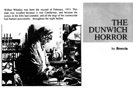
The Dunwich Horror by Alberto Breccia. A superb adaptation.

Looking back, the issue isn’t quite as good as it seemed at the time: many of the stories are slight, a couple have nothing whatever to do with Lovecraft, and, Breccia aside, none of the artists tackle the major works. What counted in the end was the idea of the issue, the implication that Lovecraft’s imagery was there to be seized and reworked in visual form. There were better issues of the magazine, before and after, but for the next six years this one remained for me a tantalising possibility. They hadn’t got it quite right…what if someone else did? After searching comic shop shelves in vain I eventually decided to have a go myself.

Continue reading “Heavy Metal, October 1979: the Lovecraft special”

The art of François Schuiten

schuiten1.jpg

Paris au XXieme Siecle by Jules Verne (1994).

Following a comment I made last week in the post about the Temples of Future Religions by François Garas I’ve decided it’s time to give some proper attention to one of my favourite comic artists, François Schuiten, a Belgian whose obsession with imaginary architecture resembles the earlier endeavours of Garas and others. Schuiten’s parents were both architects which perhaps explains his predilection. In addition to a large body of comics work, he’s produced designs for film—notably Taxandria by Raoul Servais—Belgian stamps, and a steampunk makeover for the Arts et Métiers station of the Paris Métro. In 1994 he created cover designs and a series of illustrations for the publication of Jules Verne’s rediscovered manuscript, Paris au XXieme Siecle.

schuiten2.jpg

Cover for Spirou (2000).

I first encountered Schuiten’s work in a 1980 issue of Heavy Metal magazine which was reprinting translated stories from the French Métal Hurlant along with original work. Schuiten’s story, The Cutter of the Fog, was an erotic and futuristic tale of a small community and the obsession of the local “fog-cutter”. François’s brother Luc wrote the piece and it bears some similarity with JG Ballard’s Vermilion Sands story, The Cloud Sculptors of Coral D. Unusually for Schuiten, the architecture was downplayed in this one although the small homes with their geodesic roofs are like extrapolations of architectural plans from one of the Whole Earth Catalogues.

The next time I saw his work was several years later when artist Bryan Talbot showed me some of the comic albums he’d brought back from a European convention. Among these there were several of the Cités Obscures books that Schuiten had been creating during the Eighties and Nineties with writer Benoît Peeters. These knocked me out with their apparently effortless creation of an imaginary world comprised of several city states, each with their own unique architectural style, and a wealth of retro-future technology, from dirigibles of all shapes and sizes to ornithopters and huge motorised unicycles. One of the many things I liked about European comic artists, and something which made me favour their work over their American counterparts, was the creation of richly detailed imaginary universes with inhabitants one could expect to meet in our world, not facile superheroes or vigilantes. Schuiten went further than his contemporaries by making the architecture meticulously believable and foregrounding its design to an extent that in some of the Cités Obscures stories architecture itself is the subject.

Continue reading “The art of François Schuiten”