Picasso-esque

picasso1.jpgJessica Helfand at Design Observer draws attention to Mr Picassohead, a site which allows you to create your own Picasso-style portraits. The interface doesn’t have as much choice of elements as the Simpsonizer did but messing around with it this afternoon yielded a passable rendering of David Britton’s Lord Horror.

This idling reminded me that I’ve yet to finish reworking the Lord Horror series Reverbstorm which I’ve been engaged with on and off for the past year. The handful of people actually waiting for this magnum opus should know that other work and new Savoy projects keep intervening at the moment. Anyone who saw the original comics will be aware that pastiching Picasso was a consistent theme from issue five onwards. For those who haven’t seen the comics (and few people have…) I’ve posted a couple of the original Picasso-esque Horrors below, beginning with a more representational view of his Lordship for those unfamiliar with the appearance of the man.

lord_horror.jpg

A 1997 portrait which owes much to the style of Burne Hogarth‘s later Tarzan illustrations.

Continue reading “Picasso-esque”

Czanara: The Art & Photographs of Raymond Carrance

czanara1.jpg

Untitled photo print.

A fantastic exhibition of photographs, drawings and engravings by Raymond Carrance, aka Czanara, opens today at Wessel + O’Connor Fine Art, New York, running until June 21, 2008. For those of us who can’t get to see it there’s a selection of the works on show at their site which immediately increases the web visibility of this artist by several orders of magnitude.

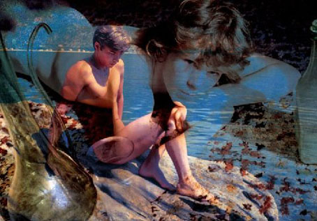
Carrance was a photographer and book illustrator who, working mostly in the 1950’s and 60’s, created a private body of homoerotic dreamscape’s under the pseudonym ‘Czanara’. The exhibit shines new light on Carrance’s art, which is certainly courageous and innovative, especially for its time.

One of the last great unknown erotic artists of the 20th century, his work is somewhat reminiscent of the magic realism style of the painters Paul Cadmus and Jared French, yet done in a photographic medium. Using overlays of abstract graphics over dreamy images of languid young men at play, his work is a meditative pondering of the artist’s psyche. The work is reverential, distinctly European, yet never exploitative.

Carrance, who lived from 1921–1998, was also responsible for illustrating with elaborate etchings and lithographs the works of Jules Renard and Cyrano de Bergerac, as well as an edition of Henry de Montherlant’s 1951 gay classic La Ville dont Le Prince est un Enfant (The Land Whose King is a Child). There will be examples of this riveting work, as well as his compelling drawings, on view as well. Having died with no heirs, his work was sold at auction by the French state, but luckily fell into the hands of a bookseller who we have to thank for it finally seeing the light of day.

czanara2.jpg

Untitled engraving (c. 1950s).

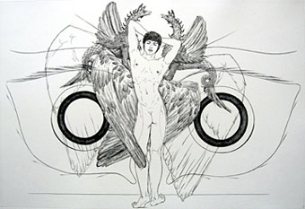
Among the items worthy of note is the above engraving which is another version of the hermaphrodite angel picture I posted in March last year. The other engravings are equally fascinating, looking at times like gay equivalents of Hans Bellmer.
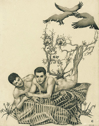
czanara3.jpg

May 4, 1953.

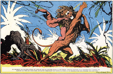
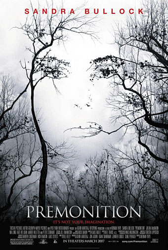
There’s also the drawing above which raises a curious artistic conundrum by being very reminiscent of the work of comic artist Burne Hogarth. A couple of weeks after posting the Czanara angel picture I pointed out the similarity between the film poster for Premonition and one of Hogarth’s panels from Jungle Tales of Tarzan, both of which use the trick of making faces out of tree branches. (I also noted that Dalí was doing similar things before almost everyone else.) Czanara’s 1953 drawing not only contains very Hogarthesque figures but does the same thing with the branches to make a skull face. The curious thing here is that Czanara’s picture predates Hogarth’s Tarzan book by more than twenty years. It’s very unlikely that Hogarth would have seen Czanara’s work; given that Hogarth was made world famous by his Tarzan strips of the 1940s it’s more likely that Czanara knew Hogarth’s work although none of his Sunday strips contained these kind of pictorial tricks and I’ve not seen any example of Hogarth doing this in the 1950s. I also haven’t yet seen the recent book about Czanara so can’t say what light has been shed on his artistic influences. If anyone can solve this mystery (which may simply be coincidence, of course), please leave a note in the comments.

Elsewhere on { feuilleton }
The gay artists archive
The etching and engraving archive

Previously on { feuilleton }
The skull beneath the skin
A premonition of Premonition
Czanara’s Hermaphrodite Angel
The art of Paul Cadmus, 1904–1999

My pastiches

rev3cov.jpg

Lord Horror: Reverbstorm #3 (1992).

Following from the post about an art forgery exhibition (and Eddie Campbell discussing his American Gothic cover for Bacchus), I thought I’d post some of my own forgeries, or pastiches as we call them when no deception is intended.

Reverbstorm was the Lord Horror comic series I was creating with David Britton for Savoy in the 1990s. The Modernist techniques of collage (as in the work of Picasso and others) and quotation (as in TS Eliot’s The Waste Land) became themes in themselves as the series developed, so it seemed natural to imitate the styles of various artists as we went along. Pastiche is also a chance to flagrantly show off, of course, and I can’t deny that this was also one of my impulses here.

Issue #3 of Reverbstorm had marauding apes as its theme, from the Rue Morgue to Tarzan and King Kong, so I had the idea of doing an ape cover in the style of the celebrated paintings by Giuseppe Arcimboldo (1527–1593) which make human heads out of fruit, flowers or animals. Easy enough to have the idea but making it work took a lot of effort and required careful sketching beforehand, something I rarely do. The painting was gouache on board, a medium I’d been using for years and this was about the last gouache work I did before switching to acrylics.

Continue reading “My pastiches”

A premonition of Premonition

hogarth.jpg

Jungle Tales of Tarzan by Burne Hogarth (Watson-Guptill, 1976).

premonition.jpg

Premonition (Sony Pictures, 2007).

And multiple works by Salvador Dalí

Previously on { feuilleton }
L’Amour Fou: Surrealism and Design
Perfume: the art of scent
Metropolis posters
Film noir posters

Watchmen

watchmen.jpg

This year sees the 20th anniversary of the publication of Watchmen by Alan Moore and Dave Gibbons. The landmark comic book, one of the few to deserve the designation “graphic novel”, remains a particular favourite of mine, and one that still excites for its consummate command of the comics medium. The following is a very long round table discussion with Watchmen‘s creators from issue 100 of Fantasy Advertiser, first published in March 1988. It’s surprising that this doesn’t seem to have been posted anywhere else on the web as it’s an excellent discussion about this great book.

Spoiler warning: this piece discusses in depth just about every revelation in the story so you’d be advised to skip it if you haven’t read the book.

MARTIN SKIDMORE: Alright, let’s have a starting point… just what is it about Watchmen that distinguishes it from other…
STEVE WHITAKER: Cream cheeses?
MS: …superhero comics on the market?
DAVE GIBBONS: Is this in the form of direct questions to us, or…
FIONA JEROME: No, we’re all gonna talk.
DG: Well, I’ll have a schnoozle then…
SW: The thing that I think distinguishes Watchmen from other comics is that the series holds together more like a novel. Your climax isn’t in the last 3 panels in Watchmen 12. There are long quiet tracts with exciting bits or…moderately exciting bits (LAUGHTER) In terms of Jack Kirby Wham! Smash! Pow! it’s all very quiet. There’s a lot of suffering but…
MS: …it’s all emotional rather than physical suffering.
ALAN MOORE: It’s a difficult question for me and Dave to answer, probably one that you could answer better, but if I had to say anything then it’s the degree of structure that me and Dave have applied to it—I can’t think of many examples of that degree of structure, that degree of layering.
FJ: I was going to say: especially visually you don’t get such a use of motif certainly not in American comics.
MS: Doug Moench has used it occasionally.
FJ: But not with the same complexity and not filling-in with written structure as well.
PETER HOGAN: The thing is: you’re given a world. The characters, alright, they’re based on the Charlton Characters but they’re new as of page 1. Even so, they’re characters with a history that comes out over the course of the thing… Their world has a history… it has a cohesion to it.
SW: Something that quite interests me now we’re talking about structure and stuff, is the symmetry—there is a real symmetry to Watchmen and the way the characters are set up.
DG: Two arms… two legs. (LAUGHTER)
MS: Perhaps the Comedian and Rorschach…
SW: I was thinking more of Osterman and Ozymandias.
MS: That’s right—the intellectual and physical, chaos and law…
AM: It’s difficult pinning down what’s symmetrical to what—I mean to me, at least to some extent, there’s an equally good case for contrasting Nite Owl and Rorschach.

Continue reading “Watchmen”