Piranesi as designer

piranesi1.jpg

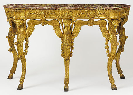
Pier table for Cardinal Rezzonico (c. 1768).

This ostentatious object is on display at the Cooper-Hewitt National Design Museum in an exhibition devoted to Piranesi’s work as a designer. Piranesi (whose work adorns the current {feuilleton} header) is far more well-known for his Carceri d’Invenzione and Vedute di Roma prints than for his furniture design, of course, so this exhibition addresses a side of the artist/architect which is rarely explored outside the more extensive books about his work. I’d seen this table before in black and white photographs in John Wilton-Ely’s substantial monograph, The Mind and Art of Giovanni Battista Piranesi (1978) but those photos don’t fully convey its lavish (some might say gaudy) effect.

The exhibition runs from September 14, 2007–January 20, 2008. From the Cooper-Hewitt site:

This exhibition examines the artist’s role in the reform of architecture and design from the 18th century to the present. This is the first museum exhibition to show Piranesi’s full range and influence as a designer of architecture, elaborate interiors and exquisite furnishings. On view will be etchings, original drawings and prints by Piranesi, as well as a selection of three-dimensional objects. In addition to his better-known architectural projects, Piranesi also designed fantastic chimneypieces, carriage works, furniture, light fixtures and other decorative pieces. The exhibition is co-curated by Dr. Sarah E. Lawrence, director, Master’s Program in the history of decorative arts and design, Cooper-Hewitt, National Design Museum, and John Wilton-Ely, professor emeritus, University of Hull.

piranesi2.jpg

Diverse Maniere…, Open to Chimneypiece: Griffon Monopods on the Jambs (1769).

The original table design appeared in Diverse Maniere, a collection of prints showing design for clocks, furniture and fireplaces. Many of these are the most bizarre and detailed inventions in Piranesi’s corpus, especially the elaborate Egyptian-themed fireplaces. Very few of these confections were built at all but a number of the prints are in the exhibition and can be seen at its very elegant website.

NYT feature on Piranesi and the Cooper-Hewitt exhibition

Elsewhere on { feuilleton }
The etching and engraving archive

Aerodynamik by Kraftwerk

kraftwerk.jpg

1 Aerodynamik (Intelligent Design Mix by Hot Chip) (8:34)
2 La Forme (King Of The Mountains Mix by Hot Chip) (11:31)

This is a curious moment to be releasing a remix single, four years after the last studio album, Tour De France Soundtracks, which is the origin of the music here. But the Düsseldorf boys have always been a law unto themselves and I’m a Kraftwerk obsessive so I won’t complain, especially when any release at all is a significant event.

kraftwerk2.jpg

Tour De France Soundtracks (2003); Aerodynamik single (2004).

An additional attraction for this fan is seeing how the design changes from one release to the next. Kraftwerk control their presentation as carefully as their music and this new design combines the original quartet of cyclists (which date back to the first Tour De France single from 1983) with the fluorescent green that became a feature with Expo 2000. The bikes and riders have now been updated so they look suitably aero-dynamic.

Kraftwerk are notoriously tight-lipped about their activities and since the Eighties have developed a Kubrick-like prevarication towards new projects. A multi-disc retrospective, The Catalogue, was supposed to have appeared in 2004 and came close enough to release for promo editions to go out, only to be cancelled at the last minute. (Those promos now sell for hundreds of dollars on eBay.) The new single may be intended to stimulate interest in something more substantial seeing as we’re entering the prime period for pre-Christmas releases. Fingers crossed.

Previously on { feuilleton }
Street Sounds Electro
White Noise: Electric Storms, Radiophonics and the Delian Mode
The genius of Kraftwerk

Street Sounds Electro

electro.jpg

I spent much of the summer of 1983 playing games on a very primitive ZX Spectrum computer while listening to the first couple of Street Sounds Electro compilations. Those mix albums were among the best releases that year and remain highly sought after, seeing as they’ve never been reissued on CD.

face.jpg

The musical reputation of the compilations has overshadowed the sleeve design which was very distinctive for the time and undoubtedly a factor in their success. The vertical ELECTRO type was inspired by Neville Brody’s design for The Face which had turned the magazine’s title through ninety degrees the year before. Also very Brodyish was the use of photocopier-processed graphics and narrow typography although it should be pointed out that Brody hand-drew nearly all his headlines which left his imitators searching through type catalogues for approximations. The sleeve designs are credited to “Red Ranch for Carver’s” about whom I can find no information whatever. Things came full-circle when The Face ran a feature on the electro scene in 1984 giving Brody the opportunity to do a cover with his own variant on the sleeve layouts.

essential.jpg

Essential Electro 9-album box, HBOX 1 (1984).

One of the big attractions of these albums for me was the new directions they were opening up for electronic music. Outside the mainstream pop world electronica in the early Eighties meant either the polite fare of Tangerine Dream or the dreary sludge of minor industrial acts such as Portion Control. Cabaret Voltaire were still vital in the early 1980s: their thundering Crackdown single (with sleeve design by Neville Brody) was remixed for its 12-inch incarnation by dance producer John Luongo while electro producer John Robie (whose production is featured on Electro 1) remixed their Yashar single for Factory Records. But nothing matched the excitement of a bunch of NYC kids lifting Kraftwerk riffs and playing in a very unselfconscious manner with new and relatively cheap equipment, especially the Roland TR-808 drum machine which provides the backbone for many of these recordings.

Continue reading “Street Sounds Electro”

Gertrude Käsebier’s crystal gazer

crystal.jpg

The Crystal Gazer (or The Magic Crystal, 1904).

The photographs of Gertrude Käsebier (1852–1934) seem to be popular with art directors; the picture above was used on the sleeve of the Spangle Maker EP by the Cocteau Twins in 1984 and her Silhouette of a Woman / A Maiden at Prayer (1899) appeared on the cover of the Nonesuch recording of Henryk Górecki’s Symphony no. 3 in 1991.

spangle.jpg

The Spangle Maker by The Cocteau Twins (design by 23 Envelope).

Gertrude Käsebier at the Art of the Photogravure

Previously on { feuilleton }
Karl Blossfeldt
The Dawn of the Autochrome
Fred Holland Day
The Door in the Wall
Edward Steichen
Mark Twain and Nikola Tesla